Attention in the first few precious seconds is key to YouTube advertising.
When netizensInternet users, especially those active on social media or forums are bombarded with so much visual stimuli and information, an ad should pop, not just visually but also say what it has to offer quickly and effectively.
Making impactful ad design can make the difference between skipping your ad and engaging with it.
With a more thoughtful ad design, YouTube can continue to be a vibrant platform on which brands and marketers can effectively build their brand visibility, engage their customers, and even drive conversions.
We will look at ten creative ad design approaches to help you get the most out of your YouTube advertising campaigns.
This guide will walk you through the process of mastering ad design basics, crafting persuasive messages, and optimizing for mobile and desktop views, with insights and practical tips to help you design ads that best resonate with your audience.
Let’s start with the foundational elements of creating effective ad designs on YouTube.
Understanding the Basics of YouTube Ad Design
Before jumping into creative strategies, it’s essential to understand the core elements that make up an effective YouTube ad.
YouTube’s platform offers several ad formats, each suited for different goals.
Whether it’s brand awarenessThe extent to which consumers are familiar with a brand's qualities or products, product promotion, or audience engagement, understanding the core principles of ad design will prepare you for success.
The importance of captivating ad design in holding viewers’ attention on YouTube.
Why Ad Design Matters on YouTube
Designing an ad for YouTube is more than just making something visually appealing; it’s about a strategy of communication.
An effective ad draws the attention of viewers in a very short period, allowing for easier communication of your message in that short time.
A well-crafted design can evoke feelings, spark curiosity, and influence viewer behavior.
On a platform where viewers can skip ads after just a few seconds, impactful design is the ticket to holding their attention.
With YouTube’s wide reach, visually appealing ads are an integral part of setting your brand apart.
Effective ad design increases the likelihood of engagement, driving users to take action, whether that’s watching more of your video, visiting your website, or learning more about your product.

Essential components of impactful ad design on YouTube.
Key Elements of Effective Ad Design
When designing ads for YouTube, certain elements consistently make ads more effective:
- Clear Branding: Include your logo, brand colors, and other visual identifiers. This helps viewers recognize and identify with your brand instantly, strengthening brand identification.
- Engaging Visuals: Use high-quality imagery or video clips that align with your brand’s tone and message.
- Focused Message: Keep your message simple and direct. Avoid clutter and focus on one main point.
- Clear Call to Action (CTA): Whether you want viewers to subscribe, visit your website, or learn more, a strong call to action is essential.
- Concise Storytelling: Share your story and create an emotional hook within a brief period to capture your audience’s attention.
These are the major building blocks for creating successful advertisements on YouTube that not only grab attention but also encourage people to take the desired action.

Exploring the diverse ad formats available on YouTube.
Understanding Different YouTube Ad Formats
YouTube presents various ad formats, each with unique benefits and use cases:
- Skippable Video Ads: These allow viewers to skip after five seconds, making them ideal for building brand awareness while giving viewers control.
- Non-Skippable Video Ads: These are mandatory viewing ads, usually 15 to 20 seconds long, and are suitable for delivering messages in a controlled viewing environment.
- Bumper Ads: Six-second ads that are perfect for concise and memorable messages.
- Overlay Ads: Small ads that overlay the bottom of the video, serving as gentle reminders without being intrusive.
- Sponsored Cards: Relevant cards that appear within the video, useful for promoting products or related content, thus increasing awareness.
Knowing these formats helps you choose the best advertising approach based on your specific goals.

Establishing precise objectives for successful ad campaigns.
Setting Clear Objectives for Your Ad Campaign
Setting clear objectives is crucial before diving into ad design.
Whether it’s increasing brand awareness, driving traffic, or boosting conversions, having set goals allows you to tailor your ad design, tone, and calls to action to meet those objectives effectively.
For instance, if your goal is to drive website visits, ensure that your ad includes a strong call to actionA prompt or instruction that encourages the audience to take a specific action that encourages viewers to click.
Setting specific and measurable objectives puts you in a better position to evaluate how well an ad performs and to refine your approach for future campaigns.
Captivating attention with YouTube ad design means capturing attention quickly through compelling visuals.
You have just a few seconds to make an impression, and that impression should come through creative visuals aligned with your branding.
Effective visual design in ads isn’t just about making them look great; it’s how you convey the essence of your brand, draw in your audience, and guide them to take action.

The value of professional, high-definition visuals in advertising.
Using High-Quality Imagery and Video
Quality matters in ad design, especially on YouTube, where viewers expect professional content.
Poor-quality visuals can quickly lead to a loss of credibility.
High-definition images and videos create a strong first impression and keep viewers’ attention.
Ensure that all images, video clips, and animations are sharp, distraction-free, and clearly focused on your product, message, or brand.
Using a mix of close-ups, wide shots, and dynamic angles helps maintain visual stimulation throughout the ad.
A strong visual narrative can cut through and effectively communicate your message, even without sound.
Each frame of your ad should feel like a polished representation of your brand’s standards.

Effective use of color and contrast in creating engaging ads.
The Role of Color and Contrast in Ad Design
Color psychology plays a significant role in ad design, influencing viewers’ emotions and perceptions.
Vibrant colors are effective in attracting attention, while a balanced use of contrast helps highlight specific elements, like a call to action.
Your color choices should reflect your brand’s identity and the mood you want to convey to viewers.
- Brand Colors: Use consistent colors associated with your brand to reinforce brand identity.
- High Contrast: Use noticeable contrast to make important elements, such as text or buttons, stand out from the background.
- Emotionally Engaging Hues: Choose colors that elicit specific emotional reactions. For instance, red can create urgency, while blue conveys trust and stability.
Using color strategically enhances the appeal of your ad and guides viewer engagement by subtly directing attention to key areas within the ad.

Leveraging animation and motion graphics for engaging ads.
Making the Most of Animation and Motion Graphics
Motion graphics and animations are powerful tools in ad design, especially on YouTube, where dynamic visuals help retain viewer interest.
Adding animation to text, icons, or other visual elements creates a lively and engaging experience.
For instance, animated transitions between scenes can make your ad feel smoother and more polished.
Animation can also simplify complex ideas, making them more accessible and engaging.
For example, if your product is technical, a short animation depicting its features can be more effective than a static image or plain text.
However, pay attention to pacing, as overly fast or chaotic animations can overwhelm viewers and reduce engagement.

Achieving harmony between creativity and brand identity in ad design.
Balancing Visual Appeal with Brand Consistency
While creativity in ad design is essential, brand consistency is equally important.
Your ad’s visuals should match your overall brand look and feel so that viewers instantly recognize your company or product.
By using consistent colors, fonts, and design elements across all your ads, you strengthen brand recall and build trust.
Even as you experiment with new visual styles, ensure that every visual choice supports your brand identity.
The goal is to create visually appealing ads that attract attention while reinforcing brand recognition.
Balancing creative display with brand consistency will help you create memorable ads that not only capture attention but also convey the right message about your brand.
Crafting Messages and Calls to Action that Work
This is where the real creativity begins in designing YouTube ads: it’s the message and CTA, not just the visuals, that ultimately drive action.
The message should not be a mere collection of words; it’s meant to resonate with the viewer and connect with a need or a want.
A persuasive message with a clear, compelling call to action can make the difference between a viewer scrolling past and taking action on your ad.

Crafting compelling and persuasive ad copy for digital marketing.
Writing Engaging Ad Copy
Ad copy on YouTube should be concise, clear, and compelling.
Since YouTube ads are typically short, every word should have a function: each one drives the viewer closer to understanding your product or taking action.
Use simple language that quickly conveys your unique value proposition.
Avoid jargon, and focus on the benefits your audience will gain from engaging with your brand.
Consider using emotionally charged words and phrases that resonate with viewers.
Think about what might make someone stop and consider your message, whether it’s a solution to a problem, a discount, or an invitation to join a community.
A great approach is to highlight how your product or service resolves a pain point or satisfies a need.

Building strong audience connections through emotional appeal.
Using Emotional Appeal to Connect with Audiences
Emotions play a powerful role in ad design, often making all the difference in whether a viewer engages with an ad.
Tapping into emotional appeal enables you to connect with your audience.
Consider the emotions you want your ad to evoke—joy, curiosity, urgency, or a sense of relief—and build your message around these feelings.
For example, ads that inspire or excite viewers often perform well, as do those that build trust or showcase empathy.
An emotional appeal can make your ad more relatable and memorable through storytelling, humor, or empathy.
Using phrases like “Imagine if…” or “What if you could…” can help paint a picture that resonates with viewers’ experiences or aspirations.

Encouraging engagement with clear and focused calls to action.
Incorporating Clear and Direct Calls to Action
The call to action (CTA) is arguably one of the most critical parts of any YouTube ad.
After capturing attention and delivering your message, a strong CTA guides the viewer on what to do next.
Your CTA should be straightforward, action-oriented, and aligned with your campaign goals.
- Clear Language: Use simple and direct language, such as “Learn More,” “Sign Up,” or “Get Started.”
- Urgency Cues: Adding words that imply urgency, like “Today” or “Limited Time,” can encourage viewers to act quickly.
- Relevance to the Ad: Ensure the CTA aligns with the message. For example, a product ad should include a CTA like “Shop Now” or “See the Collection.”
Testing different CTA variations helps determine what works best for your audience.
The goal is to make the CTA visible and enticing, leading to higher engagement and conversions.

Optimizing ad messaging through testing and refinement.
Tips for Testing and Refining Your Messaging
A/B testing is essential for refining your ad copy and CTA.
By testing different messages and CTAs, you can discover what resonates most with your audience.
Experiment with variations in wording, tone, and structure to find the most effective approach.
Additionally, track other engagement metrics, such as click-through rates and view duration, to assess which messages work best.
Use these insights to make iterative adjustments that optimize your ad design over time.
Testing and refining are crucial steps to make your ad designs more convincing and appealing to your targeted audience.
Optimize Ads for Mobile and Desktop Experiences
Since YouTube users access content on a wide range of devices—from mobile phones and desktop computers to game consoles and smart TVs—it’s important to optimize your ad design for both mobile and desktop experiences.
Each of these devices has its own unique user interactions and screen dimensions.
Tailoring your ad to these differences can increase engagement and offer a better viewer experience.
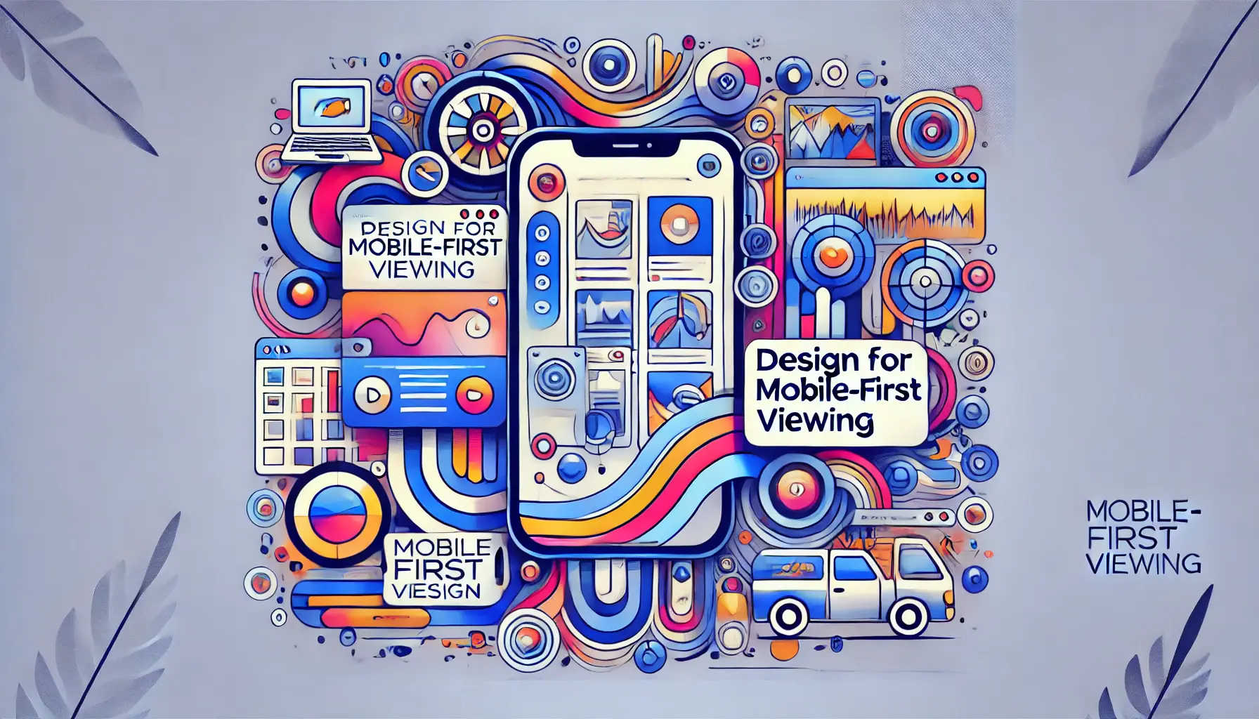
Optimizing ad design for mobile viewing.
Design for Mobile-First Viewing
With the majority of YouTube viewers using mobile devices, a mobile-first approach is essential.
Consider creating verticalAn ad format or aspect ratio suited for mobile viewing, usually taller than it is wide or square video formats that work well on mobile, and position key elements, such as logos or text, so they are highly visible without requiring the viewer to rotate the device.
When designing for mobile, remember that less is more.
Small screens can make overly detailed visuals difficult to comprehend.
Using bold, readable text and high-contrast visuals helps ensure that your message is easily readable.
Also, consider shorter ad formats, as mobile users are often on the go and may not engage with lengthy ads.

Adapting ad layouts to fit various screen sizes.
Adjusting Layouts for Various Screen Sizes
Responsive design is vital for YouTube ads, allowing your content to look great on any screen size.
Consider how your ad layout will appear on both large desktop monitors and small mobile screens.
You may need to reposition elements, like text or a logo, to prevent them from being overlapped or cut off across different devices.
This helps create a layout that adapts to different screen sizes, preventing issues like text running off-screen or important visuals getting obscured.
Tools like safe zones, which mark the area visible across all devices, can help ensure that key messages and CTAs are consistently displayed, regardless of screen size.

Optimizing ad performance with fast loading and smooth playback.
Ensuring Fast Loading and Smooth Playback
Ad performance is closely tied to loading speed and playback quality.
If an ad takes too long to load, viewers may skip it before it fully displays.
Compress video files without losing quality to ensure faster loading, especially for mobile users who may have slower internet connections.
Smooth playback is equally important, as buffering can frustrate viewers and reduce their engagement with your ad.
Test your ads on various devices and internet connections to ensure smooth playback.
For optimal results, follow YouTube’s video ad specifications, such as recommended file formats and codecs, to reduce loading times and ensure consistent playback quality.
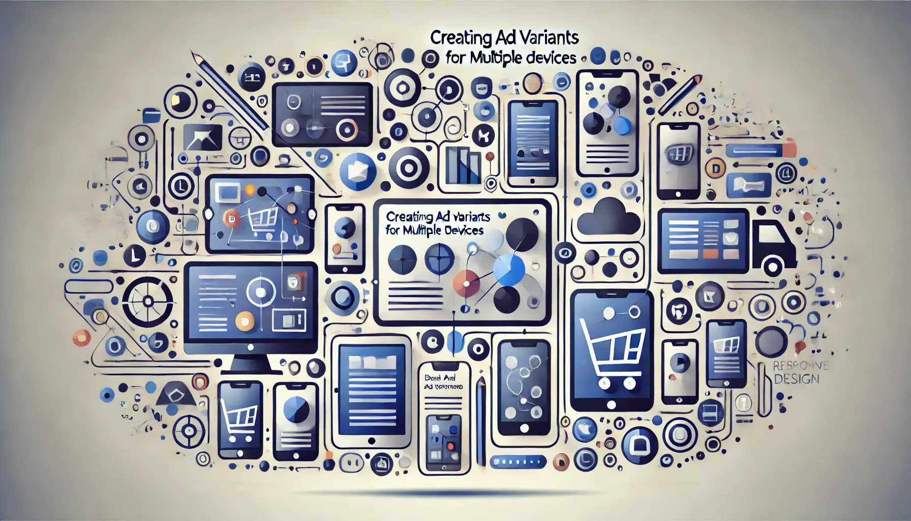
Designing responsive ad variants for different devices.
Creating Ad Variants for Multiple Devices
To maximize reach and engagement, consider creating ad variants tailored to different devices.
A mobile-oriented ad might have a vertical format and shorter duration, while a desktop version could include additional details and a wider format.
This approach allows you to create an ideal experience for each viewer by ensuring that ad variants are optimized for different devices, ultimately boosting your campaign’s overall performance.
Creating multiple versions of an ad also enables you to test device-specific calls to action or interactive elements, like swipe gestures on mobile.
By customizing ad variants, you’re more likely to capture viewers’ interest and foster engagement across different platforms.
Tracking, Analyzing, and Optimizing Ad Performance
Once your YouTube ad campaign is up and running, tracking and analyzing its performance becomes essential.
Regularly reviewing ad metrics can reveal what works and what doesn’t, providing you with insights to make informed adjustments.
By understanding viewer behavior and engagement, you can optimize your ads for better results, maximizing the impact of your investment.

Tracking and optimizing key performance indicators (KPIs) for ad campaigns.
Setting Up Metrics and KPIs
Key Performance Indicators, or KPIs, are metrics that should be established before any performance analysis begins.
Predefining KPIs enables you to measure the success of YouTube ads against your goals.
Common YouTube ad KPIs include:
- View Rate: Measures the number of viewers who watched your ad to its end, indicating viewer interest.
- Click-Through Rate (CTR): Reflects the number of viewers who clicked on your ad’s call to action, based on the number of exposures.
- Conversion Rate: Tracks the number of viewers who completed a desired action, such as signing up or purchasing.
- Cost Per View (CPV): Shows how much you pay per view, allowing you to manage ad budgets effectively.
- Watch Time: Measures how long viewers are engaging with your ad, indicating the level of interest drawn by your content.
These KPIs provide a basis for assessing ad effectiveness and identifying areas where improvements can be made.

Optimizing YouTube ads through Google Analytics data.
Using Google Analytics for YouTube Ads
Google Analytics is an ideal tool for gaining deeper insights into ad performance.
By integrating Google Analytics with your YouTube channel, you can track user behavior after they engage with your ad.
This allows you to see metrics like bounce rateThe percentage of users who leave a website without interacting with it further, pages per sessionThe average number of pages a user views during a single session on a website, and the user journey on your website, offering a better understanding of post-ad engagement.
Google Analytics also enables you to identify which audience segments respond best to your ads.
For instance, you can view demographic dataStatistics on the characteristics of a population, such as age, gender, and location to see which groups engage the most, helping you tailor future ads to better match their preferences.
Monitoring this data provides valuable information for refining ad strategies and improving targeting.
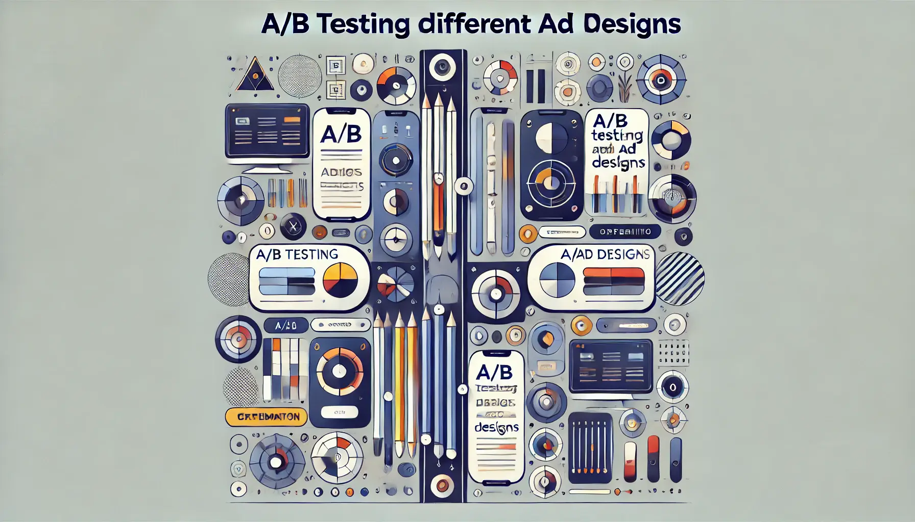
Optimizing ad performance through A/B testing.
A/B Testing Different Ad Designs
A/B testing is a crucial strategy for improving YouTube ad performance.
By making slight changes to two or more versions of an ad, you can determine which design, message, or CTA resonates best with your audience.
For example, you may want to test different video lengths, CTA buttons, or even thumbnail images to see which version achieves the highest engagement.
Effective A/B testingA method of comparing two versions of an ad or content to see which performs better involves changing only one variable at a time to pinpoint the precise impact of each element.
Over time, this process helps you fine-tune your ad approach, leading to ads that are more effective and better aligned with viewer preferences.

Optimizing ad campaigns through data-driven decision making.
Making Data-Driven Adjustments to Boost Results
Once you’ve gathered insights from metrics and testing, use this data to make targeted adjustments.
Focus on enhancing elements that drive engagement while refining or removing those that don’t.
For instance, if a specific CTA is driving high conversions, consider using that CTA in other ads as well.
Apply these insights to future ad campaigns, allowing each campaign to build on the successes of previous ones.
By continuously optimizing your ads based on data, you create a cycle of improvement that boosts performance over time and increases return on investment.
Understanding core elements of YouTube ad design, like brand consistency and viewer engagement, lays the foundation for effective ads.

Maximizing the impact of YouTube ad designs for success.
How to Maximize Your YouTube Ad Design for Success
YouTube advertising can be extremely effective if done right, combining creativity, strategy, and an understanding of what drives engagement.
By thoughtfully applying the principles discussed in this article, you can create YouTube ads that capture attention and drive meaningful action.
Here, we break down key strategies to help you maximize your ad design’s resonance with viewers across all platforms.
Foundational components that make up effective YouTube ad design.
Basic Components of YouTube Ad Design
Successful ad design begins with an understanding of the fundamental elements that build upon one another.
Each component plays a crucial role in creating a powerful ad on YouTube.
By focusing on brand consistency, visual appeal, and audience needs, you lay a strong foundation for your ad to capture attention effectively.

Engaging viewers with striking and creative visuals.
Use Compelling Visuals to Engage Viewers
Visuals are crucial in YouTube ads, as they are often the first element that catches viewers’ attention.
Make sure your visuals are high-quality, engaging, and consistent with your brand’s message.
Key tips include:
- Using HD images and high-quality videos to convey professionalism and build trust with viewers
- Employing color contrast to enhance readability and visual engagement
- Incorporating animation or motion graphics to add energy and dynamism to your ads, making them more memorable
By using compelling visuals, you create ads that stand out and leave a lasting impression on viewers.

Crafting effective messages and motivating action through clear calls to action.
Create Persuasive Messages and Clear Calls to Action
Your ad’s message and call to action are what drive viewers to take action.
Ensure that your message is clear, direct, and resonates emotionally with your audience.
A strong, clear CTA provides guidance on the next steps, helping increase conversions.
Focus on:
- Crafting creative, benefit-focused ad copy that connects with your audience’s needs
- Establishing an emotionally resonant message that builds rapport
- Providing a clear, action-focused CTA to boost viewer interaction
Aligning your message and CTA with campaign goals increases the likelihood of meaningful engagement from your viewers.

Optimizing ad designs for seamless experiences across mobile and desktop devices.
Optimize for Mobile and Desktop Experiences
With YouTube accessible across a wide range of devices, optimizing for mobile and desktop is essential.
A mobile-first design with simple, bold visuals ensures the majority of YouTube users can easily view your ad on smaller screens, while responsive layouts and adaptable formats enhance the experience on desktops and larger screens.
Effective strategies include:
- Designing with a mobile-first approach, using vertical or square formats
- Adjusting layouts to fit any screen size without compromising quality
- Ensuring fast loading times and smooth playback for an optimal user experience
Optimizing your ad for both mobile and desktop ensures maximum reach and high-quality presentation across all devices.
Tracking and optimizing ad performance for continuous improvement.
Track, Analyze, and Improve Ad Performance
Ad design is an ongoing process, and tracking performance metrics allows for continuous improvement.
Key Performance Indicators (KPIs), such as view rate, click-through rate, and conversion rateThe percentage of users who take a desired action, such as clicking a link or making a purchase, provide insights into what works and what doesn’t.
Key steps for effective tracking and improvement include:
- Defining KPIs and measuring success against these goals
- Using Google Analytics to gain deeper insights into user behavior
- Conducting A/B testing to identify the most effective design, message, and CTA elements
- Making data-driven adjustments to increase engagement and conversions
With a data-driven approach, you can optimize each ad campaign for sustained success, ultimately increasing return on investment.
Creating YouTube ads that lead to success and deliver results.
Conclusion: Crafting YouTube Ads that Deliver Results
Mastering YouTube ad design requires creativity, a deep understanding of audience behavior, and platform dynamics.
By applying tips from basic design principles to advanced optimization techniques, you can create striking ads that grab users’ attention and keep them engaged.
Remember, effective ad design doesn’t happen overnight.
Continuously tracking performance and making adjustments lead to improvement—a well-practiced cycle that enhances visibility for your brand and resonates with your audience.
Whether you aim for brand awareness, conversions, or engagement, a well-designed YouTube ad will significantly enhance your digital marketing success.
Combining creativity with data-driven strategies ensures YouTube ads that capture attention and drive action effectively.
Exploring common questions about YouTube ad design.
Your campaigns can be managed by an agency specialized in Google Ads, check out our service page.
YouTube Ad Design: Frequently Asked Questions
The following section answers frequently asked questions about creating effective YouTube ads, laying out best practices for driving engagement and conversions.
Key elements include high-quality visuals, a clear and compelling message, brand consistency, and a strong call to action.
These elements work together to capture interest and encourage engagement with your ad.
Use compelling visuals, like vibrant colors and animation, and create a message that resonates emotionally with your audience.
A strong CTA also encourages viewers to interact with your ad.
Essential KPIs include view rate, click-through rate, conversion rate, and cost per view.
Continuously tracking these metrics allows you to monitor ad performance and make improvements as needed.
Consider a mobile-first approach by using vertical or square formats, high-contrast visuals, and concise messaging.
Ensure text and key elements are visible without requiring viewers to rotate their device.
A/B testing involves creating ad variations with minor changes to see which version performs better.
Testing different visuals, CTAs, or messages helps you optimize your ad for viewer preferences.
Google Analytics provides insights into post-ad engagement, such as bounce rate and pages per session.
This data helps you refine ad strategies and target future campaigns to key audience segments.
The ideal length depends on your goals and audience.
Short ads (15-30 seconds) capture attention quickly, while longer ads (up to 60 seconds) work better for in-depth storytelling.
Brand consistency builds trust and makes your ad more memorable.
Using consistent colors, fonts, and logos reinforces your message and enhances recall among viewers.
Make your CTA clear, direct, and aligned with your ad’s message.
Use action-oriented language and add urgency (e.g., “Sign Up Today”) to encourage immediate engagement.


