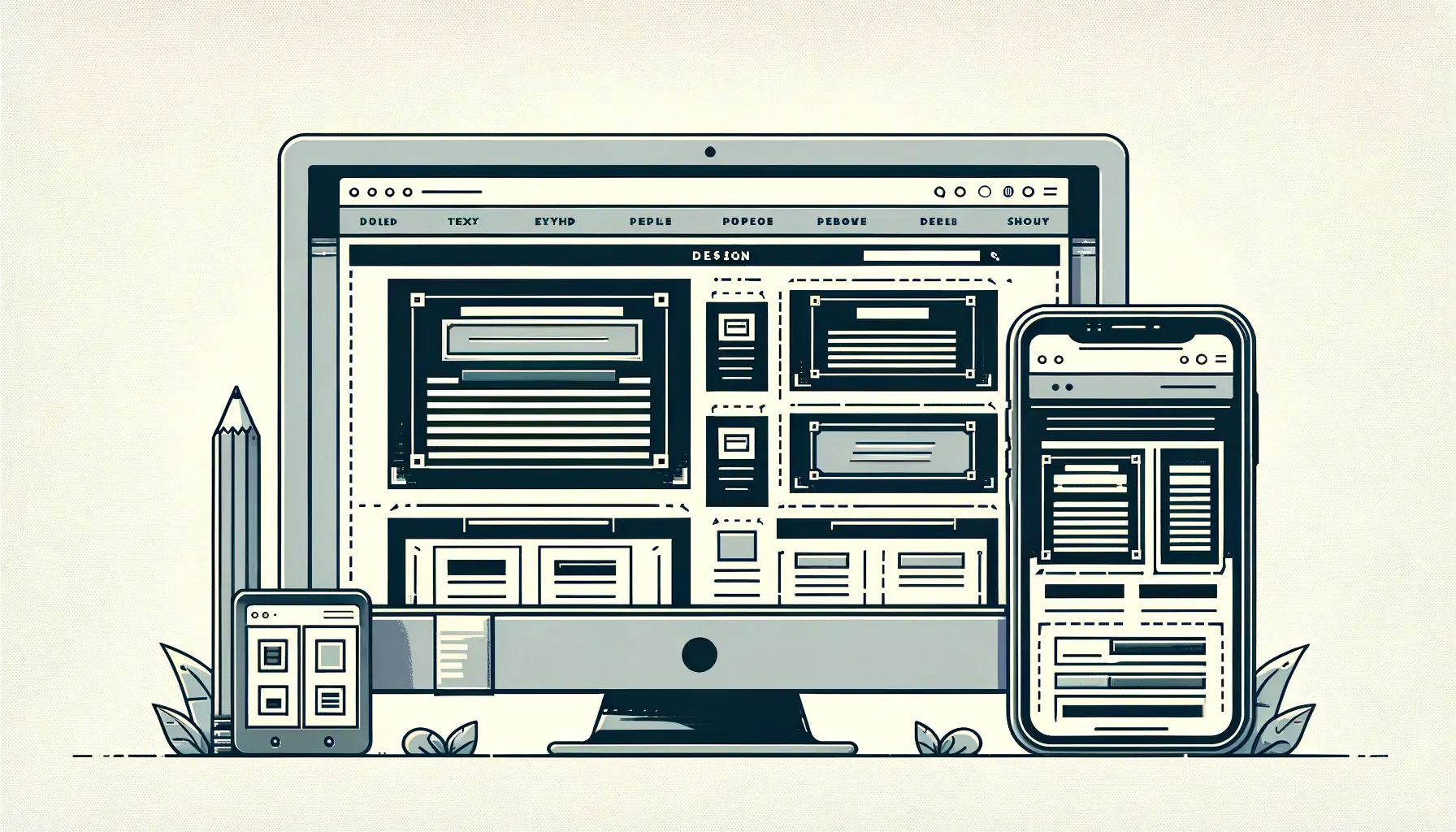
Responsive design has become a cornerstone of modern web development, ensuring that websites are accessible and functional across a wide range of devices.
At the heart of this approach lies the use of media queries, a powerful CSS3 feature that allows web designers to create multiple layouts from a single codebase.
By understanding and implementing media queries effectively, developers can ensure that their websites adapt seamlessly to different screen sizes, orientations, and resolutions, providing an optimal viewing experience for all users.
The concept of media queries extends beyond simple device detection; it’s about crafting experiences that are tailored to the user’s current context.
This includes adapting layouts, font sizes, and navigation elements to match the capabilities and limitations of the device being used.
As the web continues to evolve, the importance of responsive design and the role of media queries in achieving it cannot be overstated.
This article aims to delve deep into the mechanics of media queries, offering insights, tips, and best practices for leveraging this technology to create responsive, user-friendly websites.
- Understanding Media Queries
- Best Practices for Using Media Queries
- Media Query Syntax and Features
- Responsive Layouts with Flexbox and Grid
- Optimizing Images and Media for Responsive Design
- Accessibility in Responsive Design
- Performance Optimization in Responsive Design
- Embracing the Future with Responsive Design
- FAQs on Media Queries for Responsive Design
Understanding Media Queries
Media queries are a feature of CSS that allow content to adapt to different conditions such as screen resolution, device orientation, and window size.
They work by using the @media rule to include a block of CSS properties only if a certain condition is true.
This enables designers to create a single webpage that can look different on a desktop, tablet, or mobile phone, enhancing the user experience by making sites accessible and navigable on any device.
At its core, a media query consists of a media type and one or more expressions that check for the conditions of particular media features.
The most common use of media queries is to check the width and height of the viewport or device.
However, they can also test for other features, such as device orientation (portrait vs.
landscape), resolution, and even color capabilities.
This flexibility makes media queries an indispensable tool in the responsive designer’s toolkit.
Implementing Basic Media Queries
Implementing media queries in a CSS file is straightforward.
A basic media query might look something like this: @media screen and (max-width: 600px) { …
}.
This query applies the contained styles only if the device’s screen type is screen and its width is 600 pixels or less.
Such queries enable designers to create responsive designs that adapt to the screen size, improving readability and navigation on smaller devices.
It’s important to adopt a mobile-first approach when using media queries.
This means designing for the smallest screen size first and then adding media queries to adjust the layout for larger screens.
This approach is efficient because it addresses the constraints of mobile devices upfront, ensuring that the design is optimized for performance and usability from the start.
Remember, media queries are not just about adjusting layout sizes; they’re about creating a holistic user experience that adapts to the user’s current context.
Best Practices for Using Media Queries
Effectively implementing media queries requires more than just understanding their syntax; it involves adopting best practices that ensure your responsive designs are efficient, maintainable, and user-friendly.
Here are some key considerations and strategies for making the most out of media queries in your projects.
Start with a Mobile-First Approach
Adopting a mobile-first approach means designing your website for mobile devices first before scaling up to larger screens.
This strategy is beneficial for several reasons:
- Performance Optimization: Mobile devices generally have less processing power and slower internet connections than desktops. Designing for mobile first ensures that your website is optimized for performance from the outset.
- User Experience: With the increasing prevalence of mobile internet usage, starting with mobile ensures that the largest segment of your audience gets an optimized experience.
- Simplicity in Design: Focusing on mobile forces designers to prioritize content and functionality, leading to cleaner, more focused designs.
Use Breakpoints Wisely
Breakpoints are specific media query values that trigger changes in the layout of a website.
While it’s tempting to create breakpoints for every possible device size, this approach can lead to overly complex and hard-to-maintain code.
Instead, consider these guidelines:
- Content-Based Breakpoints: Choose breakpoints based on the content of your site, not specific devices. This ensures your design remains flexible and future-proof.
- Common Device Sizes: While focusing on content, it’s still practical to be aware of common device sizes and ensure your design looks good on these screens.
- Minimal Breakpoints: Use the minimum number of breakpoints necessary to achieve your design goals. This simplifies your CSS and makes your site easier to maintain.
Test Across Devices and Browsers
Testing is a critical part of responsive design.
Ensure that your media queries and layouts work as expected across a range of devices and browsers by:
- Using Developer Tools: Most modern browsers offer developer tools that allow you to simulate various screen sizes and resolutions.
- Physical Testing: Whenever possible, test your website on actual devices to get a true sense of how it performs and looks.
- Cross-Browser Testing Tools: Utilize online tools and services that allow you to test your website across different browsers and operating systems.
Incorporating these best practices into your workflow can significantly enhance the effectiveness of your media queries and, by extension, the responsiveness of your designs.
Media Query Syntax and Features
Understanding the syntax and features of media queries is crucial for crafting responsive designs that adapt to various conditions.
Media queries consist of a type, an optional expression that checks for specific conditions, and the CSS rules that should be applied when those conditions are met.
Let’s delve into the components and capabilities of media queries to better understand how they can be utilized in responsive design.
Types of Media Queries
Media queries can target different media types, such as screen, print, or all.
The most commonly used type in responsive design is screen, but understanding the full range allows for more versatile designs:
- Screen: Used for computer screens, tablets, and smart phones.
- Print: Used for content intended to be printed or for print preview modes.
- All: Suitable for all devices and can be used when you want your styles to apply broadly.
Using Expressions in Media Queries
Expressions in media queries evaluate to either true or false and determine whether the contained CSS rules should be applied.
These expressions can test for various features, including width, height, resolution, and orientation.
Here’s a closer look at how expressions can be used:
- Width and Height: The
min-width,max-width,min-height, andmax-heightfeatures are among the most commonly used. They allow you to apply styles based on the viewport’s dimensions. - Orientation: This feature is used to detect whether the device is in landscape or portrait mode, allowing for layout adjustments based on the device orientation.
- Resolution: Targeting different screen resolutions can be particularly useful for serving high-resolution images to devices capable of displaying them, enhancing visual fidelity without compromising performance on lower-resolution devices.
Combining Multiple Conditions
Media queries can combine multiple conditions using logical operators such as and, not, and only.
This capability allows for more precise targeting and control over when styles are applied.
For example, you might want to apply certain styles only if the device is in landscape mode and the viewport width is greater than 768 pixels.
By combining conditions, you can create sophisticated, adaptive designs that cater to a wide range of user contexts.
Understanding the syntax and capabilities of media queries is the first step toward mastering responsive design.
By leveraging these features, you can create websites that not only look great on any device but also offer enhanced usability and performance, leading to a better overall user experience.
Media queries empower designers to create adaptive, flexible layouts that respond to the user’s environment, making them a key tool in the responsive design toolkit.
Responsive Layouts with Flexbox and Grid
While media queries provide the foundation for responsive design by allowing us to apply different styles based on device characteristics, CSS Flexbox and Grid layouts offer powerful ways to create these responsive designs.
Both Flexbox and Grid enable developers to create complex layouts that are flexible and adapt to the screen size without the need for extensive media query adjustments.
Flexbox for Responsive Design
Flexbox, or the Flexible Box Layout, is a one-dimensional layout method for laying out items in rows or columns.
It allows each item within a flex container to expand, shrink, and align, making it incredibly useful for responsive design.
Here’s why Flexbox is a go-to choice for many developers:
- Flexibility: Flexbox provides a more efficient way to distribute space among items in a container, even when their size is unknown or dynamic.
- Alignment: It offers advanced alignment capabilities, making it easy to vertically or horizontally align items within a container, which is particularly useful for centering content or creating sticky footers.
- Responsive Menus: Flexbox is ideal for creating responsive navigation menus that adjust to the viewport width, switching from horizontal to vertical layout or showing/hiding menu items as needed.
Grid for Complex Layouts
CSS Grid Layout is a two-dimensional layout system for the web.
It lets you create grid-based layouts, where you can precisely place items in rows and columns.
Grid is particularly suited for designing complex layouts that need to be responsive:
- Control: Grid offers a high level of control over layout design, allowing you to specify the size of rows and columns, and place content exactly where you want it within the grid.
- Complex Layouts: It simplifies the creation of complex layouts that were difficult to achieve with older CSS properties, such as multi-column layouts that adjust based on content size.
- Integration with Media Queries: When combined with media queries, Grid enables you to reposition and resize grid items based on the viewport size, offering a robust solution for creating fully responsive designs.
Both Flexbox and Grid have their unique strengths and can be used together to build responsive, flexible layouts.
By understanding when and how to use each, you can enhance the responsiveness of your designs, ensuring they work seamlessly across all devices and screen sizes.
While media queries handle the conditional application of styles, Flexbox and Grid tackle the layout challenges, making them complementary tools in responsive web design.
Optimizing Images and Media for Responsive Design
In responsive design, optimizing images and media is crucial to ensure fast loading times and a smooth user experience across all devices.
High-resolution images that look stunning on a desktop can significantly slow down a site on mobile devices, where network conditions are often less ideal.
Here’s how to optimize images and media for responsive design:
Using Responsive Images
Responsive images adapt to the size of the viewport to provide a better user experience by loading the appropriate image size.
Implementing responsive images involves using HTML and CSS techniques such as the srcset attribute, the element, and CSS background images.
These methods allow the browser to select and load the most suitable image size, reducing unnecessary data transfer and improving page load times.
- Srcset Attribute: The
srcsetattribute in<img>tags allows you to define multiple image sources for different screen resolutions. The browser then chooses the most appropriate version based on the current viewport width. - Picture Element: The
<picture>element provides even more control, allowing you to specify different images for different scenarios, not just based on the viewport width but also on other factors like the viewport height or pixel density. - CSS Background Images: For background images, CSS media queries can be used to serve different background images based on the viewport size.
Optimizing Video Content
Like images, video content must also be optimized for responsive design.
This includes selecting the right video formats, compressing video files, and using responsive video containers that adjust to the screen size.
HTML5 provides the
- Video Compression: Compressing video files without significantly sacrificing quality can drastically reduce load times, especially on mobile networks.
- Responsive Video Containers: Wrapping videos in containers with a responsive aspect ratio ensures that they scale correctly and maintain their aspect ratio on any screen size.
- Adaptive Streaming: Technologies like HLS (HTTP Live Streaming) and MPEG-DASH allow the video to adapt to the user’s bandwidth in real-time, providing a smooth viewing experience regardless of network conditions.
Optimizing images and media is not just about reducing file sizes; it’s about ensuring that your website remains accessible, engaging, and fast, regardless of how or where it’s being accessed.
By implementing responsive images and optimizing video content, you can significantly improve the performance and usability of your responsive designs.
Effective optimization of images and media is essential for responsive design, ensuring that content is delivered efficiently and appropriately across all devices.
Accessibility in Responsive Design
Accessibility should be a key consideration in responsive design, ensuring that websites are usable for everyone, including people with disabilities.
Responsive design and accessibility go hand in hand, as both aim to provide a better user experience across a range of devices and situations.
Here are some strategies to ensure your responsive designs are also accessible:
Flexible Text and Readable Fonts
Text size and readability are crucial for accessibility.
Users should be able to read content comfortably on any device without having to zoom in.
Employ relative units like ems or rems for font sizes, and use media queries to adjust text sizes and line spacing based on the viewport size.
Additionally, choose fonts that are easy to read and provide sufficient contrast against the background.
- Relative Units: Using ems or rems for font sizes ensures that text scales appropriately when users adjust their browser or device settings for larger text.
- Contrast and Font Choices: Ensure high contrast between text and background colors and use legible font families to improve readability.
Adaptable Navigation
Navigation is a critical component of web design, and it must adapt to different screen sizes without compromising accessibility.
Implement responsive navigation menus that are easy to interact with, regardless of the device.
This might include transforming a horizontal desktop menu into a toggleable dropdown or off-canvas menu on mobile devices.
Ensure that all navigation elements are accessible via keyboard and screen readers.
- Keyboard Navigation: Ensure that your navigation can be fully operated with a keyboard, which is essential for users who cannot use a mouse or touch screen.
- Screen Reader Friendly: Use ARIA (Accessible Rich Internet Applications) labels and roles to describe navigation elements and their state to screen reader users.
Responsive Media and Interactive Elements
Ensure that all media and interactive elements on your site are accessible.
This includes providing alternative text for images, captions and transcripts for videos, and accessible controls for interactive elements.
Use media queries to adjust the layout of these elements as needed, but always keep accessibility in mind.
- Alternative Text: Provide descriptive alternative text for images, which is crucial for users who rely on screen readers.
- Captions and Transcripts: Offer captions for videos and transcripts for audio content, ensuring that users with hearing impairments can access the information.
- Accessible Controls: Make sure that interactive elements like sliders, carousels, and buttons are operable with keyboard and screen readers, providing appropriate ARIA attributes where necessary.
Integrating accessibility into your responsive design process not only expands your audience but also reflects best practices in web development, creating a more inclusive and user-friendly internet for everyone.
Making your responsive designs accessible ensures that your website can be used by as wide an audience as possible, enhancing usability and compliance with web standards.
Performance Optimization in Responsive Design
Performance optimization is critical in responsive design, ensuring that websites load quickly and run smoothly across all devices.
A site that performs well on a desktop might struggle on a mobile device due to different hardware capabilities and network conditions.
Here are key strategies to enhance performance in your responsive designs:
Minimize HTTP Requests
Reducing the number of HTTP requests is one of the most effective ways to speed up your website.
This can be achieved by combining files, using CSS sprites, and minimizing the use of external scripts and fonts.
Each request adds to the load time, so it’s essential to keep them to a minimum.
- Combine Files: Where possible, combine multiple CSS or JavaScript files into single files to reduce the number of requests.
- CSS Sprites: Use CSS sprites to combine multiple images into one, reducing the number of image requests.
- Limit External Resources: Be judicious in the use of external scripts and fonts, as these can significantly increase load times.
Optimize Assets
Optimizing your website’s assets, including images, videos, and fonts, is crucial for performance.
Use compression tools to reduce file sizes without compromising quality, and consider the format of your assets to ensure they’re optimized for the web.
- Image Compression: Use tools to compress images, reducing their file size while maintaining visual quality.
- Video Optimization: Compress and convert videos to efficient formats to ensure they load quickly without sacrificing quality.
- Web-Optimized Fonts: Choose fonts that are optimized for web use, and only load the font weights and styles you need.
Leverage Browser Caching
Browser caching can significantly improve the loading times for repeat visitors.
By storing parts of your website locally in the user’s browser, you can reduce server requests and load times on subsequent visits.
Configure your server to set appropriate cache lifetimes for your assets.
Use Content Delivery Networks (CDNs)
CDNs can dramatically improve the speed of your website by hosting your assets on a network of servers around the world.
This means that users can download files from a server that is closer to them, reducing latency and improving load times.
By focusing on performance optimization, you can ensure that your responsive website offers a fast, efficient, and enjoyable experience to all users, regardless of their device or connection speed.
This not only improves user satisfaction but can also contribute to better search engine rankings.
Effective performance optimization ensures that your responsive designs are not just visually appealing and functional but also fast and efficient, providing a superior user experience across all devices.
Embracing the Future with Responsive Design
The journey through the intricacies of media queries and responsive design underscores the pivotal role they play in today’s digital landscape.
As we’ve explored, responsive design is not merely a trend but a fundamental approach to web development that ensures websites are accessible, usable, and enjoyable on any device.
The use of media queries, alongside modern layout techniques such as Flexbox and Grid, empowers developers to create websites that respond to the user’s environment, providing an optimal viewing experience regardless of device or screen size.
Key Takeaways for a Responsive Future
Our exploration has highlighted several critical areas for effective responsive design, from understanding and implementing media queries to optimizing images and ensuring accessibility.
Here are some key takeaways:
- Media queries are the cornerstone of responsive design, allowing for dynamic adjustments based on device characteristics.
- Flexbox and Grid layouts offer powerful tools for creating fluid and adaptable designs without relying heavily on media queries.
- Optimizing images and media is essential for performance, ensuring that content loads quickly and efficiently across all devices.
- Accessibility considerations are integral to responsive design, ensuring that websites are usable by everyone, including people with disabilities.
- Performance optimization techniques, such as minimizing HTTP requests and leveraging CDNs, enhance the user experience by reducing load times.
As we look to the future, the importance of responsive design will only continue to grow.
With an increasing array of devices and screen sizes, the challenge for web developers is to create experiences that are not just flexible but also fast, accessible, and engaging.
By embracing the principles of responsive design and staying abreast of the latest techniques and technologies, developers can ensure that their websites are prepared for whatever the future holds.
Conclusion
In conclusion, media queries and responsive design represent more than technical strategies; they embody a philosophy of web development that prioritizes the user experience above all.
As the web continues to evolve, the ability to adapt and respond to the myriad ways users interact with digital content will be paramount.
By focusing on the core aspects of responsive design discussed in this article, developers can build websites that not only meet the demands of today’s diverse device landscape but also anticipate the needs of tomorrow’s digital world.
Quality web design is key for a great website! Check out our service page to partner with an expert web design agency.
FAQs on Media Queries for Responsive Design
Explore common questions about utilizing media queries to craft responsive designs, ensuring your websites adapt seamlessly across all devices.
Media queries are CSS tools that apply styles based on the device’s screen size, orientation, and resolution, enabling adaptable layouts.
They allow websites to dynamically adjust layouts, improving readability and navigation on various devices, enhancing overall user satisfaction.
Yes, they can target specific device characteristics like width, height, and orientation, but are used to create general responsive conditions.
A strategy where design starts for mobile devices first, then scales up to larger screens, optimizing performance and user experience.
While essential for flexibility, responsive designs can also leverage Flexbox and Grid CSS for layout adjustments without extensive media queries.
Testing involves using browser developer tools to simulate various devices, ensuring the design adapts correctly across different screen sizes.
Common breakpoints include widths for mobile (320px), tablet (768px), and desktop (1024px), tailored to content rather than specific devices.
Properly used, they enhance performance by loading appropriate styles for the user’s device, but excessive use can increase complexity.


