In the competitive world of digital marketing, making display adsGraphical advertisements that appear on websites, apps, or social media platforms. look beautiful is important.
They need to stand out, capture attention, and communicate the right message to an audience in split seconds.
This is where your knowledge and utilization of effective visual techniques come into play.
This article discusses eight powerful visual techniques that can easily turn your display ads into highly engaging and results-driven advertising assets.
- Understanding the Basics of Visual Techniques
- Using Color Psychology to Influence Viewers
- Typography: Designing Noticeable Ads
- Incorporating Images and Graphics for Better Engagement
- Leveraging Animation and Motion for Attention-Grabbing Ads
- Mastering Visual Techniques for Display Ad Success
- Frequently Asked Questions About Visual Techniques for Display Ads
Understanding the Basics of Visual Techniques
Before diving into advanced strategies, it’s essential to understand the basics of visual techniques in display advertising.
Visual techniques are design methods used to attract viewers and convey a message effectively.
By mastering these fundamentals, you can ensure your ads are visually appealing and aligned with your marketing goals.
Illustration highlighting the essence of visual techniques in display ads.
What Are Visual Techniques in Display Ads?
Visual techniques refer to the strategic use of design elements like color, typographyThe art and technique of arranging text in a readable and visually appealing way., imagery, and layout to make display ads attractive and engaging.
These techniques aim to catch the viewer’s eye and encourage interaction with your ad, whether it’s clicking, signing up, or making a purchase.

Visuals play a critical role in capturing and holding audience attention in display ads.
The Importance of Visuals in Capturing Attention
In a world flooded with digital content, visuals play a critical role in standing out.
Studies show that people process visuals 60,000 times faster than text, making it imperative for your ads to have compelling imagery or design elements.
Strong visuals can create an instant emotional connection, driving higher engagement rates.
Utilizing effective visual techniques ensures your ads stand out from the competition.
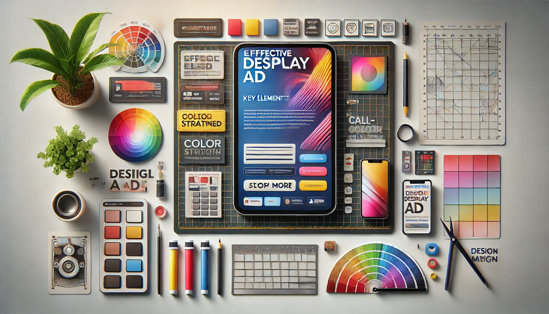
Illustration of the essential elements that make display ads effective and visually engaging.
Key Elements of an Effective Display Ad
Successful display ads share several common elements:
- Clear Messaging: Ensure your ad conveys its message instantly using strong visual techniques.
- Compelling Call-to-Action (CTA): Use CTAs that drive viewers to take the desired action.
- Branding: Incorporate consistent colors, logos, and fonts to strengthen brand recognition through effective visuals.
- High-Quality Visuals: Use sharp, professional images or graphics to enhance your ad’s appeal.

Visual techniques like color contrast and clean design boost engagement and click-through rates in ads.
How Visual Techniques Improve Click-Through Rates
The application of proper visual techniques gives your click-through rates (CTRs) much room to grow.
Eye-catching colors, clean designs, and judiciously positioned CTAs entice users to interact with your ad.
For instance, placing a CTA button in a contrasting color ensures it stands out and provokes action.
Dynamic visuals, including animations, tend to be more interactive and thereby remain memorable for a longer time.
These techniques can significantly elevate the performance of your display ads.
Mastering the basics of visual techniques ensures your ads are both attractive and aligned with your marketing goals.
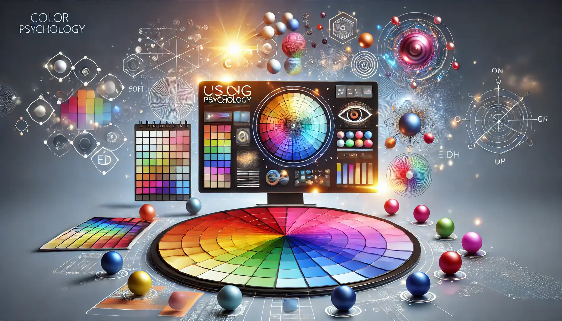
Illustration of how color psychology influences emotions and decisions in advertising.
Using Color Psychology to Influence Viewers
Color is one of the most powerful elements in visual design, capable of evoking emotions, influencing decisions, and creating brand recognition.
In display advertising, understanding color psychologyThe study of how colors influence perceptions, emotions, and behaviors. can help you craft ads that resonate with your target audience and drive action.
By applying the right visual techniques, you can make your ads visually striking and emotionally compelling.

Illustration of how various colors evoke specific emotions in consumers through display ads.
How Colors Impact Consumer Emotions
Colors have a psychological effect on how people perceive your brand and message.
For example:
- Red: Drives energy, urgency, and passion. Commonly used in sales announcements and calls-to-action.
- Blue: Conveys trust, reliability, and professionalism. Often used by technology and financial brands.
- Yellow: Represents happiness, optimism, and warmth. Ideal for drawing attention in playful or friendly campaigns.
- Green: Symbolizes health, nature, and growth. Frequently used in ads promoting eco-friendly products or wellness.
- Purple: Reflects creativity and luxury. Often chosen by brands aiming to appear premium or unique.
Using these color associations strategically will help you connect with your audience on an emotional level.

Representation of best practices for selecting ad colors, focusing on contrast, balance, and complementary color schemes.
Best Practices for Choosing Ad Colors
When choosing colors for your display ads, consider the following best practices:
- Know Your Audience: Research the color preferences and cultural associations of your target audience. For example, red may denote good luck in some cultures but represent warnings in others.
- Maintain Brand Consistency: Use your brand’s visual identity to guide color choices, building trust and recognition.
- Emphasize Contrast: Ensure good contrast between foreground and background colors to enhance readability and visibility.
- Test Different Combinations: A/B test color palettes to determine what resonates best with your audience.
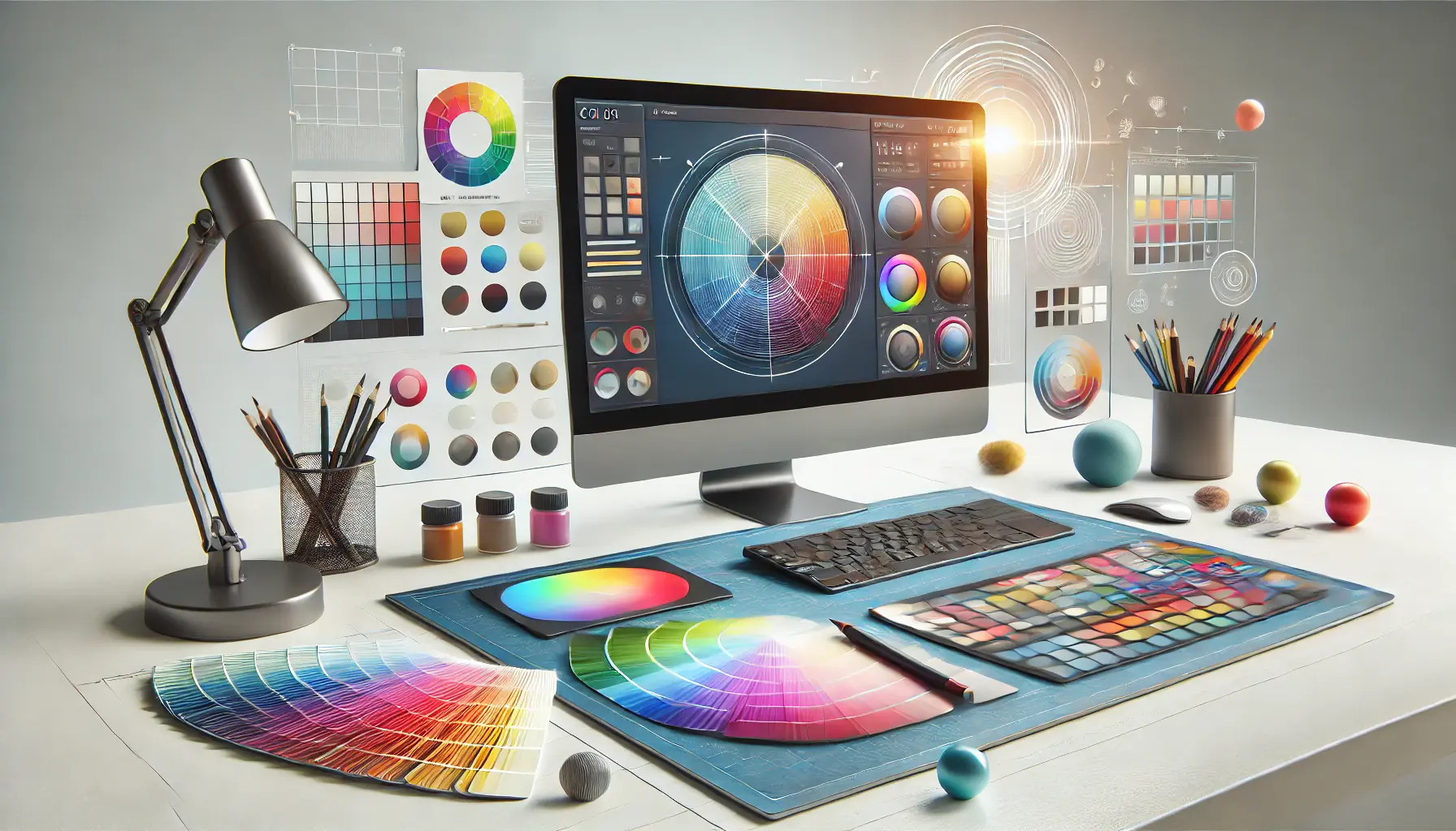
Visual representation of creating a cohesive color palette for design consistency.
Creating a Cohesive Color Palette
A cohesive color palette ensures your display ads look professional and visually appealing.
To create one:
- Choose a primary color that represents your brand.
- Pick complementary colors that work harmoniously with your primary color.
- Incorporate neutral tones like white, black, or gray to balance your palette.
- Use an accent color sparingly to draw attention to key elements, such as CTAs.
Consistency across your ads strengthens brand recognition and enhances the overall user experience.
Illustration of common color mistakes to avoid in display ads, focusing on poor contrast and cluttered palettes.
Avoiding Common Color Mistakes in Display Ads
Despite the benefits of using color effectively, mistakes can hinder your ad’s performance.
Avoid these common pitfalls:
- Overusing Bright Colors: While bright colors grab attention, overusing them can overwhelm viewers.
- Ignoring Accessibility: Ensure that color choices meet accessibility standards, such as proper contrast for text readability.
- Using Too Many Colors: A cluttered palette can confuse and distract your audience.
- Forgetting Cultural Differences: Colors carry different meanings across cultures, so tailor your palette accordingly.
By avoiding these mistakes and using color psychology to your advantage, you can craft display ads that engage your audience and drive results.
Color psychology is a powerful tool to evoke emotions and influence decisions, driving better ad performance.
Illustration of typography techniques used to design noticeable ads with a focus on font contrast and legibility.
Typography: Designing Noticeable Ads
Typography is a crucial factor in the success of display ads.
It conveys not just the message but also the tone and mood of your ad.
Using effective visual techniques along with typography can ensure that your ads are not only visually appealing but also legible and engaging.
In this section, we will look at how to make typography work for your display ads and elevate their impact.

Illustration of how different fonts and font pairings are used to tell stories visually in design.
The Role of Fonts in Visual Storytelling
Fonts are much more than text styles; they are part of visual storytelling.
The font you choose conveys emotions, personality, and brand identity.
For example:
- Sans-serif fonts: Clean, modern, and minimalistic. Perfect for tech and lifestyle brands.
- Serif fonts: Classic, elegant, and professional. Commonly used in luxury or high-end branding.
- Display fonts: Bold and unique. Perfect for making headlines and offers stand out.
Choosing the right font ensures your message resonates with your audience while staying true to your brand identity.

Illustration of the process of selecting readable fonts for ads, emphasizing legibility and font clarity.
How to Choose Readable Fonts for Ads
Readability is a top priority when selecting fonts for display ads.
Consider these tips:
- Prioritize Simplicity: Avoid overly decorative fonts that can be hard to read, especially at smaller sizes.
- Test for Legibility: Make sure your font is legible on a range of screen sizes and resolutions.
- Limit Font Usage: Use no more than one or two font families for the sake of harmony and to avoid visual noise.
- Match Font to Message: Choose fonts that are appropriate to the tone of your message, such as playful for fun campaigns or formal for professional messaging.
Illustration of font pairing techniques to create impactful and visually appealing designs.
Using Font Pairing to Create Impactful Designs
Font pairing is the art of putting together two or more fonts that complement each other to enhance visual appeal.
To master font pairing:
- Use a bold font for headlines and a simple font for body text.
- Pair serif with sans-serif fonts to create a balanced look.
- Ensure there is enough contrast between the fonts being paired to provide readability.
- Be consistent with your ads by using the same font pairing.
Effective font pairing helps direct the viewer’s attention and creates a harmonious design.

Illustration of typography mistakes to avoid in display ads, focusing on font pairing, sizing, and contrast issues.
Mistakes to Avoid with Typography in Display Ads
Typography mistakes can undermine your ad’s effectiveness.
Avoid these common pitfalls:
- Using Too Many Fonts: Multiple font styles can make your ad look chaotic and unprofessional.
- Inadequate Font Sizes: Fonts that are too small or too large can reduce readability and impact.
- Poor Color Choices: Low contrast between text and background will make your ad hard to read.
- Ignoring Alignment: Misaligned text can affect the flow and balance of your ad altogether.
By avoiding these mistakes and using the right typography techniques, you can create ads that are visually appealing and effective in communicating your message.
Readable fonts paired effectively ensure both aesthetic appeal and clarity, enhancing ad impact.

Illustration of how images and graphics are used in ads to improve viewer engagement and enhance the overall message.
Incorporating Images and Graphics for Better Engagement
Images and graphics are essential elements of display ads that can significantly enhance viewer engagement.
They help convey your message quickly, evoke emotions, and create a lasting impression.
By applying effective visual techniques, you can ensure that your use of images and graphics drives better results and resonates with your target audience.

Illustration of how high-quality images are selected for display ads, focusing on clarity and relevance to the ad’s message.
Choosing High-Quality Images for Display Ads
The quality of the images you use will directly impact how your ad is perceived.
Here’s how to choose the best visuals:
- Use High-Resolution Images: The images should be sharp and clear, even on larger screens.
- Align with Your Brand: Choose visuals that complement your brand’s identity and message.
- Focus on Relevance: Choose images relevant to your product, service, or campaign goals.
- Avoid Stock Clichés: Use authentic, unique images rather than generic stock photos.
High-quality images create a professional and trustworthy impression, making your ads more effective.
Illustration of how illustrations and icons are effectively used in display ads to highlight key features and enhance the message.
Using Illustrations and Icons Effectively
Illustrations and icons can add a creative touch to your display ads, making them more engaging and memorable.
Here’s how to use them effectively:
- Keep It Simple: Use illustrations and icons sparingly to avoid overwhelming the design.
- Highlight Key Information: Use icons to draw attention to important details like features or benefits.
- Ensure Consistency: Stick to a consistent style of illustrations or icons across your ads.
- Combine with Text: Use icons alongside text to enhance clarity and readability.
Well-designed illustrations and icons can make your ads stand out and improve communication with your audience.

Illustration of how to effectively balance text and images in ads, ensuring clarity and visual harmony.
How to Balance Text and Images in Ads
It is all about finding a balance that can make your ad look catchy and effective.
Here’s how to achieve this balance:
- Give Importance to Key Information: Visualize the most important information while keeping the text to a minimum.
- Ensure a Visual Hierarchy: Ensure that images and text do not fight for attention.
- Use White Space: Leave enough white space around elements to avoid clutter and improve readability.
Balancing text and images keeps your message clear without sacrificing visual appeal.

Illustration of how to avoid overcrowding with visual elements, maintaining a clean and balanced ad layout.
Avoiding Overcrowding with Visual Elements
While visuals are important, too many elements in your ad can dilute its effectiveness.
Here’s how to avoid this:
- Limit Visuals: Use only one or two key images or graphics in each ad.
- Stick to a Clear Layout: Organize the elements in a logical manner with a clean and professional look.
- Eliminate Redundancy: Never repeat the same visual or message unnecessarily.
By keeping it simple and focused, you can turn your ads into creative assets that are both engaging and effective in driving results.
High-quality and relevant visuals ensure your ads leave a professional and lasting impression.

Illustration of how animation and motion can be used in display ads to engage viewers and grab their attention.
Leveraging Animation and Motion for Attention-Grabbing Ads
Animation and motion are powerful tools in display advertising.
They can captivate your audience, convey complex ideas in seconds, and make your ads stand out in a crowded digital landscape.
When used strategically, these visual techniques can significantly enhance the effectiveness of your ads and boost engagement.

Illustration of how animation in ads enhances performance by capturing attention and boosting engagement.
Why Animation Enhances Ad Performance
Animated advertisements grab attention and hold the audience’s focus.
Here are some reasons why animation works:
- Eye-Catching Motion: Motion naturally captivates the human eye, making your ad very noticeable.
- Conveys More Information: Animation can communicate complex messages quickly and clearly.
- Builds Emotional Bonds: Dynamic visuals evoke emotions, ensuring your brand is well remembered.
- Engages Viewers: Interactive animation can motivate viewers to take action toward an advertisement.
By incorporating animation, you can make your ads more dynamic and impactful.

Illustration of tips for creating subtle and effective animations in display ads, focusing on simplicity and elegance.
Tips for Subtle and Effective Animations
While animations can be highly engaging, overdoing them can be counterproductive.
Here are tips for creating subtle yet effective animations:
- Focus on Simplicity: Keep animations smooth and minimal to avoid overwhelming viewers.
- Highlight Key Elements: Use animation to draw attention to CTAs, headlines, or product features.
- Maintain Brand Consistency: Ensure animations align with your brand’s style and tone.
- Optimize for Performance: Use lightweight animations to ensure fast loading times across devices.
Subtle animations can enhance your ad’s visual appeal without distracting from the message.

Illustration of common mistakes to avoid with motion in ads, focusing on excessive and overwhelming animation.
Common Mistakes to Avoid with Motion in Ads
While motion can boost ad performance, certain mistakes can hinder its effectiveness.
Avoid these pitfalls:
- Too Much Movement: Excessive animation can distract viewers and dilute your message.
- Poor Timing: Animations that are too fast or too slow can irritate or lose your audience.
- Lack of Purpose: Each animation should serve a specific purpose and not just add unnecessary complexity to your ad.
- Disregarding Accessibility: Be mindful of viewers’ sensitivities and avoid triggering discomfort or motion sickness.
By avoiding these mistakes, you can ensure your animated ads are effective and well-received.

Illustration of how interactive elements, such as hover effects and clickable buttons, can amplify engagement in display ads.
Utilizing Interactive Elements to Amplify Engagement
Interactive animation elevates your ad by encouraging users to engage with it.
Here’s how you can incorporate it:
- Hover Effects: Subtle animations that respond to user actions, like hovering over a button.
- Scroll Animations: Dynamic effects that activate as users scroll through the content.
- Gamify the Experience: Add interactive elements, such as quizzes or mini-games, to hold viewers’ attention.
- Visual Feedback: Use animations to confirm user actions, such as clicking a CTA.
Interactive elements not only make your ads more engaging but also prompt viewers to interact with your brand.
By leveraging animation and motion effectively, you can create attention-grabbing ads that resonate with your audience and drive meaningful results.
Subtle animations can amplify engagement while ensuring your message remains clear and impactful.
Illustration of how mastering visual techniques, such as color, typography, images, and motion, contributes to display ad success.
Mastering Visual Techniques for Display Ad Success
Crafting effective and attractive display ads is an art that combines creativity with strategy.
By utilizing powerful visual techniques, you can ensure your ads stand out in a competitive digital environment, capture attention, and drive meaningful engagement.
Let’s summarize the key takeaways from this article to help you optimize your display ads.

Illustration of how visual techniques, such as color contrast and typography, enhance the effectiveness of display ads.
Why Visual Techniques Matter
Visual techniques play a pivotal role in the success of display ads.
They help convey your message more effectively, establish an emotional connection with your audience, and create a strong brand presence.
Whether through the strategic use of colors, typography, images, or animation, each element contributes to making your ad more appealing and memorable.
Illustration of key strategies for effective display ads, including color psychology, typography, and high-quality images.
Key Strategies for Effective Display Ads
Here are the key strategies discussed throughout the article to make your display ads stand out:
- Color Psychology: Colors can create emotions and help drive the viewer to act. Choose a cohesive color palette that reflects your brand identity.
- Typography: Select highly readable fonts and combine them for maximum readability and aesthetic appeal.
- Images and Graphics: Incorporate high-quality, relevant visuals that complement your message and resonate with your target audience.
- Animation and Motion: Leverage subtle animations and interactive elements to capture attention and boost engagement.
Illustration of common pitfalls in ad design, highlighting mistakes like overcrowded elements and poor contrast.
Avoiding Common Pitfalls
To ensure the effectiveness of your ads, avoid these common mistakes:
- Overloading ads with too many elements, leading to visual clutter.
- Using inconsistent or irrelevant visuals that confuse the audience.
- Ignoring accessibility standards, which can alienate potential viewers.
By addressing these issues, you can create ads that are not only visually appealing but also inclusive and impactful.
Illustration of the final stage in display ad design, where all elements are harmoniously integrated into a professional and impactful ad.
Final Thoughts
Adding the right visual techniques to your display ads can significantly improve their performance.
From using color psychology and typography to incorporating images, graphics, and animations effectively, every element contributes to creating captivating, informative, and converting ads.
By putting these strategies into practice, testing your approach continuously, and refining it over time, you’ll create impactful display ads that drive results and elevate your brand presence.
Integrating visual techniques like color psychology, typography, and animations ensures your display ads stand out and drive results.
Illustration of frequently asked questions about visual techniques for display ads, focusing on color, typography, and imagery.
Your campaigns can be managed by an agency specialized in Google Ads, check out our service page.
Frequently Asked Questions About Visual Techniques for Display Ads
This section addresses common questions about visual techniques to help you optimize your display ads and achieve better results.
Visual techniques are design strategies like color, typography, images, and animation used to create visually appealing and engaging display ads that capture attention and communicate messages effectively.
Color psychology influences emotions and behaviors, helping to create ads that resonate with your audience.
Using the right colors can evoke specific feelings and drive desired actions, enhancing the effectiveness of your display ads.
Readable fonts like sans-serif for modern appeal or serif for elegance are ideal.
Pair fonts to create contrast and maintain consistency with your brand identity for professional and visually appealing ads.
High-quality images enhance professionalism, build trust, and make ads visually appealing.
They ensure your message is conveyed effectively while aligning with your brand identity and campaign goals.
Animation attracts attention, simplifies complex messages, and evokes emotions.
Interactive animations can boost user engagement and make ads more memorable, leading to higher click-through rates and better results.
Avoid overcrowded designs, inconsistent visuals, and ignoring accessibilityDesigning products or content to be usable by people with disabilities. standards.
These mistakes can confuse your audience and reduce the impact of your display ads.
Keep text concise and focus on key messages.
Use visuals to support and enhance your message while maintaining white space to avoid clutter and ensure clarity in your display ads.
Interactive ads engage viewers through animations, quizzes, or hover effectsInteractive animations or changes that occur when a user moves their cursor over an element., encouraging interaction and making the ad experience more memorable.
They also increase brand engagement and improve overall ad performance.
Utilize proper color contrast, readable fonts, and avoid overwhelming animations.
Test your ads for accessibility across different devices and audiences to ensure inclusivity and effectiveness.


