In the ever-evolving environment of web development, new trends continue to spring up on a regular basis, each with a certain uniqueness and purpose to user interfaces.
Among them is claymorphism.
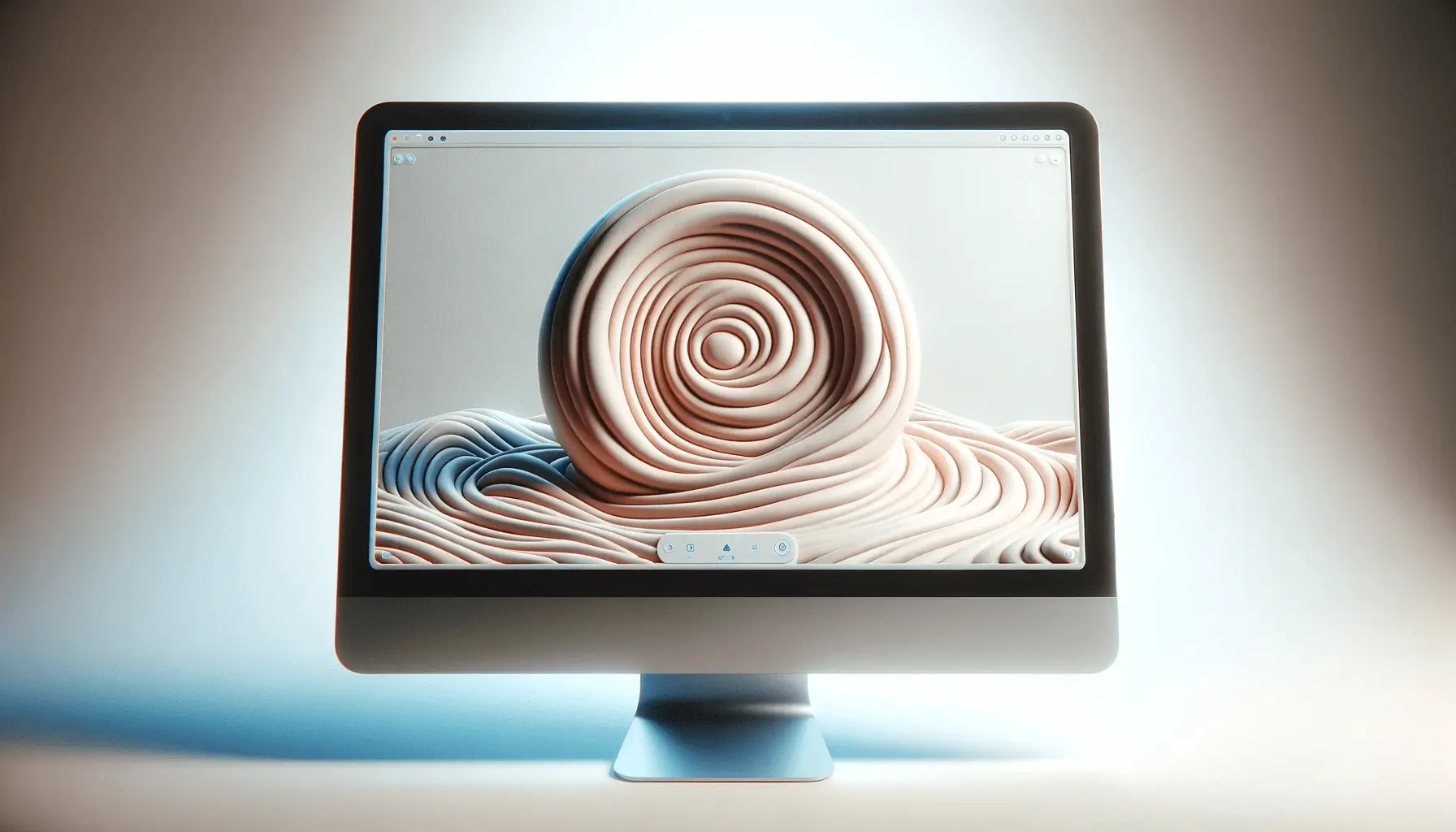
This type of design offers a gentle, hand-haptic sensation to online interfaces, rendering items as though created from clay.
But just what is claymorphism, and why has it become the preferred choice of designers worldwide?
- What is Claymorphism in Web Design?
- Core Elements of Claymorphic Design
- How to Implement Claymorphism in Web Interfaces
- Effect of Claymorphism on User Experience and Accessibility
- Future of Claymorphism in Web Design
- The Long-Term Impact of Claymorphism in Web Design
- Claymorphism: Frequently Asked Questions
What is Claymorphism in Web Design?
Claymorphism is a design pattern that provides digital interfaces with a soft, almost haptic look, with elements appearing as though they are made of clay.
It borrows from previous design patterns like skeuomorphismA design approach that mimics real-world objects and textures in digital interfaces to make them more intuitive. and neumorphismA UI design trend that combines flat design with subtle shadows and highlights to create a soft 3D effect. but introduces a more cheerful and approachable aesthetic.
Utilizing soft shadows, rounded corners, and bold colors, claymorphism adds a sense of depth and reality that invites people to interact with the interface.
Origins and Inspiration Behind Claymorphism
The roots of claymorphism lie in earlier design trends.
Skeuomorphism attempted to emulate objects in the physical world within digital interfaces, rendering them more intuitive to users.
But when design aesthetics moved towards minimalism, flat design became the norm, stripping away much of the texture and depth.
Neumorphism then attempted to return subtle 3D effects but was faulted for accessibility issues.
Claymorphism was a response to these challenges, offering a middle ground between beauty and functionality.
It draws inspiration from physical materials like clay, giving interfaces a handmade, human-friendly feel.
Core Features of Claymorphic Design
Certain distinguishing features mark claymorphic design:
- Soft and Rounded Shapes: Objects possess soft, rounded borders, giving them a welcoming and friendly look.
- Faint Shadows and Dimension: The use of inner and outer shadows adds dimension, making features look like they are floating above the background.
- Vibrant and Pastel Palettes: Bright and inviting colors contribute to the lighthearted nature of the design.
- 3D-Inspired Aesthetic: Features have a semi-realistic, three-dimensional feel without employing bulky graphics or complex coding.
How Claymorphism Differs from Other UI Trends
While skeuomorphism focuses on the replication of real-world objects and flat design emphasizes simplicity, claymorphism strikes a balance by adding depth and texture without overwhelming the user.
While neumorphism often suffers from low contrastThe difference in color and brightness between elements in a design to ensure readability and accessibility. and accessibility problems, claymorphism employs well-defined shadows and vibrant colors to make it both visually engaging and functional.
This approach not only enhances the aesthetic appeal but also improves the user experience, making interfaces more intuitive and interactive.
Why Designers Are Turning Towards Claymorphism
Designers are turning to claymorphism for several reasons:
- Better User Interaction: The tactile feel encourages users to engage more with the interface.
- Brand Differentiation: Its unique appearance allows brands to stand out in a crowded digital landscape.
- Simplified Usability: Clear distinctions between interactive surfaces and backgrounds improve user interactions.
- Versatility: It can be adapted to various design styles, from playful to professional, making it suitable for multiple purposes.
By implementing claymorphism, designers can create interfaces that not only look visually appealing but also provide a more immersive and enjoyable user experience.
This trend represents a shift towards a more human-centered design approach, where form and function support one another to cater to evolving user needs.
Claymorphism blends elements of skeuomorphism and neumorphism, offering a friendly and engaging visual experience through soft edges, shadows, and vibrant colors.
Core Elements of Claymorphic Design
An understanding of the core elements of claymorphism is necessary for the successful implementation of this design trend.
Let’s discuss its key components:
Soft and Rounded Shapes in UI
The essence of claymorphic design lies in soft, rounded forms.
These elements, which have smooth, rounded borders, give a welcoming and warm appearance.
By starting with basic geometric shapes and applying high border-radius values—most often over 50%—designers can achieve the signature clay-like effect.
This approach transforms strict, rigid forms into softer, more natural, and inviting ones.
Subtle Shadows and Layering Effects
Depth and dimension in claymorphism are achieved through the strategic use of shadows and layering.
This design style employs both inner and outer shadows to create the illusion of elements floating above the background.
Typically, two inner shadows—one light and one dark—are used to mimic light sources and add realism.
An outer shadow further enhances the floating effect, making UI elements feel tactile and interactive.
Bright and Pastel Color Palettes
The colors used in claymorphic design are primarily light and pastel.
These shades enhance the friendly and playful nature of the design, making interfaces appear more inviting.
Proper selection of background and element colors is crucial; soft and light tones are generally preferred to maintain the desired aesthetic.
Gradual color transitions can be applied to provide depth to the 3D appearance without overwhelming the viewer.
3D-Like Aesthetic Without Complexity
One of the major benefits of claymorphism is its ability to produce a 3D-like appearance without requiring complex graphics or excessive computational power.
By combining rounded shapes, strategically placed shadows, and a thoughtful use of color, designers can create interfaces that feel three-dimensional and even touchable, all while maintaining simplicity and performance efficiency.
This balance ensures that claymorphic design remains both visually appealing and highly functional, enhancing the overall user experience.
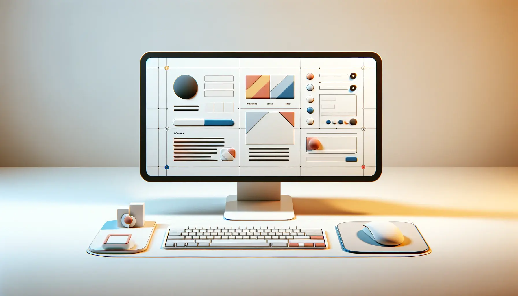
Soft shapes, shadow layering, pastel palettes, and a simple 3D-like appearance define claymorphic design, making it intuitive and inviting.
How to Implement Claymorphism in Web Interfaces
Implementing claymorphism in your web interfaces can enhance user experience by introducing depth and a sense of tactility.
Here’s a step-by-step guide to effectively incorporating this design trend:
Best Design Tools to Create Claymorphic Elements
Different design tools can assist in creating claymorphic elements:
- Figma: Offers corner smoothing and inner shadow features, ideal for creating soft and rounded shapes characteristic of claymorphism.
- Sketch: Provides robust vector editing, allowing designers to experiment with shapes and shadows to achieve the necessary clay-like effect.
- Adobe XD: Supports advanced shadow and gradient effects, enabling designers to create depth and layering that is essential for claymorphic designs.
CSS and UI Frameworks Supporting Claymorphism
To achieve claymorphism, specialized CSS techniques and supporting UI frameworks are required:
- CSS Techniques: Use properties such as border-radius for rounded corners and box-shadow for inner and outer shadows to create depth. Combining multiple shadows can effectively replicate the clay-like effect.
- Tailwind CSS: As a utility-first framework, Tailwind can be customized to accommodate claymorphic effects. By extending the default theme with personalized shadows and rounded corners, designers can directly implement claymorphic designs.
Typography and Iconography in Claymorphic Design
Choosing appropriate typography and iconography contributes to the cohesive feel of a claymorphic interface:
- Typography: Use rounded, sans-serif fonts that complement the soft aesthetic of claymorphism. Fonts like Nunito or Quicksand enhance the overall design.
- Iconography: Use icons with rounded edges and consistent shadowing to maintain the claymorphic look. Ensure that icons share the same light source and shadow characteristics as other UI elements for visual consistency.
Common Mistakes to Avoid When Using Claymorphism
To use claymorphism effectively, be mindful of these common pitfalls:
- Excessive Use of Shadows: Overuse of shadows can overwhelm the design. Aim for subtlety to maintain a clean and approachable interface.
- Inconsistent Lighting: Ensure all elements adhere to the same light source direction to maintain visual consistency and realism.
- Forgetting Accessibility: Maintain sufficient contrast between elements to ensure usability for visually impaired users. Avoid color combinations that reduce readability.
- Performance Considerations: Be cautious with complex shadow effects that impact load times. Optimize CSS and graphical resources to enhance performance.
By thoughtfully incorporating these techniques and considerations, designers can create engaging, easy-to-use interfaces that evoke the warm, inviting essence of claymorphism.
Effective claymorphism requires careful use of design tools like Figma, Sketch, and CSS techniques such as border-radius and box-shadow.
Effect of Claymorphism on User Experience and Accessibility
Adopting claymorphism in web design is highly effective in enhancing user experience, as it introduces an interactive and tactile interface.
However, claymorphic design must be implemented while ensuring accessibility to maintain inclusivity.
Enhancing Usability
The tactile nature of claymorphism, with its soft shadows and illusion of depth, naturally draws users in.
The visual aspect creates a playful environment that encourages interaction and exploration.
By mimicking real-world physical objects and materials, the claymorphic design approach enhances the intuitiveness of user interfaces.
The use of depth, shadow, and texture makes interactive elements stand out from non-interactive ones, guiding users through a more natural interaction process.
Accessibility Considerations
Although claymorphism provides visual appeal, designers must address potential accessibility challenges:
- Color Contrast: Ensure sufficient contrast between elements to assist visually impaired users. Avoid color schemes that may reduce readability.
- Visual Hierarchy: Maintain a logical and structured visual hierarchy. The subtle 3D appearance of claymorphism makes certain elements more prominent, so it is crucial to ensure the design effectively guides users.
- Performance Optimization: Overuse of shadows, gradients, and animations can slow down loading times. Optimization is necessary to maintain a smooth and efficient user experience.
By incorporating claymorphism with these considerations in mind, designers can create interfaces that are both visually appealing and accessible, ultimately enhancing the overall user experience.
While claymorphism improves engagement, designers must ensure sufficient contrast and hierarchyA visual arrangement technique used to prioritize information and guide users through a design. to maintain accessibility.
Future of Claymorphism in Web Design
The evolution of web design continues to reveal emerging trends that shape the digital world in unique ways.
Claymorphism, characterized by its circular and three-dimensional appearance, has gained recognition as a contemporary design trend.
Understanding its future direction provides valuable insights into its continued impact on the industry.
Integration with Emerging Technologies
As virtual and augmented reality technologies advance, the tactile nature of claymorphism makes it an excellent fit for immersive experiences.
Its three-dimensional aesthetics can enhance user engagement in VR and AR environments, making interactions more intuitive and visually appealing.
As these technologies evolve, claymorphic design may play a crucial role in bridging the gap between digital and physical experiences.
Effect on Mobile and Responsive Design
With mobile-first design remaining a priority, claymorphism offers a scalable aesthetic that adapts well across various screen sizes.
Its focus on touchable, rounded interfaces aligns with the tactile interactions inherent in mobile devices.
As responsiveA design approach that ensures a website adapts well to different screen sizes and devices. design strategies continue to evolve, claymorphic elements could see wider adoption, enhancing user experiences across multiple platforms.
Potential Challenges and Considerations
Despite its appeal, claymorphism presents certain challenges, particularly in terms of accessibility and functionality.
Designers must address the following concerns:
- Accessibility: Ensuring sufficient contrast and readability is essential to accommodate visually impaired users. Overuse of shadows and subtle contrasts may hinder usability.
- Performance Optimization: Heavy use of shadows, gradients, and animations can lead to increased load times. Proper optimization is necessary to maintain smooth performance.
- Usability Balance: While maintaining artistic vision, designers must ensure that claymorphism does not degrade user experience by overcomplicating interactions or reducing clarity.
In conclusion, while claymorphism introduces an exciting new approach to web design, its future will depend on careful integration that balances both aesthetics and usability.
As technology and design trends evolve, its role in shaping engaging and immersive digital experiences is likely to grow.
With the rise of AR, VR, and mobile-first design, claymorphism has the potential to enhance digital experiences across multiple platforms.
The Long-Term Impact of Claymorphism in Web Design
Claymorphism has emerged as a dominant design trend, blending depth, tactility, and softness to create user-focused and visually engaging interfaces.
As digital interactions continue to evolve, claymorphic design represents a balance between minimalism and realism, crafting a modern yet approachable interface.
Why Claymorphism is Revolutionizing Web Design
The unique characteristics of claymorphism contribute to its growing popularity in web design.
By incorporating soft, rounded forms, subtle shadows, and pastel colors, this design trend enhances the overall user experience.
Its ability to offer an engaging, welcoming interface makes it a preferred choice for designers and businesses.
- Enhanced User Engagement: The soft, tactile nature of claymorphism naturally engages users, encouraging interaction.
- Improved Accessibility: When implemented thoughtfully, claymorphic design can enhance visual clarity and user-friendliness.
- Compatibility with Modern Technologies: Claymorphic elements integrate well with AR, VR, and mobile-first design principles.
Challenges and Considerations
While claymorphism offers numerous advantages, it also comes with challenges.
Designers must strike a balance between aesthetics and functionality to ensure an optimal user experience.
- Performance Issues: Excessive use of shadows and gradients can impact website speed, necessitating optimization techniques.
- Accessibility Concerns: Poor contrast and overly soft elements may make navigation difficult for visually impaired individuals.
- Overuse Risks: Like any design trend, excessive use of claymorphic elements can lead to cluttered or inconsistent designs.
The Future of Claymorphism in Web Interfaces
The future of claymorphism will be shaped by user needs and technological advancements.
As designers refine their approach, this trend is likely to evolve to include:
- More Interactive and Dynamic Features: Enhanced motion effects and animations can further intensify the immersive experience.
- Greater Integration with UI Frameworks: Continued support from frameworks like Tailwind CSS will simplify implementation.
- Increased Focus on Sustainability: More efficient design approaches will lead to lightweight, fast-loading interfaces.
Ultimately, claymorphism is not just a fleeting trend—it represents a shift towards more human-centric and engaging web design.
When applied thoughtfully and with a focus on overcoming its challenges, claymorphic principles can help designers create beautiful, functional, and inclusive digital experiences that stand the test of time.
Claymorphism is more than a passing trend; it represents a shift towards human-centric, engaging, and interactive web interfaces.
Quality web design is key for a great website! Check out our service page to partner with an expert web design agency.
Claymorphism: Frequently Asked Questions
Claymorphism is a design pattern that employs rounded, soft shapes, subtle shadows, and bold colors to create a three-dimensional, tactile experience in user interfaces.
This technique gives elements a molded clay-like appearance, making them more visually engaging.
While both promote depth and realism, claymorphism uses bolder colors and stronger contrasts, resulting in a brighter and friendlier aesthetic compared to neumorphism’s typically muted and subtle color palette.
The key features of claymorphic design include rounded, organic shapes, carefully balanced depth and shadow, and the use of earthy and pastel color schemes.
These elements work together to create an inviting and interactive user experience.
Claymorphism is most suitable for websites that aim to have a playful and friendly aesthetic.
However, it may not align well with the branding of more formal, corporate, or traditional websites.
The three-dimensional, tactile nature of claymorphism encourages users to engage more with the interface.
This increased interaction can enhance user experience and improve overall engagement levels.
Yes, designers must ensure sufficient contrast and a clear visual hierarchy in claymorphic design to maintain accessibility.
Overly soft elements or insufficient contrast can negatively impact usability for visually impaired users.
Yes, claymorphism can be combined with other trends like minimalism or glassmorphism.
However, careful planning is required to maintain a cohesive, user-friendly design without overwhelming the interface.
UI and design software such as Figma, Sketch, and Adobe XD offer features that enable the creation of claymorphic elements, including corner smoothing and detailed shadow control.
Yes, implementing claymorphism can impact website performance if not optimized properly.
The use of shadows, gradients, and animations may increase load times, making performance optimization crucial.
