In the realm of design, minimalist typography has carved out a niche that continues to captivate and inspire.
This design philosophy, which emphasizes simplicity and functionality, has proven its staying power and relevance in an ever-evolving digital landscape.
Minimalist typography, at its core, is more than just a stylistic choice; it’s a reflection of a broader cultural shift towards clarity, efficiency, and the beauty of unadorned simplicity.
As we delve into the reasons behind its enduring popularity, it becomes clear that minimalist typography is not just a trend but a timeless approach to design that resonates with our collective desire for a cleaner, more focused way of communicating.
The appeal of minimalist typography lies in its ability to create impact with minimal elements.
By stripping away unnecessary embellishments, designers are able to highlight the essential message with greater clarity and directness.
This design strategy aligns perfectly with the modern user’s preference for quick, easily digestible information.
In a world cluttered with information and visual stimuli, minimalist typography offers a breath of fresh air, a visual pause that allows the message to stand out amidst the noise.
This article explores the multifaceted reasons behind the sustained popularity of minimalist typography, demonstrating its significance in contemporary design practices.
- The Essence of Minimalist Typography
- Historical Context and Evolution
- Principles of Minimalist Typography
- Impact of Minimalist Typography on User Experience
- Challenges and Considerations in Implementing Minimalist Typography
- Innovative Applications of Minimalist Typography
- Future Trends in Minimalist Typography
- Embracing the Timeless Appeal of Minimalist Typography
- FAQs on Minimalist Typography
The Essence of Minimalist Typography
Defining Minimalist Typography
Minimalist typography is characterized by its simplicity and focus on the essentials of text.
It often involves the use of clean, sans-serif fonts, ample white space, and a restrained color palette to enhance readability and direct attention to the content itself.
This design approach eschews ornate details in favor of clarity and functionality, making it a powerful tool for effective communication.
The philosophy of “less is more” is central to minimalist typography, where every element serves a purpose and contributes to the overall message.
The beauty of minimalist typography lies in its versatility and adaptability across various mediums.
From digital interfaces to print materials, minimalist typography can be applied to create a cohesive and recognizable brand identity.
It’s not just about the choice of font or color; it’s about creating a visual hierarchy that guides the viewer’s eye and emphasizes the key points of the message.
This strategic simplicity makes minimalist typography a favorite among designers seeking to convey complex ideas in an accessible and engaging way.
Benefits of Minimalist Typography in Design
One of the key benefits of minimalist typography is its impact on user experience.
By reducing visual clutter, minimalist typography enhances the user’s ability to process and retain information.
This is particularly important in the digital age, where attention spans are short and competition for viewers’ attention is fierce.
A minimalist approach can help your content stand out by offering a clear, unambiguous path through the information presented.
Moreover, minimalist typography contributes to a seamless and intuitive user interface.
Whether navigating a website or reading a printed brochure, users appreciate the ease and simplicity that minimalist design provides.
This not only improves the aesthetic appeal of the product but also its usability and functionality.
By focusing on the essentials, designers can create experiences that are both visually appealing and user-friendly, meeting the needs of a diverse audience.
Minimalist typography is not just a design trend; it’s a strategic tool for effective communication and enhanced user experience.
Historical Context and Evolution
The journey of minimalist typography is deeply rooted in the history of design, reflecting broader cultural and technological shifts.
Understanding its evolution provides insight into why it remains relevant today.
Initially emerging as a response to the ornate and decorative styles of the early 20th century, minimalist design sought to strip away excess and focus on the essentials.
This movement was influenced by modernist principles, which emphasized function over form and the beauty of simplicity.
Over the decades, minimalist typography has been shaped by various art and design movements, including Bauhaus, De Stijl, and Swiss Design.
These movements shared a common belief in the power of clean, geometric forms and the importance of typography as a means of communication.
The advent of digital design tools and technologies further propelled minimalist typography into the mainstream, allowing for greater experimentation with space, contrast, and typographic detail.
Key Influences on Minimalist Typography
- Modernism: The modernist movement’s emphasis on functionality and rejection of unnecessary decoration laid the groundwork for minimalist typography.
- Bauhaus: This influential German design school introduced the idea that design should meet the needs of society, emphasizing clarity and readability in typography.
- Swiss Design: Known for its precision and grid-based layouts, Swiss Design contributed significantly to the development of minimalist typography, promoting the use of sans-serif fonts and clean, orderly composition.
Adaptation to Digital Media
With the rise of digital media, minimalist typography found new ground to flourish.
The constraints and possibilities of digital screens necessitated designs that could adapt to various sizes and resolutions, making simplicity a practical necessity.
Minimalist typography in digital interfaces ensures legibility and ease of navigation, enhancing the user’s experience across devices.
This adaptability has cemented its place in the toolkit of modern designers, proving that minimalist typography is not just a stylistic choice but a response to the evolving landscape of communication.
Today, minimalist typography continues to evolve, incorporating new trends and technologies while staying true to its roots.
It remains a testament to the enduring power of simplicity in design, offering a clear, focused way to communicate in an increasingly complex world.
The historical evolution of minimalist typography underscores its adaptability and enduring relevance in design.
Principles of Minimalist Typography
At the heart of minimalist typography lie several core principles that guide designers in creating clear, impactful designs.
These principles are not just rules to follow but serve as a foundation for thoughtful, purpose-driven design.
By adhering to these guidelines, designers can leverage minimalist typography to convey messages effectively, enhance brand identity, and improve user experience.
Understanding and applying these principles is crucial for anyone looking to harness the power of minimalist typography in their projects.
Here’s a closer look at the key principles that define this design approach:
Clarity and Readability
The primary goal of minimalist typography is to ensure that the text is easy to read and understand.
This involves choosing fonts that are legible at various sizes and weights, and organizing text in a way that guides the reader through the content.
Effective use of white space is also crucial, as it helps to reduce visual clutter and highlight important information.
Simplicity
Simplicity is the hallmark of minimalist design.
In typography, this means stripping away unnecessary embellishments and focusing on the essentials.
Designers often opt for clean, sans-serif fonts and a limited color palette to achieve a look that is both modern and timeless.
Attention to Detail
While minimalist typography is characterized by its simplicity, attention to detail is what sets great design apart.
This includes careful consideration of font choice, spacing, alignment, and hierarchy.
Even the smallest adjustments can have a significant impact on the overall effectiveness of the design.
Contrast
Contrast is a powerful tool in minimalist typography.
It can be achieved through variations in font size, weight, and color.
Contrast helps to create visual interest and guide the reader’s eye to the most important elements of the design.
Functionality
Every element of a minimalist typographic design should serve a purpose.
Functionality is key, with a focus on enhancing the user experience.
This means that the design should not only look good but also be intuitive and easy to navigate.
- Font Selection: Choose fonts that reflect the message and tone of the content while ensuring maximum readability.
- White Space: Use white space strategically to create focus and allow the design to breathe.
- Alignment and Hierarchy: Organize text in a way that establishes a clear visual hierarchy, guiding the reader through the content.
By adhering to these principles, designers can create minimalist typographic designs that are not only visually appealing but also highly effective in communicating their intended message.
Impact of Minimalist Typography on User Experience
Minimalist typography significantly influences user experience (UX), shaping how users interact with and perceive content.
In the digital age, where users are bombarded with information, the clarity and simplicity of minimalist typography can dramatically enhance content consumption and user satisfaction.
This design approach prioritizes the user’s needs, aiming to create a seamless and enjoyable interaction with websites, applications, and digital media.
The impact of minimalist typography on UX is multifaceted, affecting everything from readability to navigation.
By focusing on the essentials, minimalist typography ensures that users are not overwhelmed by excessive visual elements, making it easier for them to find what they need and absorb information.
Enhanced Readability and Comprehension
One of the most direct impacts of minimalist typography on UX is improved readability.
Simple, clean fonts and ample white space help reduce eye strain and make texts easier to read.
This is particularly important in an era of mobile devices, where screen sizes and lighting conditions vary.
Minimalist typography ensures that content is accessible and legible across all platforms, enhancing the user’s ability to quickly comprehend and retain information.
Simplified Navigation
Minimalist typography contributes to simplified navigation within digital products.
By eliminating unnecessary design elements, users are presented with a clear path through the content, making it easier to locate desired information or features.
This streamlined approach reduces user frustration and enhances the overall efficiency of the interaction, leading to a more positive user experience.
Increased Focus on Content
By stripping away decorative elements, minimalist typography places the emphasis squarely on the content itself.
This not only makes the design more aesthetically pleasing but also ensures that the user’s attention is focused on the most important information.
Users appreciate content that is presented in a straightforward, uncluttered manner, as it allows them to engage more deeply without being distracted by irrelevant details.
Emotional Connection and Brand Perception
Minimalist typography can also influence the emotional connection users feel towards a brand or product.
A clean, minimalist design conveys a sense of professionalism, trustworthiness, and modernity.
This can positively affect how users perceive the brand, making them more likely to engage with the content and develop a loyal relationship.
The simplicity and elegance of minimalist typography can evoke positive emotions, contributing to a memorable user experience.
The thoughtful application of minimalist typography enhances user experience by improving readability, simplifying navigation, focusing attention on content, and fostering positive emotional connections with the brand.
Challenges and Considerations in Implementing Minimalist Typography
While minimalist typography offers numerous benefits, its implementation comes with its own set of challenges and considerations.
Designers must navigate these carefully to ensure that the minimalist approach enhances rather than detracts from the user experience and communication goals.
Balancing simplicity with functionality and visual appeal requires a nuanced understanding of design principles and user needs.
Here are some key challenges and considerations to keep in mind when implementing minimalist typography:
Finding the Right Balance
The essence of minimalist typography lies in striking the perfect balance between simplicity and expressiveness.
Designers must ensure that the design does not become so sparse that it loses its impact or fails to communicate the intended message.
This involves careful selection of typographic elements such as font choice, size, and color, as well as the strategic use of white space to create a design that is both visually engaging and functionally effective.
Maintaining Legibility Across Devices
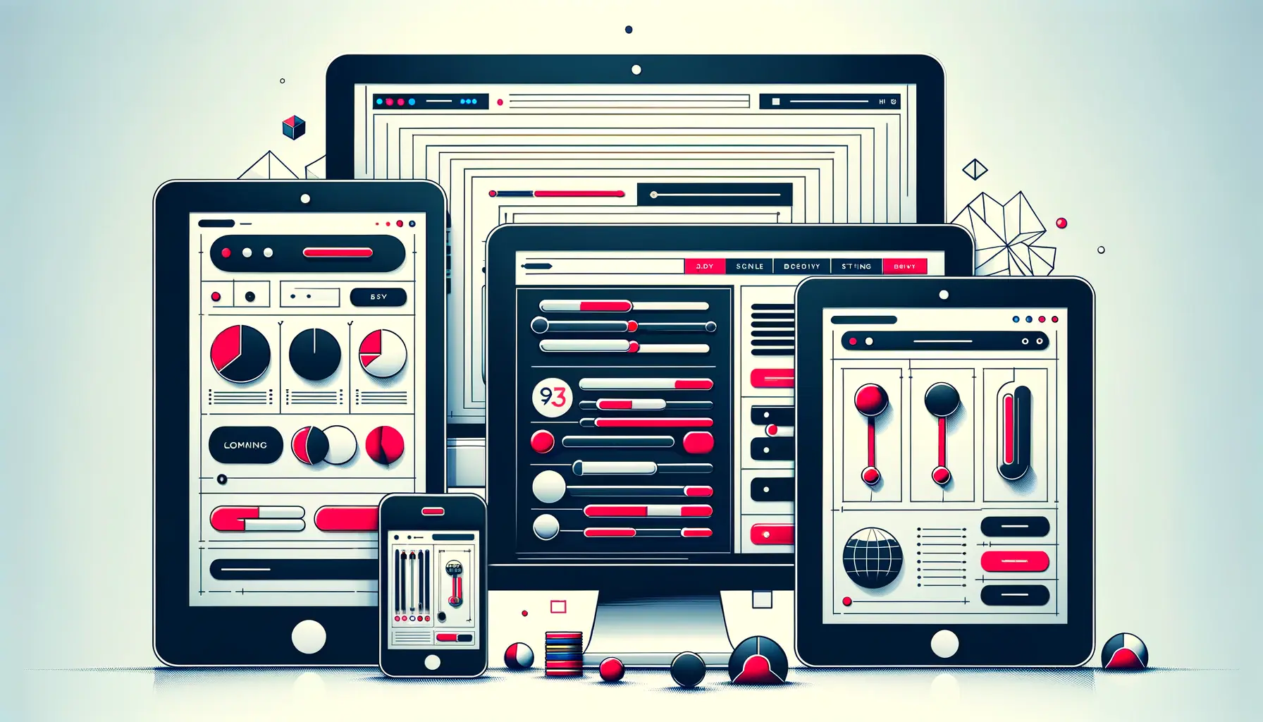
In today’s multi-platform digital environment, ensuring that minimalist typography remains legible across various devices and screen sizes is a significant challenge.
Designers must consider factors such as responsive design, scalable fonts, and contrast ratios to guarantee that text is easily readable on everything from large desktop monitors to small mobile screens.
This requires a deep understanding of web and mobile design standards and best practices.
Ensuring Accessibility
Accessibility is a critical consideration in minimalist typography.
The design must be inclusive, catering to users with diverse needs, including those with visual impairments or reading difficulties.
This means paying attention to color contrast, font selection, and the overall layout to ensure that the content is accessible to everyone.
Designers must familiarize themselves with accessibility guidelines and incorporate them into their minimalist designs.
Preserving Brand Identity
Minimalist typography must align with the brand’s identity and values.
The challenge lies in simplifying the design without stripping away elements that convey the brand’s unique personality and message.
Designers must work closely with brand stakeholders to understand the brand’s essence and find ways to express it through minimalist typographic choices.
This may involve selecting fonts that reflect the brand’s character or incorporating brand colors in a restrained, purposeful manner.
- Balance between simplicity and expressiveness is crucial.
- Responsive design practices ensure legibility across all devices.
- Accessibility considerations are integral to inclusive design.
- Brand identity should be preserved and communicated through minimalist typography.
Navigating the challenges of minimalist typography requires a careful balance of design principles, responsiveness, accessibility, and brand alignment.
Innovative Applications of Minimalist Typography
Minimalist typography is not confined to any single domain but spans across various mediums and industries, showcasing its versatility and adaptability.
From digital interfaces to print media, the innovative applications of minimalist typography demonstrate how simplicity can lead to powerful and memorable designs.
These applications not only serve practical purposes but also push the boundaries of creative expression, proving that less can indeed be more.
Exploring these innovative applications provides valuable insights into the potential of minimalist typography to transform and elevate design projects:
Digital Interfaces
In the realm of web and app design, minimalist typography plays a crucial role in creating user-friendly interfaces.
By employing clean, readable fonts and ample white space, designers can enhance navigation and readability, making digital platforms more accessible and engaging.
Minimalist typography in digital interfaces focuses on improving the user experience, ensuring that content is king and that users can easily interact with the information presented.
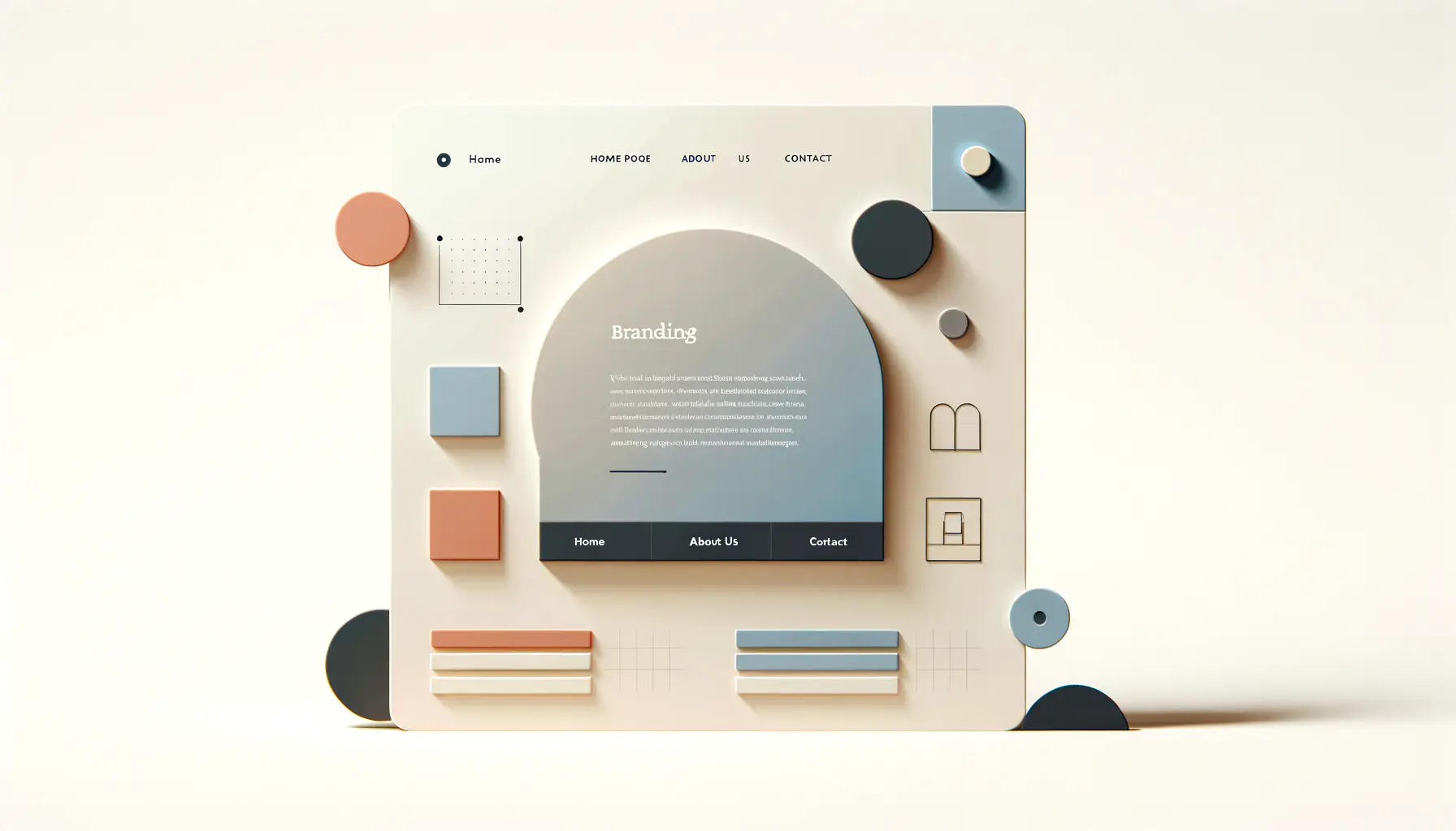
Branding and Identity
Minimalist typography is a powerful tool in branding and identity design.
It can convey a brand’s values and personality through the strategic use of type.
Simple, impactful logos and brand messaging that utilize minimalist typography can create a strong, memorable brand identity that stands out in a crowded marketplace.
This approach to branding emphasizes clarity and consistency, building a cohesive visual language that resonates with the target audience.
Print Media
In print media, minimalist typography finds expression in everything from book covers to posters, where it can communicate messages effectively without overwhelming the viewer.
The use of minimalist typography in print design allows for a focus on the content, whether it’s the title of a book or the key message of a poster, ensuring that the message is received loud and clear.
This application showcases the timeless appeal of minimalist design, proving its effectiveness beyond digital screens.
Advertising and Marketing
Minimalist typography has also made its mark in the advertising and marketing industry, where simplicity can capture attention more effectively than complexity.
In an age where consumers are bombarded with information, minimalist ads that use clean typography and lots of white space can break through the noise, delivering clear and compelling messages.
This approach to advertising emphasizes the power of simplicity in conveying promotional messages in a direct and impactful manner.
- Digital interfaces benefit from improved usability and readability.
- Branding and identity designs achieve clarity and memorability.
- Print media applications focus on content and message delivery.
- Advertising and marketing strategies stand out through simplicity and impact.
The innovative applications of minimalist typography across different mediums highlight its ability to enhance communication, improve user experience, and create memorable brand identities.
Future Trends in Minimalist Typography
The landscape of design is ever-evolving, with minimalist typography at the forefront of shaping future trends.
As we look ahead, it’s clear that minimalist typography will continue to influence design philosophies and practices, adapting to new technologies and user expectations.
The future of minimalist typography is not just about maintaining its core principles but also about innovating and integrating with emerging trends to create designs that are both timeless and timely.
Anticipating the future trends in minimalist typography allows designers to stay ahead of the curve, crafting designs that resonate with contemporary audiences while retaining the simplicity and clarity that define minimalism.
Integration with Augmented and Virtual Reality
As augmented reality (AR) and virtual reality (VR) technologies become more prevalent, minimalist typography is set to play a key role in creating immersive and intuitive experiences.
In AR and VR environments, the clarity and readability of text are paramount.
Minimalist typography, with its emphasis on simplicity and legibility, is ideally suited to these digital realms, ensuring that information is easily accessible within complex virtual spaces.
Adaptive Typography for Responsive Design
The future of minimalist typography in web and app design lies in adaptive typography, which automatically adjusts to different screen sizes and user settings.
This approach ensures optimal readability and user experience across devices, a necessity in our increasingly mobile world.
Adaptive typography, rooted in minimalist principles, will provide a more personalized and accessible digital experience, catering to individual user needs and preferences.
Experimental Typography in Branding
Branding is set to see a surge in experimental approaches to minimalist typography, where designers play with spacing, alignment, and innovative typefaces to create unique brand identities.
This trend will challenge traditional notions of minimalism, incorporating dynamic and interactive elements while maintaining the overall simplicity and focus that minimalist design is known for.
Sustainability in Design
Minimalist typography aligns with the growing trend towards sustainability in design.
By using fewer resources and focusing on the essentials, minimalist design practices contribute to more environmentally friendly and sustainable design solutions.
This approach not only benefits the planet but also resonates with consumers who value sustainability, influencing their perceptions and interactions with brands.
- AR and VR technologies will leverage minimalist typography for enhanced user experiences.
- Adaptive typography will become a staple in responsive design, ensuring accessibility and readability.
- Branding will embrace experimental minimalist typography to stand out and engage audiences.
- Sustainability will influence minimalist design choices, reflecting broader societal values.
The future of minimalist typography is marked by its integration with technology, adaptive and experimental approaches, and a commitment to sustainability, shaping the next wave of design innovation.
Embracing the Timeless Appeal of Minimalist Typography
In the dynamic world of design, minimalist typography stands as a beacon of clarity, functionality, and elegance.
Its sustained popularity is not merely a testament to its aesthetic appeal but also to its ability to adapt and resonate across various mediums and technologies.
As we have explored, minimalist typography is deeply rooted in historical design movements, yet it continues to evolve, embracing future trends and innovations.
This design philosophy, characterized by its simplicity and attention to detail, has proven to be more than just a fleeting trend; it is a timeless approach that continues to shape the future of design.
The Enduring Legacy of Minimalist Typography
Minimalist typography, with its clean lines and uncluttered layouts, has left an indelible mark on the design landscape.
Its influence extends beyond the realm of typography, inspiring a broader minimalist movement that values simplicity in all aspects of design.
The principles of minimalist typography—clarity, readability, and simplicity—serve as guiding lights for designers seeking to create impactful and meaningful work.
As we look to the future, these principles remain relevant, guiding the creation of designs that are both beautiful and functional.
Future Pathways and Innovations
The future of minimalist typography is bright, with emerging technologies and user preferences shaping its evolution.
The integration of minimalist design principles with AR, VR, and adaptive typography points to a future where design is not only visually appealing but also deeply immersive and personalized.
Moreover, the trend towards sustainability in design aligns perfectly with the minimalist ethos, promising designs that are not only effective but also environmentally responsible.
As designers continue to experiment with minimalist typography, we can expect to see innovative applications that challenge our perceptions and push the boundaries of what is possible.
- Adaptation to new technologies and platforms ensures the continued relevance of minimalist typography.
- Experimental approaches in branding and digital design highlight the versatility of minimalist typography.
- The focus on sustainability reflects a broader societal shift towards responsible design practices.
In conclusion, minimalist typography remains a cornerstone of design, offering a framework through which designers can communicate more effectively, engage audiences, and create memorable brand identities.
Its simplicity, far from being a limitation, is its greatest strength, allowing for creativity and innovation within a clear set of principles.
As we move forward, minimalist typography will undoubtedly continue to inspire and influence, proving that in the world of design, less can indeed be more.
Quality web design is key for a great website! Check out our service page to partner with an expert web design agency.
FAQs on Minimalist Typography
Explore common queries about minimalist typography to deepen your understanding and enhance your design practices.
Minimalist typography is defined by clean lines, simple strokes, and a focus on functionality over decoration, often using sans-serif fonts.
Helvetica is considered minimalist due to its balanced proportions, neutral design, and legibility, making it a staple for clean and simple typography.
It enhances readability by using ample white space, clear fonts, and a limited color palette to reduce visual clutter and focus on the message.
Benefits include improved user experience, enhanced message clarity, and a timeless aesthetic that appeals across various design mediums.
In digital design, it’s applied through responsive fonts, streamlined interfaces, and user-centric layouts that prioritize content and functionality.
White space is crucial for creating focus, balance, and clarity, allowing the design to breathe and enhancing overall readability.
Yes, it’s effective for branding by conveying a brand’s values and personality through strategic use of simple, impactful typographic choices.
Challenges include maintaining legibility across devices, ensuring accessibility, and balancing simplicity with engaging and expressive design.

