The realm of typography is a fascinating intersection of art and functionality, where the visual appeal of text meets the practical need for clarity and comprehension.
At the heart of this intersection lies the challenge of legibility, a fundamental aspect that dictates how easily a viewer can discern letters and words.
In the world of creative typography, designers often walk a tightrope, balancing between innovative design and the inherent need for their creations to be legible.
This balance is crucial, as the primary purpose of typography is communication, and without legibility, the message may be lost.
Legibility in typography is influenced by various factors, including font choice, size, spacing, and color contrast.
These elements work together to either enhance or detract from the reader’s ability to process and understand the text.
In creative typography, where designers strive to push boundaries and explore new aesthetics, the challenge of maintaining legibility becomes even more pronounced.
The quest for originality must not overshadow the text’s purpose—to be read and understood.
This article delves into the intricacies of legibility within creative typography, exploring strategies to achieve a harmonious balance between artistic expression and functional clarity.
- Understanding Legibility in Typography
- Key Factors Influencing Legibility
- Enhancing Legibility in Digital Environments
- Legibility in Print Media
- Legibility and Brand Identity
- Legibility in User Interface Design
- Future Trends in Typography Legibility
- Concluding Thoughts on Legibility in Creative Typography
- FAQs on Legibility in Creative Typography
Understanding Legibility in Typography
Defining Legibility
Legibility refers to the ease with which a reader can recognize individual characters and words in a text.
It is a quality intrinsic to the typeface design itself, influenced by the characteristics of the letters, such as their shape, size, and spacing.
A legible typeface is one that allows for quick and effortless reading, minimizing confusion and misinterpretation.
This is particularly important in contexts where quick information processing is essential, such as road signs, instructional materials, and fast-paced digital content.
Factors that significantly impact legibility include the x-height, character width, weight, and stroke contrast.
For instance, typefaces with a generous x-height, moderate weight, and open counters tend to be more legible, especially at smaller sizes or from a distance.
Understanding these factors is crucial for designers, as it enables them to make informed choices that align with the communication goals of their projects.
Legibility vs. Readability
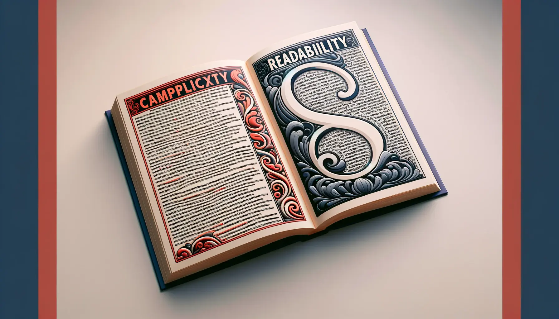
While legibility focuses on the design of individual letters and words, readability extends to how blocks of text are arranged and presented.
Readability encompasses the layout of text, including line length, line spacing (leading), and overall text organization.
It’s about creating an environment that facilitates not just the recognition of words but also the comfortable and sustained reading of text.
In creative typography, achieving readability means considering how text layout and design choices affect the reader’s ability to smoothly navigate through content.
Designers must carefully consider the interplay between legibility and readability to ensure that their typographic creations are not only visually striking but also functionally effective.
This involves a thoughtful selection of typefaces, meticulous attention to text layout, and a keen understanding of the context in which the typography will be experienced.
By prioritizing both legibility and readability, designers can craft typographic works that captivate and communicate effectively.
The challenge of legibility in creative typography is not just about making text visible; it’s about making it effortlessly understandable in any context.
Key Factors Influencing Legibility
In the quest to balance creativity with clarity, several key factors emerge as pivotal in influencing the legibility of typography.
These elements serve as the foundation upon which legible and engaging typographic designs are built.
Understanding these factors is essential for designers aiming to create work that is both visually compelling and easily comprehensible.
Font Choice and Character Design
The selection of font plays a critical role in legibility.
Fonts with clear, distinct character designs enhance legibility by reducing the likelihood of misinterpretation.
Considerations include:
- Serif vs. Sans Serif: Serif fonts are traditionally considered more legible in print due to the added strokes that guide the reader’s eye along lines of text. However, sans serif fonts are often preferred for digital screens for their clean, straightforward appearance.
- Character Width: Neither too condensed nor too expanded fonts are ideal. A balanced character width facilitates easier character recognition and word formation.
- Open Forms: Fonts that feature open counters and ample space within letters (e.g., ‘e’, ‘c’) tend to be more legible, especially in smaller sizes or at a distance.
Size and Scaling
The size of the text directly impacts its legibility.
Smaller text sizes challenge legibility, necessitating fonts that maintain clarity even when scaled down.
Key considerations include:
- Optimal Size for Context: The ideal text size varies depending on the medium (print, web, signage) and the viewing distance. Designers must adjust text size accordingly to ensure legibility across different contexts.
- Scalability: A legible font retains its clarity and distinctiveness across a range of sizes, from the very small to the very large, without losing detail or becoming distorted.
Spacing and Layout
How text is spaced and laid out can significantly affect its legibility.
Proper spacing helps distinguish individual letters and words, making text blocks more approachable.
Elements to consider are:
- Letter Spacing (Kerning): Adjusting the space between characters can prevent letters from merging visually, especially in fonts with tight kerning.
- Word Spacing: Adequate space between words aids in the quick recognition of word boundaries, enhancing reading speed and comprehension.
- Line Spacing (Leading): Increasing the space between lines of text can improve readability by reducing visual clutter and making text blocks appear less dense.
Color and Contrast
The use of color and contrast significantly influences legibility.
High contrast between text and its background makes the text stand out and easier to read.
Considerations include:
- Background Contrast: A high contrast ratio between text and background colors ensures that text is distinguishable and legible under various lighting conditions and on different devices.
- Color Choices: While color can be a powerful tool for attracting attention and conveying mood, it’s important to choose hues that do not strain the eyes or reduce legibility. Avoid using colors of similar luminance for text and background.
Legibility in typography is a multifaceted challenge that requires a holistic approach, considering everything from font selection to color contrast.
Enhancing Legibility in Digital Environments
The digital realm presents unique challenges and opportunities for typographic design.
With the proliferation of devices and screen sizes, from smartphones to large monitors, ensuring legibility across all platforms is paramount.
Designers must employ specific strategies to optimize typography for digital contexts, where legibility can significantly impact user experience and accessibility.
Understanding the nuances of digital screens and how they affect the perception of text is the first step in creating legible digital typography.
Factors such as resolution, pixel density, and backlighting all influence how text is displayed and, consequently, how easily it can be read.
The following strategies are essential for enhancing legibility in digital environments:
Responsive Typography
- Adaptive Size: Implementing responsive design principles allows text size to adjust based on the screen size and resolution, ensuring that typography remains legible across devices.
- Media Queries: Use CSS media queries to change typography settings based on device characteristics, such as width, height, and orientation, to maintain optimal legibility.
Screen-Optimized Fonts
- Font Selection: Choose fonts designed or optimized for screen use, which often feature stronger character forms and open apertures to improve legibility on digital displays.
- Web Fonts: Utilize web fonts that are specifically engineered to render well on screens, taking advantage of technologies like hinting and anti-aliasing to enhance clarity.
Contrast and Color
- High Contrast: Ensure high contrast between text and background colors to make reading effortless, especially in brightly lit or outdoor environments.
- Accessible Color Schemes: Design with accessibility in mind by choosing color schemes that are legible to individuals with color vision deficiencies.
Dynamic Text Scaling
- Viewport Units: Use viewport units (vw, vh) for dynamic text scaling, allowing typography to grow or shrink in response to the size of the browser window or screen.
- User Preferences: Respect user preferences by supporting browser and system-level settings for text scaling, aiding those who need larger text for readability.
Legibility Testing
- User Testing: Conduct user testing across a range of devices and environments to gather feedback on typography legibility and make informed adjustments.
- Tools and Simulators: Utilize tools and simulators to test how typography performs under different conditions, such as low light or high glare, to ensure legibility is maintained.
In the digital age, legibility transcends traditional typography rules, requiring a dynamic and adaptive approach to ensure text is clear and comprehensible across all platforms.
Legibility in Print Media
While digital environments present their own set of challenges for legibility, print media encompasses a broad spectrum of considerations that impact how text is perceived and understood.
From books and magazines to posters and packaging, the principles of legibility in print media are foundational to effective communication.
The tactile nature of print, along with the absence of backlit screens, means that designers have a different set of tools and constraints when optimizing legibility.
In print media, the physical properties of the material—such as paper type, ink quality, and printing technique—play a significant role in how text is rendered.
These elements, combined with design choices, determine the legibility of printed text.
The following strategies are crucial for enhancing legibility in print media:
Choosing the Right Paper and Ink
- Paper Quality: Selecting high-quality paper with the appropriate level of opacity can prevent bleed-through and ensure that text remains crisp and legible.
- Ink Contrast: Using high-contrast ink colors against the paper background enhances the visibility of text, making it easier to read.
Typography and Layout
- Font Selection: Opt for fonts with strong legibility characteristics, such as clear letterforms and adequate character spacing, suitable for the intended print size.
- Layout Considerations: Design layouts that facilitate easy navigation through the text, with generous margins, clear hierarchies, and appropriate line lengths to support sustained reading.
Special Printing Techniques
- Spot Varnishes: Applying spot varnishes can highlight text and improve legibility by adding contrast or texture.
- Embossing: Embossing can be used to create tactile differentiation, making text elements stand out for readers with visual impairments.
Accessibility in Print
- Font Size: Ensure that font sizes are accessible to readers of all ages, with options for larger print editions where necessary.
- Color Choices: Be mindful of color choices for text and backgrounds, considering those with color vision deficiencies to maintain legibility.
Proofing and Prototyping
- Mock-ups: Create physical prototypes of your print designs to assess the legibility of text in real-world conditions.
- Pre-press Proofing: Utilize pre-press proofing techniques to identify and correct any legibility issues before final printing.
Print media demands a meticulous approach to legibility, where the interplay of design, material, and printing techniques come together to create text that is not only visible but engaging and accessible.
Legibility and Brand Identity
Typography is a powerful tool in the arsenal of brand identity, capable of conveying personality, values, and distinctiveness.
The legibility of typography within brand materials directly influences how a brand is perceived and understood by its audience.
A brand’s typographic choices should reflect its character while ensuring that messages are accessible and clear to all potential customers.
This delicate balance between style and clarity is crucial for building a strong, recognizable brand identity.
When typography is effectively leveraged, it can elevate a brand’s identity, making it memorable and impactful.
However, if legibility is compromised, it can lead to confusion, misinterpretation, and a weakened brand image.
The following considerations are essential for integrating legibility into brand identity:
Consistency Across Touchpoints
- Unified Typography: Employ a consistent set of typefaces across all brand materials, from digital content to print collateral, to reinforce brand identity and improve legibility.
- Adaptability: Choose typefaces that are versatile and legible across various applications, ensuring consistency in brand messaging regardless of the medium.
Emotional Connection Through Typography
- Font Personality: Select fonts that embody the brand’s personality, whether it be professional, friendly, innovative, or traditional, while maintaining legibility.
- Emotional Impact: Use typography to evoke emotions and connect with the audience on a deeper level, enhancing brand recall and affinity.
Accessibility and Inclusivity
- Inclusive Design: Prioritize legibility and accessibility in typographic choices to ensure that brand communications are inclusive to all segments of the audience, including those with visual impairments.
- Legible Logo Design: Ensure that the brand’s logo is legible across sizes and contexts, serving as a clear and recognizable symbol of the brand identity.
Strategic Use of Typography in Marketing
- Brand Messaging: Craft typographic treatments that enhance the clarity and impact of marketing messages, making them more persuasive and memorable.
- Campaign Consistency: Maintain typographic consistency across marketing campaigns to strengthen brand coherence and legibility, fostering trust and recognition.
Typography as a Brand Differentiator
- Unique Typefaces: Consider custom or unique typefaces that set the brand apart while ensuring that these choices do not compromise legibility.
- Brand Storytelling: Utilize typography to tell the brand’s story in a visually engaging and legible manner, deepening the audience’s connection to the brand.
Legibility in typography is not just a functional requirement; it’s a strategic component of brand identity that, when executed thoughtfully, can significantly enhance brand recognition and emotional resonance with the audience.
Legibility in User Interface Design
User interface (UI) design is a critical aspect of the digital experience, where legibility plays a pivotal role in usability and user satisfaction.
A well-designed interface facilitates seamless interaction between the user and the digital product, with typography being a key element in guiding users through their journey.
Ensuring legibility within UI design not only enhances the aesthetic appeal of the product but also significantly improves its functionality and accessibility.
In the realm of UI design, typography must be approached with precision and intentionality.
Designers must consider how users interact with digital interfaces across different devices and environments, making legible typography essential for effective communication.
The following strategies are vital for optimizing legibility in user interface design:
Clarity and Simplicity
- Simple Typefaces: Use clean, straightforward fonts that facilitate quick recognition and comprehension, avoiding overly decorative fonts that may hinder legibility.
- Minimalist Design: Embrace a minimalist approach to UI design, where typography is used judiciously to convey information without overwhelming the user.
Hierarchy and Structure
- Typographic Hierarchy: Establish a clear hierarchy using different font sizes, weights, and styles to guide the user’s attention to the most important elements.
- Logical Structure: Organize text in a logical, intuitive structure that follows natural reading patterns, enhancing the user’s ability to navigate the interface efficiently.
Contrast and Color
- High Contrast: Ensure high contrast between text and background colors to maximize legibility, especially in brightly lit or outdoor settings.
- Color Schemes: Choose color schemes that support legibility and are consistent with the overall design aesthetic, considering users with color vision deficiencies.
Responsive and Adaptive Text
- Responsive Typography: Implement responsive typography that adjusts to different screen sizes and orientations, maintaining legibility across devices.
- Adaptive Text: Allow text to adapt to user preferences and system settings, such as dark mode or text scaling, to accommodate diverse user needs.
User Testing and Feedback
- Iterative Testing: Conduct iterative user testing to evaluate the legibility of the UI and gather feedback on typographic choices.
- Continuous Improvement: Use user feedback to continuously refine typography within the UI, ensuring that it meets the evolving needs and preferences of the user base.
In user interface design, legibility is not merely an aesthetic consideration but a fundamental component that influences user engagement, satisfaction, and overall success of the digital product.
Future Trends in Typography Legibility
The evolution of typography is closely tied to advancements in technology and shifts in user behavior.
As we look towards the future, several emerging trends are set to redefine the standards of legibility in typography.
These trends reflect a broader understanding of how typography interacts with technology, culture, and human cognition.
Embracing these trends will be crucial for designers seeking to create typographic designs that are not only visually appealing but also highly legible and effective in communicating messages.
As we venture into the future, the intersection of typography and technology will become even more pronounced, with innovations offering new ways to enhance legibility.
The following are key trends that are expected to shape the future of typography legibility:
Augmented Reality (AR) and Virtual Reality (VR)
- Immersive Typography: AR and VR technologies will enable designers to create immersive typographic experiences where legibility is optimized for three-dimensional spaces and interactive environments.
- Dynamic Adjustments: Typography in AR and VR settings will dynamically adjust based on user interaction, distance, and viewing angle to ensure optimal legibility at all times.
Machine Learning and AI
- Adaptive Typography: Machine learning algorithms will enable typography that adapts to user preferences, reading habits, and environmental conditions, improving legibility and personalization.
- Automated Legibility Testing: AI-driven tools will facilitate automated testing of typography legibility across various scenarios, helping designers optimize text for maximum clarity.
Accessibility and Inclusivity
- Inclusive Design Practices: A growing emphasis on accessibility and inclusivity will drive the development of typographic designs that are legible and usable by people with a wide range of abilities and disabilities.
- Universal Typography: The push for global inclusivity will lead to the creation of typefaces that maintain legibility across different languages and scripts, bridging cultural and linguistic gaps.
Environmental and Contextual Typography
- Context-Aware Typography: Future typographic designs will be more context-aware, adjusting for legibility based on the user’s environment, such as lighting conditions and background noise.
- Eco-Friendly Typography: Sustainable design practices will influence typography, with a focus on legibility in eco-friendly printing methods and materials that reduce environmental impact.
Typography as a Service (TaaS)
- Cloud-Based Typography Platforms: The concept of Typography as a Service will emerge, offering cloud-based platforms where designers can access and customize legible typefaces for various applications.
- Collaborative Design Tools: TaaS will facilitate collaborative typographic design processes, enabling teams to work together seamlessly to optimize legibility and aesthetic appeal.
Assuming that legibility in typography is solely the responsibility of type designers is a misconception. Future trends indicate that legibility will be a collaborative effort involving technology, user feedback, and inclusive design principles.
Concluding Thoughts on Legibility in Creative Typography
The exploration of legibility in creative typography reveals a dynamic field where art meets utility, challenging designers to craft experiences that are both visually captivating and functionally accessible.
As we’ve navigated through the various facets of legibility—from its foundational principles in digital and print media to its role in brand identity and user interface design, culminating in future trends—the centrality of legibility to effective communication has been unmistakably highlighted.
The journey through these aspects underscores the importance of legibility as not just a technical necessity but as a creative opportunity to enhance user engagement and comprehension.
The Balancing Act
At the heart of creative typography lies a balancing act, where designers must navigate the interplay between aesthetic innovation and the imperative of legibility.
This balance is crucial, as it ensures that typography serves its primary function of communication while also contributing to the visual and emotional appeal of the design.
Achieving this balance requires a deep understanding of the principles of legibility, a commitment to accessibility, and a willingness to embrace new technologies and methodologies.
Legibility as a Design Philosophy
Legibility transcends mere technical considerations, evolving into a design philosophy that informs and shapes the creative process.
This philosophy advocates for a user-centered approach to typography, where the needs and preferences of the audience are paramount.
It champions the idea that good design is inclusive, accessible, and responsive, adapting to the diverse and changing needs of users.
As such, legibility becomes a guiding principle that drives innovation and creativity in typography.
Future Directions
The future of legibility in creative typography is poised at the intersection of technology, accessibility, and design innovation.
As augmented reality, machine learning, and inclusive design practices become increasingly integrated into the typographic landscape, the possibilities for enhancing legibility are vast.
These advancements promise to deliver more adaptive, responsive, and personalized typographic experiences, further blurring the lines between functionality and artistry.
The future of typography is not just about making text legible but about reimagining how we interact with and perceive written language in an increasingly digital world.
- Embracing new technologies to push the boundaries of legibility and creativity.
- Adopting inclusive design practices to ensure typography is accessible to all.
- Leveraging user feedback and data to continuously refine and optimize typographic designs.
In conclusion, the challenge of legibility in creative typography is a multifaceted endeavor that requires designers to be both artists and advocates for accessibility.
By embracing legibility as a core component of design, creatives can craft experiences that not only delight the senses but also communicate effectively and inclusively.
As we look to the future, the principles of legibility will continue to guide the evolution of typography, ensuring that it remains a powerful tool for connection and understanding in our increasingly visual world.
Quality web design is key for a great website! Check out our service page to partner with an expert web design agency.
FAQs on Legibility in Creative Typography
Explore common inquiries about the nuanced world of legibility within creative typography, providing insights into how it shapes our reading experiences and design choices.
Legibility in typography refers to how easily text can be read and understood, influenced by font design, size, spacing, and contrast.
Legibility focuses on the clarity of individual characters, while readability concerns how blocks of text are arranged and interacted with.
Legibility ensures that text communicates effectively, enhancing user engagement and comprehension across various media.
Yes, creative typography can balance artistic expression with legibility by carefully considering font choice, size, and spacing.
Contrast between text and background significantly affects legibility, with higher contrast making text more distinguishable and easier to read.
Digital environments require fonts optimized for screens, considering factors like resolution, size adaptability, and color contrast for legibility.
Choosing the right paper, ink, font design, and employing special printing techniques are key strategies to enhance legibility in print media.
Emerging technologies like AR/VR, machine learning, and a focus on accessibility will drive innovations in typography, making it more adaptive and legible.
