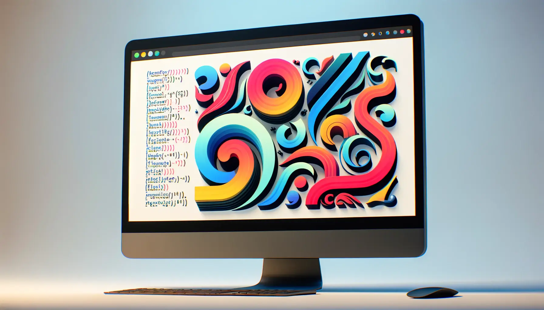
The digital landscape is continuously evolving, and with it, the elements that make up its vast expanse.
Among these, typography stands out as a pivotal aspect of web design, shaping the way information is presented and perceived.
Mixed typography, in particular, has emerged as a significant trend, blending various font styles to create compelling, visually engaging designs.
This approach not only enhances the aesthetic appeal of websites but also plays a crucial role in storytelling, brand identity, and user engagement.
At its core, mixed typography is about diversity and dynamism.
It involves the strategic combination of different typefaces to achieve a harmonious yet striking visual effect.
This trend reflects a broader cultural shift towards inclusivity and fluidity, mirroring the complex, multifaceted nature of the modern world.
By embracing mixed typography, designers can convey a multitude of tones and moods, catering to the diverse tastes and preferences of the digital audience.
- The Significance of Mixed Typography in Modern Web Design
- Strategies for Implementing Mixed Typography
- Impact of Mixed Typography on User Experience
- Challenges and Solutions in Mixed Typography
- Best Practices for Mixed Typography in Web Design
- Innovative Examples of Mixed Typography in Action
- Future Directions of Mixed Typography in Web Design
- Embracing the Future of Mixed Typography in Web Design
- FAQs on Mixed Typography in Web Design
The Significance of Mixed Typography in Modern Web Design
Enhancing Visual Hierarchy
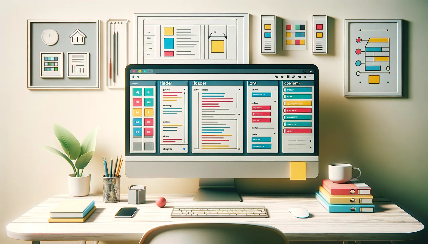
One of the primary functions of mixed typography is to establish a clear visual hierarchy on web pages.
By combining bold headlines with subtle body text, designers can guide the viewer’s attention to key areas, ensuring that important information stands out.
This technique not only improves readability but also contributes to a more organized and intuitive user experience.
Moreover, the contrast created by mixed typography adds depth to the design, making web pages more dynamic and engaging.
This is particularly effective in drawing users into the content, encouraging them to explore further and interact with the site.
Expressing Brand Personality
Mixed typography is also a powerful tool for expressing brand personality.
The choice of fonts can convey a wide range of attributes, from elegance and sophistication to fun and creativity.
By carefully selecting and combining typefaces, designers can create a unique visual language that reflects the brand’s identity and values.
This bespoke approach to typography enables brands to stand out in a crowded digital space, fostering a stronger connection with their audience.
A well-crafted typographic style can leave a lasting impression, making the brand more memorable and recognizable.
Mixed typography, when executed skillfully, can transform a website from merely functional to truly captivating, enhancing both aesthetics and usability.
Strategies for Implementing Mixed Typography
Implementing mixed typography in web design requires a thoughtful approach to ensure that the combination of typefaces enhances the overall design without overwhelming the user.
Here are several strategies that designers can employ to effectively integrate mixed typography into their projects:
Choosing Complementary Fonts
The foundation of effective mixed typography lies in the selection of complementary fonts.
Designers should aim for a balance between contrast and harmony, selecting typefaces that differ enough to create visual interest but share similar characteristics to maintain cohesion.
Considerations include:
- Font families: Pairing fonts from the same family can ensure compatibility while offering variety in weight and style.
- Font styles: Combining serif with sans-serif fonts is a classic approach that provides contrast while keeping the design grounded.
- Font weights: Using different weights of the same font can subtly differentiate between elements without sacrificing uniformity.
Controlling Typography Scale
Scale plays a crucial role in mixed typography, affecting both the visual impact and readability of the text.
Designers should carefully adjust the size of various typographic elements to create a clear hierarchy and guide the user’s attention.
Key aspects include:
- Headlines: Larger, bolder fonts can be used for headlines to catch the user’s eye and convey the main message.
- Body text: Smaller, more readable fonts should be used for body text to ensure that users can easily digest the information.
- Call-to-action (CTA) buttons: Medium-sized, attention-grabbing fonts can make CTAs stand out and encourage user interaction.
Consistency Across Design Elements
While mixed typography encourages diversity, maintaining consistency across design elements is essential for a cohesive look and feel.
This includes:
- Color schemes: Using a consistent color palette for typography can unify different fonts and styles.
- Layout patterns: Repeating certain typographic arrangements throughout the site can establish a recognizable pattern that users can follow.
- Spacing and alignment: Consistent spacing and alignment of text elements contribute to a harmonious and balanced design.
Incorporating mixed typography into web design is not just about aesthetics; it’s a strategic decision that can significantly enhance user experience and brand perception.
Impact of Mixed Typography on User Experience
The integration of mixed typography within web design goes beyond mere visual appeal, significantly influencing the user experience (UX).
A well-executed typographic strategy can enhance readability, user engagement, and emotional connection, contributing to a more effective and enjoyable online journey.
Here’s how mixed typography impacts UX:
Enhancing Readability and Accessibility
At its core, typography should facilitate easy reading and comprehension.
Mixed typography, when used judiciously, can improve the readability of web content by creating clear distinctions between different types of information.
For instance, contrasting fonts can differentiate between headings and body text, guiding users through the content seamlessly.
Additionally, the thoughtful use of typefaces can address accessibility concerns, ensuring that text is legible for users with varying visual abilities.
Boosting Engagement and Retention
Mixed typography can significantly boost user engagement by adding visual interest to a website.
A dynamic typographic landscape encourages users to spend more time exploring the content, thereby increasing the likelihood of conversion.
Moreover, memorable typographic choices can enhance brand recall, encouraging users to return.
Strategies to boost engagement include:
- Interactive typography that responds to user actions
- Animated text that draws attention to key messages
- Creative font pairings that reflect the content’s tone
Creating Emotional Connections
Typography has the power to evoke emotions and set the mood of a website.
Through the strategic use of mixed typography, designers can convey a brand’s personality and values, forging a deeper emotional connection with the audience.
Whether it’s the warmth and approachability of a hand-drawn font or the authority and trustworthiness of a bold serif, the right typographic choices can resonate with users on a personal level, making the digital experience more impactful.
Understanding the psychological impact of different fonts and styles is crucial for leveraging mixed typography to enhance user experience effectively.
Challenges and Solutions in Mixed Typography
While mixed typography offers numerous benefits for web design, it also presents certain challenges that designers must navigate.
Balancing creativity with readability, ensuring consistency, and optimizing for performance are just a few hurdles that can arise.
However, with the right strategies, these challenges can be effectively addressed.
Balancing Creativity with Readability
The drive to create visually striking designs using mixed typography can sometimes compromise the readability of the text.
To mitigate this, designers should prioritize legibility in their typographic choices, especially for body text and critical information.
Solutions include:
- Limiting the number of font styles used on a single page to prevent visual clutter.
- Ensuring sufficient contrast between text and background colors.
- Using decorative fonts sparingly and in appropriate contexts, such as headings or accents.
Maintaining Consistency Across Platforms
A consistent user experience across different devices and platforms is essential for brand identity and usability.
Mixed typography must adapt seamlessly to various screen sizes and resolutions without losing its intended effect.
Designers can achieve this by:
- Employing responsive design principles to adjust typography based on device characteristics.
- Using web-safe fonts or font services that ensure cross-platform compatibility.
- Testing designs on multiple devices and browsers to identify and resolve inconsistencies.
Optimizing for Performance
Using multiple fonts can impact website loading times, which in turn affects user experience and search engine rankings.
To optimize performance while still leveraging mixed typography, consider the following:
- Minimizing the number of font files loaded by selecting fonts that serve multiple purposes or using variable fonts.
- Using font display techniques to control how and when fonts are loaded.
- Ensuring fonts are properly compressed and cached for faster loading times.
With careful planning and strategic implementation, the challenges of mixed typography can be transformed into opportunities for creating distinctive, user-friendly web designs.
Best Practices for Mixed Typography in Web Design
To effectively harness the power of mixed typography in web design, adhering to certain best practices is crucial.
These guidelines not only help in creating visually appealing designs but also ensure that the typography serves its primary function of communication.
Here are some best practices to consider:
Start with a Clear Typographic Plan
Before diving into design, it’s essential to have a clear typographic plan that outlines how different fonts will be used throughout the website.
This plan should consider the overall theme of the site, the message it intends to convey, and the target audience.
Key elements of a typographic plan include:
- Defining the role of each font (e.g., headings, body text, calls to action).
- Establishing a hierarchy that guides the user’s attention to important information.
- Choosing fonts that reflect the brand’s personality and resonate with the audience.
Ensure Typographic Contrast
Contrast is a fundamental principle in mixed typography, helping to differentiate between various elements on a page.
However, contrast goes beyond just font selection; it also involves color, size, and weight.
Effective use of contrast can enhance readability and draw attention to key sections of the website.
Strategies for achieving typographic contrast include:
- Varying font sizes to create a dynamic visual hierarchy.
- Using bold or italic styles to highlight important text.
- Implementing color contrast to ensure text stands out against the background.
Test and Iterate
Typography in web design is not a set-it-and-forget-it element.
Continuous testing and iteration are necessary to refine the typographic experience.
This involves gathering feedback from users, analyzing engagement metrics, and making adjustments based on real-world usage.
Testing considerations should include:
- User testing sessions to gather qualitative feedback on readability and visual appeal.
- A/B testing different typographic arrangements to see which performs better in terms of user engagement and conversion rates.
- Accessibility testing to ensure the typography is legible and navigable for users with disabilities.
Adopting these best practices for mixed typography can significantly enhance the effectiveness of web design, creating engaging, accessible, and memorable digital experiences.
Innovative Examples of Mixed Typography in Action
The theoretical aspects of mixed typography come to life when applied in real-world web design projects.
Across the digital landscape, innovative examples of mixed typography showcase the versatility and impact of this trend.
These examples not only inspire but also demonstrate how mixed typography can be used to create unique, engaging, and effective web experiences.
Creative Portfolio Websites
Portfolio websites for artists, designers, and creatives often leverage mixed typography to showcase individuality and creativity.
By combining bold, expressive fonts for headlines with more subdued, readable fonts for descriptions and bios, these websites reflect the personality and style of the creator.
This approach not only captures the visitor’s attention but also provides a cohesive overview of the creative’s work and ethos.
E-commerce Platforms
E-commerce platforms are increasingly using mixed typography to differentiate themselves from competitors and highlight their brand identity.
From luxury brands employing elegant serif fonts mixed with clean sans-serifs to quirky, niche stores combining hand-drawn fonts with classic types, mixed typography helps in creating a memorable shopping experience.
It also aids in guiding customers through the buying journey, from discovery to checkout.
Editorial and Magazine Sites
Editorial websites and online magazines use mixed typography to create dynamic, visually rich layouts that enhance the storytelling experience.
By pairing distinctive headline fonts with legible body text fonts, these sites can emphasize key articles, draw readers into the content, and facilitate easy reading.
The use of mixed typography in this context not only serves aesthetic purposes but also supports the editorial hierarchy and content strategy.
Non-profit and Cause-based Websites
Non-profit and cause-based websites utilize mixed typography to convey their message and engage supporters.
The strategic use of typography can evoke emotions, highlight calls to action, and communicate the importance of the cause.
For example, a bold, impactful font for campaign slogans paired with a simple, accessible font for informational content can effectively mobilize site visitors to take action.
These examples illustrate the broad applicability and potential of mixed typography in web design, offering valuable insights for designers looking to explore this trend in their own projects.
Future Directions of Mixed Typography in Web Design
The realm of web design is ever-evolving, with mixed typography at the forefront of this transformation.
As we look to the future, several trends and innovations are set to shape the continued evolution of mixed typography.
These developments promise to further expand the creative possibilities and effectiveness of typographic design in digital spaces.
Advancements in Variable Fonts
Variable fonts, which allow for the customization of a typeface’s weight, width, and other attributes within a single font file, are poised to play a significant role in the future of mixed typography.
Future advancements in variable font technology are expected to offer even greater flexibility and control, enabling designers to:
- Seamlessly adjust font characteristics to match the user’s device and screen size, improving readability and user experience.
- Create custom font variations on the fly, allowing for more personalized and dynamic typographic expressions.
Increased Focus on Accessibility and Inclusivity
As the digital world becomes more aware of the importance of accessibility and inclusivity, mixed typography will evolve to meet these needs.
Designers will need to balance creativity with the principles of accessible design, ensuring that typographic choices do not hinder the usability of a website for individuals with disabilities.
This will involve:
- Choosing font combinations that are not only visually appealing but also legible for users with visual impairments.
- Incorporating adaptive typography that adjusts based on the user’s preferences and needs.
Integration with Augmented Reality (AR) and Virtual Reality (VR)
The integration of mixed typography with emerging technologies like AR and VR offers exciting possibilities for immersive web experiences.
As these technologies become more mainstream, designers will have the opportunity to:
- Explore three-dimensional typographic designs that interact with the user’s environment in AR applications.
- Create fully immersive typographic experiences in VR, where text can envelop the user in a virtual world.
Personalization and AI-driven Typography
Personalization is becoming increasingly important in web design, and mixed typography is no exception.
With advancements in artificial intelligence (AI), future web designs may feature AI-driven typography that:
- Automatically adjusts typographic styles based on user behavior and preferences, creating a more personalized browsing experience.
- Generates creative font combinations and layouts, aiding designers in the creation of unique and effective typographic designs.
The future of mixed typography in web design is bright, with technological advancements and a growing emphasis on user experience driving innovation. As designers, embracing these changes and exploring new possibilities will be key to creating compelling, effective, and inclusive digital experiences.
Embracing the Future of Mixed Typography in Web Design
The exploration of mixed typography in web design has unveiled its profound impact on enhancing visual appeal, user engagement, and brand identity.
As we’ve navigated through the intricacies of implementing mixed typography, its significance in modern web design cannot be overstated.
The trend not only reflects a shift towards more dynamic and inclusive digital spaces but also underscores the evolving nature of web design as an art form.
Looking ahead, the future of mixed typography is set to be shaped by technological advancements, a deeper understanding of user experience, and the continuous pursuit of creativity.
The Role of Mixed Typography in Shaping Digital Narratives
Mixed typography has emerged as a pivotal tool in crafting compelling digital narratives.
By blending various typefaces, designers can create rich, layered experiences that resonate with audiences on multiple levels.
The strategic use of mixed typography enhances readability, guides user navigation, and injects personality into web content, making each interaction memorable.
As web design moves forward, the role of mixed typography in storytelling and brand communication will only grow, driven by its ability to convey complexity and nuance in an increasingly digital world.
Challenges and Innovations on the Horizon
Despite its many benefits, mixed typography presents challenges that designers must skillfully navigate.
Balancing creativity with usability, ensuring cross-platform consistency, and optimizing for performance are ongoing concerns.
However, these challenges also spur innovation, pushing the boundaries of what’s possible in web typography.
Advancements in variable fonts, AI-driven design, and integration with AR and VR technologies are just a few areas where mixed typography is set to evolve, offering new avenues for creative expression and user engagement.
- Variable fonts will provide unprecedented flexibility in typographic design, allowing for real-time adaptation to user contexts and preferences.
- Accessibility and inclusivity will become central considerations, ensuring that mixed typography benefits all users, regardless of their abilities or devices.
- The fusion of mixed typography with AR and VR will open up new dimensions for interactive and immersive web experiences, blurring the lines between digital and physical realms.
- AI-driven typography will personalize user experiences like never before, dynamically adjusting typographic styles to match individual user profiles and behaviors.
In conclusion, the trend of mixed typography in web design is a testament to the field’s ongoing evolution and its endless potential for innovation.
As designers, embracing this trend means continually exploring new possibilities, experimenting with bold combinations, and refining our approaches to meet the needs of an ever-changing digital landscape.
The future of mixed typography is not just about the fonts we choose but about how we use them to connect, communicate, and captivate in the vast digital universe.
Quality web design is key for a great website! Check out our service page to partner with an expert web design agency.
FAQs on Mixed Typography in Web Design
Explore common questions about integrating mixed typography into your web design projects, providing insights and practical advice.
Mixed typography involves combining different font styles and families to enhance visual appeal and communication on web pages.
Effective font combination requires selecting complementary fonts, establishing a visual hierarchy, and ensuring readability and consistency.
Yes, mixing fonts can significantly boost user engagement by adding visual interest and highlighting key content areas on a website.
Using multiple font styles on a homepage is acceptable, especially when creating a clear hierarchy and visual interest.
Best practices include choosing complementary fonts, creating contrast, and maintaining a cohesive design throughout the website.
It’s recommended to use 2-3 fonts in web design to maintain clarity and cohesiveness while allowing for creative expression.
Do choose fonts that complement each other and create a visual hierarchy. Don’t use fonts that are too similar or clash visually.
Typography greatly affects readability by influencing the layout, spacing, and contrast of text, directly impacting user experience.
