In the ever-evolving landscape of digital design, a new trend has emerged that is reshaping the way we interact with text on screens.
Shapeshifter typography, a concept that seems to have leaped out of a designer’s most creative dream, is now a reality, pushing the boundaries of traditional typography into a realm of dynamic and adaptive design.
This innovative approach to typography is not just about aesthetics; it’s about enhancing user experience, making digital content not only more accessible but also more engaging across a myriad of devices.
At its core, shapeshifter typography is about fluidity and adaptability.
It represents a departure from static text, embracing a design that changes shape, size, and sometimes even form, in response to user interaction or environmental conditions.
This fluid design philosophy is rooted in the idea that digital experiences should be as dynamic and versatile as the platforms they are accessed on.
From smartphones and tablets to desktops and beyond, shapeshifter typography ensures that text is not just seen but experienced in a way that is both intuitive and immersive.
- The Essence of Shapeshifter Typography
- Implementing Shapeshifter Typography in Web Design
- Challenges and Solutions in Shapeshifter Typography
- Case Studies: Shapeshifter Typography in Action
- Typography Trends Influencing Shapeshifter Design
- Best Practices for Designing with Shapeshifter Typography
- Future Directions of Shapeshifter Typography
- Embracing the Future with Shapeshifter Typography
- Shapeshifter Typography FAQs
The Essence of Shapeshifter Typography
Shapeshifter typography is more than just a design trend; it’s a reflection of the modern web’s complexity and the need for designs that can adapt to the ever-changing digital landscape.
This approach to typography takes into consideration factors such as screen size, user preferences, and context of use, adjusting the text’s appearance to improve readability and interaction.
By doing so, it breaks free from the constraints of traditional typography, offering a more personalized and engaging user experience.
The implementation of shapeshifter typography can vary widely, from simple transformations like adjusting font size and line spacing based on screen resolution, to more complex changes in font weight and style based on user interaction.
For instance, a headline might grow bolder and larger as a reader zooms in on a webpage, or a paragraph might subtly shift its alignment and spacing when viewed on a mobile device.
These adjustments are not just cosmetic; they are strategic design choices aimed at enhancing legibility, comprehension, and overall user engagement.
Benefits for User Experience
One of the most compelling aspects of shapeshifter typography is its potential to significantly improve user experience.
By dynamically adjusting to the user’s environment, it ensures that text is always presented in the most readable and accessible format.
This adaptability is particularly beneficial in a world where digital content is accessed across a wide range of devices with varying screen sizes and resolutions.
Shapeshifter typography eliminates the one-size-fits-all approach, offering a tailored reading experience that meets the needs of each individual user.
Moreover, this dynamic approach to typography can also enhance the aesthetic appeal of digital content, making it more engaging and enjoyable to interact with.
The subtle animations and transformations of text can add a layer of depth and sophistication to web design, captivating users and encouraging them to spend more time exploring the content.
This not only benefits users by providing a more enjoyable browsing experience but also benefits content creators by increasing engagement and, potentially, conversion rates.
Shapeshifter typography represents a significant leap forward in digital design, offering a blend of adaptability, readability, and aesthetic appeal that enhances both user experience and content engagement.
Implementing Shapeshifter Typography in Web Design
The implementation of shapeshifter typography in web design requires a blend of creativity, technical skill, and a deep understanding of user interaction.
Designers and developers must work hand in hand to bring this dynamic typography to life, ensuring that it not only looks good but also serves its primary purpose of improving readability and user engagement.
Here’s how shapeshifter typography can be effectively implemented in web design:
Understanding the Basics
Before diving into the technicalities of implementing shapeshifter typography, it’s crucial to understand the foundational elements that make up this design approach.
At its heart, shapeshifter typography involves the use of variable fonts and responsive design principles to create text that adapts and responds to its environment.
This might include changes in size, weight, spacing, and even font style, based on user interactions or device specifications.
Variable fonts are at the core of shapeshifter typography.
These are font files that behave like multiple fonts in one, allowing a single font file to simulate various weights, widths, and other attributes without the need for multiple font files.
This flexibility is what enables the fluid and dynamic nature of shapeshifter typography.
Technical Considerations
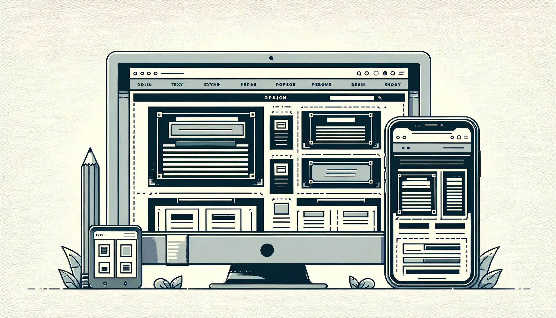
- Responsive Design: Implementing shapeshifter typography starts with responsive design principles. Text must fluidly adjust to different screen sizes and resolutions, ensuring optimal readability across devices.
- CSS and JavaScript: Utilizing CSS (Cascading Style Sheets) and JavaScript, designers can create rules and scripts that dictate how text should adapt under certain conditions. This might involve using CSS functions like
clamp(),vw(viewport width), andvh(viewport height) units for fluid typography scaling. - User Interaction: Beyond adjusting to screen size, shapeshifter typography can also respond to user interactions. This requires JavaScript to detect actions like mouse hover, scroll position, or touch gestures, triggering typography transformations accordingly.
Designing for Accessibility
While the dynamic nature of shapeshifter typography offers a unique and engaging user experience, it’s essential to balance creativity with accessibility.
Designers must ensure that text transformations enhance readability without compromising the accessibility for users with disabilities.
This includes providing sufficient contrast, maintaining a logical structure, and ensuring that text transformations do not disorient users.
Accessibility should be a priority in the design process, with testing tools and guidelines, such as the Web Content Accessibility Guidelines (WCAG), used to evaluate the accessibility of dynamic typography.
By doing so, designers can create inclusive designs that cater to a wider audience, ensuring that everyone can enjoy the benefits of shapeshifter typography.
Accessibility and user-centric design principles are crucial in the effective implementation of shapeshifter typography, ensuring that dynamic text transformations enhance rather than hinder the user experience.
Challenges and Solutions in Shapeshifter Typography
While shapeshifter typography offers a myriad of benefits, its implementation is not without challenges.
These obstacles range from technical limitations to design consistency issues, each requiring a thoughtful approach to overcome.
Here’s a look at some common challenges and the solutions that can help navigate these complexities:
Performance and Load Times
One of the primary concerns with implementing dynamic typography is the potential impact on website performance and load times.
Variable fonts and the JavaScript required for interactive typography can add to the page’s weight, potentially slowing down the site.
To mitigate this, designers and developers can:
- Optimize font files by only including the necessary font weights and features.
- Minimize the use of JavaScript and rely on CSS where possible to achieve fluid typography effects.
- Implement lazy loading for fonts, ensuring they are only loaded when needed.
By prioritizing performance from the outset, designers can ensure that the dynamic nature of shapeshifter typography doesn’t compromise the overall user experience.
Browser Compatibility
Another challenge is ensuring that shapeshifter typography works seamlessly across different browsers and devices.
Not all browsers support variable fonts or the latest CSS and JavaScript features equally, which can lead to inconsistent user experiences.
Solutions include:
- Using feature detection libraries like Modernizr to identify browser capabilities and provide fallbacks as necessary.
- Employing polyfills to emulate the functionality of newer web technologies in older browsers.
- Regularly testing the typography on various devices and browsers to identify and fix issues promptly.
Addressing browser compatibility ensures that all users, regardless of their device or browser choice, can enjoy the benefits of shapeshifter typography.
Design Consistency
Maintaining design consistency while implementing shapeshifter typography can also be challenging.
The dynamic nature of the typography means that text may appear differently across devices and interactions, potentially leading to a fragmented brand identity.
To maintain consistency, designers should:
- Establish clear guidelines for how typography should adapt across different scenarios.
- Use a limited number of variable fonts to maintain a cohesive visual language.
- Ensure that all typography transformations align with the brand’s overall style and messaging.
By carefully planning and implementing shapeshifter typography, designers can overcome these challenges, creating engaging and accessible digital experiences that stand out in the digital landscape.
Innovative solutions and careful planning are key to overcoming the challenges of shapeshifter typography, ensuring that dynamic text enhances rather than complicates the user experience.
Case Studies: Shapeshifter Typography in Action
Exploring real-world applications of shapeshifter typography provides valuable insights into its potential to transform digital experiences.
These case studies highlight how dynamic typography can be leveraged to create engaging, accessible, and memorable web designs.
Innovative Editorial Websites
One of the most striking applications of shapeshifter typography is found in innovative editorial websites.
These platforms use dynamic typography to guide readers through stories in an interactive way, changing text size, weight, and layout based on user interaction or the narrative flow.
For example, an article about climate change might feature typography that expands and contracts to mimic breathing, drawing the reader’s attention to the urgency of the topic.
This approach not only enhances the storytelling experience but also encourages deeper engagement with the content.
These editorial websites often face the challenge of balancing creativity with readability and performance.
Solutions include optimizing variable fonts for web use, ensuring that typography transformations are smooth and do not detract from the user experience, and conducting extensive user testing to refine the interplay between text and interaction.
E-commerce Platforms
E-commerce platforms have also started to embrace shapeshifter typography to enhance the shopping experience.
By dynamically adjusting typography based on user behavior or product categories, these websites can create a more personalized shopping environment.
For instance, a fashion retailer might employ bold, dramatic typography for high-end product lines, while opting for a more subdued style for everyday items.
This not only helps to differentiate product categories but also aligns the visual design with the brand’s identity.
The key challenge for e-commerce sites is ensuring that the dynamic typography does not overwhelm the user or detract from the primary goal of driving conversions.
Solutions include using typography transformations sparingly, focusing on key areas of the site such as product names and descriptions, and always prioritizing clarity and legibility over decorative effects.
Real-world applications of shapeshifter typography demonstrate its versatility and impact, from enhancing narrative engagement on editorial sites to personalizing the shopping experience on e-commerce platforms.
Typography Trends Influencing Shapeshifter Design
The evolution of shapeshifter typography is not happening in isolation.
It’s being shaped and influenced by broader trends in typography and design.
Understanding these trends is crucial for designers looking to implement shapeshifter typography effectively.
Here are some of the key trends influencing the world of dynamic typography:
Minimalism and Clean Design
Minimalism has been a dominant trend in web design, emphasizing clean lines, ample white space, and a focus on content.
Shapeshifter typography aligns with this trend by enabling text to adapt and change, ensuring legibility and focus without clutter.
For instance, a minimalist website might use shapeshifter typography to subtly adjust font sizes and weights based on the user’s screen size, maintaining a clean and uncluttered aesthetic across devices.
Key strategies for integrating shapeshifter typography into minimalist designs include:
- Limiting the range of typographic transformations to maintain simplicity.
- Focusing on functional changes that enhance readability and user experience.
- Using transitions and animations sparingly to preserve the clean and uncluttered look.
Emphasis on Mobile Experience
With the increasing prevalence of mobile browsing, designing for mobile-first experiences has become paramount.
Shapeshifter typography is particularly beneficial in this context, as it allows text to dynamically adjust to the smaller screens and varied resolutions of mobile devices.
This ensures that content is always legible and accessible, regardless of the device used to access it.
To optimize shapeshifter typography for mobile experiences, designers should:
- Consider touch interactions and how they might affect typography transformations.
- Test extensively on various devices to ensure consistent and accessible mobile experiences.
- Adjust typography dynamically not just based on screen size, but also on orientation changes.
Interactive and Immersive Experiences
As web design moves towards more interactive and immersive experiences, shapeshifter typography offers a tool to engage users in novel ways.
By integrating typography transformations with user interactions, designers can create memorable experiences that encourage exploration and interaction.
Implementing interactive typography involves:
- Linking typographic changes to user actions like scrolling, hovering, or clicking.
- Using typography to guide users through interactive storytelling or to highlight interactive elements.
- Ensuring that interactive typographic elements are intuitive and contribute to the overall user journey.
The trends of minimalism, mobile-first design, and interactive experiences are shaping the future of shapeshifter typography, guiding its integration into modern web design.
Best Practices for Designing with Shapeshifter Typography
Designing with shapeshifter typography offers a unique opportunity to create dynamic, responsive, and engaging digital experiences.
However, to fully leverage its potential, designers must adhere to best practices that ensure typography not only looks good but also enhances usability and accessibility.
Here are essential best practices for designing with shapeshifter typography:
User-Centered Design
At the heart of effective shapeshifter typography lies a user-centered design approach.
This means prioritizing the needs and preferences of the user above all else.
Typography should adapt and respond in ways that improve the user experience, making content more accessible and enjoyable to interact with.
Key aspects include:
- Ensuring that typographic transformations enhance readability and legibility across all devices and environments.
- Using user feedback and testing to refine typographic elements, ensuring they meet user expectations and preferences.
- Considering the context in which the content will be consumed, and adjusting typography dynamically to suit different scenarios.
Accessibility and Inclusivity
Accessibility should be a cornerstone of any design involving shapeshifter typography.
Designers must ensure that typographic adaptations do not hinder the ability of users, including those with disabilities, to access and understand content.
Strategies for maintaining accessibility include:
- Adhering to WCAG guidelines for text size, contrast, and spacing.
- Providing alternative text descriptions for dynamic typographic elements that convey information or meaning.
- Ensuring that typographic transformations are compatible with screen readers and other assistive technologies.
Performance Optimization
While shapeshifter typography can significantly enhance the visual appeal and interactivity of a website, it’s crucial to balance these benefits with performance considerations.
Optimized performance ensures that the website remains fast, responsive, and accessible to all users.
Effective optimization techniques include:
- Minimizing the use of heavy fonts and limiting the number of font variations loaded on the website.
- Using modern web technologies like CSS Grid and Flexbox for layout adjustments that complement typographic transformations.
- Implementing lazy loading for fonts and prioritizing above-the-fold content to improve load times.
By following these best practices, designers can create compelling, user-friendly digital experiences that make the most of shapeshifter typography’s dynamic capabilities.
The goal is to blend creativity with functionality, ensuring that typography not only captures the user’s attention but also facilitates seamless interaction with content.
Adhering to best practices in shapeshifter typography ensures that dynamic text serves to enhance, rather than complicate, the user experience, creating a balance between aesthetic appeal and usability.
Future Directions of Shapeshifter Typography
The landscape of digital design is perpetually evolving, with shapeshifter typography at the forefront of this transformation.
As technology advances and user expectations grow, the future of shapeshifter typography is poised to expand in exciting new directions.
Here’s a glimpse into what the future may hold for this dynamic design element:
Integration with Augmented and Virtual Reality
As augmented reality (AR) and virtual reality (VR) technologies become more mainstream, the potential for shapeshifter typography within these immersive environments is vast.
Typography that can adapt and respond not just to screen size and user interaction, but also to three-dimensional space and user movement, could significantly enhance the immersive experience.
This could involve text that dynamically changes based on the user’s perspective or typography that interacts with virtual objects in real-time.
The challenge will be to design typographic experiences that are intuitive and enhance the user’s immersion without overwhelming their senses.
This will require innovative approaches to typography design, as well as careful consideration of legibility and user comfort in three-dimensional spaces.
Greater Personalization and Contextual Adaptation
Personalization is becoming increasingly important in digital experiences, and shapeshifter typography is well-positioned to contribute to more personalized user experiences.
Future developments could see typography that not only adapts to device and user interaction but also to the user’s preferences, behavior, and even emotions.
Imagine a reading app where the typography adjusts not just to the ambient light but also to the content’s tone or the user’s reading speed.
To achieve this level of personalization, designers will need to leverage data analytics and machine learning algorithms to understand user preferences and behaviors.
However, it will be crucial to balance personalization with privacy concerns, ensuring that users are in control of their data and how it’s used to shape their experiences.
Enhanced Accessibility Through Smart Typography
Accessibility is a critical consideration in all areas of web design, and shapeshifter typography offers new avenues to improve how content is accessed and understood by users with disabilities.
Future advancements could include typography that automatically adjusts for optimal readability for users with visual impairments or dyslexia.
For example, text could change contrast, size, or font based on the user’s specific needs, making digital content more accessible to a broader audience.
Developing these adaptive typographic solutions will require ongoing collaboration between designers, accessibility experts, and users themselves to ensure that the technology genuinely meets the needs of those it aims to serve.
The future of shapeshifter typography is bright, with endless possibilities for innovation and enhancement of digital experiences.
As designers and developers continue to explore this dynamic design element, the key will be to focus on creating typography that is not only visually engaging but also enhances usability, accessibility, and personalization for all users.
Exploring the future of shapeshifter typography reveals a world of possibilities for more immersive, personalized, and accessible digital experiences, driven by advances in technology and a deep understanding of user needs.
Embracing the Future with Shapeshifter Typography
As we stand on the brink of new digital horizons, shapeshifter typography emerges not just as a trend but as a transformative force in web design.
Its ability to adapt, transform, and respond to the user’s environment and interaction heralds a new era of digital experiences that are more dynamic, engaging, and accessible.
The journey of shapeshifter typography from a novel concept to a fundamental design element underscores the evolving nature of how we interact with digital content.
The Path Forward
The exploration of shapeshifter typography has revealed its vast potential to enhance user experience, improve accessibility, and push the boundaries of creative web design.
As we look to the future, several key themes emerge:
- The integration of shapeshifter typography with emerging technologies like AR and VR promises to redefine our perception of immersive experiences, making digital content more interactive and engaging.
- Personalization and contextual adaptation will drive shapeshifter typography towards more user-centric designs, tailoring digital experiences to individual preferences and behaviors.
- Advancements in accessibility through smart typography will ensure that digital content is inclusive, catering to the needs of users with diverse abilities and enhancing the web for everyone.
These developments are not without their challenges, including ensuring cross-browser compatibility, optimizing performance, and maintaining design consistency.
However, the potential rewards—more engaging, accessible, and personalized digital experiences—far outweigh these obstacles.
Shaping the Future of Digital Design
Shapeshifter typography is more than just a fleeting design trend; it is a testament to the power of innovation and creativity in the digital age.
As designers and developers continue to explore the possibilities of this dynamic design element, the future of web design looks brighter and more inclusive.
The key to unlocking the full potential of shapeshifter typography lies in a balanced approach that prioritizes user experience, accessibility, and performance, ensuring that digital content is not only beautiful but also functional and accessible to all.
In conclusion, shapeshifter typography stands at the forefront of a design revolution, challenging us to rethink how we create and interact with digital content.
As we embrace the possibilities of this exciting design element, we open the door to a future where digital experiences are more engaging, personalized, and accessible than ever before.
The journey of shapeshifter typography is just beginning, and its impact on the digital landscape is poised to be profound and lasting.
Quality web design is key for a great website! Check out our service page to partner with an expert web design agency.
Shapeshifter Typography FAQs
Delve into the most common inquiries surrounding shapeshifter typography, a dynamic design trend reshaping the digital landscape.
Shapeshifter typography refers to dynamic text that adapts its form, size, or style based on user interaction or environmental conditions, enhancing readability and engagement.
By adapting to the user’s environment and preferences, shapeshifter typography improves readability and personalizes the user experience, making digital content more accessible and engaging.
Yes, it can dynamically adjust text for optimal readability and accessibility, catering to users with diverse needs and enhancing the overall inclusivity of digital content.
Shapeshifter typography leverages CSS, JavaScript, and variable fonts, utilizing responsive design principles to create fluid and adaptable text experiences.
While most modern browsers support the technologies behind shapeshifter typography, designers often implement fallbacks to ensure compatibility across a wide range of browsers.
Focus on user-centered design, prioritize accessibility, optimize for performance, and ensure cross-browser compatibility to implement shapeshifter typography effectively.
Emerging technologies like AR and VR, increased personalization, and a greater focus on accessibility are expected to shape the future of shapeshifter typography.
Designers should stay informed about the latest web technologies, prioritize user experience, and continuously explore innovative ways to integrate dynamic text into their designs.
