In the realm of design and marketing, the interplay between color and typography is not just a matter of aesthetic appeal but a strategic tool in shaping brand perception.
This intricate relationship influences how a brand communicates its identity, values, and message to the audience.
Color, with its profound psychological impact, and typography, with its ability to convey tone and personality, together create a visual language that can attract, engage, and persuade consumers.
The significance of color in typography extends beyond mere decoration.
It plays a pivotal role in readability, emotional connection, and brand differentiation.
Similarly, the choice of typeface can enhance or detract from the message a color intends to convey, making the synergy between these two elements critical in brand strategy.
This article delves into the nuanced ways in which color and typography interact to shape consumer perceptions and behaviors towards a brand.
- The Psychological Impact of Color in Branding
- Typography’s Role in Brand Communication
- Integrating Color and Typography in Branding
- Impact of Color and Typography on User Experience
- Color and Typography Trends in Digital Design
- Global Influence on Color and Typography Choices
- Strategies for Evolving Brand Identity with Color and Typography
- Conclusion: The Symbiotic Relationship Between Color, Typography, and Brand Perception
- FAQs: How Color Affects Typography and Brand Perception
The Psychological Impact of Color in Branding
Understanding Color Psychology
Color psychology is a field of study that examines how different colors determine human behavior and emotional responses.
In branding, the strategic use of color can evoke specific feelings in the audience, influencing their perception of a brand.
For instance, blue is often associated with trust, stability, and professionalism, making it a popular choice for financial institutions and tech companies.
On the other hand, red can trigger feelings of excitement, passion, or urgency, which is why it’s frequently used in call-to-action buttons and sale announcements.
The choice of color in a brand’s palette should align with its identity and the emotions it aims to evoke.
This alignment ensures that the brand communicates its message effectively and creates a lasting emotional connection with its audience.
Selecting the right color palette is crucial for a brand’s visual identity and can significantly impact consumer perception and interaction.
Color and Consumer Behavior
Colors not only affect the mood and feelings of consumers but also their behavior.
Various studies have shown that color can influence purchasing decisions, with up to 90% of snap judgments about products being based on color alone.
For example, green is often used to promote environmental and natural products, appealing to consumers’ desire for eco-friendliness.
Similarly, the use of yellow can attract attention and evoke a sense of optimism and youthfulness, making it effective for brands targeting a younger demographic.
Moreover, the consistency of color usage across a brand’s touchpoints—such as its logo, website, and packaging—helps in building brand recognition.
Consistent color use makes a brand more recognizable and memorable to consumers, reinforcing their emotional connection to the brand every time they encounter it.
This consistency in color usage helps solidify the brand’s identity in the consumer’s mind, leading to increased brand loyalty and preference.
Typography’s Role in Brand Communication
Typography, the art of arranging type, plays a fundamental role in brand communication, much like color.
It’s not just about making words readable; the choice of typeface can express personality, set a tone, and significantly affect how a message is perceived.
A well-chosen typeface enhances the brand’s voice and can make the difference between a message that resonates and one that falls flat.
Typography’s impact on brand perception is profound.
Each font style carries its own set of associations and emotional impacts.
For instance, serif fonts, characterized by their decorative feet at the end of letter strokes, are often seen as traditional and reliable.
In contrast, sans-serif fonts offer a cleaner, more modern aesthetic, suggesting simplicity and straightforwardness.
Choosing the Right Typeface for Your Brand
- Serif Fonts: Ideal for brands aiming to convey elegance, respectability, and reliability. Examples include Times New Roman and Georgia.
- Sans-Serif Fonts: Perfect for brands looking to project a modern, approachable, and clean image. Helvetica and Arial are popular choices.
- Script Fonts: These fonts mimic handwriting and can add a personal, bespoke touch to a brand’s identity. They’re suitable for brands that want to appear artisanal, creative, or luxurious.
The choice of typography should align with the brand’s personality and the message it wishes to communicate.
The right typeface can elevate a brand, making it stand out in a crowded marketplace, while the wrong choice can dilute its message and weaken its presence.
Typography and Readability
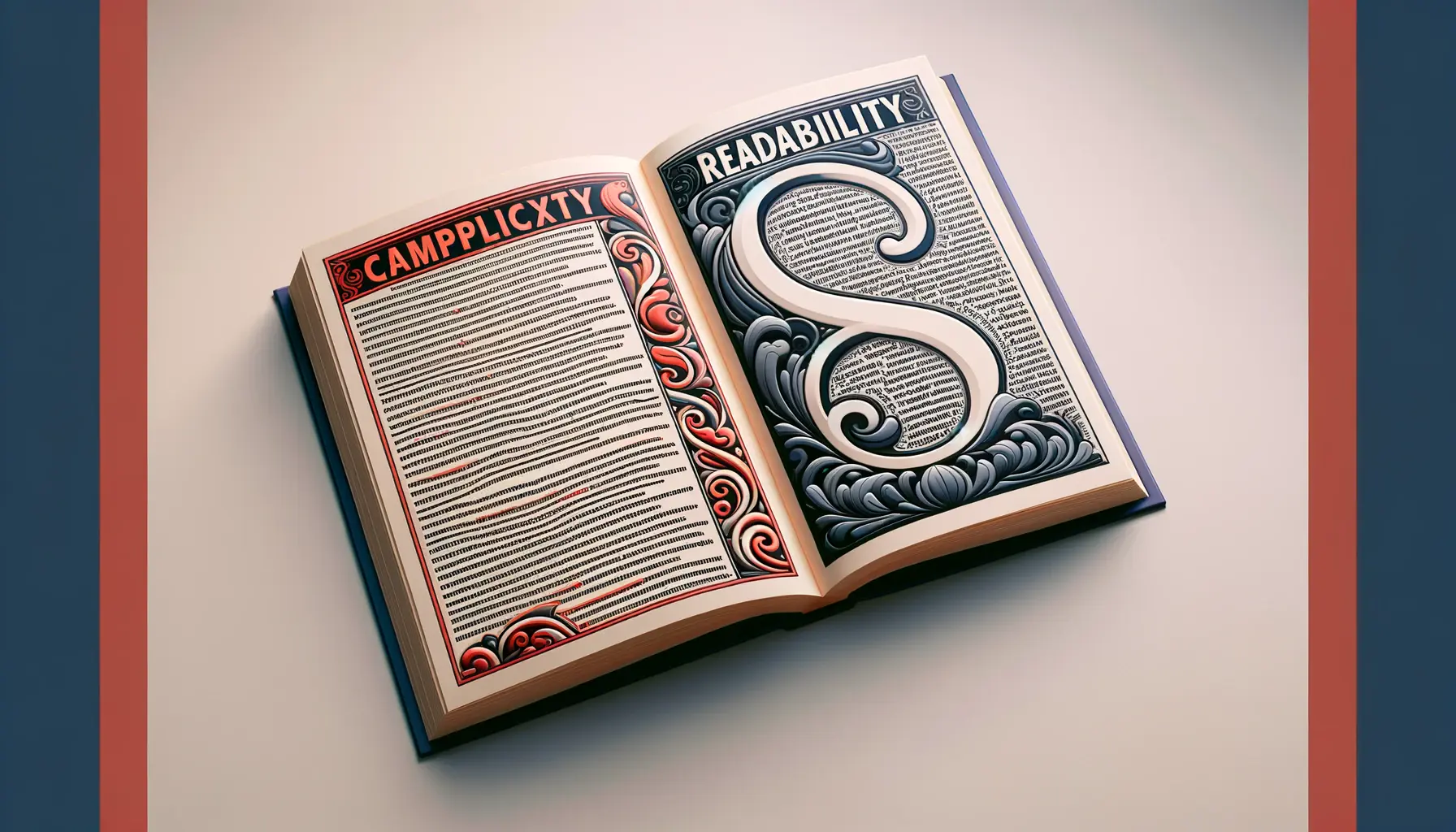
While aesthetics are crucial, readability is paramount in typography.
The primary goal is to ensure that the text is easy on the eyes and that the message is communicated effectively.
Factors like font size, letter spacing, and line height play a significant role in readability.
A well-designed typographic layout considers these elements, ensuring that the text is accessible to a wide audience, including those with visual impairments.
A brand’s typography should be consistent across all mediums, from digital to print, to maintain brand identity and ensure that the message is clear and cohesive across all platforms.
Integrating Color and Typography in Branding
The integration of color and typography in branding is a dance of visual harmony that can significantly enhance brand recognition and emotional appeal.
When color and typography are thoughtfully combined, they create a powerful brand identity that communicates the brand’s values, tone, and personality.
This synergy between color and typography not only attracts attention but also facilitates brand differentiation in a competitive market.
Choosing the right combination of color and typography involves understanding the brand’s core identity and the message it wants to convey.
The color palette and typeface should complement each other, creating a cohesive visual language that resonates with the target audience.
This visual language becomes a key component of the brand’s storytelling, making the brand memorable and easily recognizable.
Case Studies of Successful Brand Identities
- Apple: Apple’s use of clean, sans-serif typography and a monochromatic color scheme conveys simplicity, innovation, and elegance. This combination has helped establish Apple as a leader in design and technology.
- Coca-Cola: The iconic red color and Spencerian script of Coca-Cola’s logo evoke feelings of happiness, nostalgia, and familiarity, contributing to the brand’s global recognition and emotional connection with consumers.
These examples demonstrate how the strategic use of color and typography can create a strong brand identity that stands the test of time.
The key is consistency across all brand touchpoints, from the logo and packaging to the website and marketing materials.
This consistency reinforces the brand’s identity, making it easier for consumers to recognize and remember the brand.
Best Practices for Combining Color and Typography
To effectively combine color and typography in branding, consider the following best practices:
- Consistency: Maintain a consistent use of color and typography across all brand materials to reinforce brand identity.
- Contrast: Ensure sufficient contrast between the background color and typography for readability and visual impact.
- Emotional Alignment: Choose colors and typefaces that align with the emotional tone and personality of the brand.
- Target Audience: Consider the preferences and expectations of your target audience when selecting colors and typefaces.
The integration of color and typography is not just about aesthetics; it’s about creating a visual language that communicates the brand’s essence and values to the world.
Impact of Color and Typography on User Experience
The influence of color and typography extends beyond brand identity into the realm of user experience (UX).
In digital design, the way a website or app feels to a user can significantly affect their interaction with the brand.
Color and typography are key elements in creating an intuitive and enjoyable user experience.
They guide users through a site, emphasize important information, and contribute to the overall usability of a digital product.
A well-designed user interface (UI) uses color and typography to create visual hierarchies, differentiate between elements, and make navigation intuitive.
For example, a change in color can signal a clickable button, while a change in typography can indicate a shift from regular content to a call-to-action.
These visual cues help users navigate digital spaces more efficiently, enhancing their overall experience with the brand.
Enhancing Usability with Color and Typography
- Visual Hierarchy: Use color and typography to establish a clear visual hierarchy, guiding users’ attention to the most important information first.
- Accessibility: Choose color contrasts and typefaces that ensure readability for all users, including those with visual impairments, to make digital products more accessible.
- Emotional Design: Apply colors and fonts that evoke the desired emotional response, creating a more engaging and memorable user experience.
The strategic use of color and typography in UX design not only improves usability but also strengthens the emotional connection between the user and the brand.
By carefully selecting colors and typefaces that reflect the brand’s personality and values, designers can create digital experiences that resonate with users on a deeper level.
Case Study: Spotify’s User Interface
Spotify provides an excellent example of how color and typography can enhance user experience.
The streaming service uses a distinctive green color to highlight active elements and calls-to-action, making navigation intuitive for users.
Its use of clean, sans-serif typography contributes to the platform’s modern and user-friendly interface.
This combination of color and typography aligns with Spotify’s brand identity as innovative and accessible, creating a cohesive and enjoyable user experience.
A thoughtful application of color and typography in UX design not only facilitates usability but also reinforces brand identity, creating a seamless experience that keeps users engaged and loyal.
Color and Typography Trends in Digital Design
The digital design landscape is continually evolving, with color and typography trends emerging as brands strive to stand out and connect with audiences in innovative ways.
Keeping abreast of these trends can inspire brands to refresh their visual identity and stay relevant.
However, it’s crucial to balance trendiness with timelessness to ensure that a brand’s identity remains consistent and recognizable over time.
Recent trends in color have seen a shift towards bold and vibrant hues, reflecting brands’ desires to make a strong impression and convey energy and optimism.
In typography, there’s been an increased interest in custom typefaces, allowing brands to create a unique voice and further differentiate themselves in a crowded market.
Embracing Bold Colors
- Vibrant Gradients: The use of gradients has made a comeback, with brands combining multiple vivid colors to create eye-catching and dynamic visuals.
- Neon Palettes: Neon colors are being used to add vibrancy and a futuristic feel to digital designs, attracting users’ attention with their luminosity.
While bold colors can make a strong statement, they need to be used thoughtfully to avoid overwhelming users and to ensure that the brand’s message remains clear.
Innovative Typography Solutions
- Custom Fonts: More brands are investing in custom fonts to stand out. These unique typefaces reflect the brand’s personality and enhance brand recognition.
- Variable Fonts: Variable fonts offer flexibility in design, allowing a single font file to behave like multiple fonts, adjusting weight, width, and other attributes dynamically.
Adopting new trends in color and typography can refresh a brand’s digital presence, but it’s essential to ensure these trends align with the brand’s identity and values.
Trends should be incorporated in a way that enhances the brand’s message, rather than detracting from it.
While it’s important to stay current with design trends, the most successful brands are those that manage to incorporate these trends in a way that feels authentic to their identity.
Global Influence on Color and Typography Choices
The global marketplace has a significant impact on the choices brands make regarding color and typography.
Cultural differences in color perception and typographic preferences mean that what works in one market may not resonate—or could even offend—in another.
Understanding these nuances is crucial for brands operating internationally, as it enables them to adapt their visual identity to meet the diverse expectations of a global audience.
Colors carry different meanings across cultures.
For example, while white is often associated with purity and weddings in Western cultures, it is linked to mourning and funerals in some Eastern cultures.
Similarly, the choice of typography must consider not just aesthetic appeal but also readability and cultural appropriateness across different languages and scripts.
Adapting to Cultural Preferences
- Color Adaptation: Brands may need to modify their color palette when entering new markets to align with local cultural meanings and preferences.
- Typography for Global Audiences: Selecting typefaces that support multiple scripts is essential for brands communicating in different languages, ensuring consistency in their global identity.
Adapting visual elements to different cultures does not mean losing the brand’s core identity.
Instead, it’s about finding a balance that respects cultural nuances while maintaining a cohesive brand image worldwide.
Case Study: McDonald’s International Branding
McDonald’s is a prime example of a brand that successfully adapts its visual identity to cater to global markets.
While maintaining its iconic golden arches and red background, McDonald’s adjusts its menu presentations and promotional materials to reflect local tastes and cultural preferences, demonstrating an understanding of global diversity in color and typography choices.
Understanding and respecting cultural differences in color and typography can enhance a brand’s global appeal and foster deeper connections with a diverse international audience.
Strategies for Evolving Brand Identity with Color and Typography
As brands grow and markets evolve, there may come a time when a brand’s visual identity needs to be refreshed or updated.
This evolution can help a brand stay relevant, appeal to new demographics, or better reflect its values and mission.
Color and typography are often at the forefront of this evolution, serving as critical elements in redefining a brand’s identity.
However, changing these elements requires a strategic approach to ensure that the brand’s legacy is preserved while moving forward.
When evolving a brand’s identity, it’s essential to conduct thorough research and planning.
Understanding current brand perceptions, identifying the desired brand image, and recognizing the target audience’s preferences are crucial steps.
This foundation allows for informed decisions about changes in color and typography that will resonate with both existing and potential customers.
Implementing Change While Maintaining Brand Essence
- Gradual Introduction: Slowly introducing changes in color and typography can help existing customers adapt to the new brand identity without feeling alienated.
- Consistency Across Touchpoints: Ensure that the updated color and typography are consistently applied across all brand materials and channels to reinforce the new identity.
- Engage and Inform: Communicate the reasons behind the changes to your audience, highlighting how the new visual identity aligns with the brand’s values and future direction.
Refreshing a brand’s visual identity through color and typography can invigorate the brand and strengthen its market position.
However, it’s crucial that these changes are rooted in the brand’s core identity and strategic objectives.
A well-executed evolution can enhance brand perception, deepen customer loyalty, and attract new audiences.
Case Study: Google’s Brand Evolution
Google’s evolution of its brand identity, including its logo and color palette, demonstrates a strategic approach to updating its visual identity.
By refining its typeface and simplifying its color scheme, Google maintained its recognizable brand while making its identity more modern and adaptable for digital applications.
This evolution reflects Google’s commitment to innovation and accessibility, illustrating how thoughtful changes in color and typography can contribute to a brand’s ongoing relevance and appeal.
Neglecting the strategic importance of color and typography in a brand’s visual identity can lead to missed opportunities for connection and differentiation in the marketplace.
Conclusion: The Symbiotic Relationship Between Color, Typography, and Brand Perception
The exploration of how color affects typography and brand perception unveils a complex interplay that significantly influences consumer behavior and brand identity.
This relationship is not merely about aesthetics but involves a strategic approach to communicating a brand’s essence and values.
The thoughtful integration of color and typography can elevate a brand, making it memorable and impactful in the eyes of its audience.
Key Takeaways
- The psychological impact of color in branding is profound, with different hues capable of evoking specific emotional responses and driving consumer behavior.
- Typography, through its style and arrangement, complements color’s emotional cues, adding depth to the brand’s narrative and enhancing readability and user engagement.
- The synergy between color and typography in digital design plays a pivotal role in user experience, guiding interaction and reinforcing brand identity across digital platforms.
- Global considerations in color and typography choices underscore the importance of cultural sensitivity and adaptability for brands operating in the international market.
- As brands evolve, updating color and typography must be approached strategically to ensure that the brand’s core identity is preserved while appealing to new demographics and market trends.
In conclusion, the dynamic relationship between color and typography in shaping brand perception underscores the necessity for brands to carefully consider these elements in their visual identity.
By doing so, brands can craft a compelling narrative that resonates with their target audience, fostering a deep emotional connection and driving brand loyalty.
The ultimate goal is to create a cohesive and authentic brand experience that stands out in a crowded marketplace, and mastering the art of color and typography is a critical step in achieving this objective.
As we move forward, the challenge for brands will be to stay abreast of changing consumer preferences and technological advancements while maintaining the essence of their identity.
The brands that succeed will be those that view color and typography not just as design elements but as strategic tools for storytelling and engagement.
In the ever-evolving landscape of brand perception, the thoughtful application of color and typography will continue to be a key differentiator in capturing the hearts and minds of consumers worldwide.
Quality web design is key for a great website! Check out our service page to partner with an expert web design agency.
FAQs: How Color Affects Typography and Brand Perception
Explore common questions about the strategic role of color and typography in shaping brand perception.
Color significantly influences consumer emotions and perceptions, directly impacting brand recognition and consumer decision-making.
Typography shapes a brand’s voice and personality, affecting readability, mood, and the overall impression of the brand’s message.
Yes, the combination of color and typography can greatly enhance user experience by improving usability and reinforcing brand identity.
Color psychology helps brands evoke specific emotional responses, enabling more effective communication with their target audience.
Cultural differences can alter color perceptions, necessitating careful selection to ensure brand messages are appropriately conveyed globally.
Typography in digital design is crucial for readability, accessibility, and creating a cohesive look that aligns with the brand’s identity.
Brands can stay current by monitoring design trends, but should balance trendiness with their unique identity to maintain consistency.
Strategies include conducting market research, understanding audience preferences, and gradually introducing changes to maintain brand essence.


