When it comes to web design, the power of color cannot be overstated.
Color theory, a cornerstone of visual arts and design, plays a pivotal role in creating aesthetically pleasing and effective websites.
It’s not just about making a site look attractive; the right color combinations can significantly enhance user experience, convey brand values, and even influence visitor behavior.
Understanding and applying color theory in web design is essential for achieving a cohesive look that resonates with your audience and stands out in the digital landscape.
The concept of cohesion in web design transcends mere visual appeal, embedding itself into the very fabric of user interaction and engagement.
By leveraging the principles of color theory, designers can craft websites that not only capture attention but also facilitate a seamless user journey.
This article delves into the intricacies of color theory and its application in web design, offering valuable insights into creating harmonious color schemes that elevate your online presence.
- The Fundamentals of Color Theory
- Creating Cohesive Color Schemes
- Applying Color to Enhance Usability and Accessibility
- Color Trends and Innovations in Web Design
- Integrating Color Theory with Brand Identity
- Optimizing Color for Web Performance and SEO
- Enhancing User Experience with Strategic Color Use
- Conclusion: The Power of Color Theory in Web Design
- FAQs on Color Theory in Web Design
The Fundamentals of Color Theory
Understanding the Color Wheel
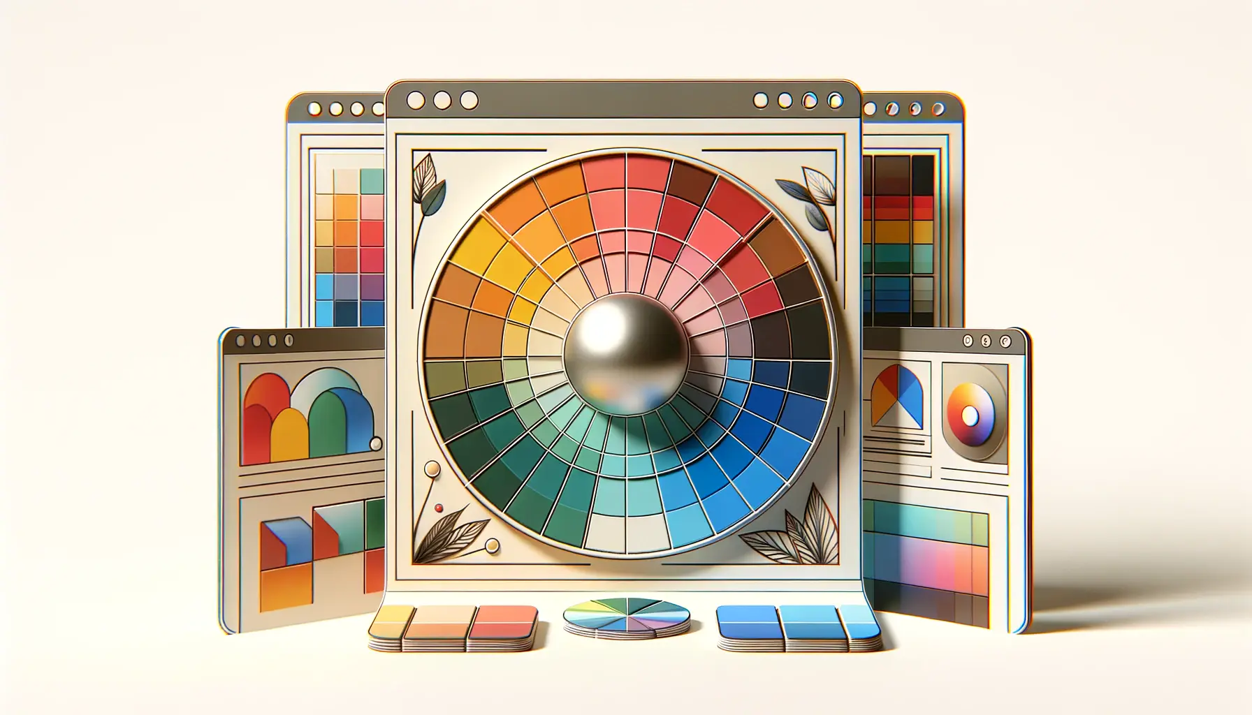
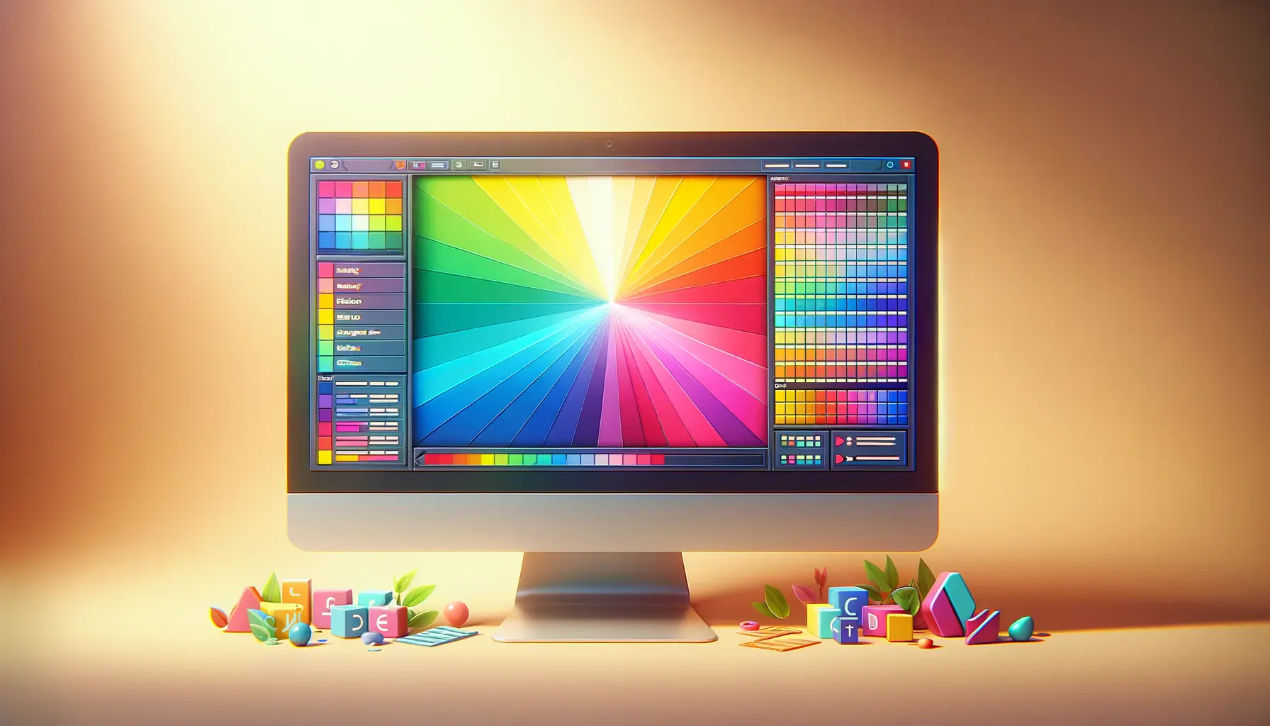
The color wheel is an indispensable tool for web designers, serving as a visual representation of colors and their relationships.
Originating from Sir Isaac Newton’s experiments with prisms, the color wheel features primary, secondary, and tertiary colors, providing a foundation for creating color schemes.
Primary colors — red, blue, and yellow — are the building blocks from which all other colors derive.
By mixing primary colors, we obtain secondary colors (green, orange, and purple), and further mixing leads to the creation of tertiary colors, offering a wide palette for designers to work with.
Utilizing the color wheel, designers can explore various color harmonies, such as complementary, analogous, and triadic schemes, each offering distinct visual effects and emotional resonances.
Complementary colors, found directly opposite each other on the wheel, create vibrant contrasts perfect for highlighting key elements.
Analogous colors, adjacent on the wheel, offer a more harmonious and unified look, ideal for creating a soothing user experience.
Triadic schemes, involving three evenly spaced colors, balance contrast and harmony, adding visual interest without overwhelming the viewer.
The Psychological Impact of Colors
Colors evoke emotional responses and can significantly impact a user’s perception of a website.
Understanding color psychology is crucial for web designers aiming to convey the right message and mood.
For instance, blue is often associated with trust and professionalism, making it a popular choice for corporate and financial websites.
Green, symbolizing growth and renewal, is frequently used for environmental and wellness sites.
Red, a color of passion and urgency, can be effective for call-to-action buttons, drawing attention and prompting action.
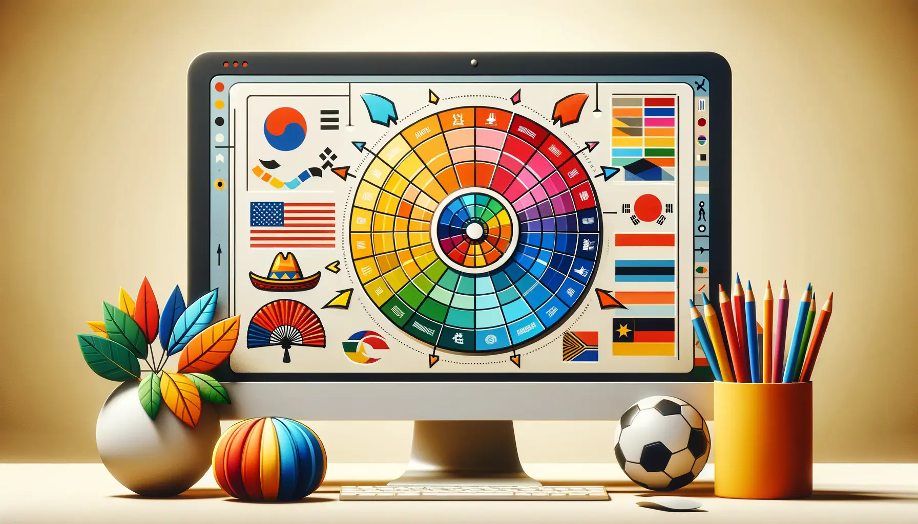
However, the psychological effects of colors can vary based on cultural differences and personal experiences, making it important for designers to consider their target audience when choosing a color scheme.
Incorporating color psychology into web design not only enhances aesthetic appeal but also supports the website’s goals, whether to calm, excite, or motivate users.
Remember, the ultimate goal of applying color theory in web design is not just to create a visually appealing site but to use color strategically to enhance user experience and support the site’s objectives.
Creating Cohesive Color Schemes
Developing a cohesive color scheme is more than just selecting colors that look good together; it’s about creating a visual experience that enhances the website’s message and functionality.
A well-thought-out color scheme can guide users through a site, emphasize important information, and contribute to the site’s overall usability.
Here are steps and considerations for creating cohesive color schemes in web design:
Step 1: Define the Website’s Purpose and Audience
Before diving into color choices, it’s essential to understand the website’s purpose and target audience.
The colors that appeal to a tech-savvy younger demographic may differ significantly from those that resonate with a more conservative, older audience.
Additionally, the website’s purpose—whether to inform, entertain, sell, or educate—should guide the color scheme to ensure it aligns with the desired user actions and emotions.
Step 2: Choose Your Base Color
Selecting a base color is the starting point for building your color scheme.
This color should reflect the brand’s identity and the emotional tone you want to set for the website.
Consider the psychological implications of your base color and how it will be perceived by your target audience.
The base color will dominate your design, so it’s crucial to choose one that supports the website’s goals.
Step 3: Build Your Color Scheme
With a base color in place, the next step is to build out the rest of your color scheme by adding complementary, analogous, or triadic colors.
Here are some strategies for each approach:
- Complementary Colors: For a scheme that pops, look to the color wheel and select colors directly opposite your base color. This approach is excellent for creating high contrast and drawing attention to key elements.
- Analogous Colors: Choose colors that are next to your base color on the wheel for a more harmonious and unified design. This scheme works well for sites aiming for a subtle and cohesive look.
- Triadic Colors: Select three colors that are evenly spaced around the color wheel to introduce vibrant diversity while maintaining balance. This scheme is ideal for dynamic and engaging websites.
Step 4: Incorporate Neutral Colors
Neutral colors like white, black, gray, and beige can provide balance and breathing room in your design.
They help to break up the color scheme and offer a backdrop against which your primary and secondary colors can stand out.
Use neutrals for background areas, text, and other elements where you want to avoid overwhelming the user with color.
Incorporating texture and patterns with your color scheme can add depth and interest to your design, making the website more engaging and visually appealing.
Applying Color to Enhance Usability and Accessibility
The application of color in web design extends beyond aesthetics, playing a crucial role in enhancing a website’s usability and accessibility.
Thoughtful use of color can guide users through a site, communicate information hierarchy, and ensure that content is accessible to everyone, including those with visual impairments.
Here’s how to leverage color to improve usability and accessibility:
Color can serve as a powerful tool for creating visual hierarchies, distinguishing between different types of content, and guiding users’ attention to the most important elements on a page.
For instance, using a contrasting color for call-to-action buttons makes them stand out and encourages clicks, while subtle background colors can differentiate sections of content without overwhelming users.
Ensuring Sufficient Color Contrast
One of the key considerations for accessibility is ensuring that there is sufficient contrast between text and its background color.
This not only helps users with visual impairments but also improves readability for everyone, especially in conditions of low light or on small screens.
The Web Content Accessibility Guidelines (WCAG) recommend a contrast ratio of at least 4.5:1 for normal text and 3:1 for large text.
Using Color to Signal Interactivity
Color can indicate interactivity, such as links, buttons, and actionable items.
Consistently using a specific color for these elements across your website can help users quickly understand what actions they can take.
However, it’s important to use more than just color to denote interactivity to accommodate color-blind users.
Underlining links or changing the shape or size of buttons upon hover are effective strategies to complement color cues.
Avoiding Color-Dependent Information
Reliance on color alone to convey information can alienate users who are color blind or have difficulty distinguishing certain colors.
Ensure that color is not the sole method of conveying critical information.
For example, instead of using only color to indicate form input errors, include an icon or text label as well.
This approach ensures that all users, regardless of their ability to perceive color, can navigate and understand your website.
- Test your website with various color blindness simulators to understand how your color choices affect visibility for users with color vision deficiencies.
- Employ tools and plugins to check the color contrast of your website against accessibility standards.
- Consider offering a high-contrast mode or allowing users to customize color settings to accommodate their preferences and needs.
Proper use of color improves not only the aesthetic appeal of a website but also its functionality and inclusivity, making the web a more accessible place for everyone.
Color Trends and Innovations in Web Design
The digital landscape is continually evolving, and with it, the trends and innovations in web design color schemes.
Staying abreast of these changes can inspire designers to push creative boundaries and craft websites that not only look contemporary but also engage users on a deeper level.
Let’s explore some of the most compelling color trends and innovations currently shaping the world of web design.
Embracing Bold and Saturated Colors
One of the standout trends in recent years is the shift towards bold and saturated colors.
This trend reflects a move away from the minimalist color palettes that have dominated web design for years, towards more vibrant and dynamic schemes.
Bold colors are used to capture attention, evoke emotion, and make a statement.
When used strategically, these colors can create visually striking designs that are unforgettable and convey a brand’s personality powerfully.
Gradient Revival
Gradients have made a significant comeback, offering a fresh way to add depth, texture, and intrigue to web designs.
Modern gradients are more subtle and sophisticated than their predecessors, blending multiple hues seamlessly to create a gradient effect that is both eye-catching and elegant.
Designers are experimenting with gradients in backgrounds, overlays, and even text, using them to add dimension and a sense of movement to flat designs.
Dark Mode and Low Light User Interfaces
The popularity of dark mode and low light user interfaces continues to rise, driven by user demand for interfaces that are easy on the eyes, especially in low-light environments.
Dark backgrounds paired with light text not only reduce eye strain but also make colors pop, creating a dramatic and stylish aesthetic.
Many websites now offer a dark mode option, allowing users to switch according to their preference or ambient lighting conditions.
Pastel Palettes and Soft Color Schemes
In contrast to the bold color trend, there’s also a growing preference for pastel palettes and soft color schemes.
These colors offer a calming and soothing visual experience, ideal for wellness brands, blogs, and any site aiming to create a tranquil space online.
Pastel colors can be paired with minimalist design elements to achieve a modern and understated look that still feels warm and inviting.
- Experiment with combining bold colors and pastels to create unique and engaging color schemes.
- Incorporate gradients as a tool to blend colors harmoniously and add visual interest to your designs.
- Consider the functional benefits of dark mode and how it can enhance the user experience on your website.
Staying informed about current color trends and innovations allows web designers to create sites that are not only visually appealing but also resonate with today’s audiences.
Integrating Color Theory with Brand Identity
Color is a fundamental component of brand identity, serving as a silent yet powerful communicator that conveys a brand’s values, personality, and positioning.
The strategic integration of color theory with brand identity in web design is crucial for creating a cohesive and memorable online presence.
This alignment ensures that every hue, shade, and tint reflects the essence of the brand, fostering a strong connection with the target audience.
Consistency Across All Touchpoints
A consistent color scheme across all brand touchpoints, including the website, packaging, marketing materials, and social media, reinforces brand recognition and loyalty.
Consistency helps to build a strong visual identity that customers can easily identify and remember.
When users visit a website, the colors should immediately resonate with the brand’s known visual language, creating a seamless experience from offline to online.
Color Choices Reflecting Brand Personality
The colors chosen for a website should mirror the brand’s personality, whether it’s energetic and bold, trustworthy and calm, or innovative and creative.
For instance, a tech company aiming to highlight its cutting-edge solutions might opt for cool blues and greys, symbolizing precision and professionalism.
In contrast, a children’s toy brand could choose vibrant yellows and reds to convey fun and excitement.
The key is to select colors that embody the characteristics and emotions you want associated with your brand.
Emotional Connection Through Color
Colors have the power to evoke emotions and feelings, making them a vital tool in establishing an emotional connection with the audience.
By understanding the psychological effects of different colors, brands can strategically use them to influence perceptions and behaviors.
A health and wellness brand might use green to emphasize natural and growth aspects, aiming to evoke feelings of tranquility and renewal among its audience.
- Conduct research to understand the emotional and psychological associations of different colors within your target market.
- Develop a color palette that not only aligns with your brand identity but also enhances the user experience on your website.
- Use color strategically to highlight key messages and calls to action, guiding users towards desired interactions.
The thoughtful integration of color theory and brand identity in web design not only strengthens brand recognition but also deepens the emotional bond with the audience, enhancing the overall impact of your online presence.
Optimizing Color for Web Performance and SEO
In the digital age, where speed and efficiency are paramount, optimizing color usage for web performance and search engine optimization (SEO) is essential.
The right color optimization strategies can significantly reduce page load times, improve user experience, and enhance a website’s visibility on search engines.
Here’s how to balance aesthetic appeal with performance and SEO considerations.
Minimizing File Sizes with Color Optimization
High-quality images and graphics can enhance a website’s visual appeal but may also lead to increased page load times.
Optimizing these elements by reducing file sizes without compromising quality is crucial.
One effective strategy is to use color palettes that compress well.
For instance, limiting the number of colors in images can reduce file sizes, making pages load faster and improving the site’s performance.
Additionally, utilizing CSS3 properties for creating gradients and shadows instead of relying on image files can further reduce the need for large image files.
This approach not only speeds up loading times but also keeps the design scalable and responsive across different devices.
Leveraging Color for SEO
While color itself is not a direct ranking factor in SEO, its impact on user experience and engagement metrics can influence a website’s search engine performance.
Websites that are visually appealing and easy to navigate tend to have lower bounce rates and higher engagement rates, signals that search engines use to gauge the quality and relevance of a site.
Ensuring that color contrasts and schemes enhance readability and accessibility can also impact SEO.
Search engines favor websites that provide a good user experience, including those that are accessible to users with visual impairments.
Implementing proper color contrast ratios ensures that text is easily readable, which can improve on-page SEO and user engagement.
- Use web-safe colors and CSS optimization techniques to reduce loading times and improve website performance.
- Consider the impact of color on user experience metrics like bounce rate and time on site, which can influence SEO.
- Implement accessibility best practices in your color choices to enhance SEO and cater to a broader audience.
Neglecting the impact of color on website performance and SEO can lead to missed opportunities for improving search rankings and user engagement.
Enhancing User Experience with Strategic Color Use
The strategic use of color in web design goes beyond mere aesthetics, playing a crucial role in enhancing the overall user experience (UX).
By carefully selecting and applying colors, designers can create intuitive navigation paths, emphasize important content, and influence user actions and decisions.
This section explores how color can be effectively used to improve UX and ensure a positive interaction with your website.
Guiding Users with Color Cues
Color can act as a visual cue to guide users through a website’s content and functionalities.
For example, using a consistent color for all call-to-action (CTA) buttons across a site can help users quickly identify where to click to take the next step, whether it’s making a purchase, signing up for a newsletter, or downloading a resource.
Similarly, color differentiation can be used to distinguish between different types of content, such as articles, videos, and infographics, making it easier for users to find what they’re looking for.
Improving Navigation and Readability
A well-thought-out color scheme can significantly improve a website’s navigation and readability.
Contrasting colors can highlight navigation menus and make them stand out from the rest of the page, while background and text color choices can affect readability.
Light text on a dark background or vice versa can ensure that content is easy on the eyes, reducing strain and enhancing the reading experience.
Additionally, using color to create visual hierarchies can help users prioritize information and understand content structure at a glance.
Creating Emotional Connections
Color has the power to evoke emotions and create an atmosphere that can enhance the user’s connection to a website.
Warm colors can create a sense of comfort and welcome, encouraging users to stay longer and explore, while cool colors can convey professionalism and trustworthiness, building confidence in a brand.
By aligning color choices with the emotional tone of the website content, designers can create a more engaging and memorable user experience.
- Utilize color psychology to evoke specific emotions and create a connection with your audience.
- Apply color strategically to highlight key information and guide users through the conversion funnel.
- Ensure color choices improve readability and navigability, contributing to a positive and seamless user experience.
Considering color not just as a design element but as a tool for enhancing user experience can transform how users interact with your website, making it more intuitive, engaging, and effective.
Conclusion: The Power of Color Theory in Web Design
Throughout this exploration of color theory in web design, we’ve uncovered the profound impact that color has on user experience, brand identity, and overall website effectiveness.
From the basics of the color wheel to the latest trends in color usage, it’s clear that understanding and applying color theory is not just an art form but a strategic tool that can significantly influence the success of a website.
Key Takeaways
Creating a cohesive look with color theory in web design is more than just an aesthetic choice; it’s a critical component of effective web design that engages users, communicates brand values, and guides user behavior.
The strategic use of color can enhance usability, improve accessibility, and contribute to a site’s SEO performance.
Moreover, by staying informed about color trends and innovations, web designers can ensure that their sites remain relevant and appealing to modern audiences.
Strategic Implementation for Maximum Impact
To harness the full potential of color theory in web design, it’s essential to:
- Understand the psychological effects of colors and use them to evoke the desired emotional response from the target audience.
- Ensure color choices align with the brand’s identity and values for a consistent and recognizable online presence.
- Optimize color usage for web performance and SEO, balancing visual appeal with technical efficiency.
- Apply color strategically to improve user experience, making websites more intuitive, accessible, and engaging.
In conclusion, the thoughtful application of color theory in web design is indispensable for creating visually appealing, cohesive, and effective websites.
By considering color not just as a design element but as a vital component of web design strategy, designers can craft experiences that captivate, communicate, and convert.
As we continue to navigate the ever-evolving landscape of web design, the principles of color theory remain a constant source of inspiration and innovation, empowering designers to create works that resonate deeply with users and stand the test of time.
Quality web design is key for a great website! Check out our service page to partner with an expert web design agency.
FAQs on Color Theory in Web Design
Explore common questions about integrating color theory into web design to create visually appealing and effective websites.
Color theory in web design is the study of how color combinations affect user experience, emphasizing visual harmony, usability, and branding.
Start with your brand’s identity and target audience, then use the color wheel to select complementary, analogous, or triadic schemes.
The 60/30/10 rule is a guideline for balancing colors: 60% dominant shade, 30% secondary color, and 10% accent color to create visual interest.
Yes, color choices can significantly impact usability by improving readability, guiding user navigation, and highlighting important elements.
Color contrast enhances readability and accessibility, making content more visible and understandable to users with visual impairments.
Color theory helps create a visual identity that reflects a brand’s values and personality, fostering recognition and emotional connections with the audience.
Color psychology studies how colors evoke emotions and behaviors, allowing designers to use color strategically to influence user perceptions and actions.
Use sufficient color contrast, avoid color-dependent information, and test your design for accessibility to ensure it’s perceivable by all users.
