Welcome to the vibrant world of color theory!
Whether you’re a budding designer, an aspiring artist, or simply curious about how colors work together, understanding color theory is essential.
This guide is designed to take beginners through the fundamentals of color theory, breaking down complex concepts into easy-to-understand steps.
By exploring the science and art behind colors, we aim to provide valuable insights that will enhance your creative projects and deepen your appreciation for the colors that surround us.
Color theory is not just about mixing paints or choosing colors for a design—it’s about communicating feelings, invoking emotions, and creating effective compositions.
Through this guide, you’ll learn how colors interact, influence each other, and affect the viewer.
With a focus on practical applications and real-world examples, we’ll explore how to use color theory to make informed decisions in your art and design work.
- Understanding the Color Wheel
- Exploring Color Harmony
- The Psychology of Color
- Color in Branding and Marketing
- Impact of Color on Web Design and User Experience
- Color Trends and Their Influence
- Integrating Color Theory into Creative Projects
- Embracing Color Theory for Creative Mastery
- Color Theory for Beginners: Frequently Asked Questions
Understanding the Color Wheel
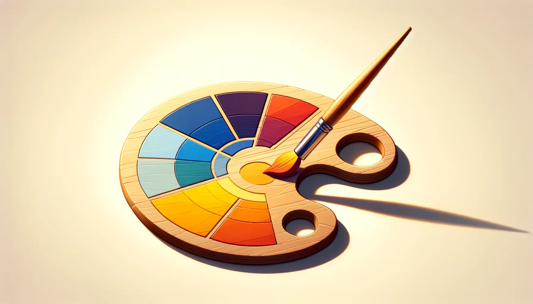
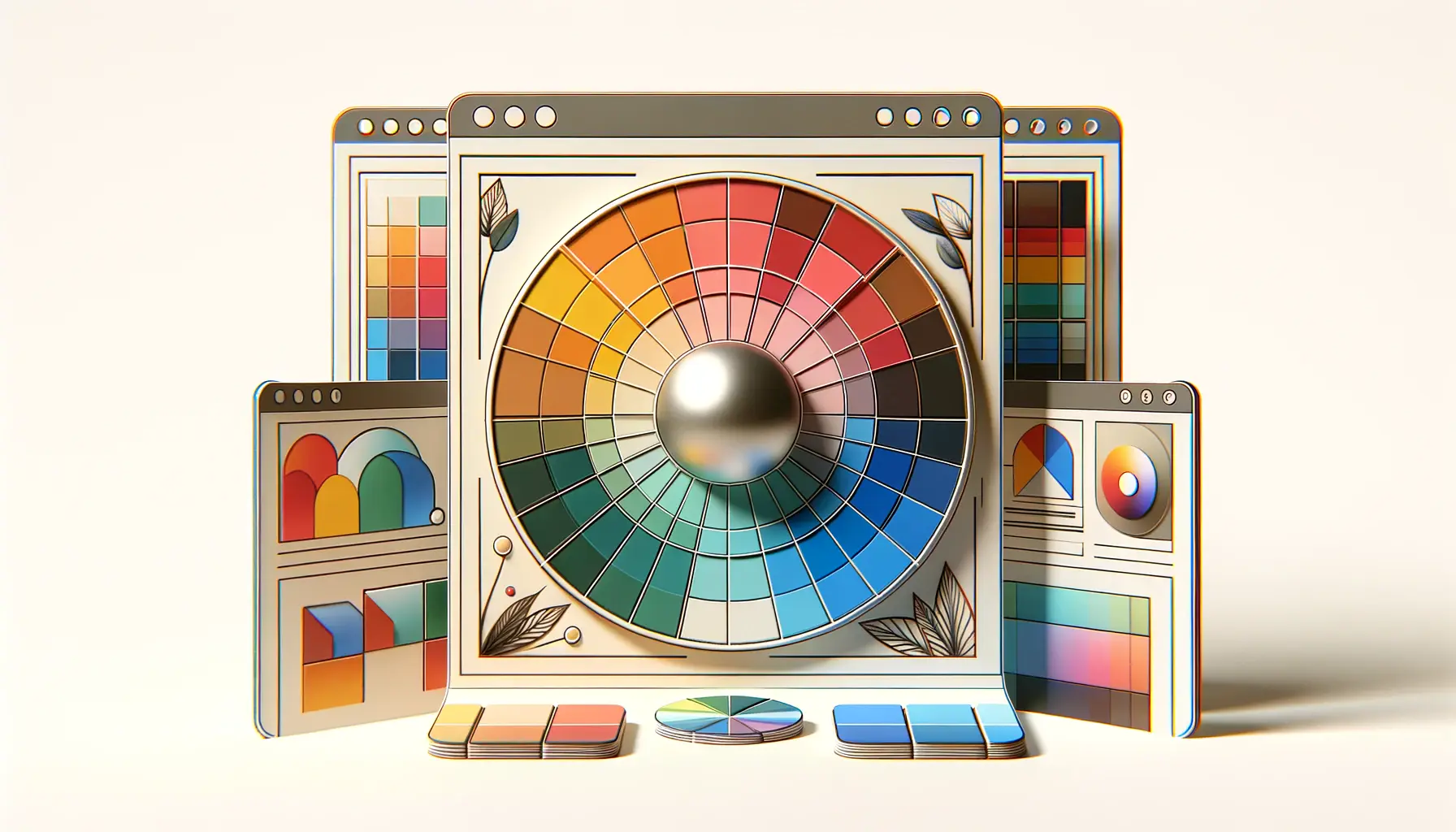
The color wheel is the cornerstone of color theory, serving as a visual representation of colors and their relationships.
Created by Sir Isaac Newton in the 17th century, the color wheel organizes colors in a circle, allowing us to see how they relate to each other.
At its most basic, the color wheel consists of three primary colors—red, yellow, and blue—from which all other colors are derived.
Secondary colors—green, orange, and purple—are created by mixing two primary colors.
Tertiary colors, such as red-orange or blue-green, are formed by mixing a primary color with a secondary color.
Understanding the color wheel is crucial for beginners as it provides a foundation for exploring color harmony, contrast, and balance in your projects.
Primary Colors
Primary colors are the building blocks of the color wheel.
They cannot be created by mixing other colors and are central to color theory.
Red, yellow, and blue are the traditional primary colors that, when combined in various ways, can produce a wide range of other colors.
These colors are powerful tools for artists and designers, as they offer pure and vibrant hues that can be used to attract attention and create impact.
Secondary and Tertiary Colors
Secondary colors are created by mixing two primary colors in equal parts.
For example, mixing red and yellow produces orange, blue and yellow make green, and red and blue create purple.
Tertiary colors take this a step further by blending a primary color with a secondary color, resulting in hues like yellow-orange or blue-violet.
These colors allow for more nuanced and subtle variations in design and art, providing a broader palette for creative expression.
The color wheel is an essential tool for understanding and applying color theory effectively. By mastering the relationships between colors, beginners can create more cohesive, dynamic, and visually appealing works of art and design.
Exploring Color Harmony
Color harmony is a principle of color theory that involves combining colors in a way that is pleasing to the eye.
Achieving color harmony in your designs or artworks can significantly enhance their aesthetic appeal and effectiveness.
There are several methods to achieve color harmony, each based on the color wheel and the relationships between colors.
Understanding and applying these harmonious color schemes can transform your projects, making them more visually engaging and emotionally resonant with your audience.
Let’s delve into some of the most popular color schemes that promote harmony.
Complementary Colors
Complementary colors are directly opposite each other on the color wheel, such as red and green or blue and orange.
This scheme offers a high contrast and vibrant look, especially when used at full saturation.
Complementary colors are excellent for creating focus and drawing attention to specific elements within a design or artwork.
- How to Use: Utilize one color as the dominant hue and the other as an accent to create a dynamic and balanced composition.
- Applications: Ideal for logos, advertisements, and any project where you want to make a bold statement.
Analogous Colors
Analogous color schemes involve colors that are next to each other on the color wheel, such as blue, blue-green, and green.
This scheme is often found in nature and is harmonious and pleasing to the eye, creating serene and comfortable designs.
- How to Use: Choose one color to dominate, a second to support, and a third for accents.
- Applications: Perfect for creating a cohesive look in interior design, web design, and landscapes.
Triadic Colors
Triadic color schemes are vibrant and offer a higher degree of contrast while retaining harmony.
This scheme uses colors that are evenly spaced around the color wheel, such as red, yellow, and blue.
Triadic schemes are great for creating a lively and colorful look.
- How to Use: Balance your colors carefully, allowing one to dominate and the others to complement.
- Applications: Useful in children’s products, websites, and any project that aims to be energetic and fun.
Experimenting with different color schemes can significantly impact the mood and effectiveness of your work. Consider the emotional response you want to evoke in your audience when choosing your colors.
The Psychology of Color
Colors have the power to influence our emotions and behaviors, making the psychology of color a crucial aspect of color theory for beginners.
Understanding how different colors can affect mood and perception is essential for artists and designers, as it allows them to use color more effectively in their work.
Let’s explore how some common colors can impact viewers and how you can apply this knowledge to your projects.
Warm Colors: Red, Orange, Yellow
Warm colors are often associated with energy, passion, and happiness.
They can stimulate emotions ranging from feelings of warmth and comfort to feelings of anger and hostility.
- Red: Evokes strong emotions such as love, passion, and danger. It’s attention-grabbing and is often used to signal importance and command action.
- Orange: Seen as friendly and inviting, orange combines the energy of red and the happiness of yellow. It’s often used to draw attention and express creativity.
- Yellow: Associated with happiness, optimism, and warmth. However, it can also signify caution and is used to create a sense of energy and liveliness.
Cool Colors: Green, Blue, Purple
Cool colors are generally calming and soothing but can also express sadness.
They are often used to create a sense of tranquility and professionalism.
- Green: Symbolizes nature, health, and renewal. It’s the easiest color on the eyes and can be used to indicate safety or to promote environmental issues.
- Blue: Represents calmness, stability, and trust. It’s often used in corporate designs to convey professionalism and credibility.
- Purple: Associated with royalty, luxury, and wisdom. It combines the stability of blue and the energy of red.
Neutral Colors: Black, White, Gray, Brown
Neutral colors are versatile and can be used to ground or balance out more vibrant color schemes.
They are often associated with simplicity, sophistication, and elegance.
- Black: Represents power, elegance, and mystery. It’s a popular choice for typography and background colors due to its strong contrast with other colors.
- White: Symbolizes purity, cleanliness, and simplicity. It’s often used to create a sense of space and minimalism.
- Gray: Seen as a color of neutrality and balance, gray can be used to create a professional and sophisticated look.
- Brown: Evokes a sense of stability and wholesomeness. It’s often associated with the earth and can be used to convey reliability and comfort.
The emotional impact of color is subjective and can vary based on personal experiences and cultural differences. Always consider your target audience when choosing colors for your projects.
Color in Branding and Marketing
Color plays a pivotal role in branding and marketing, as it can significantly influence consumer perceptions and decision-making processes.
The right color choices can enhance brand recognition, establish identity, and convey specific messages or emotions.
Let’s delve into how color theory is applied in branding and marketing and the impact it has on consumer behavior.
Brand Identity and Recognition
Colors are a key element of brand identity, helping to make brands memorable and distinguishable from competitors.
A brand’s color palette can evoke particular feelings and associations in the consumer’s mind, making it a powerful tool for building brand personality.
For instance, a brand that uses green in its logo and branding materials might be perceived as eco-friendly, natural, or growth-oriented.
Consistent use of specific colors can enhance brand recognition.
Studies have shown that color increases brand recognition by up to 80%.
This is why major brands carefully select their colors to ensure they align with their brand values and target audience’s expectations.
Influencing Consumer Behavior
Colors not only help in making a brand visually appealing but also play a significant role in influencing consumer behavior and decision-making.
Different colors can trigger different responses, such as urgency, calmness, or happiness, which can affect consumers’ willingness to purchase a product.
- Red is often used in clearance sales because it creates a sense of urgency and excitement.
- Blue is frequently used by banks and businesses to evoke trust and reliability.
- Yellow, being an optimistic color, is used to grab attention and make window shoppers feel happier.
Choosing the Right Colors for Your Brand
Selecting the right colors for your brand requires understanding your brand’s core values, the message you want to convey, and the emotions you wish to evoke in your target audience.
It’s also important to consider cultural differences in color perception, as colors can have different meanings in different cultures.
Conducting market research and testing different color schemes with your target audience can provide valuable insights into their preferences and how they perceive your brand based on color.
This data-driven approach ensures that the colors you choose align with your branding goals and resonate with your audience.
The strategic use of color in branding and marketing can significantly enhance customer engagement and brand loyalty. By understanding the psychological effects of colors, brands can create more effective marketing strategies and connect with their audience on a deeper level.
Impact of Color on Web Design and User Experience
The influence of color extends into the digital realm, profoundly affecting web design and user experience (UX).
The right color scheme can make a website more inviting, guide users’ attention to important elements, and improve usability.
Conversely, poor color choices can lead to visual confusion, reduced engagement, and even drive visitors away.
Let’s explore how color theory plays a crucial role in creating effective and aesthetically pleasing websites.
Enhancing Usability and Accessibility
Color can significantly enhance the usability and accessibility of a website.
By using contrasting colors for text and backgrounds, web designers can improve readability and make content more accessible to everyone, including individuals with visual impairments.
For example, high contrast color combinations, such as black text on a white background, are not only visually appealing but also ensure that information is easy to read.
Additionally, the use of color can guide users through a website, highlighting buttons, links, and calls to action (CTAs).
Strategic color placement can draw attention to specific areas, helping users navigate the site more intuitively and complete desired actions, such as making a purchase or signing up for a newsletter.
Creating Emotional Connections
Colors have the power to evoke emotions and create an atmosphere that reflects the website’s purpose and brand identity.
For instance, a website that uses soft, pastel colors may create a calming and welcoming atmosphere, suitable for wellness or childcare brands.
On the other hand, a website with bold and vibrant colors might convey energy and excitement, ideal for entertainment or sports-related content.
Understanding the emotional impact of different colors and their combinations allows web designers to create spaces that resonate with the website’s target audience, fostering a deeper connection between the user and the brand.
Improving Conversion Rates
The strategic use of color can also influence user behavior and improve conversion rates.
Colors can make CTAs stand out, encourage users to take action, and even affect their decision-making process.
For example, red is often used for CTAs because it is eye-catching and can evoke feelings of urgency.
Meanwhile, green, associated with positive actions and safety, can be effective for checkout buttons or confirmation messages.
Testing different color schemes and analyzing user interaction data can help identify the most effective colors for achieving specific goals, such as increasing sign-ups, sales, or engagement on a website.
In web design and UX, color is not just an aesthetic choice but a functional tool that can enhance user satisfaction, improve accessibility, and drive conversions. By applying principles of color theory, designers can create more effective and engaging digital experiences.
Color Trends and Their Influence
Just like in fashion, interior design, and other creative fields, color trends play a significant role in the visual arts and design industries.
These trends can influence consumer preferences, dictate design aesthetics, and even impact the cultural zeitgeist.
Understanding current color trends is crucial for designers, artists, and marketers to stay relevant and connect with their audience on a contemporary level.
Identifying Color Trends
Color trends often emerge from a variety of sources, including fashion runways, technological innovations, socio-economic conditions, and environmental concerns.
Designers and color experts like Pantone analyze these influences to predict the colors that will resonate with the public in the coming seasons.
- Fashion Industry: Often leads the way in color innovation, with designers showcasing new palettes in their collections.
- Technology: Advances can introduce new materials and finishes that inspire fresh color choices.
- Social Media: Platforms can rapidly accelerate the popularity of certain colors through viral content and influencer marketing.
Impact on Design and Marketing
The adoption of color trends can significantly impact design and marketing strategies.
Incorporating trendy colors can make products, advertisements, and designs feel more current, appealing to consumers’ desire for the new and now.
However, it’s important to balance trendiness with brand identity to ensure consistency and authenticity.
- Product Design: Utilizing trendy colors can increase the appeal and perceived value of products.
- Branding and Advertising: Refreshing brand colors or campaign palettes can attract attention and reinvigorate consumer interest.
- Web Design: Updating website colors can improve user engagement and reflect a brand’s awareness of current trends.
Navigating Color Trends Wisely
While staying abreast of color trends is important, it’s equally crucial to use them wisely.
Trends should complement the brand’s existing palette and not feel forced or out of place.
Designers should consider the longevity of a trend and whether it aligns with the brand’s values and target audience’s preferences.
- Research: Understand the origin and meaning behind a trend to assess its relevance to your project.
- Experimentation: Test trendy colors in small doses or limited editions before fully committing.
- Balance: Combine trendy colors with timeless hues to create a balanced and adaptable color scheme.
Chasing after every color trend can lead to a disjointed brand identity and confuse your audience. Instead, use trends as a source of inspiration rather than a strict guideline to follow.
Integrating Color Theory into Creative Projects
Applying color theory effectively can transform your creative projects, whether you’re designing a brand identity, painting a landscape, or decorating an interior space.
By understanding and utilizing the principles of color theory, you can create compositions that are visually appealing, emotionally resonant, and conceptually strong.
Here are practical tips for integrating color theory into your creative endeavors.
Start with a Color Plan
Before diving into your project, develop a color plan that aligns with your goals and the message you want to convey.
Consider the emotions and reactions you aim to evoke in your audience.
Use the color wheel as a guide to choose a color scheme that supports your project’s theme and purpose.
- Define the Mood: Decide on the emotional impact you want your project to have and select colors that contribute to this mood.
- Select a Color Scheme: Choose a harmonious, complementary, or contrasting color scheme based on the color wheel to enhance your project’s aesthetic appeal.
Experiment with Color Variations
Don’t be afraid to experiment with different shades, tints, and tones of your chosen colors.
Variation can add depth and interest to your work, making it more dynamic and engaging.
Use lighter tints for a softer, more delicate feel, or darker shades for a more dramatic and intense effect.
- Shades: Add black to a color to create shades that can add sophistication and depth.
- Tints: Mix in white to lighten colors, which can help achieve a more airy and tranquil atmosphere.
- Tones: Incorporate gray to adjust the intensity of a color, creating a more subdued and harmonious look.
Consider the Context and Lighting
The context in which colors are used and the lighting conditions can significantly affect how colors are perceived.
Always consider the environment and lighting when selecting colors for your project.
Natural light can reveal the true color, while artificial lighting can alter how a color appears.
- Contextual Harmony: Ensure your colors complement the surrounding environment and other elements within your project.
- Lighting Conditions: Test your colors in different lighting conditions to ensure they maintain their desired effect and harmony.
Collect Feedback and Iterate
Once you’ve applied your color choices, gather feedback from peers, clients, or your target audience.
Use this feedback to refine your color selections and make adjustments as needed.
The iterative process allows you to fine-tune your project, ensuring the colors effectively convey your intended message and evoke the desired emotional response.
- Seek Diverse Opinions: Different people can perceive colors differently, so gathering a range of feedback can provide valuable insights.
- Iterate and Refine: Be open to making changes based on feedback to enhance the overall impact of your project.
Color theory is a powerful tool in the creative process, offering endless possibilities for expression and communication. By thoughtfully applying color theory principles, you can elevate your projects and connect with your audience on a deeper level.
Embracing Color Theory for Creative Mastery
Throughout this journey into the world of color theory for beginners, we’ve explored the foundational elements that make color such a pivotal aspect of design, art, and visual communication.
From the basics of the color wheel to the complex psychological impacts of color, it’s clear that understanding color theory is not just beneficial but essential for anyone looking to excel in creative fields.
The power of color to influence mood, convey messages, and create harmony makes it a tool of immense potential for artists, designers, and marketers alike.
The Enduring Impact of Color
As we’ve seen, color theory extends far beyond simple color selection.
It encompasses the strategic application of color to evoke specific responses, enhance usability, and ensure that creative projects resonate with their intended audiences.
The thoughtful integration of color theory into your work can elevate your projects from ordinary to extraordinary, enabling you to communicate more effectively and connect with viewers on an emotional level.
Key Takeaways for Aspiring Creatives
- Understanding the color wheel and color relationships is the first step in mastering color theory.
- Color harmony, contrast, and schemes are tools that can dramatically enhance the visual appeal of your projects.
- The psychological effects of color can influence perception and behavior, making color choice a critical consideration in design and marketing.
- Staying informed about color trends can keep your work relevant, but always prioritize your unique brand identity and message.
- Practical application and experimentation with color will refine your skills and deepen your understanding of color theory.
In conclusion, color theory for beginners is a gateway to a more profound understanding of how color shapes our world and our experiences within it.
By embracing the principles of color theory, you can unlock new levels of creativity and effectiveness in your work, whether you’re designing a website, crafting a brand identity, or creating a piece of art.
Remember, color is not just a visual element but a language of its own, capable of telling stories, evoking emotions, and transforming perceptions.
As you continue to explore and apply color theory, let your curiosity and creativity lead the way to discovering the full spectrum of possibilities that color offers.
Quality web design is key for a great website! Check out our service page to partner with an expert web design agency.
Color Theory for Beginners: Frequently Asked Questions
Embarking on the journey of understanding color theory can raise many questions. Here are answers to some of the most frequently asked questions that can help beginners navigate the colorful world of color theory effectively.
Color theory is the study of colors and their interactions, focusing on creating harmonious color combinations and understanding the emotional effects of colors.
The color wheel visually organizes colors, showing relationships between primary, secondary, and tertiary colors, and is essential for understanding color harmony.
Primary colors are the basis from which other colors are made. Mixing two primaries gives secondary colors, and mixing a primary with a secondary yields tertiary colors.
Complementary colors are opposite each other on the color wheel, offering high contrast and vibrant visual effects when used together.
Color theory guides the selection of colors to evoke specific emotions and associations, significantly impacting brand identity and consumer behavior.
Color psychology studies how colors affect human behavior and emotions, allowing designers to use color strategically to influence audience perception.
Yes, color trends can shape design preferences and decisions, helping creators stay relevant and connect with current audience tastes.
Beginners should experiment with color combinations, study the color wheel, and observe the use of color in various forms of art and design.
