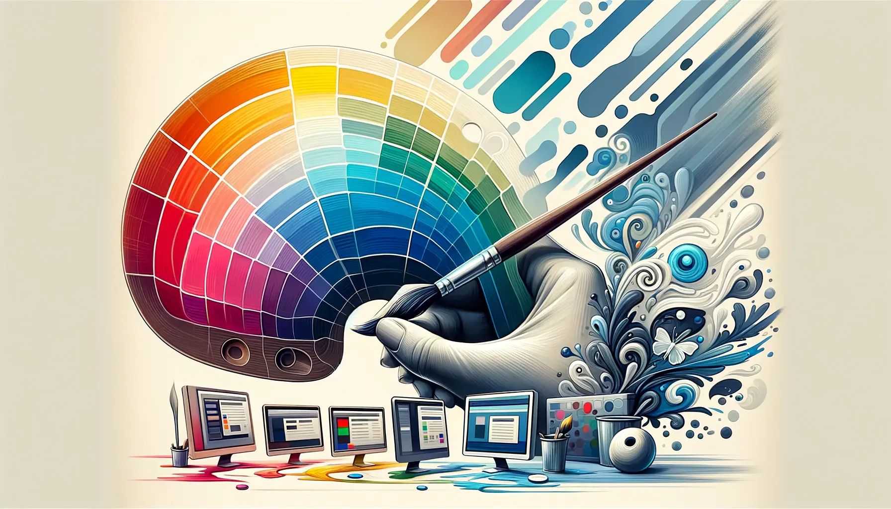
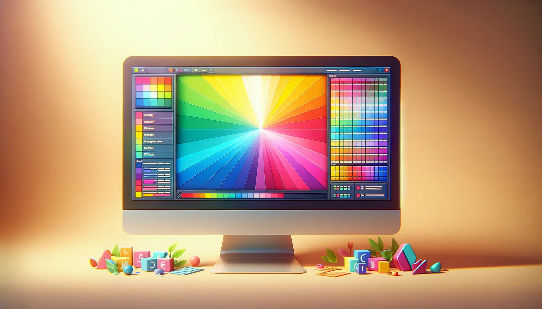
Color theory plays a pivotal role in web design, influencing how users perceive and interact with digital spaces.
It’s not just about making a website look attractive; it’s about using color strategically to communicate, engage, and even affect the mood of the viewer.
Applying color theory in web design requires a deep understanding of colors’ psychological effects, cultural connotations, and the technical know-how to blend them seamlessly into user experiences.
This article delves into advanced techniques that elevate the application of color theory in web design, ensuring that every color choice is purposeful and impactful.
The significance of color theory in web design cannot be overstated.
Colors do more than fill space; they create harmony, elicit emotions, and guide the user’s journey through a website.
The right color palette can enhance usability, improve accessibility, and reinforce brand identity.
However, applying color theory effectively demands more than a basic understanding of the color wheel.
It requires an exploration of sophisticated strategies that consider color psychology, visual hierarchy, and the latest web design trends.
By mastering these advanced techniques, designers can craft experiences that resonate deeply with their audience.
- Understanding Color Psychology in Web Design
- Color Harmony and Contrast
- Applying Color in User Interface Design
- Color Accessibility in Web Design
- Incorporating Trends and Innovation in Color Use
- Optimizing Color for Different Devices and Screens
- Effective Color Communication and Collaboration
- Conclusion: Mastering Color Theory in Web Design
- FAQs on Applying Color Theory in Web Design
Understanding Color Psychology in Web Design
Color psychology is a cornerstone of effective web design, offering insights into how different hues can influence emotions and behaviors.
This understanding is crucial for designers aiming to evoke specific feelings or actions from their audience.
For instance, blue is often associated with trust and professionalism, making it a popular choice for corporate websites.
On the other hand, orange can evoke excitement and enthusiasm, ideal for call-to-action buttons or promotional content.
However, applying color psychology goes beyond picking the right colors for the desired emotional impact.
It involves a nuanced approach that considers the brand’s identity, target audience, and cultural context.
Colors that work well for a youthful, energetic brand may not suit a more traditional, conservative company.
Similarly, color perceptions can vary significantly across different cultures, requiring designers to adapt their color choices to their audience’s cultural background.
Strategic Use of Color for Branding
Branding is where color psychology truly shines in web design.
The strategic use of color can reinforce brand identity and ensure consistency across all digital touchpoints.
A well-defined color palette becomes synonymous with the brand, enhancing recognition and recall.
This consistency is key to building trust and loyalty among users, making color an integral part of the branding strategy.
Choosing a color palette that reflects the brand’s values and message is just the beginning.
Designers must also consider how these colors are applied throughout the website to maintain visual harmony and coherence.
This includes not only the primary and secondary colors but also accents and background shades that complement the overall design without overwhelming the content.
Effective application of color psychology can transform a website from merely functional to genuinely compelling, making it a critical skill for advanced web designers.
Color Harmony and Contrast
Creating a visually appealing website involves more than just selecting attractive colors.
It requires the creation of a color scheme that achieves harmony and contrast, guiding the user’s eye and making the content readable and engaging.
Color harmony refers to the aesthetically pleasing combination of colors that work well together, creating a sense of balance and unity in the design.
Contrast, on the other hand, involves using colors of different tones and saturations to make elements stand out and improve legibility.
To achieve color harmony, web designers often rely on color schemes based on the color wheel, such as analogous, complementary, and triadic schemes.
Each of these schemes offers a different approach to combining colors, allowing designers to create a variety of moods and styles.
Contrast is equally important, especially when it comes to text and background colors.
High contrast combinations, such as black text on a white background, ensure that content is easy to read and accessible to users with visual impairments.
Techniques for Achieving Color Harmony
- Analogous Color Scheme: Uses colors that are next to each other on the color wheel, creating a serene and comfortable design.
- Complementary Color Scheme: Combines colors opposite each other on the color wheel for high contrast and vibrant look.
- Triadic Color Scheme: Involves colors that are evenly spaced around the color wheel, offering rich contrast while maintaining harmony.
Enhancing Usability with Contrast
Contrast is not just a tool for aesthetic appeal; it’s essential for creating user-friendly web designs.
By applying high contrast for text and essential elements, designers can enhance the usability of a website.
This is particularly important for navigation elements, call-to-action buttons, and any information critical to the user’s journey.
Effective use of contrast can direct attention, reduce eye strain, and ensure that all users, including those with visual impairments, can navigate the website comfortably.
However, it’s crucial to balance contrast to avoid overwhelming users.
Excessive contrast can be as detrimental as insufficient contrast, leading to visual fatigue and detracting from the overall user experience.
Designers must find the sweet spot that maximizes legibility and engagement without sacrificing comfort.
Balancing color harmony and contrast is key to creating a visually appealing and accessible website.
Applying Color in User Interface Design
Color is a powerful tool in user interface (UI) design, serving not just to beautify a digital product but to enhance its functionality and user experience.
The strategic application of color can help in organizing content, indicating interactivity, and directing user attention to the most important elements on the page.
Understanding how to effectively apply color in UI design is crucial for creating intuitive and efficient digital experiences.
One of the primary roles of color in UI design is to differentiate between different types of information and actions.
For example, color can be used to distinguish between primary, secondary, and tertiary buttons, or to highlight active versus inactive states.
This not only adds visual interest but also aids in navigation, making the interface more user-friendly.
Color for Visual Hierarchy
Visual hierarchy is an essential concept in web design, referring to the arrangement or presentation of elements in a way that implies importance.
Color plays a significant role in establishing this hierarchy, guiding users’ eyes through the content in a logical order.
By using color strategically, designers can highlight key information or calls to action, making it easier for users to understand and interact with the site.
For instance, a brighter color or a more saturated hue can draw attention to a specific element, signaling its importance or functionality.
Conversely, muted or neutral colors can be used for less critical, background elements, ensuring they don’t compete for attention.
Interactive Elements and Feedback
Interactivity is a core aspect of modern web design, and color is a vital tool for indicating interactive elements like links, buttons, and forms.
Using distinct colors for these elements makes it clear to users where they can click, tap, or interact, enhancing the usability of the site.
Additionally, color can provide feedback to user actions, such as changing the color of a button when it’s hovered over or clicked, further improving the interactive experience.
This feedback is crucial for creating an engaging user interface, as it confirms to users that their actions have been recognized, guiding them through the interaction process smoothly and efficiently.
Incorporating color thoughtfully within UI design not only enhances the aesthetic appeal but significantly improves the overall user experience by making interfaces intuitive and easy to navigate.
Color Accessibility in Web Design
Accessibility is a critical consideration in web design, ensuring that digital content is usable by as wide an audience as possible, including those with disabilities.
Color accessibility specifically refers to designing color schemes and interfaces that are perceivable, distinguishable, and understandable to people with color vision deficiencies (CVD) or other visual impairments.
This aspect of web design is not just about social responsibility but also about reaching a broader audience and improving the user experience for everyone.
Designers can employ several strategies to ensure their websites are accessible to users with CVD.
These include choosing color combinations that provide sufficient contrast, using textures or patterns in addition to color to convey information, and ensuring that color is not the sole means of conveying important information.
Strategies for Enhancing Color Accessibility
- Ensure High Contrast: Text and important elements should contrast significantly with their background to be easily readable by everyone, including users with low vision.
- Use Color and Patterns: When color is used to differentiate elements, also use patterns or icons to ensure that the information is accessible to those who cannot rely on color alone.
- Avoid Color-Only Cues: Ensure that information conveyed with color is also available through other means, such as text labels or shapes.
Tools and Testing for Accessibility
Fortunately, there are tools and resources available to help designers test and improve the color accessibility of their websites.
Color contrast analyzers, CVD simulation tools, and web accessibility evaluation tools can provide valuable insights into how a website’s color scheme performs under various conditions and for users with different types of visual impairments.
Regular testing with these tools throughout the design process can help identify and rectify potential accessibility issues before they impact users.
This proactive approach to accessibility ensures that websites are not only compliant with legal standards but are also genuinely usable and enjoyable for all users, regardless of their visual capabilities.
Adhering to color accessibility guidelines is essential for creating inclusive web designs that cater to the needs of all users, enhancing the overall user experience.
Incorporating Trends and Innovation in Color Use
The digital landscape is continually evolving, with new trends and innovations in color use emerging regularly.
Staying abreast of these developments allows web designers to create fresh and relevant designs that resonate with contemporary audiences.
However, it’s crucial to balance trendiness with timeless design principles to ensure that a website remains effective and engaging long after the current trends have faded.
Incorporating the latest color trends into web design can be a powerful way to give a site a modern and dynamic feel.
Yet, it’s essential to do so thoughtfully, ensuring that these choices align with the brand’s identity and the website’s goals.
Let’s explore how to effectively integrate trends and innovation in color use within web design.
Current Color Trends in Web Design
- Bold and Vibrant Colors: Bright, saturated colors can make a website stand out and convey energy and dynamism.
- Gradient Use: Gradients are making a comeback, offering a way to add depth and texture to designs using smooth transitions between colors.
- Dark Mode: The popularity of dark mode has risen, providing a sleek, modern look while also offering benefits in terms of readability and reduced eye strain in low-light conditions.
Applying Trends Thoughtfully
While it’s tempting to jump on the latest color trends, it’s important to apply them in a way that enhances the user experience and supports the website’s objectives.
For instance, vibrant colors and gradients can be used strategically to draw attention to key calls to action or to break up content and make it more digestible.
Similarly, offering a dark mode option can cater to user preferences and accessibility needs, providing a comfortable viewing experience across different environments and devices.
Moreover, innovation in color use isn’t limited to following trends.
It also involves exploring new tools and technologies that enable more sophisticated color schemes and effects.
For example, advanced CSS and JavaScript techniques can create interactive color experiences that respond to user interactions, adding a layer of engagement and personalization to the web design.
Embracing color trends and innovations can elevate a website’s design, but they should always be applied with consideration for the brand’s identity and the user’s experience.
Optimizing Color for Different Devices and Screens
In today’s multi-device world, web design must account for the varying ways in which content is consumed.
This includes optimizing color schemes for different devices and screens to ensure consistency and readability across all platforms.
The challenge here lies in the diverse specifications and settings of devices, from desktop monitors to mobile phones and tablets, each with its own color display capabilities.
Designers must navigate these complexities to deliver a uniform user experience.
This involves understanding the technical aspects of color reproduction on various devices and implementing responsive design principles that adapt to any screen size or device type.
Let’s delve into strategies for optimizing color across different devices and screens.
Responsive Color Design
- Testing Across Devices: Regularly test your website’s color scheme on various devices to ensure colors appear as intended and adjust as necessary.
- Adaptive Color Schemes: Consider using adaptive color schemes that can change based on the user’s device settings, such as light or dark mode preferences.
- Color Consistency: Aim for color consistency across devices to maintain brand identity and user experience, even if it means making adjustments for specific devices.
Technical Considerations for Color Reproduction
Understanding the technical aspects of how devices reproduce color is crucial for optimizing web design.
This includes knowledge of color spaces like sRGB, which is standard for web content and ensures that colors look similar across different devices.
Additionally, considering the maximum brightness and contrast ratios of screens can help in choosing colors that remain legible and vibrant under various viewing conditions.
Another aspect to consider is color calibration differences among devices.
Since users may have their devices set up with different color profiles, designing with a broad compatibility in mind is essential.
This might involve choosing colors that are less likely to be distorted on screens with different calibration settings.
Optimizing color for different devices and screens is a balancing act between maintaining visual integrity and adapting to the technical limitations and variations of modern devices.
Effective Color Communication and Collaboration
Effective communication and collaboration among team members are crucial in the application of color theory to web design.
The ability to articulate color choices and their intended psychological impact or usability function is essential for a cohesive design process.
This collaboration extends beyond designers to include stakeholders, developers, and clients, ensuring that the color scheme aligns with the overall project goals and brand identity.
Implementing a systematic approach to color selection and documentation can significantly enhance team collaboration and project outcomes.
This involves establishing clear guidelines for color usage, creating comprehensive color palettes, and utilizing tools that facilitate color consistency across design and development phases.
Tools and Practices for Color Collaboration
- Color Palette Tools: Use tools like Adobe Color, Coolors, or Color Hunt to create and share color palettes with team members and stakeholders.
- Design Systems: Implementing a design system that includes color guidelines ensures consistency across all digital assets and facilitates smoother collaboration between designers and developers.
- Communication Platforms: Utilize project management and communication platforms to discuss and document color decisions, making it easier for all team members to stay aligned.
Aligning Color Choices with Project Goals
Every color choice should be made with the project’s goals and the target audience in mind.
This requires a deep understanding of the brand’s identity, the message it wishes to convey, and the emotional responses it aims to elicit from its audience.
Effective communication about these aspects ensures that color choices are purposeful and contribute to the project’s success.
Moreover, collaboration in the context of color application extends to testing and feedback.
Gathering input from users, stakeholders, and team members on color schemes and their impact on user experience is invaluable.
This iterative process allows for adjustments and refinements, ensuring that the final design meets or exceeds expectations.
Successful web design projects hinge on effective color communication and collaboration, ensuring that every color choice is intentional and aligned with the project’s objectives.
Conclusion: Mastering Color Theory in Web Design
The journey through the advanced techniques of applying color theory to web design underscores the profound impact color has on user experience, brand perception, and digital aesthetics.
From understanding the psychological underpinnings of color choices to ensuring accessibility for all users, the strategic application of color is both an art and a science.
It demands a nuanced appreciation of how colors interact, not just with each other, but with the overall design, the brand’s identity, and the user’s expectations.
Key Takeaways for Web Designers
- Color psychology is foundational in creating an emotional connection with users, guiding their perceptions and actions on a website.
- Harmony and contrast are essential for visual appeal and readability, requiring a careful balance to guide the user’s attention effectively.
- User interface design benefits immensely from thoughtful color application, enhancing usability and interactivity.
- Accessibility should be a priority, with color choices accommodating the needs of users with visual impairments to create inclusive digital spaces.
- Staying informed about color trends and innovations ensures that designs remain relevant and engaging, but they must be applied judiciously to align with the brand and user expectations.
- Optimizing color for various devices guarantees a consistent and coherent user experience across all platforms.
- Effective communication and collaboration around color choices ensure that all stakeholders are aligned, and the final design achieves its intended impact.
In conclusion, mastering the application of color theory in web design is an ongoing process of learning, experimentation, and adaptation.
As web designers, our goal is to leverage color not just as a tool for beautification, but as a strategic element that enhances functionality, conveys brand values, and creates an emotionally resonant user experience.
By embracing the complexities and nuances of color theory, we can craft websites that are not only visually stunning but also deeply engaging and accessible to all users.
The power of color in web design is immense, and when applied with skill and sensitivity, it can elevate a website from ordinary to extraordinary.
Quality web design is key for a great website! Check out our service page to partner with an expert web design agency.
FAQs on Applying Color Theory in Web Design
Explore common questions about integrating advanced color theory techniques into web design to enhance user experience and brand identity.
Color theory in web design is the study and application of color as a critical tool in creating visually appealing and effective websites.
It’s vital for creating a cohesive look, evoking emotions, and guiding user behavior through strategic color use.
Color psychology influences user emotions and actions, making it essential for designing engaging and intuitive interfaces.
Best practices include using complementary, analogous, or triadic color schemes to create visual balance and unity.
By ensuring high contrast and legibility for users with visual impairments, color enhances web accessibility and usability.
Color differentiates elements, indicates interactivity, and establishes visual hierarchy in user interface design.
Follow design blogs, attend webinars, and use color trend resources to incorporate contemporary colors into designs.
Tools like Adobe Color, Coolors, and Color Hunt assist in creating and visualizing effective color schemes for web design.


