At the intersection of art and science, the mathematics of color theory in web design emerges as a pivotal discipline, blending aesthetics with functionality to create compelling digital experiences.
This intricate dance between color and mathematics not only enhances the visual appeal of a website but also influences user behavior, accessibility, and overall user experience.
As we delve into this fascinating subject, we uncover how mathematical principles guide the use of color in web design, ensuring that websites are not only beautiful but also effective in communicating their intended message.
The application of color theory in web design transcends mere decoration; it is a strategic tool that leverages the psychological effects of color to evoke emotions, convey messages, and guide user interactions.
By understanding the mathematical underpinnings of color theory, designers can create harmonious color schemes that enhance readability, highlight key elements, and create a cohesive brand identity.
This exploration into the mathematics of color theory reveals its significance in crafting user-centric designs that resonate on a deeper level.
- Understanding the Color Wheel
- Applying Mathematical Formulas in Color Harmony
- The Golden Ratio in Color Schemes
- Psychology of Color in Web Design
- Color Accessibility in Web Design
- Color Trends and Web Design
- Optimizing Color for Mobile and Responsive Design
- Concluding Insights on the Mathematics of Color Theory in Web Design
- FAQs on the Mathematics of Color Theory in Web Design
Understanding the Color Wheel
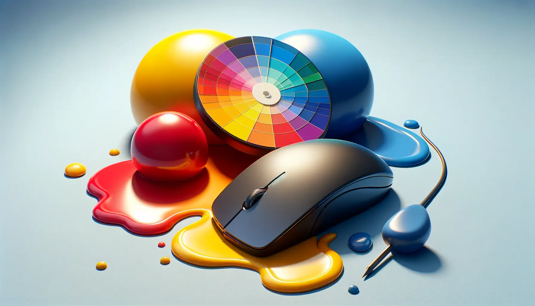
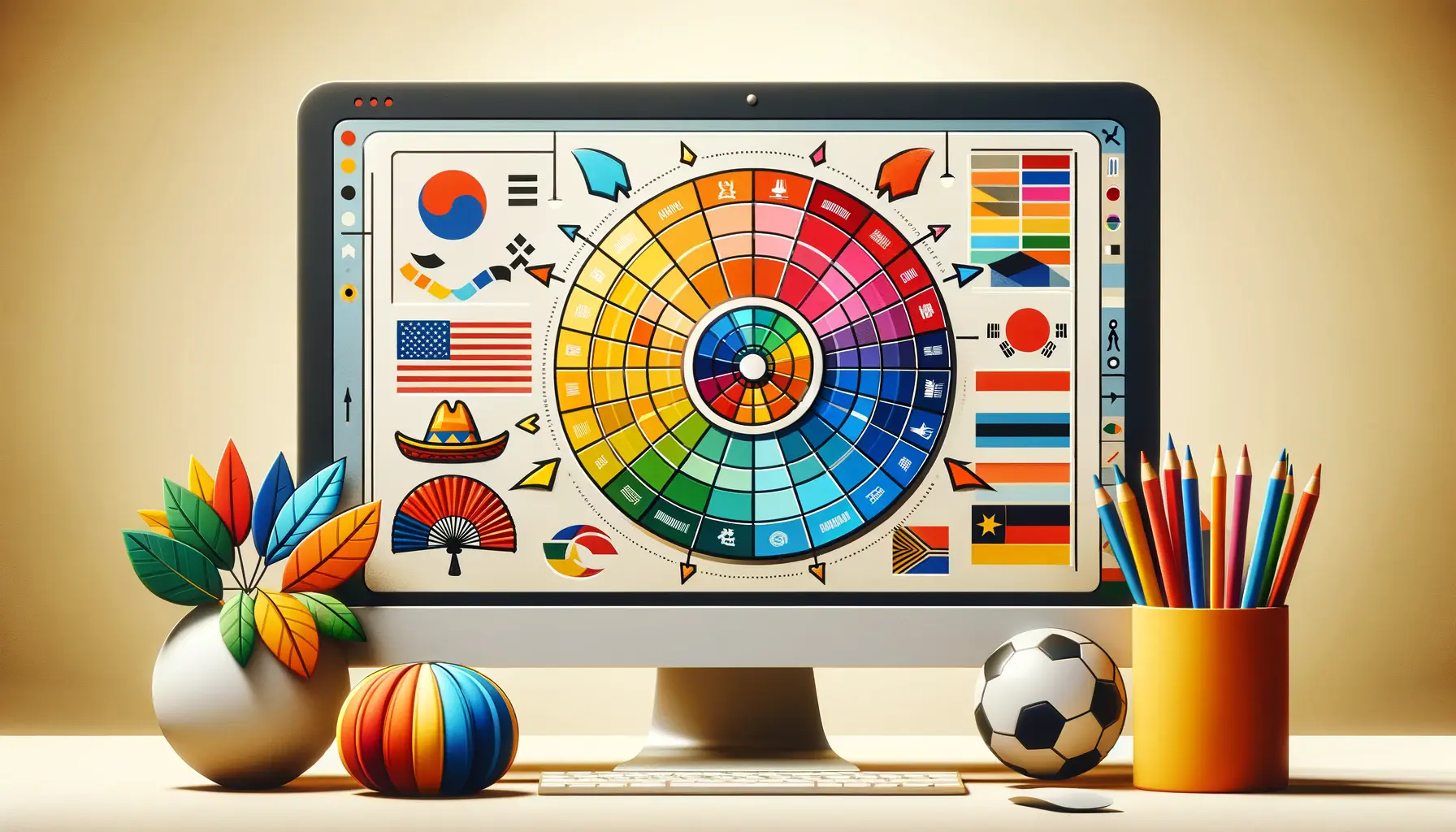
The color wheel is a fundamental concept in color theory, serving as a visual representation of colors arranged according to their chromatic relationship.
Originating from Sir Isaac Newton’s experiments with prisms, the color wheel is structured around three primary colors—red, yellow, and blue—from which secondary and tertiary colors are derived.
This circular arrangement not only simplifies color selection and combination but also embodies the mathematical relationships between colors, facilitating the creation of visually appealing and effective designs.
Designers utilize the color wheel to apply mathematical ratios and harmonies, such as the golden ratio and complementary colors, to achieve balance and contrast in their designs.
These mathematical principles ensure that color schemes are aesthetically pleasing and functionally effective, guiding the viewer’s eye and evoking the desired emotional response.
The color wheel’s mathematical structure is a testament to the blend of art and science that characterizes web design, highlighting the importance of mathematical precision in creative endeavors.
Primary, Secondary, and Tertiary Colors
At the heart of the color wheel lie the primary colors—red, yellow, and blue—colors that cannot be created through the mixing of other colors.
By combining these primary colors in various proportions, designers can generate a wide spectrum of secondary and tertiary colors, expanding the palette available for web design.
This process of color mixing is grounded in mathematical principles, with specific ratios determining the resulting hues.
The exploration of these color relationships is crucial for creating cohesive and dynamic designs that captivate and engage users.
The secondary colors—orange, green, and purple—are formed by mixing equal parts of two primary colors.
Tertiary colors, on the other hand, are created by mixing a primary color with a neighboring secondary color, resulting in hues such as red-orange and blue-green.
This systematic approach to color mixing demonstrates the mathematical precision required in design, ensuring that colors harmonize beautifully on the digital canvas.
Understanding these color relationships enables designers to craft visually stunning websites that also adhere to principles of color psychology and branding.
The color wheel is not just a tool for selecting colors; it embodies the mathematical relationships between hues, serving as a guide for creating balanced and harmonious designs.
Applying Mathematical Formulas in Color Harmony
Color harmony is a cornerstone of effective web design, creating a sense of balance and aesthetic appeal that enhances the user experience.
At its core, color harmony involves the strategic application of mathematical formulas to combine colors in a way that is pleasing to the eye.
These formulas, based on the principles of color theory, help designers achieve a cohesive look and feel across a website.
Understanding and applying these mathematical relationships allows for the creation of color schemes that are not only visually appealing but also psychologically resonant with the target audience.
This section explores the key mathematical formulas used in achieving color harmony, highlighting their importance in the design process.
Complementary Colors
Complementary colors are directly opposite each other on the color wheel, such as blue and orange or red and green.
The mathematical principle behind complementary colors is based on the concept of contrast.
By using colors that are 180 degrees apart on the color wheel, designers can create a vibrant look that stands out.
This high contrast ensures that elements are more distinguishable, enhancing usability and drawing attention to key areas of a website.
Analogous Colors
Analogous colors are located next to each other on the color wheel, such as red, orange, and red-orange.
These colors share a common hue, creating a harmonious and cohesive look.
The mathematical basis for analogous colors involves selecting hues that are within 30 to 60 degrees of each other on the color wheel.
This proximity ensures that the colors blend well together, providing a subtle and unified aesthetic that is pleasing to the eye.
Triadic Color Schemes
Triadic color schemes involve three colors that are evenly spaced around the color wheel, forming a triangle.
This could include colors like red, yellow, and blue.
The mathematical foundation of triadic color schemes is the division of the color wheel into three equal parts, each 120 degrees apart.
This arrangement offers a vibrant and balanced look, with each color providing contrast to the others while maintaining harmony within the design.
- Complementary Colors: Utilize colors 180 degrees apart for vibrant contrast.
- Analogous Colors: Select hues within 30 to 60 degrees of each other for a cohesive look.
- Triadic Color Schemes: Divide the color wheel into three equal parts for a balanced and dynamic design.
The successful application of these mathematical formulas in color harmony can significantly enhance the visual impact and effectiveness of a website, making it more engaging and accessible to users.
The Golden Ratio in Color Schemes
The Golden Ratio, a mathematical constant approximately equal to 1.618, has been used in art and design for centuries to create aesthetically pleasing and harmoniously balanced compositions.
In web design, the Golden Ratio can be applied to color schemes to enhance visual harmony and create a natural sense of order and proportion.
This section delves into how the Golden Ratio influences color selection and arrangement, providing a mathematical framework for creating compelling designs.
Implementing the Golden Ratio in Web Design
To apply the Golden Ratio in color schemes, designers can use it to determine the proportion of space or emphasis each color should receive in the design.
For instance, the primary color could occupy 61.8% of the palette, while the secondary color takes up 38.2%, mirroring the Golden Ratio’s proportions.
This method ensures that colors are balanced in a way that is naturally appealing to the human eye, enhancing the overall aesthetic of the website.
Furthermore, the Golden Ratio can guide the placement of colors within a layout.
By dividing sections of a page according to the Golden Ratio, designers can create a visually engaging hierarchy that naturally draws the viewer’s attention to key elements.
This strategic use of color and space makes the content more accessible and enjoyable to interact with, improving the user experience.
Color Proportions and the Golden Ratio
When selecting colors for a web design project, the Golden Ratio can also inform the intensity and saturation levels of the colors used.
By adjusting these parameters in line with the Golden Ratio, designers can achieve a balanced contrast that highlights the most important elements of the design without overwhelming the viewer.
This subtle application of mathematical principles in color selection underscores the importance of balance and proportion in creating effective web designs.
- Use the Golden Ratio to determine color proportions, ensuring a balanced and harmonious design.
- Apply the Golden Ratio to layout divisions, creating a natural flow that guides the viewer’s eye.
- Adjust color intensity and saturation according to the Golden Ratio for a visually appealing contrast.
Incorporating the Golden Ratio in color schemes not only enhances the visual appeal of a website but also leverages mathematical harmony to create designs that are inherently pleasing and engaging to users.
Psychology of Color in Web Design
The psychology of color plays a pivotal role in web design, influencing how users perceive and interact with a website.
Colors have the power to evoke emotions, convey messages, and affect decision-making, making their selection a crucial aspect of the design process.
By understanding the psychological effects of different colors, designers can create more effective and persuasive websites.
This exploration into color psychology reveals how mathematical precision in color selection can enhance user engagement and conversion rates.
Emotional Responses to Color
Colors can trigger a wide range of emotional responses, from the calmness and trust associated with blue to the energy and excitement evoked by red.
These emotional reactions are not arbitrary but are deeply rooted in psychological principles.
By carefully selecting colors that align with the website’s goals and target audience, designers can create an emotional environment that supports the site’s objectives, whether it’s to calm, energize, or inspire users.
For example, green is often used on financial or environmental websites to evoke feelings of growth and stability, while purple can convey luxury and sophistication on high-end product sites.
The key is to understand the emotional palette of colors and apply this knowledge in a way that resonates with the website’s intended audience and purpose.
Color and Decision-Making
Color not only affects how users feel but also influences their decision-making processes.
Certain colors can prompt action, such as the use of red for ‘Buy Now’ buttons, which can increase conversion rates by creating a sense of urgency.
Similarly, the use of orange for call-to-action (CTA) buttons can evoke feelings of enthusiasm and confidence, encouraging users to take the next step.
The strategic use of color in CTAs, navigation elements, and key information areas can guide users through the website, making the user journey more intuitive and leading to higher engagement and conversion rates.
Designers must balance the psychological impact of colors with the overall design aesthetic to create a cohesive and persuasive user experience.
- Emotional Influence: Select colors that evoke the desired emotional response, aligning with the website’s goals.
- Action and Decision-Making: Use colors strategically in CTAs and key areas to influence user behavior and decision-making.
- User Journey: Apply color psychology to guide users through the website, enhancing usability and engagement.
Understanding and leveraging the psychology of color can significantly enhance the effectiveness of a web design, influencing user perceptions, emotions, and actions in a way that supports the site’s objectives.
Color Accessibility in Web Design
Ensuring color accessibility in web design is crucial for creating inclusive digital environments that accommodate users with visual impairments, including color blindness.
This aspect of web design relies on understanding and applying mathematical principles to color choices, ensuring that all users can navigate, understand, and interact with a website effectively.
Color accessibility enhances usability for a wider audience, making the web more inclusive and equitable.
Contrast Ratios for Readability
One of the key considerations in color accessibility is the contrast ratio between text and its background.
Adequate contrast ensures that text is legible to users with low vision or color vision deficiencies.
The Web Content Accessibility Guidelines (WCAG) recommend a minimum contrast ratio of 4.5:1 for normal text and 3:1 for large text.
Designers can use mathematical formulas to calculate these ratios, ensuring their color choices meet these accessibility standards.
Tools and software are available to analyze color combinations for compliance with accessibility guidelines, providing a quantitative measure of contrast.
By adhering to these standards, designers can create web content that is accessible to a broader audience, including those with visual impairments.
Color Use Beyond Aesthetics
In addition to contrast, the use of color in web design must go beyond aesthetic considerations to communicate information clearly.
Relying solely on color to convey meaning can exclude users who are color blind or have difficulty distinguishing certain colors.
To address this, designers should use additional indicators such as text labels, patterns, or icons to ensure that information is accessible to all users, regardless of their ability to perceive color.
This approach to color use emphasizes the importance of inclusivity in design, ensuring that all users, regardless of their visual abilities, can have a positive and effective experience on the web.
By considering color accessibility from the outset, designers can create more user-friendly and inclusive digital products.
- Contrast Ratios: Calculate and apply appropriate contrast ratios for text and background colors to enhance readability.
- Inclusive Design Practices: Use color as one of several methods to convey information, ensuring accessibility for users with color vision deficiencies.
- Tools and Guidelines: Leverage tools and adhere to guidelines such as WCAG to evaluate and improve color accessibility in web designs.
Color accessibility is not just a technical requirement but a fundamental aspect of inclusive design, ensuring that websites are usable and enjoyable for everyone.
Color Trends and Web Design
The dynamic nature of web design is often influenced by evolving color trends that reflect cultural shifts, technological advancements, and user preferences.
Staying abreast of these trends is crucial for designers aiming to create relevant and modern websites.
However, integrating trends with the foundational principles of color theory and web design requires a careful balance.
This ensures that while a design may be trendy, it remains accessible, functional, and aligned with the brand’s identity.
Adapting to Color Trends
Color trends can emerge from various sectors, including fashion, interior design, and digital art.
These trends often signal a broader societal mood or theme, such as a move towards sustainability reflected in the popularity of earth tones.
For web designers, adapting to these trends involves more than just applying the latest colors; it requires a thoughtful integration of these hues within the site’s overall design and purpose.
Designers must consider how these colors interact with existing branding, the emotions they evoke, and their impact on usability and accessibility.
Moreover, leveraging color trends effectively involves understanding the psychology behind color choices and the mathematical relationships between hues.
This ensures that the application of trendy colors enhances the user experience and supports the website’s goals, rather than detracting from them.
Longevity and Flexibility in Design
While incorporating current color trends can make a website feel contemporary and engaging, designers also need to consider the longevity of their designs.
Focusing solely on the trendiest colors may result in a website that quickly feels outdated.
To avoid this, designers can use trendy colors as accents within a more timeless and flexible color scheme.
This approach allows for easy updates to the website’s palette without a complete overhaul, ensuring the site remains both modern and sustainable over time.
Additionally, flexibility in color usage allows for A/B testing and iterative design improvements based on user feedback and engagement metrics.
This data-driven approach to color can help refine a website’s design to better meet user needs and preferences, demonstrating the importance of adaptability in web design.
- Integration with Branding: Ensure trendy colors complement and enhance the brand’s existing identity and messaging.
- User Experience: Consider the psychological impact and accessibility of trendy colors to maintain a positive user experience.
- Design Longevity: Use trendy colors as accents within a timeless palette for easier updates and sustained relevance.
Embracing color trends in web design offers an opportunity to refresh and invigorate a website’s appearance, but it requires a strategic approach to ensure that designs remain effective, accessible, and aligned with the brand over time.
Optimizing Color for Mobile and Responsive Design
In today’s digital landscape, optimizing color for mobile and responsive design is essential for creating seamless user experiences across devices.
With the increasing use of smartphones and tablets for internet access, designers must ensure that color schemes are effective and accessible on smaller screens.
This involves considering the limitations and capabilities of mobile devices, as well as the varying contexts in which users may interact with a website.
Color Consistency Across Devices
Ensuring color consistency across devices is a challenge due to the diverse display technologies and settings used in mobile devices and monitors.
Colors that look vibrant and clear on one screen may appear muted or distorted on another.
To address this, designers can employ color management techniques and test color schemes on multiple devices to ensure that the intended palette is accurately represented.
This process may involve adjusting color saturation, brightness, and contrast to achieve the best possible uniformity across different viewing conditions.
Furthermore, designers must consider the psychological impact of color and its influence on user perception and behavior.
The colors chosen for a mobile-responsive design should not only be consistent but also conducive to a positive user experience, encouraging engagement and interaction.
Adapting Color Schemes for Readability and Accessibility
On mobile devices, readability and accessibility become even more critical due to smaller screen sizes and variable lighting conditions.
High-contrast color schemes are particularly effective in enhancing text legibility and user interface elements.
Designers can use tools to calculate contrast ratios, ensuring compliance with accessibility standards such as the Web Content Accessibility Guidelines (WCAG).
Adapting color schemes for mobile also involves considering user context.
For example, users accessing a website outdoors in bright sunlight may struggle with glare, making low-contrast color schemes difficult to read.
By optimizing color choices for typical mobile use scenarios, designers can improve usability and ensure that the website is functional and accessible for all users, regardless of their device or environment.
- Device Testing: Test color schemes on various devices to ensure consistent and accurate color representation.
- High-Contrast Colors: Employ high-contrast color schemes to enhance readability and accessibility on mobile screens.
- User Context: Consider the typical environments and scenarios in which mobile users access the website to optimize color choices for usability.
Optimizing color for mobile and responsive design is a complex but crucial process that enhances the user experience, ensuring that websites are accessible, legible, and visually appealing across all devices.
Concluding Insights on the Mathematics of Color Theory in Web Design
The exploration of the mathematics of color theory in web design reveals a fascinating intersection between aesthetic beauty and mathematical precision.
This synergy not only enhances the visual appeal of digital spaces but also significantly improves user experience, accessibility, and interaction.
Through the strategic application of color harmonies, contrast ratios, and psychological principles, designers can create compelling websites that resonate deeply with their audience.
Key Takeaways
Our journey through the mathematics of color theory in web design has uncovered several critical insights:
- The color wheel serves as a foundational tool, guiding designers in the selection and combination of colors to achieve balance and harmony.
- Mathematical formulas and principles, such as the Golden Ratio and contrast ratios, provide a framework for creating aesthetically pleasing and accessible designs.
- The psychology of color plays a pivotal role in influencing user behavior and decision-making, underscoring the importance of choosing colors that align with a website’s goals and audience.
- Color accessibility is essential for inclusive design, ensuring that websites are usable and enjoyable for everyone, including those with visual impairments.
- Staying attuned to color trends allows designers to keep their websites contemporary and engaging, while also considering longevity and flexibility in their designs.
- Optimizing color for mobile and responsive design is crucial in today’s digital landscape, where users access content across a multitude of devices and contexts.
In conclusion, the mathematics of color theory in web design is a dynamic and intricate field that blends creativity with analytical rigor.
By harnessing the power of color, designers can craft experiences that are not only visually stunning but also deeply engaging and accessible.
As we look to the future, the continued exploration and application of these principles will undoubtedly lead to even more innovative and user-centric web designs.
Quality web design is key for a great website! Check out our service page to partner with an expert web design agency.
FAQs on the Mathematics of Color Theory in Web Design
Explore common inquiries about the integration of mathematical principles in color theory for web design, providing insights into creating visually appealing and effective websites.
Mathematics is crucial in digital color theory, especially in defining digital colors with HSB values between 0, 100, and 360, ensuring precise and harmonious color schemes.
The Golden Ratio can determine the proportion of space or emphasis each color receives, creating a naturally appealing balance in web design color schemes.
Complementary colors, positioned 180 degrees apart on the color wheel, create vibrant contrast, enhancing the visual appeal and readability of web content.
Analogous colors, located next to each other on the color wheel, ensure a harmonious and cohesive look, contributing to a website’s aesthetic unity.
Triadic color schemes involve colors evenly spaced around the color wheel, offering vibrant and balanced designs that are visually stimulating.
Color psychology affects user behavior and decision-making, with specific hues evoking certain emotions, making strategic color choice pivotal in web design.
Best practices include using high-contrast color schemes for readability and incorporating additional indicators beyond color to convey information.
Color trends reflect cultural shifts and user preferences, influencing web design to stay relevant and engaging while ensuring usability and brand consistency.
