Understanding color theory is crucial in the world of HTML design, where the right color choices can significantly impact user experience and website effectiveness.
Color not only enhances the aesthetic appeal of a website but also influences user behavior, emotions, and site usability.
This article delves into the significance of color theory in HTML design, offering insights into how colors can be strategically used to create more engaging and effective websites.
At its core, color theory is the science and art of using color.
It explains how humans perceive color; how colors mix, match or clash; the subliminal (and often cultural) messages colors communicate; and the methods used to replicate color.
In the realm of HTML design, color theory is applied to create a visual language that communicates the desired message of the website and enhances the user’s experience.
- Understanding Color Basics
- Psychological Impact of Colors
- Color Accessibility in Web Design
- Incorporating Color Trends
- Color in User Interface (UI) Design
- Color and Conversion Rates
- Optimizing Color for SEO and Web Performance
- Harnessing the Power of Color Theory in HTML Design
- FAQs on the Importance of Color Theory in HTML Design
Understanding Color Basics
Before diving into complex color schemes and their impacts on HTML design, it’s essential to grasp the basics of color theory.
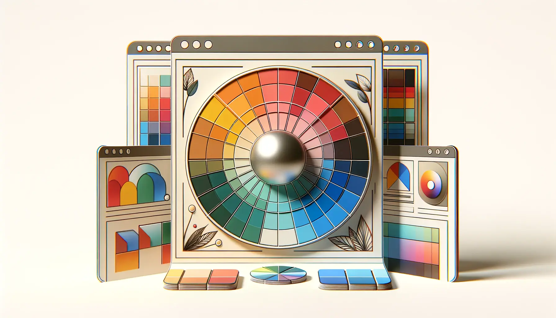
The color wheel, a fundamental tool in color theory, illustrates the relationships between colors.
It consists of primary colors (red, blue, and yellow), secondary colors (created by mixing primary colors), and tertiary colors (made by mixing primary and secondary colors).
Each color on the wheel has its own set of emotions and meanings associated with it, which can vary depending on cultural context.
For instance, while blue often represents calmness and stability in Western cultures, it might symbolize immortality in Eastern traditions.
Understanding these basic principles is crucial for web designers aiming to evoke specific emotions or convey messages through their color choices.
Color Harmony and Contrast
Creating a harmonious color scheme is vital for achieving a balanced and visually appealing website design.
Color harmony refers to the arrangement of colors in a way that is pleasing to the eye, creating a sense of balance and visual interest.
On the other hand, contrast involves using colors that stand out against each other to draw attention or highlight important elements on a webpage.
Effective use of color harmony and contrast can guide visitors’ attention to key sections of a website, improve readability, and enhance the overall user experience.
For example, a well-chosen color scheme can help make a call-to-action button more noticeable or improve the legibility of text against its background.
Incorporating the principles of color theory into HTML design not only boosts the aesthetic quality of a website but also its functionality and user engagement.
Psychological Impact of Colors
The psychological impact of colors is a powerful tool in HTML design, influencing how users feel and behave on a website.
Colors have the ability to evoke emotions, convey messages, and even affect decision-making processes.
Understanding the psychological effects of different colors can help designers create more effective and emotionally engaging websites.
Here’s a look at how some commonly used colors in web design can affect user psychology:
- Red: Often associated with energy, passion, and danger. It can stimulate strong emotions, grab attention, and prompt action, making it ideal for call-to-action buttons or sale announcements.
- Blue: Known for its calming effects, blue can convey trust, security, and professionalism. It’s frequently used in corporate and financial websites to foster trust and reliability.
- Green: Symbolizes nature, growth, and harmony. It’s often used to suggest eco-friendliness and sustainability or to relax users, making it a popular choice for wellness and environmental websites.
- Yellow: Represents happiness, optimism, and youthfulness. Used effectively, it can create a sense of warmth and encourage positive thinking, though overuse can be overwhelming.
- Black: Conveys sophistication, power, and luxury. It’s a popular choice for high-end products and services, offering a sleek and modern look when combined with minimalist design elements.
Color and Brand Identity
Color is a critical component of brand identity, helping to establish recognition and differentiate from competitors.
The right color choice can enhance brand personality and connect with the target audience on an emotional level.
For instance, a brand aiming to appear eco-friendly might choose green for its website, while a luxury brand might opt for black to convey elegance and sophistication.
When selecting colors for a website, it’s important to consider the brand’s core values, the message it wants to convey, and the emotions it aims to evoke in its audience.
This strategic approach ensures that the website not only looks appealing but also aligns with the brand’s identity and goals.
Choosing the right colors for a website can significantly enhance brand perception and user engagement, making color theory an essential consideration in HTML design.
Color Accessibility in Web Design
Color accessibility is a crucial aspect of web design, ensuring that content is easily perceivable and understandable by users with various forms of color vision deficiencies, such as color blindness.
Designing for color accessibility enhances the usability of a website for a wider audience, including those affected by such conditions.
To achieve color accessibility, web designers must consider the following strategies:
- Contrast Ratios: Ensuring sufficient contrast between text and its background to improve readability. The Web Content Accessibility Guidelines (WCAG) recommend a minimum contrast ratio of 4.5:1 for normal text and 3:1 for large text.
- Color Independence: Information should not rely solely on color to be understood. Designers should use additional cues, such as text labels or patterns, to convey information that might otherwise be communicated through color alone.
- Color Testing Tools: Utilizing tools and software to simulate how designs are perceived by users with color vision deficiencies. This helps identify and rectify potential accessibility issues early in the design process.
Implementing Color Schemes for Accessibility
When selecting a color scheme for a website, incorporating accessibility considerations from the start can save time and ensure a more inclusive user experience.
Designers can opt for color combinations that are known to be accessible and test these choices using color accessibility tools.
Additionally, providing options for users to adjust color settings or switch to a high-contrast mode can further improve accessibility.
It’s also beneficial to involve users with color vision deficiencies in the testing phase of the design process.
Their firsthand experience can provide valuable insights into how the color scheme performs in real-world scenarios, leading to more informed design decisions.
Accessibility should be a priority in web design, and adhering to color accessibility guidelines ensures that websites are usable and enjoyable for all users, regardless of their visual capabilities.
Incorporating Color Trends
Staying abreast of color trends is vital for web designers aiming to create fresh and contemporary websites.
While the foundational principles of color theory remain constant, the popularity of specific hues can fluctuate based on cultural shifts, technological advancements, and fashion influences.
Incorporating these trends can make a website feel more modern, relevant, and engaging to users.
However, it’s crucial to balance trendiness with the website’s purpose, brand identity, and target audience preferences.
A color that’s trendy but doesn’t align with the brand’s message or audience’s expectations might do more harm than good.
Here are some strategies for effectively incorporating color trends:
- Research: Stay updated with the latest design trends by following reputable design blogs, attending web design conferences, and observing the color choices of leading brands within and outside your industry.
- Experimentation: Use trendy colors in less permanent website elements, such as call-to-action buttons, hover effects, or seasonal promotional banners. This allows for flexibility and easy adjustments as trends evolve.
- Balance: Combine trendy colors with timeless hues to create a balanced color scheme that is both modern and enduring. This approach ensures the website won’t appear outdated when the trend fades.
Future-Proofing Your Design
While incorporating current color trends can enhance a website’s appeal, future-proofing the design ensures it remains effective and attractive long-term.
This involves selecting a versatile color palette that can easily adapt to future trends and changes in brand strategy.
Additionally, employing a modular design approach allows for easy updates to color schemes without a complete overhaul, ensuring the website can evolve with minimal disruption.
Ultimately, the goal is to create a visually appealing and flexible design that stands the test of time.
By carefully selecting colors that reflect both current trends and the timeless aspects of color theory, designers can craft websites that captivate users today and in the future.
Incorporating color trends should be a strategic decision, enhancing the website’s relevance and appeal while maintaining its core identity and message.
Color in User Interface (UI) Design
Color plays a pivotal role in User Interface (UI) design, directly affecting the usability and user experience of a website.
The strategic use of color can guide users’ attention, differentiate elements, and create visual hierarchies, making the interface intuitive and easy to navigate.
Understanding the principles of color usage in UI design is essential for creating effective and aesthetically pleasing digital environments.
Here are key considerations for employing color in UI design:
- Visual Hierarchy: Use color to establish a visual hierarchy that guides users through the interface naturally. Bright and contrasting colors can highlight important elements, while muted tones can indicate less critical information.
- Feedback and Interaction: Color changes can provide immediate feedback to users. For instance, changing the color of a button upon hover or click can indicate interactivity and guide users on the next steps.
- Consistency: Maintaining color consistency throughout the UI ensures a cohesive user experience. Consistent use of color for similar elements and actions helps users learn the interface faster and reduces cognitive load.
Optimizing Color for Different Devices
With the variety of devices and screens users interact with, optimizing color for different displays is crucial.
Colors can appear differently across devices due to variations in screen technology, resolution, and settings.
Designers must test color schemes on multiple devices to ensure visual consistency and readability.
Employing responsive design principles and CSS media queries allows for adjustments in color based on device characteristics, ensuring an optimal viewing experience across all platforms.
Furthermore, considering the ambient light conditions in which users might view the website can influence color choices.
For example, brighter colors may be more suitable for mobile devices frequently used outdoors, while subtler tones might be better for desktop environments with controlled lighting.
Effective color use in UI design enhances usability, ensures consistency, and adapts to various devices, contributing to a seamless and engaging user experience.
Color and Conversion Rates
The impact of color on conversion rates cannot be overstated in the realm of web design.
Strategic color choices can significantly influence user actions, from clicking a call-to-action button to completing a purchase.
Understanding the psychology behind color preferences and how they affect user behavior is key to optimizing a website for higher conversion rates.
Here are strategies for leveraging color to improve conversions:
- Call-to-Action Buttons: Utilize contrasting colors for call-to-action (CTA) buttons to make them stand out from the rest of the page. The right color can draw attention and encourage clicks, leading to increased user engagement and conversions.
- Color Associations: Choose colors that evoke the desired emotional response or action. For example, green is often associated with “go” or positive action, making it an effective choice for “buy” or “submit” buttons.
- A/B Testing: Conduct A/B testing with different color schemes to determine which combinations yield the highest conversion rates. This data-driven approach allows for informed decisions that can significantly impact website performance.
Understanding Audience Preferences
Audience demographics such as age, gender, and cultural background can influence color preferences and perceptions.
Tailoring your website’s color scheme to match your target audience’s preferences can enhance user satisfaction and increase the likelihood of conversion.
For instance, younger audiences may prefer vibrant and bold colors, while older users might appreciate more subdued tones.
Additionally, cultural considerations play a crucial role in color selection.
Colors that are appealing and positive in one culture may have negative connotations in another.
A thorough understanding of your audience’s cultural context can prevent unintended messages and optimize the site for global appeal.
Assuming a one-size-fits-all approach to color selection can lead to missed opportunities for engagement and conversion. Tailoring color choices to audience preferences and conducting thorough testing are essential for maximizing a website’s conversion potential.
Optimizing Color for SEO and Web Performance
While the visual impact of color in HTML design is evident, its influence extends beyond aesthetics to affect SEO and web performance.
Proper use of color can improve site visibility, user engagement, and ultimately, search engine ranking.
Moreover, optimizing color usage is crucial for enhancing website loading times and performance, factors that significantly contribute to user experience and SEO.
Here are essential tips for optimizing color for SEO and web performance:
- Web-Safe Colors: Use web-safe colors to ensure consistent color rendering across different browsers and devices. This consistency improves user experience and can positively impact SEO by reducing bounce rates caused by poor rendering.
- Color and Content Readability: Ensure that text color contrasts sufficiently with the background color to guarantee readability. Search engines favor content that is easily accessible and readable, which can enhance your site’s SEO.
- Image Optimization: Use color optimization techniques for images to reduce file sizes without compromising quality. Smaller image files load faster, improving page speed—a critical factor in SEO ranking and user satisfaction.
Implementing Schema Markup for Color
Schema markup is a powerful tool for SEO that helps search engines understand the content of your website, including information about color.
For e-commerce sites, using schema markup to highlight product colors can make your listings more attractive and informative in search results, potentially increasing click-through rates.
Implementing schema markup for color involves adding specific tags to your HTML code, providing search engines with detailed information about the color attributes of your products.
By carefully selecting and optimizing colors, implementing schema markup, and ensuring content readability, web designers can significantly enhance both the user experience and SEO performance of a website.
These strategies not only make your site more visually appealing but also more discoverable and efficient, leading to better engagement, conversions, and search engine rankings.
Effective color optimization is a multifaceted strategy that encompasses visual design, user experience, and technical SEO. By addressing each aspect, designers can create websites that are not only beautiful but also high-performing and SEO-friendly.
Harnessing the Power of Color Theory in HTML Design
The journey through the intricacies of color theory in HTML design underscores its pivotal role in crafting visually appealing, user-friendly, and effective websites.
From the basic principles of color harmony to the psychological impacts of hues, and from enhancing accessibility to optimizing for SEO and performance, color theory emerges as an indispensable tool in the web designer’s arsenal.
This exploration has not only highlighted the importance of strategic color choices but also offered practical insights for implementing these strategies to achieve desired outcomes.
Key Takeaways
Reflecting on the insights shared, several key takeaways stand out:
- The choice of color can significantly influence user perception, emotions, and actions, making it crucial for enhancing user engagement and conversion rates.
- Understanding and applying color accessibility principles ensures that websites are usable by a wider audience, including those with visual impairments.
- Staying attuned to color trends while maintaining brand identity and audience preferences can make websites feel contemporary without sacrificing their core message.
- Optimizing color usage for SEO and web performance is essential for improving site visibility, loading times, and overall user experience.
Looking Ahead
As web technologies and design trends continue to evolve, so too will the applications of color theory in HTML design.
The future of web design promises even more sophisticated tools and methodologies for leveraging color effectively.
However, the fundamental principles of color theory will remain relevant, guiding designers in creating harmonious, accessible, and engaging digital experiences.
In conclusion, the importance of color theory in HTML design cannot be overstated.
It is a powerful element that, when used wisely, can transform the aesthetic appeal, functionality, and effectiveness of a website.
As designers continue to explore and innovate within the spectrum of color theory, the potential to captivate and connect with users in meaningful ways is boundless.
Embracing the full spectrum of color theory offers a pathway to designing websites that are not only visually stunning but also deeply resonant with their intended audiences.
Quality web design is key for a great website! Check out our service page to partner with an expert web design agency.
FAQs on the Importance of Color Theory in HTML Design
Explore commonly asked questions about integrating color theory into HTML design to enhance your website’s visual appeal and effectiveness.
Color theory in HTML design is the study and application of color principles to create aesthetically pleasing and effective web designs.
It’s crucial for creating visually appealing sites that communicate effectively and influence user behavior and emotions.
Color can affect mood, readability, and usability, directly influencing how users interact with and perceive a website.
Yes, by using contrasting colors and considering color blindness, designers can make websites more accessible to everyone.
Consider your brand identity, target audience’s preferences, and the psychological effects of colors to select an appropriate scheme.
Strategic color use can highlight key elements, guide user actions, and significantly increase conversion rates.
Follow design blogs, attend webinars, and observe industry leaders to incorporate contemporary colors into your designs.
Yes, tools like Adobe Color, Coolors, and color contrast checkers can assist in creating harmonious and accessible color schemes.
