The intersection of color theory and user experience (UX) design forms a pivotal foundation in the digital design landscape.
It’s a realm where aesthetics meet functionality, guiding designers in creating interfaces that are not only visually appealing but also enhance usability and user engagement.
The significance of color in UX design transcends mere decoration; it’s a powerful tool that influences perception, behavior, and the emotional connection users form with a product.
This article delves into the nuanced role of color within UX design, exploring how it can be leveraged to craft experiences that are both memorable and intuitive.
Understanding color theory is essential for any UX designer looking to make informed decisions about their color palette.
It’s not just about choosing attractive colors; it’s about selecting hues that align with the psychological cues and cultural contexts of the target audience.
Color choices can dramatically affect the usability of a product, from highlighting important elements to conveying status information or evoking specific emotions.
By examining the principles of color theory in the context of UX design, designers can create more effective and inclusive digital experiences.
- The Fundamentals of Color Theory in UX Design
- Color Accessibility and Inclusivity in UX Design
- Psychological Impact of Color in UX Design
- Color Trends and Innovation in UX Design
- Integrating Color with Other Design Elements
- Color and User Behavior: Driving Engagement and Conversion
- Future Directions in Color Theory and UX Design
- Embracing the Spectrum: The Future of UX Design
- FAQs on Color Theory in UX Design
The Fundamentals of Color Theory in UX Design
Understanding Color Psychology
At the heart of color theory lies color psychology, which studies how color influences human behavior and decision-making.
In UX design, leveraging color psychology means more than just picking aesthetically pleasing shades; it involves choosing colors that evoke the right emotions and actions from users.
For instance, blue is often associated with trust and reliability, making it a popular choice for financial applications, while green is frequently used to suggest growth or environmental friendliness.
Designers must consider the cultural implications of colors as well.
What represents happiness and positivity in one culture may convey a completely different message in another.
This cultural sensitivity is crucial in creating a UX design that resonates with a diverse user base, ensuring that the product is accessible and appealing to a wide audience.
Color Harmony and Contrast
Creating a harmonious color scheme is vital for ensuring a cohesive and pleasant user interface.
Color harmony refers to the strategic arrangement of colors in a way that is pleasing to the eye, creating a balanced and visually appealing interface.
This can be achieved through various color schemes, such as analogous, complementary, or triadic, each offering different vibes and energies to the design.
Contrast, on the other hand, is about creating distinction between elements, making the interface more readable and navigable.
High contrast between text and background, for example, is essential for readability, especially for users with visual impairments.
The use of contrasting colors can also guide users’ attention to important actions or information, such as call-to-action buttons or alerts.
Effective use of color harmony and contrast can significantly enhance the usability and aesthetic appeal of a product, making it more engaging and accessible to users.
Color Accessibility and Inclusivity in UX Design
Ensuring that digital products are accessible to everyone, including those with visual impairments or color blindness, is a critical aspect of UX design.
Color accessibility involves designing interfaces that are usable and enjoyable for people with a wide range of visual capabilities.
This commitment to inclusivity not only broadens the user base but also reflects a brand’s dedication to diversity and equality.
One of the key strategies in achieving color accessibility is the careful selection and testing of color combinations to ensure sufficient contrast and readability.
Tools and guidelines, such as the Web Content Accessibility Guidelines (WCAG), provide standards for contrast ratios, helping designers create interfaces that meet the needs of users with visual impairments.
Implementing Color Accessibility
- Contrast Ratios: Adhering to recommended contrast ratios ensures that text stands out against its background, making it readable for users with low vision or color vision deficiencies.
- Color-Blind Friendly Palettes: Designing with color-blind friendly palettes means avoiding color combinations that are commonly problematic, such as red/green, ensuring that all users can distinguish between different elements and actions.
- Use of Textures and Patterns: Incorporating textures and patterns alongside color can help users with color vision deficiencies differentiate between elements that would otherwise rely solely on color distinction.
By prioritizing color accessibility, designers not only comply with legal and ethical standards but also enhance the user experience for a significant portion of the population.
This approach fosters an inclusive digital environment where more users can navigate, understand, and enjoy the content without barriers.
Case Studies on Color Accessibility
Real-world applications of color accessibility can be seen in various digital products that have successfully implemented inclusive design principles.
For example, a social media platform redesigned its interface with higher contrast ratios and color-blind friendly palettes, leading to an increase in usability scores and positive feedback from users with visual impairments.
Another case involved a mobile app that introduced patterns and shapes to complement its color-coded features, significantly improving accessibility for color-blind users.
These examples underscore the importance of incorporating color accessibility into the UX design process.
By doing so, designers can create more inclusive products that cater to the needs of all users, regardless of their visual capabilities.
Incorporating color accessibility into your design process is not just about compliance; it’s about creating a more inclusive and user-friendly digital world.
Psychological Impact of Color in UX Design
The psychological impact of color on users is a fundamental aspect of UX design that goes beyond mere visual appeal.
Colors have the power to evoke emotions, influence perceptions, and even drive decision-making.
Understanding the psychological effects of different colors can help designers create more engaging and effective user experiences.
Each color can trigger specific psychological responses.
For example, blue is often associated with trust, stability, and calmness, making it a popular choice for banking and social media apps.
Red, known for its intensity, can evoke feelings of excitement or urgency, which is why it’s frequently used for call-to-action buttons or sale announcements.
The key is to align the emotional connotations of color choices with the desired user experience and the brand’s identity.
Emotional Design and Color
Emotional design is an approach that focuses on creating products that elicit positive feelings in users, thereby enhancing user engagement and loyalty.
Color plays a crucial role in emotional design, as it can significantly affect users’ mood and emotional state.
For instance, using warm colors like orange and yellow can create a sense of warmth and optimism, while cool colors like green and blue can have a calming effect.
Designers can use color strategically to create a desired atmosphere or mood within their app or website.
This involves not only choosing the right colors but also considering their saturation and brightness, as these aspects can also influence the emotional impact of a design.
Color and Brand Perception
Color is a powerful tool for shaping how users perceive a brand.
Consistent use of a color palette across all touchpoints can reinforce brand identity and increase recognition.
For example, a tech company might use sleek, modern hues like blue and grey to convey innovation and professionalism, while a health and wellness brand might opt for earth tones to emphasize natural and holistic values.
The choice of colors should reflect the brand’s personality and values, creating a visual identity that resonates with the target audience.
This alignment between color and brand perception is crucial for building trust and fostering a strong emotional connection with users.
Leveraging the psychological impact of colors can transform a user’s interaction with a product from merely functional to emotionally resonant, deepening the user’s connection to the brand.
Color Trends and Innovation in UX Design
The dynamic nature of color trends plays a significant role in UX design, influencing how designers approach their projects and how users perceive and interact with digital products.
Staying abreast of color trends is crucial for designers aiming to create fresh and relevant user experiences.
However, it’s equally important to balance trendiness with timeless design principles to ensure that a product remains accessible and enjoyable for all users over time.
Color trends in UX design often reflect broader cultural shifts and technological advancements.
For example, the rise of dark mode in many apps and operating systems is not just a trend; it addresses user concerns about screen time, eye strain, and battery life.
Similarly, the popularity of gradient colors can add depth and vitality to a design, making interfaces feel more dynamic and engaging.
Adapting to Color Trends
- Research and Inspiration: Keeping up with design publications, art, and nature can provide fresh ideas and insights into current color trends.
- User Preferences: Understanding the target audience’s preferences can help designers choose color trends that resonate with users, enhancing the user experience.
- Brand Alignment: Any adoption of color trends should align with the brand’s identity and values, ensuring consistency and coherence in the user interface.
While trends offer a way to innovate and refresh designs, they should not overshadow the fundamental goals of UX design: usability, accessibility, and user satisfaction.
Designers must critically assess how a trend can be integrated into their work to add value rather than merely following it for its own sake.
Innovative Use of Color in UX
Innovation in color usage within UX design extends beyond following trends.
It involves exploring new ways to use color to enhance functionality, convey information, and improve user engagement.
For instance, the strategic use of neon colors can draw attention to important elements without overwhelming the user, while subtle use of shadows and highlights can create a sense of depth and realism in flat designs.
Experimentation with color can lead to breakthroughs in how information is presented and perceived.
By challenging conventional color schemes and exploring unconventional combinations, designers can create unique and memorable user experiences that stand out in a crowded digital landscape.
Embracing color trends and innovation can elevate a user interface, but it’s the thoughtful application of these trends that truly enhances the user experience.
Integrating Color with Other Design Elements
Color does not exist in isolation within the realm of UX design; it interacts with and is influenced by other design elements, such as typography, layout, and imagery.
The integration of color with these elements is crucial for creating a cohesive and effective design.
This synergy between color and other design components can significantly enhance the user experience, making interfaces more intuitive, engaging, and aesthetically pleasing.
Understanding the relationship between color and other design elements allows designers to craft interfaces that are not only beautiful but also highly functional.
For example, the choice of color can affect the readability of text, the visibility of icons, and the overall visual hierarchy of a page.
By carefully considering these interactions, designers can ensure that their use of color supports and enhances the overall design rather than detracting from it.
Color and Typography
- Contrast and Legibility: Ensuring high contrast between text color and its background is essential for readability. Designers must select color combinations that provide sufficient contrast without causing strain to the eyes.
- Emotional Tone: The color of typography can also convey mood and tone, complementing the message of the text. Choosing the right color can enhance the emotional impact of written content.
Color and Layout
- Visual Hierarchy: Color can be used to establish a visual hierarchy on a page, guiding users’ attention to key elements. Bright or contrasting colors can highlight important features or buttons, while more subdued tones can indicate secondary information.
- Space and Balance: The use of color can affect the perception of space within a layout. Lighter colors tend to open up a space, making it appear larger, while darker colors can make it feel more compact and focused.
Color and Imagery
- Consistency: Maintaining a consistent color palette between imagery and other design elements ensures a unified and harmonious look. This consistency helps to reinforce brand identity and improve user experience.
- Enhancement: Colors in imagery should complement the overall color scheme of the design, enhancing the visual appeal without overwhelming the user with too much variation or contrast.
The thoughtful integration of color with typography, layout, and imagery is key to creating a seamless and effective UX design.
By considering how these elements interact, designers can craft experiences that are not only visually stunning but also highly functional and user-friendly.
A holistic approach to color integration can transform a good design into a great one, elevating the user experience to new heights.
Color and User Behavior: Driving Engagement and Conversion
The strategic use of color in UX design can significantly influence user behavior, driving engagement, and increasing conversion rates.
By understanding how different colors affect user actions and decisions, designers can create interfaces that not only attract attention but also encourage desired behaviors.
This aspect of color theory is particularly relevant in e-commerce, marketing, and any digital platform where user interaction directly correlates with business outcomes.
Colors can evoke specific responses that are crucial in guiding users towards taking action.
For example, red can create a sense of urgency, often used in clearance sales or limited-time offers to prompt immediate action.
On the other hand, green is commonly associated with positivity and ease, making it an effective choice for “proceed” or “submit” buttons.
The key is to apply these insights in a way that aligns with the overall design and messaging of the site or app.
Optimizing Conversion with Color
- Call-to-Action Buttons: Using contrasting colors for call-to-action (CTA) buttons can make them stand out and increase the likelihood of user clicks. The color choice should make these buttons immediately visible and inviting to users.
- User Trust and Comfort: Colors that evoke trust and comfort can enhance user engagement and encourage longer site visits, which is particularly important for websites requiring personal information or financial transactions.
- Visual Cues: Color can serve as a visual cue to guide users through a desired journey or process within an app or website. Strategic color use can highlight pathways or options available to users, simplifying navigation and improving the overall user experience.
Case Studies and A/B Testing
Real-world case studies have shown the impact of color on user behavior and conversion rates.
For instance, an e-commerce site experienced a significant increase in sales after changing their CTA button color from green to red, highlighting the power of color psychology in influencing user actions.
Similarly, A/B testing different color schemes can provide valuable insights into user preferences and behaviors, allowing designers to optimize interfaces based on empirical data.
These examples underscore the importance of color in shaping user behavior and its potential to drive engagement and conversions.
By leveraging color effectively, designers can create more persuasive and user-friendly interfaces that align with business goals.
Ignoring the psychological and behavioral implications of color choices can lead to missed opportunities in user engagement and conversion optimization.
Future Directions in Color Theory and UX Design
The future of color theory in UX design holds exciting possibilities as technology evolves and our understanding of user behavior deepens.
Innovations in display technology, user interface design, and psychological research are likely to shape how color is used in digital products.
As designers, staying informed about these developments and experimenting with new approaches will be key to creating engaging and effective user experiences.
One area of future exploration is the use of dynamic color schemes that adapt to user preferences, time of day, or even emotional states.
This personalized approach to color could enhance user engagement by creating interfaces that feel more tailored and responsive to individual users.
Additionally, advancements in augmented reality (AR) and virtual reality (VR) offer new contexts for applying color theory, where the immersive nature of these technologies can amplify the psychological impact of color choices.
Personalization and Adaptability
- User-Centric Design: Future UX design will likely emphasize more personalized color schemes, adapting to user settings or preferences to offer a more customized experience.
- Context-Aware Interfaces: Interfaces that adjust their color palette based on the context, such as the ambient light or the user’s activity, could improve usability and comfort.
Emerging Technologies and Color
- AR and VR: The role of color in AR and VR environments presents unique challenges and opportunities, from enhancing realism to influencing user mood and behavior in immersive experiences.
- Advanced Display Technologies: Innovations in display technology, such as OLED and quantum dots, offer richer and more vibrant colors, pushing the boundaries of how color can be used in design.
As we look to the future, the intersection of color theory and UX design will continue to evolve, driven by technological advancements and a deeper understanding of human psychology.
By embracing these changes and exploring new possibilities, designers can create more meaningful and impactful user experiences.
The potential of color to influence emotion, behavior, and perception remains a powerful tool in the designer’s toolkit, one that will only grow in significance as we move forward.
The future of color in UX design is not just about following trends but innovating and personalizing experiences to meet the evolving needs and expectations of users.
Embracing the Spectrum: The Future of UX Design
In the realm of UX design, color theory transcends mere aesthetic considerations, emerging as a pivotal factor in enhancing user experience, driving engagement, and facilitating accessibility.
This article has traversed the multifaceted role of color within UX design, underscoring its capacity to influence user behavior, convey information, and evoke emotional responses.
As we look ahead, the integration of color theory in UX design promises to evolve, fueled by technological advancements and a deeper understanding of human psychology.
The Harmonious Blend of Color and Functionality
At its core, the effective use of color in UX design is about achieving a harmonious balance between visual appeal and functionality.
The future of UX design lies in creating interfaces that are not only visually captivating but also intuitively navigable, ensuring that users of all abilities can interact with digital products seamlessly.
The principles of color theory provide a foundation for this endeavor, guiding designers in making informed decisions that enhance the usability and accessibility of digital interfaces.
Color as a Catalyst for Inclusive Design
Looking forward, the emphasis on color accessibility and inclusivity will become increasingly paramount in UX design.
As digital products strive to cater to a global audience, incorporating color-blind friendly palettes and ensuring adequate contrast ratios will be essential.
These practices not only comply with legal and ethical standards but also reflect a commitment to creating a digital environment that is welcoming and accessible to all users.
- Personalization and adaptability in color schemes will cater to individual user preferences and contexts, enhancing the overall user experience.
- Emerging technologies such as AR and VR will offer new avenues for applying color theory, presenting unique challenges and opportunities for immersive user experiences.
- Advancements in display technologies will push the boundaries of color fidelity and vibrancy, enabling more dynamic and expressive design possibilities.
In conclusion, the role of color in UX design is both profound and far-reaching, influencing not just how users perceive and interact with digital products but also how they feel about them.
As we continue to explore the depths of color theory and its application in UX design, the potential to create more engaging, accessible, and emotionally resonant digital experiences is boundless.
The future of UX design, illuminated by the spectrum of color, holds the promise of more personalized, inclusive, and impactful user experiences.
Quality web design is key for a great website! Check out our service page to partner with an expert web design agency.
FAQs on Color Theory in UX Design
Explore common questions about the impact and application of color theory in UX design.
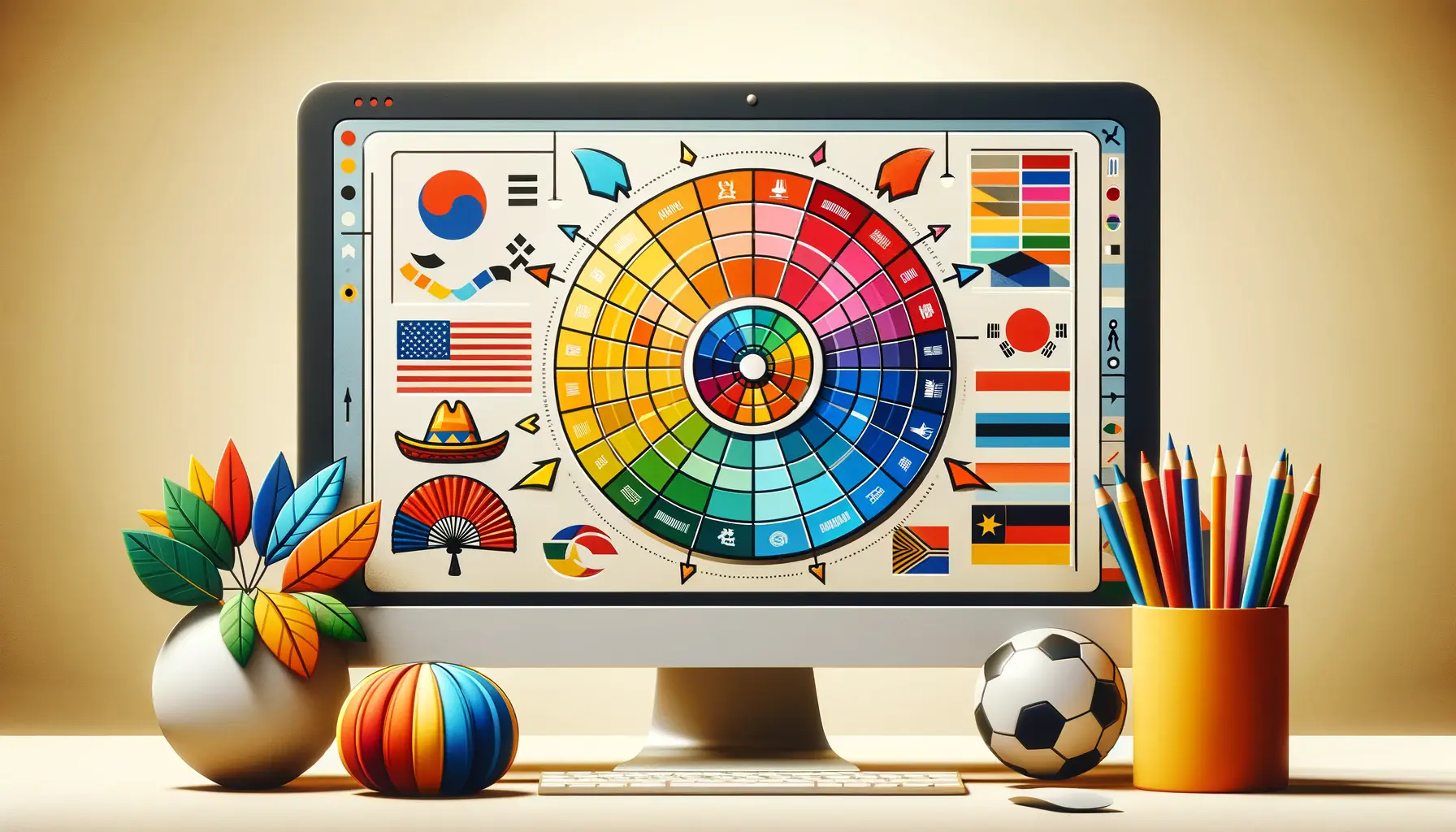
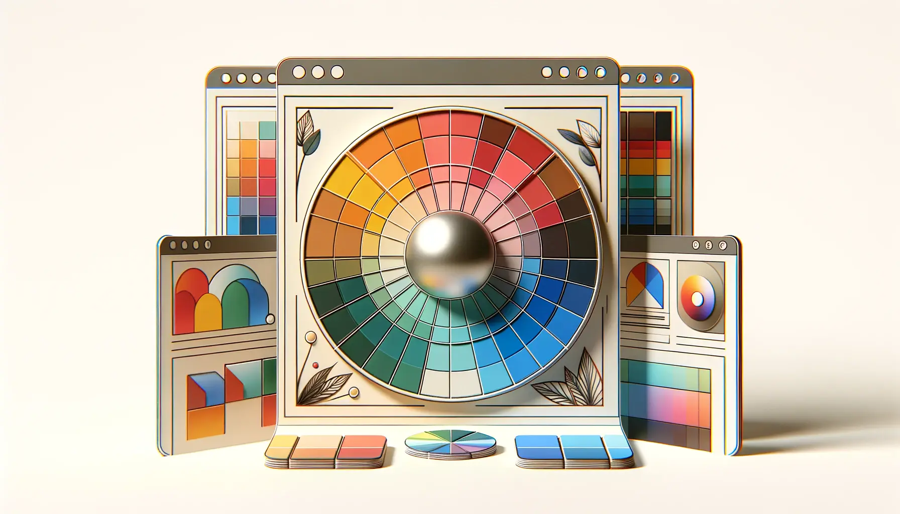
The color wheel is a tool that helps designers understand and apply relationships between colors effectively in UX design.
Red evokes feelings of excitement, urgency, or warning, influencing users to take immediate action or alerting them to important elements.
Color theory is crucial in creating visually appealing, coherent, and effective designs that enhance user experience and engagement.
Yes, mastering color theory can significantly enhance a designer’s ability to create intuitive and emotionally resonant user interfaces.
Hue, saturation, and brightness are the core elements, each contributing to the visual impact and effectiveness of a design.
Color psychology helps designers understand how colors affect emotions and behaviors, enabling more user-centered design decisions.
It enables the creation of visually appealing and user-friendly designs by effectively applying color principles to improve usability and aesthetics.
Colors play a key role in establishing a brand’s visual identity, evoking specific emotions and creating a consistent user experience across platforms.
