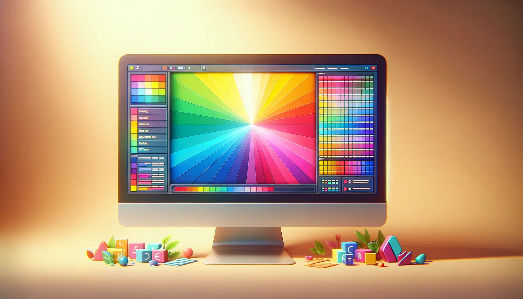
Color theory plays a pivotal role in web design, serving not just as an aesthetic choice but as a functional tool that guides users through a digital experience.
The strategic application of color can dramatically improve the usability and effectiveness of a website, making it not only more engaging but also more intuitive for users.
By understanding and applying principles of color theory, designers can create a visual hierarchy that subtly directs viewers’ attention to key elements, enhances readability, and conveys the intended mood or message of the website.
The concept of visual hierarchy in web design is about organizing elements in a way that mirrors the importance and order of information, making the site easy to navigate and content easy to digest.
Color, when used effectively, becomes a powerful tool in this regard.
It can highlight important features, differentiate between types of information, and create a path for the viewer’s eye to follow.
This article delves into how color theory can be harnessed to enhance visual hierarchy in web design, ensuring that visitors to a site not only enjoy their viewing experience but also understand and absorb the information as intended.
- Understanding Color Theory Basics
- Applying Color for Visual Hierarchy
- Color Contrast and Accessibility
- Color Schemes and Brand Identity
- Optimizing Color for User Experience
- Future Trends in Color and Web Design
- Integrating Color with Other Design Elements
- Conclusion: The Power of Color in Web Design
- FAQs on Enhancing Visual Hierarchy with Color Theory in Web Design
Understanding Color Theory Basics
The Color Wheel and Color Relationships
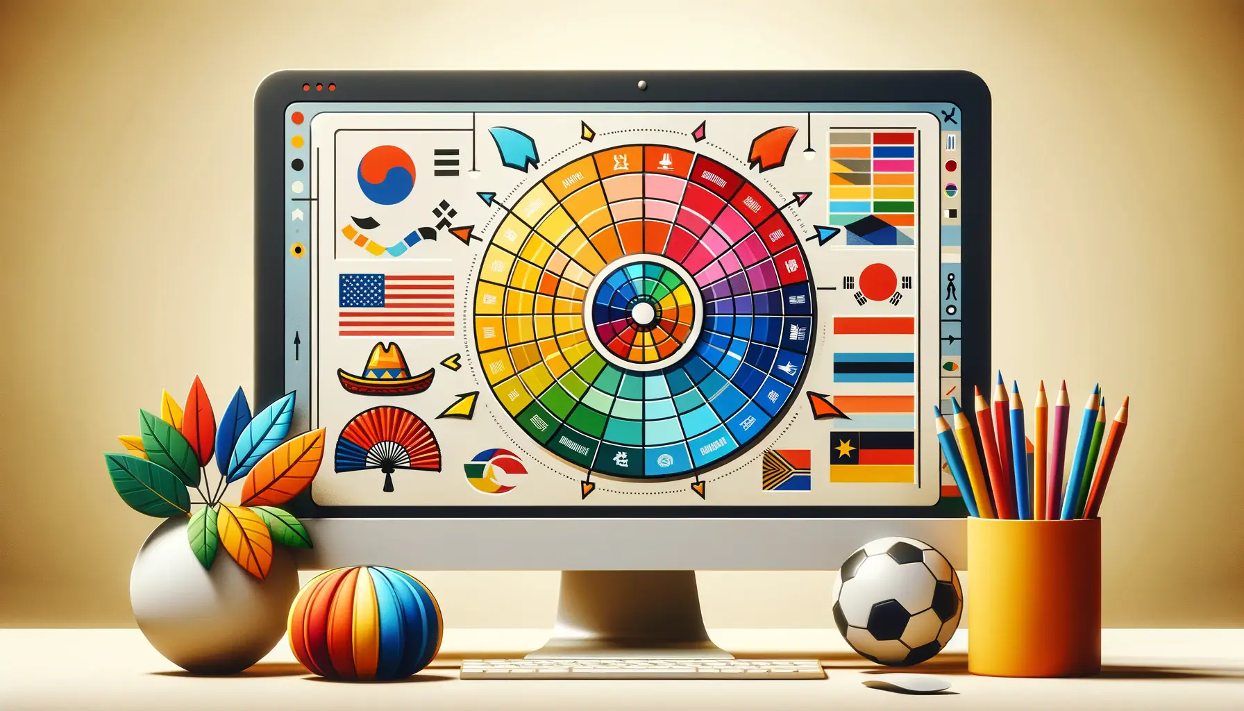
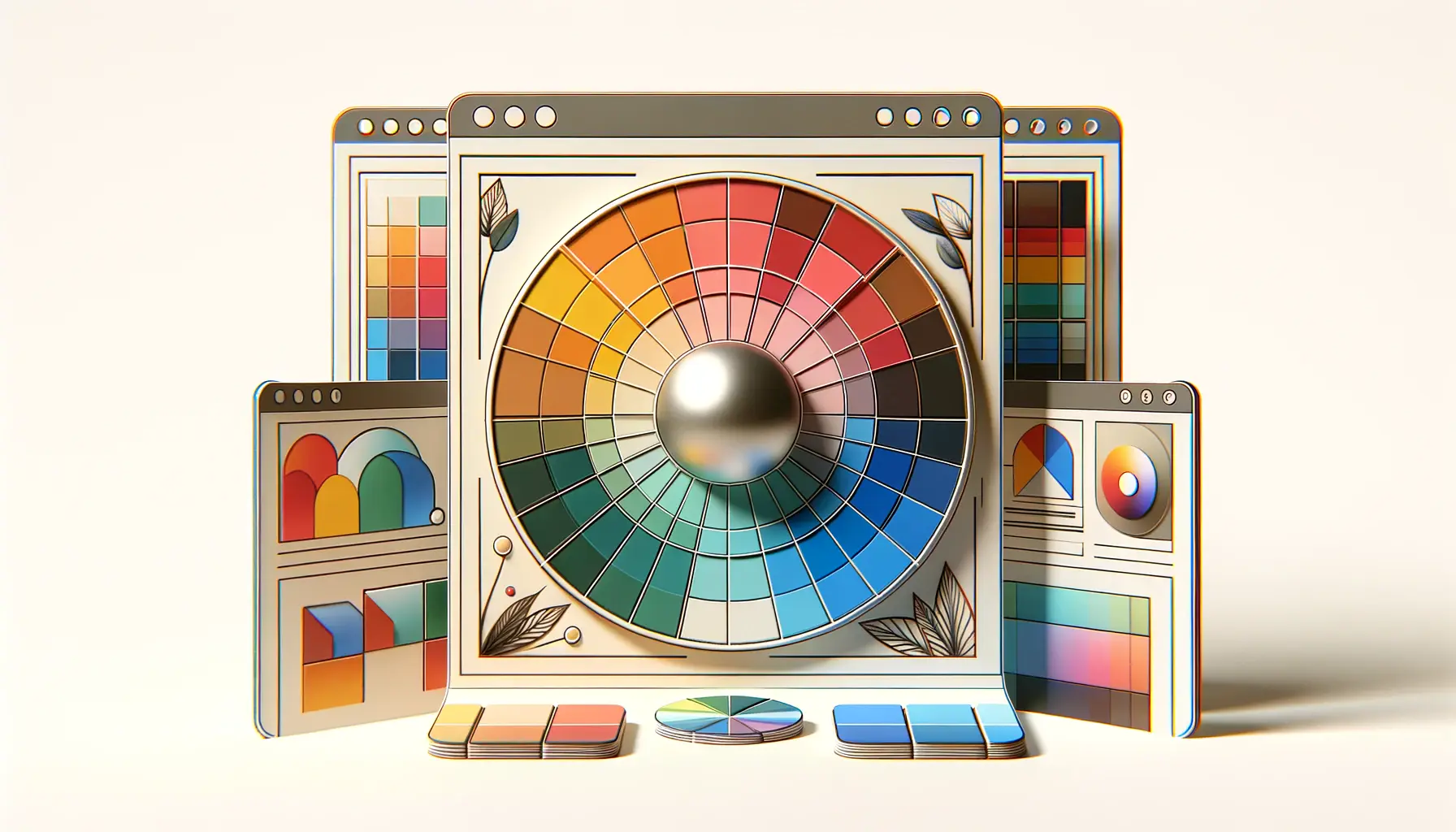
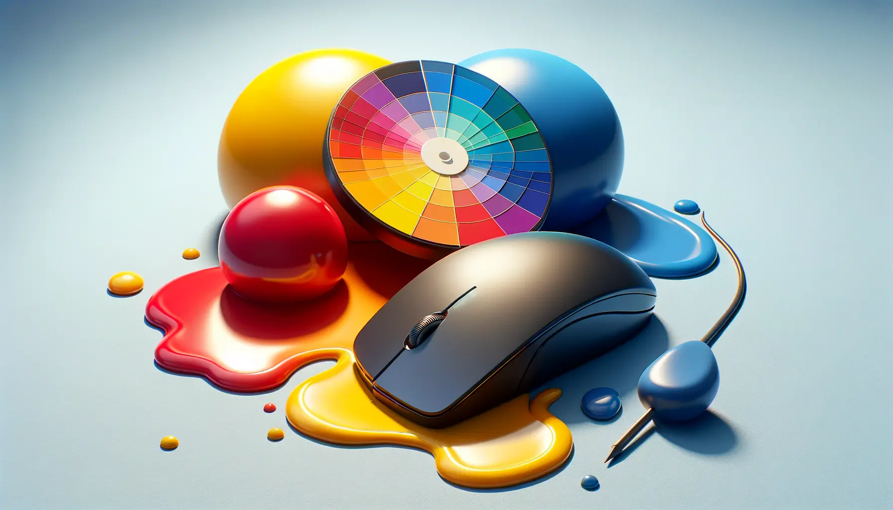
At the heart of color theory lies the color wheel, a visual representation of colors arranged according to their chromatic relationship.
Primary colors (red, blue, and yellow) are positioned equidistantly, forming the foundation from which secondary and tertiary colors are derived.
Understanding the color wheel is crucial for web designers, as it helps in creating color schemes that are harmonious and pleasing to the eye.
By leveraging complementary, analogous, and triadic color relationships, designers can craft websites that are visually balanced and cohesive.
Complementary colors, which are opposite each other on the color wheel, offer high contrast and vibrancy when used together.
This contrast can be used to draw attention to call-to-action buttons or important information.
Analogous colors, which are next to each other on the wheel, create a more harmonious and less contrasting look, ideal for background and content areas.
Triadic color schemes, involving three colors evenly spaced around the color wheel, offer a rich and vibrant palette while maintaining balance.
Color Psychology in Web Design
Color psychology is another critical aspect of using color in web design.
Different colors evoke different emotions and associations, which can significantly affect how users perceive a website.
For instance, blue is often associated with trust and professionalism, making it a popular choice for corporate websites.
Green, symbolizing nature and growth, is frequently used for environmental and health-related sites.
Understanding these associations allows web designers to choose colors that align with the website’s message and purpose, creating a deeper connection with the audience.
However, it’s important to consider cultural differences in color perception.
A color that is positive in one culture may have negative connotations in another.
Therefore, knowing the target audience’s cultural background is essential when deciding on a color scheme for a website.
Remember, the goal of applying color theory in web design is not just to make the site look attractive but to enhance its functionality and user experience by creating a clear visual hierarchy.
Applying Color for Visual Hierarchy
Creating a visual hierarchy involves strategically using color to guide the viewer’s eye through a website, emphasizing certain elements over others.
This hierarchy helps users navigate the site more intuitively, understanding which areas are of primary importance and which are secondary or tertiary.
Here are key strategies for applying color to establish a clear visual hierarchy in web design:
Highlighting Key Elements with Color
One of the most effective ways to use color in web design is to highlight key elements, such as call-to-action buttons or important links.
By choosing a color that stands out from the rest of the site’s color palette, these elements become instantly more noticeable, guiding users towards the desired actions.
For example, a bright color like yellow or orange can be very effective for call-to-action buttons against a more subdued background.
Using Color to Differentiate Content Types
Color can also be used to differentiate between types of content on a website.
For instance, different background colors can indicate different sections, such as a light blue for a contact section and a soft green for testimonials.
This not only adds visual interest but also helps users intuitively understand the structure and flow of the site’s content.
- Background Colors: Choose subtle variations to delineate different sections or types of content without overwhelming the user.
- Text Colors: Use contrasting colors for text to ensure readability and draw attention to key information.
- Interactive Elements: Employ distinct colors for interactive elements like links and buttons to make them easily identifiable.
Creating Depth and Dimension
Another technique is using color to create a sense of depth and dimension on a webpage.
Lighter colors tend to recede, making them ideal for backgrounds, while darker colors appear to come forward, making them suitable for elements that should stand out.
This can create a layered effect that adds sophistication to the design and helps organize the content hierarchically.
Shadows and gradients can also be used in conjunction with color to enhance the sense of depth.
A subtle shadow under a button not only makes it pop but also suggests interactivity, inviting users to click.
Consider the psychological impact of your color choices and how they contribute to the site’s overall usability and user experience.
Color Contrast and Accessibility
Ensuring that your website is accessible to all users, including those with visual impairments, is a critical aspect of web design.
Color contrast plays a significant role in this, as it affects the readability of text and the visibility of interactive elements.
Here’s how to effectively use color contrast to enhance accessibility:
High contrast between text and its background is essential for readability.
For users with visual impairments, such as color blindness, this becomes even more critical.
The Web Content Accessibility Guidelines (WCAG) recommend a contrast ratio of at least 4.5:1 for normal text and 3:1 for large text.
Tools like the WebAIM Contrast Checker can help designers ensure that their color choices meet these accessibility standards.
Strategies for Improving Contrast
- Text and Background: Use dark text on a light background or vice versa to maximize readability. Avoid placing text on patterned or gradient backgrounds, which can reduce contrast.
- Interactive Elements: Ensure buttons and links stand out by using colors that contrast highly with their surroundings. This not only makes them more visible but also more accessible to users with visual impairments.
- Visual Elements: For icons and other non-text elements, sufficient contrast with the background is necessary to ensure all users can perceive them.
Implementing sufficient color contrast is not just about meeting accessibility standards; it’s about creating a more inclusive web experience that allows everyone to access and enjoy your content.
By prioritizing contrast in your color choices, you make your website more user-friendly for a wider audience.
Testing for Color Accessibility
Regular testing is crucial to ensure that your website remains accessible to as many users as possible.
Utilize accessibility testing tools and resources to check your site’s color contrast and overall accessibility.
Feedback from real users, especially those with visual impairments, can provide invaluable insights into how your color choices affect usability.
Remember, accessibility should never be an afterthought in web design.
Integrating color contrast considerations from the start of your design process not only helps you create a more accessible website but also a more aesthetically pleasing and effective one.
True accessibility in web design means designing for all users, regardless of their abilities or how they access the web.
Color Schemes and Brand Identity
Color is a powerful tool for building and reinforcing brand identity on the web.
The colors chosen for a website can significantly affect how a brand is perceived by its audience, making it crucial to select a color scheme that aligns with the brand’s values, message, and target market.
Here’s how to approach color schemes in web design to strengthen brand identity:
Firstly, consider the emotional connotations of different colors and how they align with your brand’s personality.
For example, blue often conveys trustworthiness and professionalism, making it a popular choice for financial institutions.
Green, associated with nature and growth, is frequently used by eco-friendly brands.
Selecting a color scheme that reflects your brand’s character can create a stronger emotional connection with your audience.
Consistency Across Platforms
- Website: Your website’s color scheme should be consistent with your brand’s overall visual identity, including logos, packaging, and marketing materials. This consistency helps reinforce brand recognition and loyalty.
- Social Media: Extend your color scheme to your social media profiles and posts for a cohesive brand experience across platforms.
- Email Campaigns: Incorporate your brand’s colors in email marketing campaigns to maintain visual consistency and enhance brand recall.
Consistency in color usage across all digital platforms is key to building a strong, recognizable brand.
It not only aids in brand recall but also contributes to a more unified and professional online presence.
Adapting Color Schemes for Web
While maintaining brand consistency is important, it’s also necessary to adapt your color scheme for the web to ensure optimal usability and accessibility.
This might mean adjusting shades for better contrast or incorporating additional colors to highlight interactive elements like buttons and links.
The goal is to balance brand identity with web design best practices to create a site that is both visually appealing and functional.
Remember, the ultimate aim is to use color to enhance the user’s experience and engagement with your brand online.
By thoughtfully selecting and applying your color scheme, you can create a memorable and effective web presence that accurately reflects your brand’s identity and values.
Your brand’s color scheme is more than just decoration; it’s a communication tool that conveys your brand’s values and personality to your audience.
Optimizing Color for User Experience
Optimizing the use of color in web design goes beyond aesthetic appeal; it’s about enhancing the overall user experience (UX).
A well-thought-out color scheme can significantly improve usability, guide user behavior, and even influence conversion rates.
Here are strategies for using color to optimize UX:
Understanding the target audience is crucial when choosing colors for a website.
Different demographics may have varying preferences and cultural associations with colors.
For instance, younger audiences might respond better to vibrant, high-contrast color schemes, while a more subdued palette might appeal to an older demographic.
Researching your audience’s preferences can lead to more effective color choices.
Guiding User Actions with Color
- Call-to-Action Buttons: Use contrasting colors for call-to-action (CTA) buttons to make them stand out and encourage clicks. The right color can draw attention to these buttons, guiding users towards taking the desired action.
- Navigation: Employ color to differentiate navigation elements, making it easier for users to find their way around the site. Consistent color usage for links and menus helps users understand how to interact with your site more intuitively.
- Feedback: Colors can also provide immediate feedback to users. For example, changing the color of a button upon hover or click can indicate that the action has been recognized, enhancing the interactive experience.
Color can significantly affect the mood and emotional response of users.
Warm colors like red and orange can create a sense of urgency, which might be useful for clearance sales or limited-time offers.
In contrast, cool colors like blue and green can have a calming effect, suitable for spa or wellness websites.
Selecting colors that evoke the right emotional response can enhance the effectiveness of your website.
Testing and Iteration
It’s important to test different color schemes and elements with real users to see how they affect user behavior and site performance.
A/B testing can reveal which colors lead to higher engagement and conversion rates.
Continuously iterating based on user feedback and testing results can help refine the color scheme to better meet user needs and preferences.
By carefully considering how color affects usability, navigation, mood, and behavior, web designers can create more engaging and effective websites.
The goal is to use color not just as a design element but as a tool for enhancing the user experience, making the web a more intuitive and enjoyable space for everyone.
Effective use of color can transform a website from merely functional to memorable, significantly enhancing the user experience.
Future Trends in Color and Web Design
The digital landscape is constantly evolving, and with it, the trends in color and web design.
Staying ahead of these trends can give designers a competitive edge, ensuring that websites not only look contemporary but also meet the changing preferences and expectations of users.
Here’s a look at some future trends in color usage in web design:
As technology advances, we’re seeing a shift towards more vibrant and dynamic color schemes in web design.
This includes the use of bold colors, gradients, and even animations that incorporate color transitions.
These elements can make websites feel more alive and engaging, capturing users’ attention in an increasingly crowded digital space.
Personalization and Color
- User-Defined Color Schemes: With the increasing focus on personalization, we may see more websites offering users the ability to customize color schemes according to their preferences. This level of personalization can enhance user engagement and satisfaction.
- Adaptive Colors: Websites might also adapt their color schemes based on user behavior, time of day, or even seasons, creating a more dynamic and personalized user experience.
Environmental sustainability is becoming a priority for many, and this is reflected in web design through the choice of colors.
Earth tones and nature-inspired palettes are gaining popularity, reflecting a brand’s commitment to sustainability and appealing to environmentally conscious consumers.
Accessibility and Inclusivity
As awareness of accessibility issues grows, future web design will likely place even greater emphasis on color contrast and readability.
Designers will need to balance aesthetic trends with the need to make websites accessible to all users, including those with visual impairments.
This includes using color wisely to create designs that are both beautiful and inclusive.
Emerging technologies, such as augmented reality (AR) and virtual reality (VR), are also influencing color trends in web design.
As these technologies become more integrated into web experiences, designers will need to consider how color schemes work in three-dimensional spaces and how they affect user immersion and interaction.
Staying informed about these trends and understanding how they can impact web design is crucial for creating websites that are not only visually appealing but also aligned with the expectations of modern users.
By anticipating and incorporating future color trends, designers can create more engaging, relevant, and forward-thinking websites.
Embracing future trends in color and web design can help ensure that your website remains at the forefront of digital innovation, offering users an experience that is both captivating and cutting-edge.
Integrating Color with Other Design Elements
While color is a critical component of web design, its effectiveness is significantly enhanced when integrated thoughtfully with other design elements.
Typography, imagery, layout, and interaction design all play a role in creating a cohesive and engaging user experience.
Here’s how color can be harmoniously integrated with these elements:
Typography and color go hand in hand in web design.
The choice of color for text not only affects readability but also sets the tone and mood of the content.
When selecting colors for typography, consider contrast, legibility, and how the color complements the overall design palette.
Additionally, using color to highlight key text elements, such as headings or quotes, can draw the user’s attention to important information.
Imagery and Color Harmony
- Consistent Color Themes: Ensure that the colors in your website’s images align with your overall color scheme. This consistency helps to create a visually cohesive experience.
- Accent Colors: Use colors from your palette as accent tones in images or graphics to tie them back to your brand identity and enhance the visual flow of your website.
The layout of a website provides the framework within which color operates.
Strategic use of color can help to define different sections, guide the user’s eye through the content, and emphasize key information.
Employing background colors to differentiate content areas or using color blocks to highlight calls to action can significantly improve the site’s navigability and user engagement.
Enhancing Interaction with Color
Color can also play a pivotal role in interaction design.
Subtle changes in color can indicate interactivity, such as hover effects on links or buttons.
These visual cues are crucial for creating an intuitive user interface where users can easily identify where to click, tap, or swipe.
Moreover, incorporating dynamic color changes in response to user interactions can make the experience more engaging and satisfying.
Integrating color with other design elements requires a careful balance.
The goal is to create a harmonious and unified design that enhances the user experience without overwhelming the senses.
By considering how color interacts with typography, imagery, layout, and interaction design, web designers can craft websites that are not only visually stunning but also highly functional and user-friendly.
Ignoring the integration of color with other design elements can lead to a disjointed and confusing user experience, undermining the effectiveness of the website.
Conclusion: The Power of Color in Web Design
The exploration of color theory and its application in web design reveals the profound impact color has on user experience, brand identity, and overall website effectiveness.
As we’ve navigated through the various aspects of using color to enhance visual hierarchy, it’s clear that color is not merely an aesthetic choice but a crucial element in creating engaging, accessible, and intuitive web designs.
Key Takeaways
Our journey through the nuances of color theory underscores several key takeaways:
- The strategic use of color can significantly influence user behavior and guide their interactions on a website.
- Color contrast and accessibility are paramount in creating an inclusive digital environment that welcomes all users.
- A consistent and thoughtful color scheme strengthens brand identity and fosters brand loyalty among users.
- Future trends in color and web design point towards personalization, sustainability, and technological integration, highlighting the evolving nature of digital experiences.
- The integration of color with other design elements such as typography, imagery, and layout is essential for a cohesive and effective web design.
As web design continues to evolve, the role of color theory remains central, offering designers a powerful tool to enhance visual hierarchy, engage users, and convey brand messages effectively.
The thoughtful application of color, grounded in an understanding of its psychological and aesthetic implications, can elevate a website from merely functional to truly memorable.
Looking Forward
Looking forward, the challenge for web designers will be to continue exploring innovative ways to use color in response to emerging technologies and user expectations.
As digital experiences become more immersive and personalized, the ability to adapt and creatively apply color theory will be critical in designing the next generation of websites.
By staying informed about trends and maintaining a user-centered approach, designers can leverage color to create more dynamic, accessible, and engaging online spaces.
In conclusion, the effective use of color in web design is a dynamic and ongoing process that requires a deep understanding of color theory, a keen eye for design trends, and a commitment to creating user-friendly digital experiences.
By mastering the art and science of color, designers can continue to craft websites that not only look beautiful but also function seamlessly, providing users with enjoyable and meaningful interactions on the web.
Quality web design is key for a great website! Check out our service page to partner with an expert web design agency.
FAQs on Enhancing Visual Hierarchy with Color Theory in Web Design
Explore common questions about using color theory to create effective and visually appealing web designs.
Visual hierarchy involves organizing elements to guide the user’s focus towards important content, using color to enhance this effect.
Color theory helps create a cohesive look, evoke emotions, and guide user attention, improving overall user experience.
Yes, well-chosen colors can evoke specific emotions, guide users’ attention, and influence actions, like clicking a call-to-action button.
Best practices include using a consistent color scheme, ensuring sufficient contrast for readability, and using color to highlight key elements.
Applying color theory with high contrast and mindful color choices can make websites more accessible to users with visual impairments.
Color is crucial in brand identity, conveying brand values and emotions, and ensuring consistency across all digital platforms.
Designers can stay ahead by researching emerging trends, understanding cultural shifts, and applying color psychology in innovative ways.
The future involves dynamic and personalized color schemes, with a focus on inclusivity, accessibility, and technological advancements.

