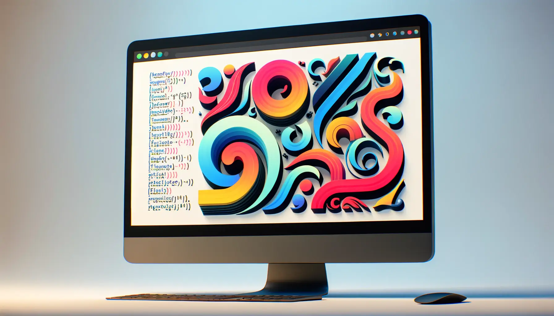
The resurgence of Art Nouveau in the digital age is a testament to the timeless appeal of this decorative art form, especially within the realm of typography.
Art Nouveau, a style that flourished between 1890 and 1910, is characterized by its use of organic shapes, elegant lines, and intricate patterns.
Its influence on typography has been profound, offering a unique blend of creativity and elegance that can transform the aesthetic of web interfaces.
This article delves into how Art Nouveau typography can be leveraged to create elegant and visually compelling web interfaces, enhancing user experience and engagement.
Integrating Art Nouveau typography into web design not only pays homage to a pivotal movement in the history of art and design but also provides a distinctive aesthetic that sets a website apart from its contemporaries.
The fluidity and ornamental beauty of Art Nouveau fonts bring a touch of sophistication and personality to digital spaces, making them more inviting and memorable to users.
By exploring the principles of Art Nouveau typography, web designers can unlock new possibilities for creative expression and communication in their projects.
- The Historical Significance of Art Nouveau Typography
- Implementing Art Nouveau Typography in Modern Web Design
- Enhancing User Experience with Art Nouveau Typography
- Art Nouveau Typography and Brand Identity
- Design Considerations for Art Nouveau Typography
- Art Nouveau Typography in Responsive Web Design
- Future Trends in Typography and Art Nouveau’s Place
- Embracing the Past to Innovate the Future: The Role of Art Nouveau Typography in Modern Web Design
- Art Nouveau Typography FAQs
The Historical Significance of Art Nouveau Typography
Art Nouveau typography emerged as a reaction against the mechanical production and rigid forms of the Industrial Revolution.
Designers of the era sought to bring beauty and nature back into everyday life, which led to the creation of typefaces that featured flowing lines, organic forms, and intricate details.
These characteristics mirrored the Art Nouveau movement’s overall philosophy, emphasizing harmony between form and function, and the integration of art into all aspects of life.
The influence of Art Nouveau typography extended beyond its time, leaving a lasting legacy on the design world.
Its emphasis on individuality and craftsmanship resonates with contemporary designers who value uniqueness and personal touch in their work.
By incorporating Art Nouveau elements into web interfaces, designers can evoke a sense of nostalgia while providing a fresh and modern user experience.
Characteristics of Art Nouveau Fonts
Art Nouveau fonts are easily identifiable by their distinctive features, which include elongated curves, sinuous lines, and a strong emphasis on natural motifs.
These fonts often contain floral and botanical elements, weaving natural beauty into the letters themselves.
The use of asymmetry and stylized forms makes Art Nouveau typography stand out, offering a break from the conventional and introducing an element of fantasy and whimsy into the design.
Another hallmark of Art Nouveau fonts is their versatility.
They can be used in a wide range of contexts, from headers and titles to body text, depending on the specific font and its readability.
This flexibility allows web designers to experiment with different applications, creating cohesive and visually engaging interfaces that capture the essence of Art Nouveau’s artistic spirit.
Incorporating Art Nouveau typography into web design not only enhances the visual appeal of a site but also connects it to a rich artistic heritage, offering a unique user experience that stands out in the digital landscape.
Implementing Art Nouveau Typography in Modern Web Design
The integration of Art Nouveau typography into modern web design requires a thoughtful approach that balances aesthetic appeal with functionality.
To effectively leverage this style, designers must consider how these ornate typefaces can enhance the user interface (UI) and user experience (UX) of a website.
Here are some practical strategies for incorporating Art Nouveau typography into web design:
Choosing the Right Font
Selecting the appropriate Art Nouveau font is crucial for achieving the desired impact on your website.
Consider the following factors when choosing an Art Nouveau font:
- Legibility: Ensure the font is readable at various sizes, especially for body text.
- Compatibility: Check that the font displays well across different browsers and devices.
- Theme alignment: Choose a font that complements the overall design theme and purpose of the website.
Strategic Placement
Once you’ve selected an Art Nouveau font, consider how and where to use it on your website for maximum effect:
- Headlines and Titles: Art Nouveau fonts make striking headlines and titles, instantly drawing attention.
- Accent Elements: Use these fonts for call-to-action buttons, navigation menus, or as decorative elements to add flair.
- Consistency: Maintain a consistent use of the font throughout the site to unify the design and enhance brand identity.
Combining Fonts
Art Nouveau fonts can be beautifully paired with other typefaces to create a balanced and harmonious look:
- Complementary Pairings: Combine an Art Nouveau font with a simple sans-serif or serif font for readability and contrast.
- Hierarchy: Use Art Nouveau fonts for headings and a more neutral font for body text to guide the user’s attention effectively.
- Experimentation: Don’t be afraid to experiment with different font pairings to find the perfect match for your design.
Art Nouveau typography, when used judiciously, can transform a website’s interface, making it not only visually appealing but also a reflection of the brand’s creative identity.
Enhancing User Experience with Art Nouveau Typography
The application of Art Nouveau typography in web design does more than just beautify the interface; it significantly enhances the user experience (UX).
A well-designed website using Art Nouveau fonts can evoke emotions, convey brand personality, and improve usability.
Here’s how Art Nouveau typography can elevate the UX of a website:
Creating an Emotional Connection
Art Nouveau typography, with its organic and flowing designs, can evoke a sense of elegance and warmth.
This emotional resonance can make the website more inviting and engaging to users, encouraging longer visits and deeper exploration.
By carefully selecting Art Nouveau fonts that align with the brand’s identity and values, designers can create a strong emotional connection with the audience.
This connection is crucial for building brand loyalty and enhancing the overall user experience.
Improving Readability and Navigation
Despite their decorative nature, Art Nouveau fonts can be highly readable when used correctly.
Improving readability with these fonts involves:
- Choosing fonts with clear, legible characters for body text.
- Using larger font sizes for headings and titles to ensure they stand out.
- Limiting the use of ornate fonts to specific elements to avoid overwhelming users.
Effective navigation is another aspect of UX that can be enhanced with Art Nouveau typography.
By using these fonts for menu items and call-to-action buttons, designers can create visually distinct navigation elements that guide users through the site intuitively.
Optimizing for Performance
The performance of a website is a critical component of user experience.
Art Nouveau fonts, especially when used as web fonts, need to be optimized to ensure they do not slow down the site.
This includes:
- Using font hosting services that offer fast loading times.
- Selecting only the font styles and weights that will be used on the site to reduce file sizes.
- Implementing font display strategies to prevent text invisibility while fonts are loading.
By optimizing Art Nouveau fonts for performance, designers can ensure that the aesthetic benefits do not come at the cost of user satisfaction.
Art Nouveau typography can significantly enhance the user experience by creating an emotional connection, improving readability and navigation, and being optimized for performance.
Art Nouveau Typography and Brand Identity
Art Nouveau typography is not just a stylistic choice; it’s a strategic tool for building and expressing brand identity.
The unique qualities of Art Nouveau fonts can help brands stand out in a crowded digital landscape, conveying their values and personality in a visually compelling way.
Here’s how Art Nouveau typography can be effectively utilized to strengthen brand identity:
Conveying Brand Personality
The intricate and ornamental nature of Art Nouveau fonts can communicate a brand’s personality traits, such as elegance, creativity, and attention to detail.
Selecting a font that aligns with the brand’s values and message is crucial for creating a cohesive identity that resonates with the target audience.
For instance, a luxury fashion brand might use an Art Nouveau font to emphasize its heritage and sophistication, while a creative agency could leverage the style to showcase its innovative and artistic approach.
Enhancing Brand Recognition
Art Nouveau typography can play a key role in making a brand memorable.
The distinctiveness of these fonts ensures that brand materials, from websites to marketing collateral, are instantly recognizable.
This visual consistency across different mediums reinforces brand identity and aids in building brand recognition.
Moreover, the use of unique Art Nouveau fonts can set a brand apart from competitors, providing a competitive edge in markets saturated with generic visual identities.
Supporting Brand Messaging
The choice of typography can significantly impact how brand messaging is perceived.
Art Nouveau fonts, with their expressive and decorative features, can add depth to brand storytelling, making messages more engaging and impactful.
By carefully integrating Art Nouveau typography into key messaging elements, brands can enhance the emotional impact of their communications, making them more persuasive and memorable to their audience.
Art Nouveau typography is a powerful asset for brand identity, capable of conveying personality, enhancing recognition, and supporting messaging in a way that resonates with audiences and distinguishes the brand in the digital era.
Design Considerations for Art Nouveau Typography
While Art Nouveau typography offers a wealth of creative possibilities, its successful integration into web design requires careful consideration.
To ensure that the use of Art Nouveau fonts enhances rather than detracts from the user experience, designers must pay attention to several key design considerations:
Balance and Harmony
Creating a balanced and harmonious design with Art Nouveau fonts involves:
- Contrast: Pairing ornate Art Nouveau fonts with simpler typefaces for body text to ensure readability and visual balance.
- Scale: Adjusting font sizes and weights to create a clear hierarchy of information, guiding the user’s eye through the content.
- Spacing: Using adequate spacing around Art Nouveau type elements to prevent the design from feeling cluttered or overwhelming.
Color and Background
The choice of color and background plays a significant role in how Art Nouveau typography is perceived:
- Color Schemes: Selecting colors that complement the font’s style and enhance its legibility, especially on digital screens.
- Background Textures: Using subtle textures or patterns can add depth to the design and make Art Nouveau fonts stand out.
- Contrast: Ensuring high contrast between the font color and the background to improve readability and visual impact.
Adaptability and Responsiveness
Ensuring that Art Nouveau typography works well across different devices and screen sizes involves:
- Responsive Design: Testing font sizes and layouts on various devices to ensure that the design adapts effectively and remains user-friendly.
- Font Loading: Optimizing font loading times to prevent delays in text rendering, which can affect the user experience.
- Scalability: Choosing fonts that scale well, maintaining their decorative qualities without compromising legibility at smaller sizes.
Attention to balance, color, and adaptability is crucial when incorporating Art Nouveau typography into web design, ensuring that the aesthetic benefits enhance rather than compromise the user experience.
Art Nouveau Typography in Responsive Web Design
In the era of mobile-first design, ensuring that Art Nouveau typography remains effective and beautiful across all devices is a challenge that designers must navigate.
Responsive web design principles allow Art Nouveau fonts to adapt to various screen sizes, maintaining their aesthetic appeal without sacrificing usability.
Here’s how to integrate Art Nouveau typography into responsive web design:
Flexible Typography Systems
Creating a flexible typography system involves:
- Using relative units like ems, rems, or percentages for font sizes to ensure they scale appropriately across devices.
- Implementing CSS media queries to adjust font sizes, line heights, and spacing based on the device’s screen size and resolution.
- Designing fluid typographic scales that maintain harmony and proportion in the layout, regardless of the viewing environment.
Performance Optimization
Optimizing the performance of Art Nouveau fonts for responsive design includes:
- Choosing web-friendly Art Nouveau fonts that are optimized for screen use to reduce loading times.
- Utilizing font display techniques and loading strategies to minimize the impact on page load speed and prevent layout shifts.
- Limiting the number of font variations (weights, styles) used on the site to decrease the amount of data that needs to be downloaded.
Visual Consistency Across Devices
Maintaining visual consistency for Art Nouveau typography across different devices requires:
- Thorough testing on various screen sizes and resolutions to ensure fonts display as intended.
- Adjusting font weights and styles for smaller screens to improve readability and visual impact.
- Ensuring that the use of Art Nouveau fonts aligns with the overall design and branding, providing a cohesive user experience on any device.
Responsive web design not only enhances the usability of Art Nouveau typography across different devices but also preserves its decorative beauty, making it a versatile choice for modern web interfaces.
Future Trends in Typography and Art Nouveau’s Place
The digital landscape is ever-evolving, and with it, the trends in typography continue to shift.
As we look towards the future, the revival of historical styles, including Art Nouveau, plays a significant role in shaping modern web design.
Art Nouveau’s intricate details and organic forms offer a refreshing contrast to the minimalist tendencies that have dominated recent years.
Here’s a glimpse into the future trends in typography and where Art Nouveau might fit:
Blending Historical Inspiration with Modern Design
The future of typography lies in the innovative blending of historical influences with contemporary design principles.
Art Nouveau, with its distinctive style and emphasis on natural motifs, provides a rich source of inspiration for designers seeking to infuse their work with a sense of elegance and creativity.
This fusion of old and new can lead to unique and memorable web experiences that stand out in the digital age.
Increased Personalization and Brand Identity
As brands strive to differentiate themselves in a crowded market, the demand for personalized and distinctive typography will rise.
Art Nouveau fonts, known for their unique character and flair, can play a key role in establishing a strong brand identity.
Their use in digital interfaces can convey a brand’s values and personality, creating a deeper connection with the audience.
Technological Advancements and Typography
Technological advancements, such as variable fonts and improved web font delivery systems, will further enhance the usability and appeal of Art Nouveau typography in web design.
These technologies allow for more flexibility in font usage, enabling designers to adjust font styles dynamically based on user interaction or device specifications.
As a result, Art Nouveau fonts can become even more integrated into the fabric of web design, offering both beauty and functionality.
Assuming that historical typography styles like Art Nouveau have no place in modern web design is a misconception. As design trends evolve, the blend of historical inspiration and contemporary techniques will continue to enrich the digital landscape.
Embracing the Past to Innovate the Future: The Role of Art Nouveau Typography in Modern Web Design
The exploration of Art Nouveau typography within the realm of modern web design reveals a fascinating interplay between historical art movements and contemporary digital aesthetics.
This article has traversed the significance of Art Nouveau typography, its practical application in web design, and its potential future trends, underscoring its enduring relevance and appeal.
As we delve into the conclusion, it’s clear that Art Nouveau typography is not merely a relic of the past but a vibrant source of inspiration that continues to influence and enhance the digital landscape.
Key Takeaways on Art Nouveau Typography in Web Design
Art Nouveau typography offers a unique blend of elegance, creativity, and naturalism, making it a compelling choice for web designers seeking to create distinctive and engaging online experiences.
The intricate details and organic forms characteristic of Art Nouveau fonts can elevate a website’s aesthetic, imbuing it with personality and sophistication.
However, the successful integration of these fonts into web design requires careful consideration of legibility, balance, and responsiveness to ensure a seamless user experience across all devices.
Future Directions and Technological Synergies
Looking ahead, the fusion of Art Nouveau typography with modern design trends and technologies presents exciting possibilities for innovation in web design.
The resurgence of interest in historical typography styles, coupled with advancements in font technology, suggests a future where Art Nouveau’s ornamental beauty and functional versatility are more accessible and adaptable than ever before.
Designers are poised to explore new frontiers in typography, where the past and future converge to create web interfaces that are not only visually stunning but also deeply resonant with users.
- The continued blending of historical inspiration with contemporary design will enrich the visual and emotional impact of web interfaces.
- Personalization and brand identity will increasingly leverage unique typographic styles like Art Nouveau to stand out in the digital domain.
- Technological advancements will enhance the flexibility and performance of Art Nouveau fonts, making them a practical choice for responsive and dynamic web design.
In conclusion, Art Nouveau typography embodies the spirit of innovation and the pursuit of beauty, qualities that are as relevant in the digital age as they were at the turn of the 20th century.
By integrating Art Nouveau fonts into web design, we pay homage to the past while embracing the future, creating digital experiences that are not only functional but also deeply meaningful and aesthetically enriching.
As we move forward, the legacy of Art Nouveau typography will continue to inspire designers to push the boundaries of creativity and technology, crafting web interfaces that captivate, communicate, and connect in profound ways.
Quality web design is key for a great website! Check out our service page to partner with an expert web design agency.
Art Nouveau Typography FAQs
Explore the elegance and intricacies of Art Nouveau typography with answers to frequently asked questions that blend historical insight with modern application.
Art Nouveau typography is characterized by its organic shapes, flowing lines, and intricate patterns, often inspired by natural elements.
It introduces elegance and uniqueness, setting a website apart with its decorative and organic design elements.
Ensuring legibility and optimizing for web performance are key challenges due to the intricate details of Art Nouveau fonts.
While primarily used for headings and decorative purposes, select Art Nouveau fonts can be adapted for body text with careful design considerations.
Consider the font’s legibility, compatibility with your design theme, and its ability to convey the desired brand personality.
Its distinctive style can convey elegance and creativity, helping brands stand out and connect emotionally with their audience.
Yes, many Art Nouveau fonts have been adapted for digital use, offering web-friendly versions that maintain their stylistic features.
It offers a counterpoint to minimalist trends, adding decorative complexity and a touch of historical elegance to modern designs.
