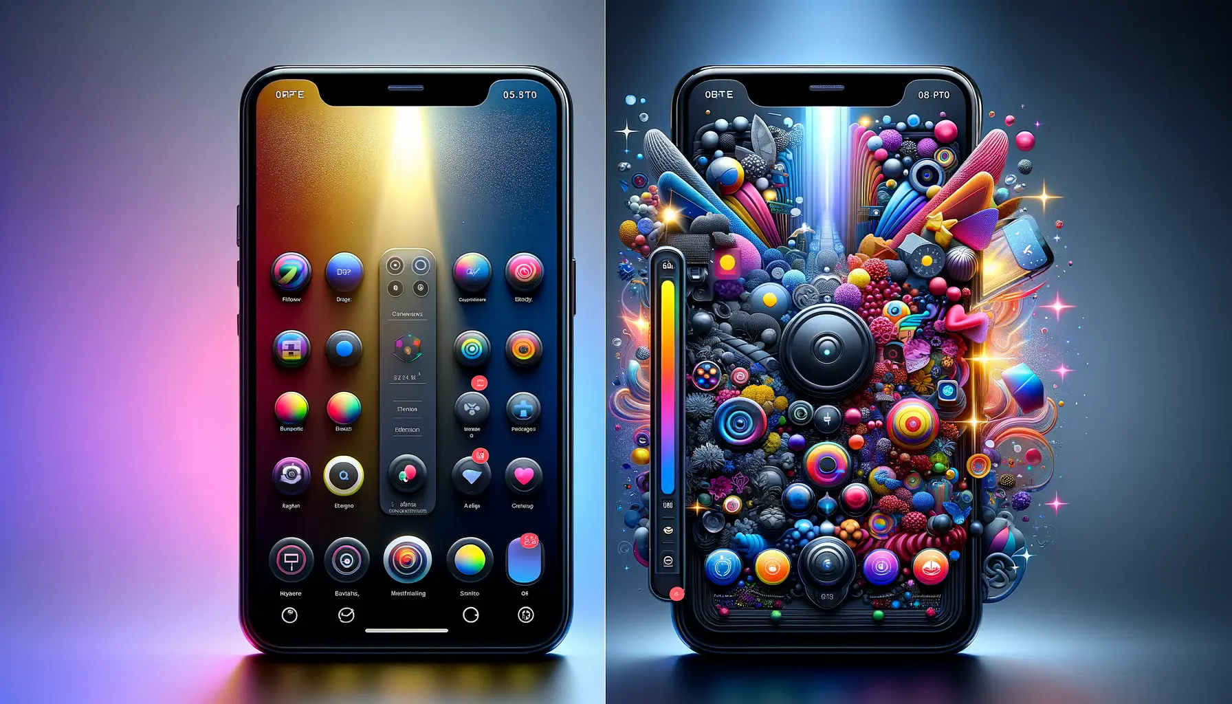
The digital landscape is teeming with apps, each vying for user attention.
In this competitive arena, the visual appeal of app icons and screenshots plays a pivotal role in captivating users.
These elements are not mere embellishments; they are the forefront of user engagement and app marketing.
This article delves into the art and science of designing app icons and screenshots that not only attract attention but also encourage downloads and usage.
Understanding the importance of these visual elements is crucial for developers and marketers alike.
As the first point of contact between the app and potential users, icons and screenshots must convey the essence of the app, its functionality, and its value proposition.
They are the visual storytellers of the app’s journey, enticing users to embark on an experience that is both engaging and rewarding.
- The Art of App Icon Design
- Mastering App Screenshot Design
- Optimizing Visuals for Different Platforms
- Utilizing A/B Testing for Icon and Screenshot Optimization
- Enhancing User Engagement Through Visual Storytelling
- Adapting to Trends and User Preferences
- Incorporating User Feedback in Visual Design
- Maximizing Impact with SEO and ASO Strategies
- Leveraging Analytics for Data-Driven Design Decisions
- Conclusion: Mastering the Art of App Visuals
- App Icons and Screenshots: Essential FAQs
The Art of App Icon Design
Designing an app icon is a nuanced process that blends creativity with strategic thinking.
The icon must be visually appealing, instantly recognizable, and reflective of the app’s core concept.
It’s not just about creating a pretty picture; it’s about encapsulating the app’s identity in a small, yet powerful visual.
Key considerations in app icon design include simplicity, uniqueness, and relevance.
A simple design ensures easy recognition, while uniqueness helps the app stand out in a crowded marketplace.
Relevance to the app’s content and purpose ties the visual representation to the user’s expectations, creating a seamless introduction to the app.
Color Psychology in Icon Design
Colors play a significant role in icon design.
Different colors evoke different emotions and associations.
For instance, blue often represents trust and reliability, making it a popular choice for social media and communication apps.
Understanding color psychology can help designers choose a palette that not only looks good but also aligns with the app’s ethos.
Symbolism and Metaphors
Effective app icons often use symbolism or metaphors to convey the app’s functionality.
For example, a note-taking app might use an image of a pen or notebook.
This visual shorthand helps users quickly grasp the app’s purpose, enhancing the likelihood of engagement.
Remember, an app icon is not just a logo; it’s a visual summary of the app’s purpose and appeal.
Mastering App Screenshot Design
Screenshots are the narrative that complements the story told by the app icon.
They provide a sneak peek into the app’s interface, features, and user experience.
Well-designed screenshots can significantly boost an app’s download rates by showcasing its best features in an attractive and understandable format.
When designing screenshots, it’s essential to focus on clarity and context.
The images should be high-quality and clearly display the app’s main features.
They should also tell a story, guiding the user through the app’s benefits and how it can be used in their daily life.
Highlighting Key Features
Choose screenshots that highlight the app’s key features and functionalities.
This not only informs users about what the app offers but also demonstrates how it stands out from competitors.
Showcasing unique features or innovative user interfaces can be a decisive factor in a user’s decision to download.
Creating a Visual Flow
The arrangement of screenshots should follow a logical sequence, creating a visual flow that takes the user on a journey through the app.
This can start with the home screen, followed by key features and user benefits, ending with a call to action or a glimpse of advanced features.
Optimizing Visuals for Different Platforms
Creating app icons and screenshots that are optimized for various platforms is a critical step in app design.
Each platform, be it iOS, Android, or web-based applications, has its unique design guidelines and user expectations.
Adhering to these guidelines ensures that the visuals are not only aesthetically pleasing but also functional and user-friendly.
iOS Design Considerations
- Apple’s iOS platform favors clean, minimalist designs with a focus on clarity and depth. Icons should have a sleek, modern look, often with a 3D effect.
- Screenshots for the App Store should be straightforward, highlighting the app’s functionality and user interface without unnecessary embellishments.
Android Design Elements
- Android app icons often embrace Material Design principles, focusing on bold, graphic, intentionally flat designs.
- For Google Play, screenshots can be more descriptive, providing users with detailed insights into the app’s features and usability.
Web Application Visuals
- Web app icons need to be versatile, scaling effectively for different browser tabs and devices.
- Screenshots for web apps should demonstrate how the app functions within a web browser, providing a realistic preview of the user experience.
Adapting your app’s visuals to fit the platform’s style and requirements is essential for a cohesive user experience.
Utilizing A/B Testing for Icon and Screenshot Optimization
A/B testing is a powerful tool in the app development process, particularly for optimizing icons and screenshots.
This method involves creating multiple versions of an icon or screenshot and testing them with a segment of the app’s target audience to see which version performs better in terms of user engagement and conversion rates.
Key Steps in A/B Testing
- Develop multiple variations of the app icon or screenshots, each with a distinct design element altered.
- Use analytics tools to track which version garners more clicks, downloads, and positive user feedback.
- Analyze the data to determine which design elements resonate most with your target audience.
Benefits of A/B Testing
- Identifies the most effective visual elements that lead to higher engagement and downloads.
- Provides data-driven insights, reducing the guesswork in design decisions.
- Helps in understanding user preferences and trends in app design.
By continuously testing and refining app icons and screenshots, developers and marketers can significantly improve the app’s appeal and performance in the market.
Enhancing User Engagement Through Visual Storytelling
Visual storytelling in app design is not just about creating attractive graphics; it’s about weaving a narrative that resonates with users.
This approach involves using visuals to tell a story about the app, its features, and how it fits into the user’s life.
Effective visual storytelling can significantly enhance user engagement and foster a deeper connection with the app.
Creating a Narrative with Screenshots
- Start with an introductory screenshot that sets the tone and introduces the app.
- Follow with images that showcase key features and how they solve common problems or enhance the user’s experience.
- End with a call-to-action or a glimpse into advanced features, encouraging users to explore further.
Emotional Connection Through Icon Design
App icons can evoke emotions and create a sense of familiarity.
Designing icons that users can relate to on an emotional level can lead to increased app affinity and loyalty.
This might involve using familiar shapes, colors that evoke certain moods, or imagery that reflects the app’s purpose.
Consistency in Visual Elements
Maintaining consistency in visual elements across the app icon and screenshots helps in building a cohesive brand image.
This consistency should extend to the app’s user interface, creating a seamless experience from the first interaction to daily usage.
Consider your app’s icon and screenshots as chapters in a story, each contributing to a narrative that captivates and engages users.
Utilizing Visuals to Highlight Unique Selling Points
Identify what sets your app apart and use visuals to highlight these unique selling points (USPs).
This could be an innovative feature, a unique user interface, or a specific problem that the app solves.
Make these USPs the focal point of your visual storytelling.
Interactive Elements in Screenshots
Incorporating interactive elements in screenshots, such as swipeable images or short animations, can provide a more dynamic and engaging preview of the app.
This interactive approach can give users a taste of the app’s functionality and user experience.
By mastering the art of visual storytelling, app developers and marketers can create a compelling narrative that not only attracts users but also keeps them engaged and invested in the app.
Adapting to Trends and User Preferences
Staying attuned to the latest design trends and user preferences is crucial in the ever-evolving world of app development.
Trends in app icon and screenshot design can shift rapidly, influenced by changes in user behavior, technological advancements, and cultural shifts.
Adapting to these trends while maintaining the app’s core identity is key to staying relevant and appealing to users.
Monitoring Design Trends
Keeping an eye on emerging design trends is essential.
This includes changes in color schemes, typography, and graphic styles.
For instance, a shift towards minimalism or the use of bold, vibrant colors can significantly impact user expectations and preferences.
Understanding User Behavior
Understanding how users interact with app stores and what captures their attention can inform design decisions.
This might involve analyzing user feedback, conducting surveys, or using analytics to track user behavior patterns.
Adapting to Technological Changes
Technological advancements, such as new screen sizes or display technologies, can impact how visuals are designed and displayed.
Staying updated with these changes ensures that app icons and screenshots are optimized for the best user experience.
Customization and Personalization
Offering customization options for app icons can cater to user preferences, allowing them to personalize their experience.
This approach can increase user attachment and satisfaction with the app.
Adapting to trends and user preferences is not about losing the app’s identity; it’s about evolving with the times while maintaining the essence of the app.
Localizing Visuals for Global Appeal
For apps targeting a global audience, localizing visuals can be highly effective.
This involves adapting icons and screenshots to reflect cultural nuances and preferences of different regions, making the app more relatable and appealing to a diverse user base.
Responsive and Adaptive Design
Ensuring that app icons and screenshots are responsive and adapt well to various devices and screen sizes is crucial.
This adaptability enhances the user experience, making the app more accessible and user-friendly across different platforms.
By staying flexible and responsive to trends, technological advancements, and user preferences, app developers and marketers can ensure that their app remains competitive and appealing in a rapidly changing digital landscape.
Incorporating User Feedback in Visual Design
User feedback is an invaluable resource in the iterative process of app design, especially when it comes to the visual elements like app icons and screenshots.
Actively seeking and incorporating user feedback ensures that the app not only looks appealing but also meets the practical needs and preferences of its target audience.
Gathering User Feedback
- Utilize app store reviews and ratings to understand user opinions about the app’s visuals.
- Conduct surveys or focus groups to gather detailed feedback on specific design elements.
- Monitor social media and online forums for unsolicited feedback and discussions about the app.
Responding to Feedback
It’s not just about collecting feedback, but also about responding to it in a meaningful way.
This could involve making design tweaks based on user suggestions or addressing common concerns in app updates.
Iterative Design Process
App design should be viewed as an ongoing process.
Regular updates based on user feedback can help keep the app visually and functionally relevant.
This iterative process is key to maintaining user interest and satisfaction over time.
User feedback is a direct line to the app’s audience, providing insights that can drive meaningful improvements in visual design.
Testing Changes with Users
- Before rolling out major visual changes, test them with a small user group to gauge reactions and effectiveness.
- Use A/B testing for different design variations to determine which changes are most positively received.
Adapting to User Needs
Be prepared to adapt the app’s visuals to changing user needs and preferences.
This could mean simplifying the design, making it more vibrant, or even overhauling the visual theme to better align with user expectations.
Accessibility Considerations
Incorporating user feedback should also involve considering accessibility.
Ensure that the app’s visuals are usable and enjoyable for people with varying abilities, enhancing the app’s inclusivity and reach.
By placing user feedback at the heart of visual design, app developers and marketers can create icons and screenshots that not only attract users but also keep them engaged and loyal to the app.
Maximizing Impact with SEO and ASO Strategies
In the digital marketplace, the visibility of an app is as crucial as its design.
Search Engine Optimization (SEO) and App Store Optimization (ASO) are strategies that enhance an app’s discoverability and appeal to potential users.
These strategies involve optimizing various elements, including app icons and screenshots, to improve ranking and visibility in app stores and search engines.
Keyword Optimization in Descriptions
- Incorporate relevant keywords in the app’s description and metadata to improve search rankings.
- Use tools to research and identify keywords that are popular and relevant to the app’s features and target audience.
Visual Optimization for Search Algorithms
Search algorithms in app stores also consider visual elements.
Ensure that app icons and screenshots are optimized for visibility, with clear, high-quality images that align with search terms and user queries.
Localized Content for Global Reach
Localizing app content, including visuals and descriptions, can significantly improve visibility in different regions.
Tailoring content to specific languages and cultural contexts enhances relevance and appeal to a broader audience.
Assuming that SEO and ASO are only about text optimization is a misconception. Visual elements play a significant role in these strategies.
User Reviews and Ratings
Encourage users to leave reviews and ratings, as these are important factors in SEO and ASO.
Positive reviews and high ratings can improve the app’s visibility and credibility in app stores and search results.
Regular Updates and Refreshes
Regularly updating the app, including its visuals, can signal to search algorithms that the app is active and evolving.
This can lead to better rankings and increased visibility.
Monitoring and Adapting to Algorithm Changes
Stay informed about changes in app store algorithms and SEO best practices.
Adapting to these changes promptly can maintain or improve the app’s visibility in a competitive market.
By integrating SEO and ASO strategies into the app’s visual design process, developers and marketers can ensure that their app not only looks appealing but also reaches its intended audience effectively.
Leveraging Analytics for Data-Driven Design Decisions
In the realm of app development, analytics play a crucial role in guiding design decisions.
By analyzing user data, developers and marketers can make informed choices about app icons, screenshots, and overall visual strategy.
This data-driven approach ensures that design decisions are not based on assumptions but on actual user behavior and preferences.
Tracking User Engagement
- Monitor how users interact with the app’s visuals, including click-through rates on icons and engagement with screenshots.
- Analyze which visual elements are most effective in driving downloads and user retention.
Understanding User Demographics
Use analytics to gain insights into the app’s user demographics.
Tailoring the app’s visuals to the preferences and behaviors of the target audience can significantly enhance its appeal and effectiveness.
Heatmaps and User Flow Analysis
Employ tools like heatmaps to understand how users navigate through the app store pages.
Analyzing user flow can reveal which screenshots are most viewed and which elements capture the most attention.
Data-driven design is about aligning the app’s visuals with real user insights, leading to more effective and user-centric design choices.
Experimentation and Iteration
Use analytics as a basis for experimentation.
Test different visual elements and analyze their impact on user behavior.
This iterative process can lead to continuous improvement in the app’s visual appeal and functionality.
Competitive Analysis
Analyze competitors’ visual strategies and user responses to them.
This can provide valuable insights into what works well in the market and help in differentiating the app’s visuals from competitors.
Long-Term Tracking for Trends
Track user data over extended periods to identify long-term trends in user preferences and behaviors.
This can inform decisions about evolving the app’s visual strategy to stay relevant and appealing.
By leveraging analytics, app developers and marketers can make data-driven decisions that not only enhance the visual appeal of the app but also align closely with user needs and market trends.
Conclusion: Mastering the Art of App Visuals
In the dynamic world of app development, the creation of captivating app icons and screenshots is not just an artistic endeavor but a strategic one.
These visual elements serve as the gateway to user engagement, acting as silent ambassadors that communicate the essence of the app.
The journey of crafting these visuals is intricate, involving a deep understanding of design principles, user psychology, and market trends.
Key Takeaways for Effective App Visual Design
- App icons should be simple, memorable, and reflective of the app’s purpose.
- Screenshots need to tell a compelling story of the app, highlighting key features and user benefits.
- Adapting to platform-specific design guidelines ensures consistency and enhances user experience.
- Incorporating user feedback leads to designs that resonate more deeply with the target audience.
- SEO and ASO strategies are crucial for enhancing the app’s visibility and discoverability.
- Leveraging analytics provides data-driven insights for informed design decisions.
Ultimately, the success of app icons and screenshots lies in their ability to communicate effectively with the user.
They must not only attract attention but also convey the value and functionality of the app.
In a marketplace where first impressions are critical, these visual elements hold the power to make or break an app’s success.
Embracing a Holistic Approach
Developers and marketers must embrace a holistic approach, where design, user experience, and marketing strategies converge.
This approach ensures that app visuals are not only aesthetically pleasing but also aligned with user needs and market dynamics.
It’s about creating a visual language that speaks directly to users, enticing them to explore and engage with the app.
In conclusion, the art of designing app icons and screenshots is a continuous journey of exploration, adaptation, and refinement.
By staying attuned to user preferences, technological advancements, and design trends, developers and marketers can craft visuals that truly captivate users, driving the success of their apps in the competitive digital landscape.
Boost your mobile app's success with our guaranteed App Store Optimization (ASO) service. Leave it to the experts!
App Icons and Screenshots: Essential FAQs
Unraveling the intricacies of app icons and screenshots, this FAQ section addresses common queries to help you optimize your app’s visual appeal.
An effective app icon is unique, memorable, and clearly communicates the app’s purpose and personality, aiding in instant recognition.
Optimize app screenshots by using the right sizes, showcasing key features, and creating a narrative that reflects the app’s user experience.
Best practices include using appropriate dimensions, highlighting unique features, and ensuring visuals align with the app’s branding and style.
To make your app icon stand out, focus on distinctive design, vibrant colors, and ensure it resonates with the app’s core functionality.
Colors in app icon design evoke emotions and convey meanings, with each color having its psychological impact on user perception.
App screenshots are crucial for ASO as they visually communicate the app’s features and user experience, influencing download decisions.
Yes, app icons can significantly affect user engagement by influencing first impressions and reflecting the app’s quality and reliability.
The key lies in balancing aesthetic appeal with functionality, ensuring visuals are both attractive and reflective of the app’s purpose.


