Did you ever scroll through a page and get the sense, boom—something just fell into place, like the structure wasn’t fully orthodox, but it pulled you in immediately?
That’s what makes asymmetrical layouts in web design so amazing.
In the age of templates and grid-heavy web design, asymmetrical layouts buck the trend.
They bring in energy, tension, and visual stimulation, and they drive the viewer’s eye in directions symmetrical layouts can’t.
Whether you are a web designer, entrepreneur, or creative thinker, knowing about asymmetrical layouts can change everything about how you tackle your digital presence.
Asymmetrical layouts are more than centering items off-center.
They’re a solid design methodology that achieves balance without being rigid.
Here, we’re going to delve deeper into why asymmetrical layouts are so strong and how you can use them to bring your website’s visual storytelling to a higher level.
Let’s begin at the beginning—what are asymmetrical layouts in web design?
What Are Asymmetrical Layouts in Web Design?
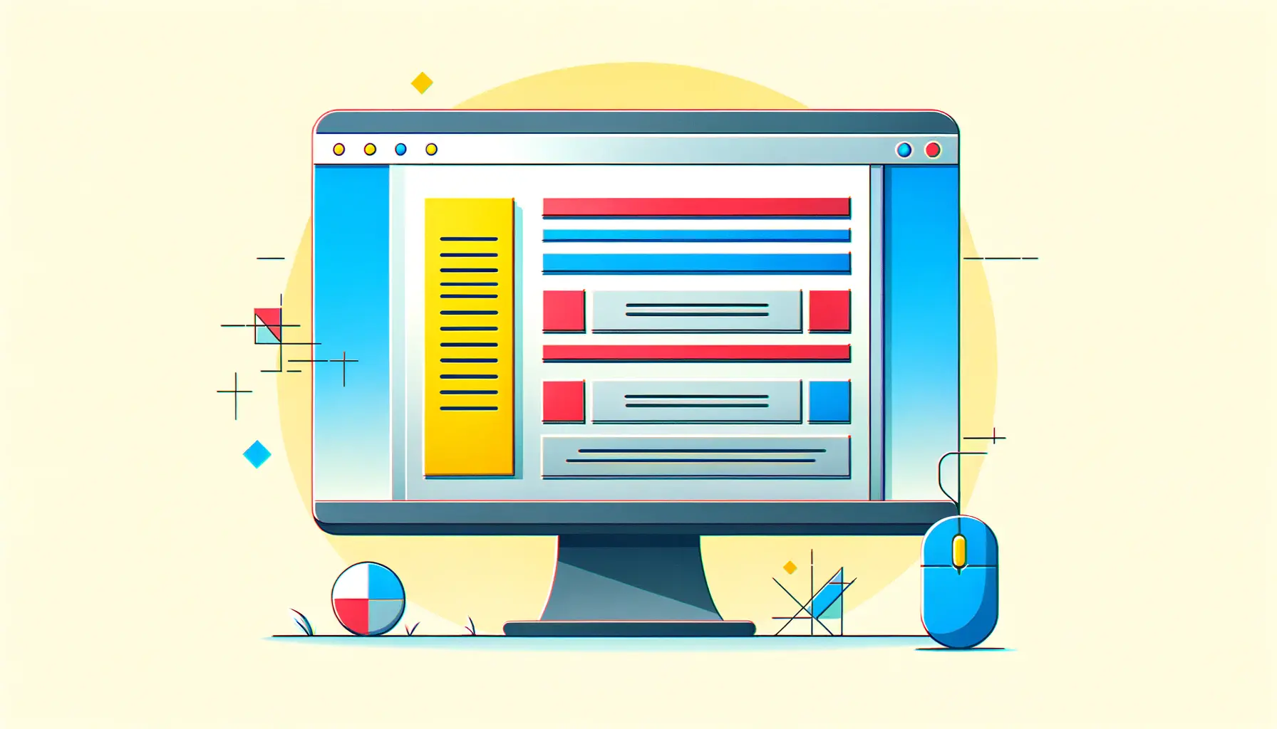
Asymmetrical layouts in web design are not mirrored elements on either side of a middle axis.
Instead of producing harmony via symmetry, they balance using contrast, movement, and visual weight.
The result?
An interactive and dynamic user experience that is more expressive and natural.
But don’t mix up asymmetrical layouts with chaos.
When done correctly, they provide a deliberate visual direction that draws your audience’s attention to where you want it to go.
Let’s get into closer detail on how this is different from the traditional method.
Understanding Symmetry vs. Asymmetry
Symmetrical designs are like folding a sheet of paper in half and both sides being exactly the same.
They’re tidy, predictable, and typically used for formal or conservative websites.
Asymmetrical layouts, on the other hand, break from predictability.
- Symmetry: Evenly balanced on both sides, typically with center alignment.
- Asymmetry: Intentionally unbalanced but still seem to be visually harmonious.
You will often see asymmetrical layouts on design portfolios, new-generation startups, and digital agencies that want to stand out.
Historical Development of Asymmetrical Designs
Use of asymmetry isn’t new.
In fact, it dates back to art movements like ConstructivismAn early 20th-century artistic movement that emphasized abstract, geometric forms and a focus on materials and construction. and ModernismA design and art movement characterized by minimalism, simplicity, and a rejection of ornamentation. when artists used to play around with imbalance to create emotions and accentuate details.
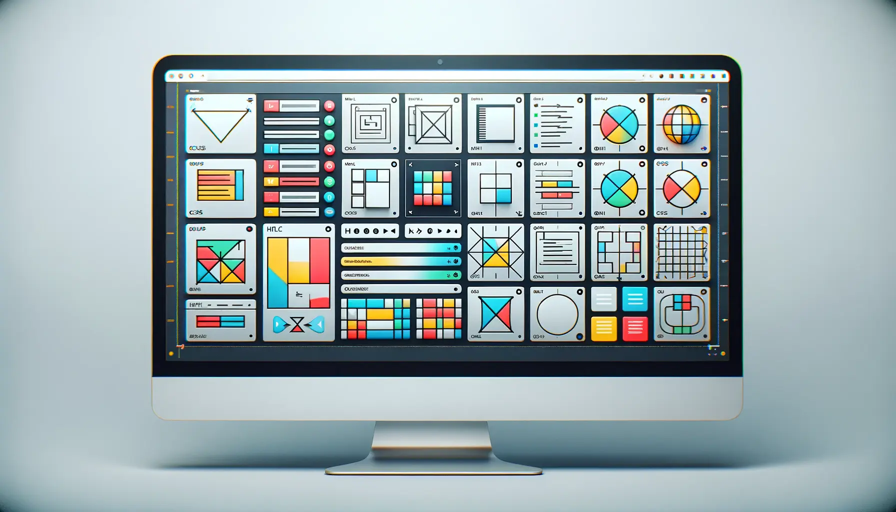
As the web evolved, designers applied those same principles to the web universe, especially with the advent of CSS GridA layout system in CSS used to create complex and responsive web designs using rows and columns. and FlexboxA CSS layout model that allows elements to align and distribute space within a container efficiently..
Asymmetrical layouts are now the trademark of contemporary, progressive design.
They appeal to a younger, design-savvy crowd who expect distinctiveness.
The Reasons Why Designers Like Asymmetry Today
Why are asymmetrical layouts gaining wider acceptance than ever?
Just because users are tired of plain designs.
Asymmetrical layouts introduce personality and can make a brand appear bold, fresh, and innovative.
They also give designers more liberty to create unique brand stories.
- They form focal points naturally.
- They guide user attention without forcing them.
- They stand out amidst a sea of grid-based websites.
If you yearn to defy the rules without forgoing structure, asymmetrical layouts may be your next best move.
Popular Myths About Asymmetrical Design
Let’s bust a few myths while we’re here.
First, asymmetrical layouts don’t mean messy.
In fact, they often require more planning and intentionality than symmetrical layouts.
Another myth?
That asymmetrical layouts are bad for user experience.
Quite the opposite—it can lead users through content more effectively when done right.
- Myth: Asymmetrical layouts confuse users. Truth
- Myth: They’re not mobile-friendly. Truth
- Myth: They’re for designers only. Fact
Asymmetrical layouts in web design are here to stay, and getting to know them is your beginning to making phenomenal digital experiences.
Ready to learn the secrets behind how to make them work?
Let’s begin.
Asymmetrical layouts are not chaotic—they’re structured with intent, using visual weight and contrast to guide users through content in a meaningful way.
Basic Principles Underlying Asymmetrical Layouts
Now that you understand what asymmetrical layouts are, it’s time to learn the underlying design principles that make them work so well.
This is where creativity converges with strategy.
Using asymmetrical layouts isn’t a case of flouting visual conventions willy-nilly—it’s a case of knowing how to flout conventions deliberately.
Everything you lay down has weight, rhythm, and intent.
If you’re going to capture users’ attention and guide them intuitively, learning these principles is vital.
Let’s explore the basic design principles that give asymmetrical layouts their unique beauty and functionality.
Visual Balance Without Symmetry
One of the biggest myths about asymmetrical layouts is that they aren’t balanced.
Actually, balance is still key—but it’s simply achieved in different ways.
Instead of duplicating elements, designers use visual weight, size, and position to achieve harmony.
It’s a little bit like balancing a seesaw: a large image on the left side may be balanced by two smaller elements on the right.
- Use contrasting color or shape to guide the eye.
- Balance a dense element with white space or with smaller text blocks.
- Vary spacing to create balance, not sameness.
Visual balance in asymmetrical layouts is more natural and dynamic and involves users in a natural flow.
Using Negative Space Effectively
Negative space—also called white space—is your secret ally in asymmetrical layouts.
It gives elements breathing room and makes them more effective.
Well-used negative space emphasizes the importance of content by allowing the viewer to focus without distraction.
Don’t be afraid of empty space.
In asymmetrical layouts, strategic emptiness can:
- Create contrast and highlight important content.
- Balance heavy visuals or text blocks.
- Direct the user’s experience by highlighting focal points.
Most contemporary websites adopt this minimalist ethos with great success.
Focal Points and Hierarchy
Hierarchy is more important than ever in asymmetrical layouts.
You need the viewer to know where to look first—and second.
Designers create this by forming focal points using color, typography, or position.
A bright headline, a button with high contrast, or an eye-catching image can instantly draw attention.
To establish strong hierarchy in asymmetrical layouts, consider:
- Employing font size and weight variation to guide the eye.
- Positioning key content where users are likely to look (e.g., top-left corners).
- Highlighting CTAs with bold color or unique shapes.
This enables users to navigate confidently, even with a non-linear layout.
Movement and Flow in Layouts
Asymmetrical layouts thrive with motion.
When crafted with intention, they subtly direct users through the page in a way that’s dynamic yet contained.
This motion is typically achieved through diagonals, layering, overlapping elements, or intentional spacing between elements.
Modern UI/UXUser Experience; the overall experience and satisfaction a user has when interacting with a product or system. trends often include scrolling animations and parallax effects that pair beautifully with asymmetrical layouts.
The kineticism of these approaches captivates users and encourages exploration.
- Employ background shapes or slanted lines to direct attention.
- Layer content to create depth and visual interest.
- Use motion effects that align with the flow of your layout.
Applied correctly, these principles yield engaging, intuitive designs that vibrate with energy—making asymmetrical layouts a favorite among avant-garde designers and brands alike.
The secret to strong asymmetrical layouts lies in mastering balance, negative space, and visual hierarchy without relying on symmetry.
Best Practices in Creating Asymmetrical Layouts
So, you’re ready to join the world of asymmetrical layouts.
Great!
But before you dive in, it’s important to understand that designing with asymmetry is not about putting elements randomly on a screen.
It’s an art—a balance of creativity and intention.
When done right, asymmetrical layouts can be visually appealing, user-friendly, and downright memorable.
Let’s talk best practices to help you design smarter, not harder.
Choosing the Right Grid System
It might sound contradictory, but a solid grid system is the foundation of asymmetrical layouts.
Think of the grid as your invisible assistant.
It keeps the layout intact even when elements appear off-balance.
Designers typically use multi-column grids, modular grids, or CSS Grid systems to maintain alignment and consistency.
- Use a 12-column grid for maximum versatility.
- Experiment with offset columns for energetic structure.
- Utilize tools like CSS Grid or Flexbox to gain custom layouts.
A grid will render your asymmetrical layout harmonious, even when it looks random.
Combining Typography with Layout
Typography is also a huge player in the success of asymmetrical layouts.
Large fonts, varying sizes, and unusual placements can make your content pop.
Combine large headlines with smaller texts, or angle text elements to break linear flows.
Here’s how to use typography to best effect:
- Use jumbo-type headlines to attract attention.
- Combine serif and sans-serif type to create visual contrast.
- Align type with photos to enhance storytelling.
Through proper typography, your asymmetrical layout is more communicative and easier to read.
Color and Contrast Considerations
Color is not just decoration—it’s a tool of emphasis and direction.
In asymmetrical layouts, color establishes hierarchy, balance, and motion.
Bright accents can direct attention to CTAsCalls to Action; prompts on a website that encourage users to take a specific action, like clicking a button., and muted backgrounds provide contrast.
- Use bold colors sparingly to avoid composition overload.
- Ensure color contrast is accessible.
- Use a limited palette to unite your design.
Color unites disparate elements and gives users visual cues on where to look in an asymmetrical layout.
Incorporating Imagery and Visual Assets
Icons, illustrations, and photographs are powerful tools in asymmetrical layouts.
If placed strategically, they can balance text, guide user focus, and bring emotional depth to your design.
Tips for incorporating visuals:
- Counterbalance heavier text areas with imagery.
- Overlay text with visuals for layered effect.
- Experiment with asymmetrical photo cropping and placement.
Images should complement your asymmetrical layout, not battle it—be intentional with every image you choose.
Responsive Design and Mobile Adaptation
Asymmetrical layouts’ biggest hurdle is making them function on every device.
A layout that looks amazing on desktop can entirely collapse on mobile if not adapted correctly.
Fortunately, responsive design features like media queries, Flexbox, and CSS Grid make this easier than ever.
- Test your layout on various screen sizes at an early stage.
- Utilise breakpoints to reorder elements for mobile.
- Put readability and usability ahead of design flair on small screens.
A responsive asymmetrical layout doesn’t have to mean your creativity is at the expense of user experience.
With a bit of planning, it’s possible to maintain the same visual effect regardless of which device is being used.
With these best practices, you can tap into all the power and personality of asymmetrical layouts—without sacrificing structure or usability.
Using asymmetry doesn’t mean abandoning structure—start with a grid system and build intentional designs around it.
Examples and Inspiration from Real Sites
One of the very best ways to learn how to use asymmetrical layouts effectively is to study real-life examples.
The most modern sites on the web today use asymmetry not just to grab attention, but to tell stories, create emotional responses, and connect with users.
Whether you’re building a portfolio, a brand site, or an e-commerce store, studying how others use asymmetrical layouts well can be inspirational for your own creative journey.
Award-Winning Asymmetrical Websites
The majority of websites that have been awarded by platforms like AwwwardsAn online platform that recognizes and promotes innovative and well-designed websites. and CSS Design AwardsA platform that showcases and awards outstanding web design and development projects. feature stunning, beautiful asymmetrical layouts.
Such websites often defy conventional layout patterns in favor of creativity and impact.
- Large offset images and unusual placement of text are typical features of creative portfolios that make strong impressions.
- Animated elements and unconventional grid patterns are featured on agency websites to emphasize creativity.
- Art and culture sites use asymmetry to express movement and energy in their layouts.
These examples show that asymmetrical layouts are more than just a trend—they’re a mark of outstanding design.
E-Commerce Sites Using Asymmetry Effectively
You might think that e-commerce sites use asymmetry only for ease, but many modern online shops use asymmetrical layouts to build stronger brand personalities and engage users more.
- Product information arrives at disparate vertical and horizontal locations to displace boredom.
- Hero images and lifestyle photos morph into product sections with stacked information and overlapping text.
- Storytelling-driven designs guide consumers through an out-of-sequence experience, especially for luxury or boutique products.
This strategy differentiates brands and offers a more memorable shopping experience.
Creative Portfolios with Asymmetrical Layouts
Creative professionals—developers, designers, photographers—prefer to use asymmetrical layouts in order to break away from the rigid structure of common templates.
Their portfolios typically involve bold headlines, white space, unusual image placements, and scrolling effects to lead visitors along a personal visual journey.
- Off-center placed interactive sliders.
- Thinly designed interfaces with contrast and motion.
- Broken grids or diagonal lines that stress creativity.
By breaking rules of symmetry, these portfolios talk in human terms and in honest voices.
Simple Asymmetrical Designs That Work
Minimalist designs are synonymous with asymmetrical layouts.
Pure designs with minimal colors, text, and pictures can work as long as layout choices are deliberate and bold.
In fact, asymmetry brings just the right measure of visual tension to minimalist interfaces to make them feel less clinical.
- Off-grid elements are centerpieces.
- Negative space is used to accentuate headlines or CTAs.
- Subtle asymmetry adds class and sophistication.
It is ideal for brands looking to be fresh, but not tacky.
Trends of Asymmetrical Web Design Nowadays
Asymmetrical layouts are still on the rise, driven by technology as well as users’ expectations.
Some of today’s most popular trends include:
- Scroll-triggered animations: Asymmetrical areas that animate in as the user scrolls.
- Split screens with unequal columns: For storytelling or side-by-side comparison.
- Layered content blocks: Stack text, images, and icons for depth and interaction.
- Interactive asymmetry: Hover effects and micro-interactions that move layout elements.
Exploring these trends will place you on the edge and make your designs fascinating.
Use live sites as your inspiration, and integrate asymmetrical layouts to develop your next work of art.
Study award-winning websites and portfolios to understand how professionals apply asymmetry for storytelling and engagement.
Common Errors and How to Prevent Them
Asymmetrical layouts can bring personality and flair to your work, but they can also be challenging.
It’s easy to do too much asymmetry and produce a design that appears haphazard or confusing.
To make your layout not look accidental or disorienting to users, it’s important to understand the common errors—and how to avoid them.
Unbalanced Designs That Confuse Users
Asymmetry does not equal randomness.
The most frequent mistake is to create arrangements that seem unbalanced or haphazard.
If your content appears to be scattered all over the place, users won’t know where to begin, and this leads to frustration and excessive bounce rates.
- Make sure there remains a visual hierarchy and flow.
- Balance heavy visuals with white space or less heavy elements.
- Test your design with real users or heatmaps to see where attention goes.
Great asymmetrical layouts feel dynamic, not random.
Overcomplicating the Visual Structure
Another error is trying to include too many layers, effects, or contrasting elements.
While complexity can be beautiful when executed well, too much of it causes cognitive overload and visual fatigue.
- Adhere to a straightforward design goal and avoid too much decoration.
- Use no more than three points of focus per page.
- Let breathing room and contrast do some of the heavy lifting.
Keep it simple, and let asymmetry be its own reward.
Bad Use of White Space
White space is crucial to balance in asymmetrical layouts.
Designers tend to forget this and cram too many things into one space, resulting in cluttered and heavy-looking visuals.
- Use negative space to guide the viewer’s eye.
- Give each item some breathing room.
- Don’t hesitate to leave parts of the screen blank intentionally.
If in doubt, add more space for greater clarity and flow.
Ignoring User Experience Principles
With all the thrill of producing a unique design, it’s easy to lose sight of the user.
Asymmetrical layouts still must obey basic UX guidelines like accessibility, intuitive navigation, and fast load times.
- Ensure clickable elements are easy to identify and reach.
- Provide consistent behavior across screen sizes and devices.
- Design with clarity and simplicity.
Design is not purely about appearance—it’s for real people and real devices.
Overshadowing Accessibility in Asymmetry
Accessibility must not be forgotten while creating inspiring designs.
The most creative and artistic asymmetrical layouts need to be accessible to all.
This should include people with visual, cognitive, or motor impairments.
- Utilize proper contrast between color and background for text.
- Use screen reader compliance with clean HTML structure.
- Design layouts that can be navigated with a keyboard or assistive devices.
When accessibility is built into your asymmetrical layout, your site becomes inclusive—and that’s the ultimate goal of great design.
By avoiding these common mistakes, you’ll unlock the full potential of asymmetrical layouts while delivering a seamless and enjoyable experience to your audience.
Asymmetry must be purposeful—random, cluttered layouts can harm user experience and weaken your design’s impact.
Embracing the Power of Asymmetrical Layouts
Why Asymmetrical Layouts Matter in Modern Web Design
Asymmetrical layouts are more than just a stylistic preference—they’re a design advantage for those wishing to create interactive, emotionally driven, and user-centric websites.
Amidst a virtual world cluttered with templated grids and mirrored structures, asymmetry gives designers a way out, to surprise their audiences and communicate your brand’s story in an unorthodox fashion.
When employed with purpose and harmony, asymmetrical layouts can guide visitors through your content in a smooth way, highlight crucial facts, and make a lasting impression.
Their energy naturally invites investigation, stirs emotion, and distinguishes your site from all the other sites that abide by conventional principles of design.
Key Takeaways for Designing with Asymmetry
Throughout this article, we’ve explored the many facets of asymmetrical layouts, from their core principles to real-world applications and common mistakes to avoid.
To recap, here are some critical points to remember:
- Understand the difference between balance and symmetry—aim for visual harmony, not uniformity.
- Use grid systems, white space, and focal points to bring structure to your asymmetrical layout.
- Carefully utilize typography, color, and imagery to establish depth and character.
- Look for inspiration from real sites, especially those that cleverly utilize asymmetry to guide the user experience.
- Prioritize usability and accessibility above all in your design decisions.
Making Asymmetrical Layouts Work for You
If you’re a designer, coder, marketer, or entrepreneur, asymmetrical layouts provide the creative freedom to do as much or as little as you want without sacrificing clarity.
The secret is balancing innovation and usability.
When your design feels meaningful—when every piece has a reason to be there—users won’t just notice, they’ll interact.
Remember that asymmetry is not necessarily disorder.
It represents freedom.
It’s about centering narrative, emotion, and design thinking.
Whether you’re launching a chic portfolio, revamping your brand home page, or creating a world-class landing page, asymmetrical layouts can help you get noticed and get things started.
Your Next Steps
Ready to get started?
Begin by evaluating your current website.
Where can you insert asymmetry?
What elements can be relocated, resized, or stacked to provide a more interactive visual experience?
Experiment freely but test regularly.
User feedback, A/B testing, and performance metrics will allow you to fine-tune your strategy and make sure your asymmetrical layout is performing as planned.
Be inspired by learning from industry-leading designs, and never be afraid to experiment beyond the boundaries of conventional layouts.
With the right strategy, a clear design objective, and careful execution, asymmetrical layouts can transform your online presence into something truly remarkable.
Asymmetrical layouts offer a powerful alternative to traditional design—when used with intention, they can evoke emotion and enhance storytelling.
Quality web design is key for a great website! Check out our service page to partner with an expert web design agency.
Asymmetrical Layouts FAQs
Here are some of the most frequently asked questions regarding the use of asymmetrical layouts in web design, along with concise yet explanatory answers to help navigate your design process.
An asymmetrical layout refers to a design organization in which elements are purposely unbalanced, offering visual stimulation and leading users through content in a dynamic, stimulating manner.
Asymmetrical designs allow for a dramatic, modern look that commands attention, allows for storytelling, and enhances user engagement by breaking free from rigid, symmetrical templates.
Not at all—done correctly, asymmetrical layouts can enhance UX by focusing attention, bringing eyes to what’s most important, and creating depth without overwhelming users with clutter and confusion.
Balance is achieved by deliberate application of visual weight, negative space, contrasting color, and thoughtful positioning of elements to create harmony without exact symmetry.
Yes, but asymmetrical layouts require responsive design methods such as breakpoints and flexible grids to deliver a seamless user experience on every screen size and orientation.
Indeed!
With some fundamental design principles and the help of software like CSS Grid or page builders, novice designers can create stunning asymmetrical designs.
Creative portfolios, agency websites, lifestyle brands, and modern e-commerce websites employ asymmetrical layouts to communicate uniqueness and ensure user interaction.
Yes, white space is essential in asymmetrical layouts to prevent clutter, guide the user’s eye, and maintain the visual experience clean and light.
Use A/B testing, user testing, and heatmaps to quantify performance and ensure that your asymmetrical layout enables usability, accessibility, and engagement goals effectively.


