Among the constantly evolving world of web design, there’s one trend that stands above the rest—bold typography.
It’s not just a matter of making text bigger or heavier; it’s a matter of using type as a visual force.
Bold typography has emerged as an intentional design move that creates attention, imposes hierarchy, and communicates brand personality.
With web design becoming increasingly minimalist and user-focused, bold text has taken center stage, pushing images and graphics aside as a leader in storytelling.
Think about the most recent time that a website really caught your eye—most probably bold typography was present.
It was maybe a bold headline or a bold call-to-action, but bold type does have the effect of stopping you in your tracks mid-scroll.
So how did we get here?
Let’s examine the origin of bold typography in modern web design.
- The Rise of Bold Typography in Modern Web Design
- Design Principles for Working with Bold Typography
- Integrating Bold Typography in UI and UX
- Technical Considerations for Bold Typography
- Future of Bold Typography in Web Design
- Why Bold Typography Will Be the Future of Web Design
- Bold Typography: Most Asked Questions
The Rise of Bold Typography in Modern Web Design
Bold typography is no longer a design choice—it’s a communication behemoth.
Web developers are tapping into bold fonts to improve the user experience and create lasting impressions.
The trend’s popularity is rising due to a combination of visual simplicity, accessibility needs, and web attention spans shorter than ever before.
How bold fonts are changing digital beauty
In the age of the digital, visuals need to be clear, fast, and engaging.
Bold typography does all three.
Bold type provides visual interest and presents organization without relying on complicated graphics.
Designers are looking to text as a significant visual element, and messages are leaping off the screen.
- Bold text creates hierarchy: It informs readers what to pay attention to first.
- It enhances branding: Properly designed bold fonts can become symbols, such as logos.
- It injects emotion: The weight and shape of strong fonts can convey confidence, urgency, or playfulness.
Typography trends shaping 2025 web experiences
Trends in web design are always evolving, and bold typography is leading the charge into 2025.
Designers are experimenting with oversized text, kinetic type animations, and even mixing bold fonts with muted color schemes to create contrast and mood.
You’ll see more landing pages built entirely around text, where every word counts and every letter carries weight.
- Super-sized headlines that dominate the screen
- Monospaced bold fonts for tech and SaaS branding
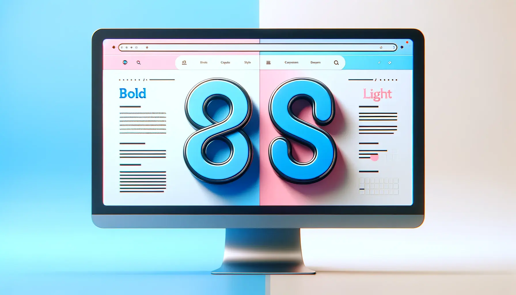
- Mixing thin and bold font to create contrast and rhythm
The psychology of bold visual communication
Why is bold typography so effective?
It resonates with the way our brain sees.
People identify shapes first before reading texts, and bold text provides that with more emphasis.
A bold statement says something meaningful, urgently compelling, and something to be noticed.
That is why it is well-suited for grabbing attention and guiding users through your content flow.
When executed correctly, bold typography doesn’t simply look nice—it feels deliberate.
It’s as if your site is communicating boldly, and your users can sense it.
And when people sense something, they’re more likely to remain engaged.
Case studies of brands successfully using bold typography
Some of the world’s most innovative brands right now are nailing bold typography.
Think modern e-commerce sites, creative agencies, and digital publications.
They use bold fonts to craft identity and enhance narrative.
For example:
- A fashion brand may use bold sans-serif type to convey modernity and confidence.
- A startup may use bold monospaced type to express innovation and tech awareness.
- Media publications often use bold headlines to grab attention immediately and make content more scan-able.
They’re not just design choices—these are calculated moves that turn words into images and infuse your content with strength.
So, are you ready to rethink the role of bold typography in your next web design project?
Bold typography isn’t just a design choice—it’s a visual strategy that shapes user experience and brand communication in modern web design.
Design Principles for Working with Bold Typography
Working effectively with bold typography isn’t a question of merely choosing a heavy font—it’s a question of strategy, balance, and intention.
When done well, bold text can be a real game-changer for your web design.
When done poorly?
It has the potential to overwhelm your layout, confuse your visitors, and dilute your brand.
That’s why mastering the basic design principles underlying bold typography is so important.
Let’s walk through how to use bold fonts in ways that are visually striking, user-friendly, and on-brand.
Balancing contrast and readability
Bold typography must stand out, but not at the cost of readability.
Always consider contrast between your text and its background.
If your text is bold but placed on a low-contrast or highly textured background, it will be difficult to read.
- Use high-contrast color schemes like black on white or dark blue on beige.
- Avoid using more than one bold font in the same space—it reduces clarity.
- Make your line height generous to avoid visual clutter.
The goal is to make your bold text stand out while still being readable by even visually impaired users.
Pairing bold fonts with minimal layouts
Minimal design is a perfect accompaniment to bold typography.
Ample clean space allows bold text to shine with no competition.
When your design is too busy, the impact of your bold messages is negated.
- Use plenty of space around bold headlines.
- Limit your use of color and decorative elements.
- Let the bold typography speak—don’t combat it.
Remember, white space is your friend when working with bold type.
It allows the message to breathe and develops a clean, sophisticated appearance for your layout.
Choosing the right typeface for your brand
Not all bold fonts are created equal.
Some are sleek and modern, others playful or edgy.
When selecting a typeface, think about what your brand stands for.
Your bold typography selection should reflect your personality and values.
- Sans-serif bold fonts are appropriate for modern, clean brands.
- Slab serif or display fonts add character and uniqueness.
- Monospaced bold fonts have a techy, innovative vibe—perfect for startups and dev-oriented sites.
Try different font pairings to see which pairs well with your visual identity.
Two typefaces are the most that the majority of modern websites use to ensure consistency and professionalism.
Spacing, alignment, and visual hierarchy guidelines
Spacing and alignment are just as important as the typeface itself when you’re working with bold typography.
Your bold text should guide the eye, not confuse it.
Visual hierarchy helps your readers scan content faster and notice what’s most valuable.
- Employ bold fonts for headings and key messages—not everything.
- Align bold elements in the same manner to ensure clean and organized layouts.
- Use font size and weight together to create a layered hierarchy.
Think of bold typography as a spotlight.
Use it to highlight your most important messages, but let the rest of your design support that message without drowning it out.
When done correctly, bold typography becomes a powerful storytelling device—one that speaks to your audience before they’ve read one word.
Successful use of bold typography requires balance, intentional design, and careful consideration of readability and brand alignment.
Integrating Bold Typography in UI and UX
Bold typography isn’t just a visual style—it plays a critical role in both user interface (UI) and user experience (UX) design.
It helps guide user attention, improves readability, and strengthens interaction.
As digital spaces become more content-driven, using bold fonts thoughtfully can elevate your product’s usability and emotional impact.
Let’s explore how bold typography fits into UI and UX and how you can use it to create more intuitive and engaging experiences.
Enhancing navigation and user flow with bold text
Clear navigation is key to good UX, and bold typography helps establish that clarity.
Bold labels, headers, and menu items stand out immediately, making it easier for users to understand where they are and where they can go.
- Use bold fonts for primary navigation items to draw attention.
- Highlight section titles and page headers to guide user flow.
- Employ bold labels in forms to improve scannability and reduce confusion.
By using bold typography in your navigation, you’re not just styling your site—you’re directing user behavior with purpose.
Using bold headers to improve accessibility
Accessibility is at the heart of good UX.
Bold text increases readability, especially for users with visual impairments or cognitive difficulties.
When combined with proper contrast and size, bold typography becomes a powerful tool for inclusive design.
- Use bold headers to break up long content and create clear sections.
- Ensure there’s enough contrast between bold text and background colors.
- Pair bold text with semantic HTML tags (like
<h1>to<h6>) to improve screen reader support.
Making your content easier to navigate with bold typography benefits every user—not just those with accessibility needs.
Responsive typography for all screen sizes
With users accessing websites across phones, tablets, laptops, and desktops, your bold typography must adapt.
Responsiveness isn’t just for layout—it’s also about how your text scales and behaves across devices.
- Use relative units like
emorremto keep bold text scalable. - Apply media queries to adjust font weight and size for readability.
- Test your bold fonts across breakpoints to maintain consistency.
Responsive bold typography ensures that your message remains powerful, no matter where it’s viewed.
Interactive design elements and bold fonts
Bold typography can enhance interaction when used in buttons, hover effects, and micro-interactions.
It helps users identify actionable elements quickly, encouraging engagement.
- Use bold text in call-to-action (CTA) buttons to create urgency.
- Apply font weight transitions on hover to give feedback.
- Use animated bold headlines to capture attention during loading states.
When combined with motion and color, bold typography adds personality to your UI and makes user interactions feel more alive.
Microcopy and CTAs: When bold means action
Microcopy—the short, helpful bits of text in your interface—is often overlooked.
But when paired with bold typography, it becomes more visible and impactful.
Whether it’s a small tooltip, error message, or CTA, bold fonts can give microcopyShort text snippets used in user interfaces to guide or inform users. the attention it deserves.
- Highlight key phrases in tooltips with bold styling.
- Use bold CTAs like “Get Started” or “Join Now” to increase conversions.
- Pair bold microcopy with icons to reinforce meaning.
Bold typography isn’t just decorative—it’s functional.
When you integrate it with intent, it improves usability, accessibility, and engagement across every touchpoint of your digital product.
Using bold text purposefully in UI and UX boosts clarity, improves accessibility, and creates a seamless flow that enhances user engagement.
Technical Considerations for Bold Typography
While bold typography adds visual impact to your web design, it also introduces several technical challenges.
From performance optimization to browser compatibility and accessibility, every design decision involving bold fonts should be supported by smart development practices.
Let’s dive into the key technical aspects you need to consider when implementing bold typography on your website.
Performance impact of custom and bold fonts
Custom bold fonts can significantly impact your website’s load time if not optimized properly.
Since fonts are external resources, loading multiple or heavy font files may delay page rendering—especially on mobile networks.
Minimizing font weight and controlling how fonts load can improve performance and user experience.
- Only load the font weights you actually use (e.g., bold, regular).
- Use modern formats like WOFF2 for smaller file sizes.
- Implement font-display: swap; in your CSS to avoid invisible text during loading.
Fast-loading bold typography ensures that your strong visual style doesn’t compromise the speed of your site.
Optimizing font loading for speed and SEO
Incorporating bold fonts should be balanced with SEO and loading speed.
Google considers page speed a ranking factor, and slow-loading fonts can affect your Core Web VitalsA set of performance metrics defined by Google to measure user experience on websites..
- Preload critical bold fonts using the
<link rel="preload">tag in your HTML. - Combine fonts into a single stylesheet to reduce HTTP requests.
- Host fonts locally instead of relying solely on third-party providers.
Keeping your bold typography lean and fast helps you stay competitive in search engine results and improves overall user satisfaction.
Variable fonts and adaptive design benefits
Variable fonts are revolutionizing the way we use bold typography in responsive design.
Instead of loading multiple font files for different weights and styles, a single variable font file can handle it all—saving bandwidth and increasing flexibility.
- Use CSS to adjust font weight dynamically based on screen size or user preferences.
- Improve animation smoothness with font-weight transitions.
- Deliver consistent typography across devices without bloating load times.
Variable fonts give you the power to scale and adapt bold typography seamlessly across your entire design system.
Cross-browser compatibility and typography rendering
Not all browsers render bold fonts the same way.
Differences in antialiasingA technique used in digital graphics to smooth jagged edges on curved lines and diagonals., font smoothing, and rendering engines can affect how bold typography appears across platforms.
It’s important to test on all major browsers and devices to ensure consistency.
- Use web-safe fonts as fallbacks in your font stack.
- Test font rendering on both Windows and macOS—results can vary significantly.
- Adjust letter-spacing and line-height for better clarity on low-resolution screens.
Paying attention to these differences ensures your bold typography looks sharp and intentional everywhere.
Accessibility compliance in bold text usage
Accessibility should always be a priority when working with bold typography.
Just because text is bold doesn’t mean it’s automatically readable.
It still needs to meet contrast guidelines, and its semanticRelated to meaning in language; in HTML, it refers to tags that convey meaning about the content they enclose. meaning must be clear.
- Ensure a minimum contrast ratio of 4.5: 1 between bold text and background colors.
- Don’t rely on bold styling alone to indicate importance—use semantic HTML tags like
<strong>or<em>. - Test with screen readers to confirm that visually bold elements are properly understood by assistive technologies.
When used responsibly, bold typography can enhance accessibility rather than hinder it—making your web design more inclusive for everyone.
Overusing heavy fonts without optimization can negatively impact performance, accessibility, and SEO. Always load only what you need.
Future of Bold Typography in Web Design
Bold typography has already transformed the way we design for the web—but its evolution is far from over.
With the speed of technological innovation, emerging creative software, and shifting design mentality, bold text will play an even more significant role in the future of digital experiences.
Let’s discuss the trends, tools, and cultural phenomena that will impact the way bold typography will be used beyond 2025.
AI-powered typography and design tools
Artificial intelligence is transforming web design, and bold typography is not left behind.
AI tools are now being utilized to generate font pairings automatically, forecast user engagement, and even modify typography in real-time according to user behavior or personalization.
- AI-powered design platforms recommend bold font combinations according to brand tone and objectives.
- Machine learning is being applied to optimize text hierarchy for enhanced UX.
- Responsive bold typography that reacts to screen size, context, or mood is gaining traction.
Expect to see bold typography get smarter, more personalized, and further incorporated into performance-driven design strategies.
Kinetic and animated bold typography trends
Animation is playing a huge role in the future of web aesthetics, and bold typography is being transformed by motion.
Kinetic typography—animated text that moves or morphs—is turning static websites into immersive, interactive experiences.
- Animated bold titles grab user attention right away.
- Micro-animations applied to bold text increase engagement and storytelling.
- Scroll-triggered bold type injects energy and depth into landing pages.
Motion combined with bold fonts creates powerful points of emphasis that can guide users through a story or funnel.
Cultural shifts influencing typography styles
Typography does not exist in isolation—it is a mirror of culture.
As design increasingly goes global and becomes more inclusive, bold typography is evolving to embrace a multiplicity of languages, scripts, and visual expectations.
- Multilingual bold fonts with harmonized weight and structure are being created.
- Designers are merging cultural aesthetics with bold Western type trends.
- Inclusive typography is emerging as a central element of global brand identity.
This shift fosters more dynamic and readable cross-cultural communication, driven by bold and intentional use of bold typography.
AR/VR integration and immersive typography
As augmented and virtual reality technologies come to the web, bold typography is finding new dimensions—literally.
In immersive experiences, text isn’t just read, it’s experienced.
- AR interfaces use floating bold labels and icons to guide users through real space.
- VR experiences use 3D bold typography as part of spatial storytelling.
- Bold fonts are being designed with depth, animation, and interactivity in consideration.
Bold typography in these media translates to more than a stylistic choice—it’s an essential UX element that enforces presence and readability.
Predictions for bold typography beyond 2025
In the future, strong type will still dominate in web structures but subtly and invisibly merged into interactive processes.
With distinctions dissolving between visual design, motion graphics, and user interface, big bold text will become a dynamic data-driven design element.
- Bold type will be integrated into voice and gesture-based UI systems.
- Intelligent typography will respond to environment-like factors such as light or device type.
- Design systems will feature variable bold typography as a default, not an upgrade.
The future of bold typography lies in its responsiveness—to technology, culture, and user behavior.
As a developer or designer, being ahead of these trends will help you create more engaging, inclusive, and effective digital experiences.
The future of bold typography lies in smart, adaptive, and immersive experiences—fueled by AI, ARAugmented Reality; technology that overlays digital content onto the real world./VRVirtual Reality; a simulated digital environment experienced through special hardware like headsets., and inclusive global design standards.
Why Bold Typography Will Be the Future of Web Design
Bringing Purpose and Personality to the Web
Today, bold typography has emerged to become a purer design strategy in the digital world and not merely a stylistic choice.
As the article above demonstrates, bold text grabs the eye but also serves to communicate visual hierarchy, guide user behavior, and clearly convey brand values.
Now, in a time when users scroll fast but make decisions much faster, giving your message a chance at standing out is crucial—hence giving one good reason to choose bold typography.
Recapping the Strength of Bold Typography
Bold typography represents a versatile and powerful toolset throughout the range of web design, from visual identity to technical implementation.
Its value extends beyond aesthetics to transcend performance, accessibility, user experience, and even future-facing technics like AI and AR/VR.
- It enhances usability because it provides enhanced readability and assists in navigation.
- It creates strong brand recognition through the selection of distinctive fonts and assertive design language.
- It improves usability in combination with adequate contrast and semantic meaning.
- It works across responsive and immersive technologies, making digital experiences future-proof.
Designing for the Next Generation of Digital Experiences
The future of bold typography is in its flexibility.
Both designers and developers need to think about not only how bold text appears, but how it acts across devices, platforms, and user situations.
With new developments such as variable fontsA single font file that contains multiple styles and weights, allowing for flexible and responsive typography., AI-driven UI, and immersive interfaces, bold text will persist as a key element of effective web communication.
- Incorporate bold fonts purposefully—use them to highlight, not inundate.
- Test across platforms for consistency and accessibility.
- Stay current with new tools and trends to take your typography even further.
Your Next Move with Bold Typography
If you’re looking to make your web presence more impactful, more inclusive, and more aligned with the demands of modern users, start by rethinking your typography.
From landing pages to product interfaces, every line of bold text can be a strategic tool when used wisely.
Let bold typography not just decorate your site—but define it.
Something is clear, however: with the continually changing face of web design, strong typography is in for the long haul and getting stronger.
Bold typography is set to define the visual language of next-gen digital experiences—where function meets aesthetic and clarity meets creativity.
Quality web design is key for a great website! Check out our service page to partner with an expert web design agency.
Bold Typography: Most Asked Questions
Here are some of the most asked questions about bold typography and its use in today’s web design.
Through these facts, you’ll be able to understand its value, use, and future directions better.
Bold typography is the use of heavy font weights for visual weight, hierarchy, and legibility in digital interfaces.
Bold font grabs the user’s attention, improves navigation, and reaffirms brand identity, making it a powerful tool in user-centric, minimalist design environments.
Choose a bold font that fits your brand voice, is readable on all platforms, and complements the overall look of your design system.
Yes, if accompanied with sufficient color contrast and semantic markups, bold font can effectively contribute to reading accessibility for visually impaired or cognitively disabled users.
Yes, uncompressed or unused bold fonts may slow down page load times.
Use web font compression and minimize font weights to improve performance.
Not necessarily.
Use bold typography sparingly to emphasize only the most important headings and content for balanced hierarchy and better readability.
In mobile design, bold typography is used for titles and call-to-actions, helping with quick recognition and readability in smaller, limited spaces.
Indirectly, yes.
Bold typography enhances readability and content structure, which increases user engagement and time on page—two factors that support better SEO performance.
Variable bold fonts are flexible typefaces that include multiple weights and styles in a single file, offering performance benefits and responsive design control.
