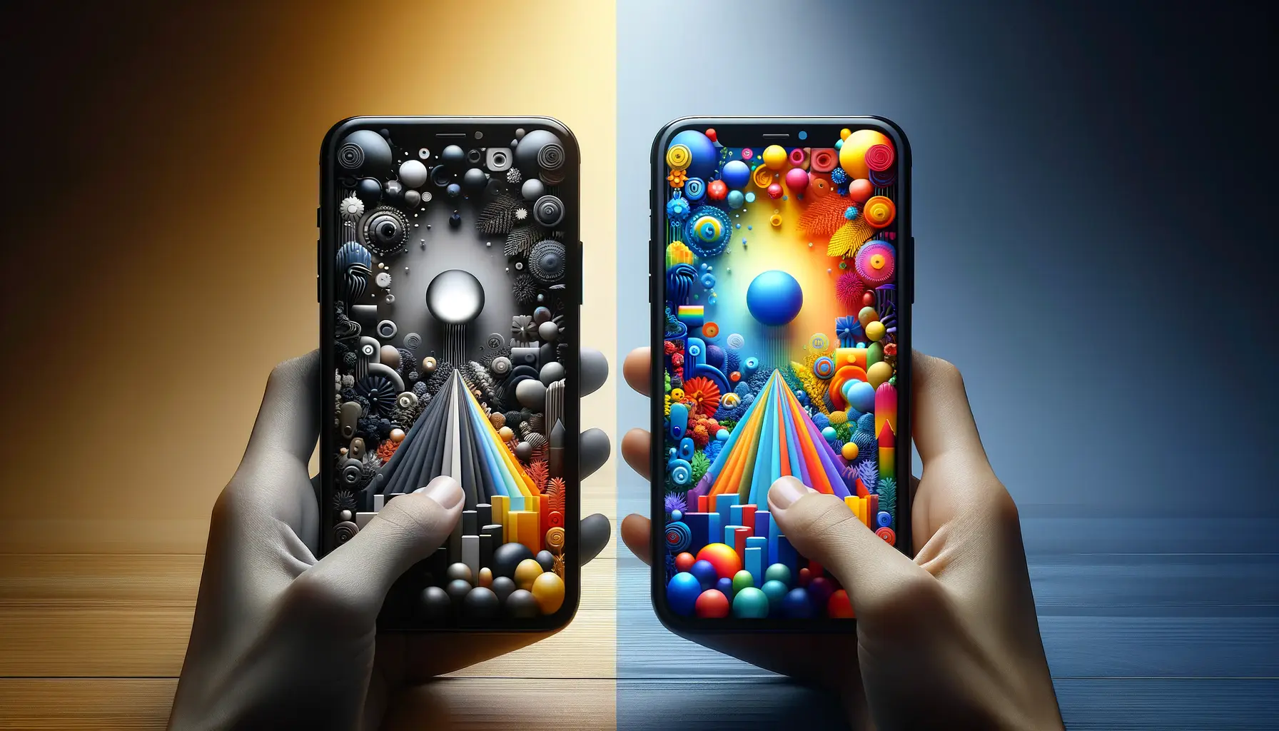
Understanding the influence of color in app store optimization (ASO) screenshots is not just about making an app look attractive.
It delves deeper into how different hues can affect potential users’ perceptions and decisions.
Color psychology is a pivotal aspect of marketing and branding, significantly impacting user engagement and conversion rates.
Through strategic use of color, developers and marketers can effectively communicate their app’s purpose, evoke specific emotions, and significantly enhance the app’s visibility and appeal in a crowded marketplace.
In the realm of ASO, where first impressions are everything, the thoughtful application of color psychology can be the difference between a user downloading your app or scrolling past it.
This article explores the nuanced role that color plays in ASO screenshots, offering insights into how colors can influence user behavior and enhance app store performance.
By integrating color psychology principles, apps can stand out in the competitive digital landscape, engaging users at a subconscious level and encouraging them to take the desired action.
- Understanding Color Psychology in ASO
- The Psychological Effects of Specific Colors
- Color and Cultural Considerations in ASO
- Optimizing Color for Different App Categories
- Testing and Iterating Color Schemes in ASO
- Integrating Color with Other ASO Elements
- Future Trends in Color and ASO
- Harnessing the Power of Color in ASO
- FAQs on Color Psychology in ASO Screenshots
Understanding Color Psychology in ASO
Color psychology examines how colors influence human behavior and decision-making.
In ASO, leveraging the right colors in your screenshots can make your app more appealing and improve its conversion rate.
Different colors can evoke different emotions, affect perceptions, and influence user actions.
For instance, blue often instills a sense of trust and reliability, making it a popular choice for social media and communication apps, while red can trigger feelings of excitement or urgency, commonly used in gaming or fitness apps to stimulate engagement.
It’s crucial for developers and marketers to understand the psychological effects of colors to optimize their ASO strategy effectively.
Selecting the appropriate colors for your app screenshots can highlight its key features and benefits, create a strong first impression, and directly influence the decision-making process of potential users.
This strategic choice can significantly impact the app’s visibility, download rates, and overall success in the app store.
Impact of Color on User Perception
Color not only affects the aesthetic appeal of app screenshots but also plays a crucial role in shaping user perceptions.
The right color combinations can make your app appear more professional, user-friendly, and relevant to your target audience.
For example, using green in your screenshots can convey a message of growth, harmony, or environmental consciousness, which can be particularly appealing for apps focused on health, wellness, or nature.
Moreover, color contrast and saturation can affect the clarity and legibility of text and icons in your screenshots, further influencing user perception and the overall effectiveness of your ASO efforts.
High contrast colors can ensure that key messages and call-to-action elements are easily visible, increasing the likelihood of user engagement and app downloads.
- Choosing the Right Color Palette: It’s essential to select a color palette that reflects your app’s core features and resonates with your target audience. This involves understanding the demographic’s preferences and cultural associations with specific colors.
- Consistency Across Screenshots: Consistency in color usage across all screenshots creates a cohesive visual experience, reinforcing brand identity and making your app more memorable.
Selecting the optimal colors for your ASO screenshots involves understanding your target audience, the emotions you wish to evoke, and the actions you want users to take.
The Psychological Effects of Specific Colors
Delving deeper into the psychological impact of specific colors reveals how each hue can be strategically used in ASO screenshots to influence user behavior.
Understanding these effects allows developers to tailor their visual strategy to match the app’s tone, purpose, and desired user action.
For instance, blue, often associated with stability and trust, is ideal for apps requiring user trust, such as finance or health apps.
Conversely, red, which can evoke urgency and excitement, is effectively used in gaming or deal-finding apps to encourage quick decisions.
Green, symbolizing growth and harmony, resonates well with productivity or lifestyle apps aiming to convey a sense of improvement or balance.
Yellow, with its associations of happiness and energy, can be excellent for educational or creativity apps, drawing attention and stimulating mental processes.
Each color, with its unique psychological effects, plays a crucial role in creating an engaging and persuasive ASO screenshot.
Utilizing Color to Guide User Emotion
The strategic use of color in ASO screenshots can guide user emotions and create a more compelling narrative for your app.
By carefully selecting colors that align with the emotional response you wish to evoke, you can enhance user engagement and increase the likelihood of downloads.
For example, using shades of blue to evoke calmness and trust can be particularly effective for meditation or mindfulness apps, while vibrant oranges and yellows can stimulate enthusiasm for fitness or learning apps.
This emotional guidance through color not only makes your app more attractive but also helps communicate its benefits and uses at a glance, making it easier for users to understand why they should download your app.
The emotional resonance created by effective color use can differentiate your app in a crowded marketplace, making it stand out to potential users scrolling through the app store.
- Enhancing App Identity: The colors chosen for your ASO screenshots can become a part of your app’s identity, making it recognizable even outside the app store context. This recognition can boost your app’s overall branding efforts.
- Creating a Mood: The overall mood set by your screenshot colors can predefine user expectations about the app experience, aligning their emotional state with what the app promises to deliver.
Remember, the ultimate goal of utilizing specific colors in your ASO screenshots is not just to make them appealing but to ensure they communicate the right message and evoke the desired emotional response in potential users.
Color and Cultural Considerations in ASO
While color psychology provides a valuable framework for understanding general reactions to different hues, cultural background plays a crucial role in color perception.
Colors that are positively received in one culture may have negative connotations in another.
For instance, while white is traditionally associated with purity and peace in many Western cultures, it is often linked to mourning and death in some Eastern cultures.
Such cultural nuances must be carefully considered when designing ASO screenshots for a global audience to avoid unintended messages that could deter potential users.
Understanding the cultural context of your target audience can significantly enhance the effectiveness of your ASO strategy.
It involves researching and incorporating cultural preferences and sensitivities into your color choices to ensure they resonate well with users from different backgrounds.
This approach not only improves user engagement but also demonstrates respect and consideration for diverse user groups, potentially widening your app’s appeal and user base.
Adapting Color Choices for International Markets
For apps targeting international markets, adapting color choices based on cultural considerations can lead to more effective ASO outcomes.
This may involve creating different sets of screenshots for different regions, each tailored to the cultural preferences and connotations of colors in those markets.
For example, utilizing red in your screenshots for the Chinese market can evoke feelings of luck and celebration, aligning with positive cultural associations.
On the other hand, in the same market, avoiding the use of green in certain contexts is wise due to its association with infidelity.
Such tailored approaches can significantly impact your app’s download rates in international markets by aligning your ASO strategy with local cultural norms and expectations.
It demonstrates a nuanced understanding of the market and can set your app apart from competitors who may not have considered these cultural differences.
Adapting your color strategy can be a key factor in achieving global success, making your app appealing and relevant to users worldwide.
- Market Research: Conduct thorough research to understand the cultural associations of colors in your target markets. This information can guide your color selection process for ASO screenshots.
- Localize Visual Elements: Beyond color, consider localizing other visual elements in your screenshots, such as text, icons, and imagery, to fully resonate with the cultural context of your target audience.
Incorporating cultural considerations into your ASO color strategy not only enhances app appeal but also fosters a deeper connection with users by acknowledging and respecting their cultural background.
Optimizing Color for Different App Categories
The effectiveness of color psychology in ASO is not a one-size-fits-all solution.
Different app categories benefit from different color schemes that align with user expectations and app functionality.
For example, health and fitness apps often leverage green and blue hues to promote feelings of health, growth, and tranquility, aligning with their goals of improving physical and mental well-being.
In contrast, entertainment or social media apps might opt for more vibrant and engaging colors like red or yellow to stimulate user interaction and engagement.
Understanding the psychological connotations of colors and how they align with your app’s category can guide your selection process, ensuring that your screenshots not only capture attention but also communicate the right message.
This strategic alignment between color and app functionality can significantly impact user perception and app success, making it a critical consideration in ASO optimization.
Case Study: Tailoring Colors to App Categories
Analyzing successful apps in various categories can provide valuable insights into effective color use in ASO.
For instance, productivity apps often use blue to emphasize efficiency, calm, and focus, reflecting the app’s purpose of helping users manage their time and tasks.
This choice in color not only makes the app more appealing but also subconsciously prepares the user for the experience that the app intends to deliver, thereby increasing the likelihood of a download.
Similarly, children’s apps frequently utilize bright, primary colors to create a fun and engaging visual experience.
These colors capture children’s attention and are associated with playfulness and creativity, making the app more attractive to both children and their parents.
By carefully selecting colors that resonate with the intended user base, app developers can significantly enhance their app’s visibility and appeal in the app store.
- User Expectations: Aligning color choices with user expectations for a given app category can enhance the app’s perceived value and relevance.
- Competitive Analysis: Analyzing the color schemes used by successful apps in your category can provide insights into what works well with your target audience, offering a competitive edge.
The strategic use of color tailored to specific app categories not only enhances aesthetic appeal but also reinforces the app’s functionality and purpose, making it more compelling to potential users.
Testing and Iterating Color Schemes in ASO
The process of selecting the perfect color scheme for your ASO screenshots is iterative and should be guided by data and user feedback.
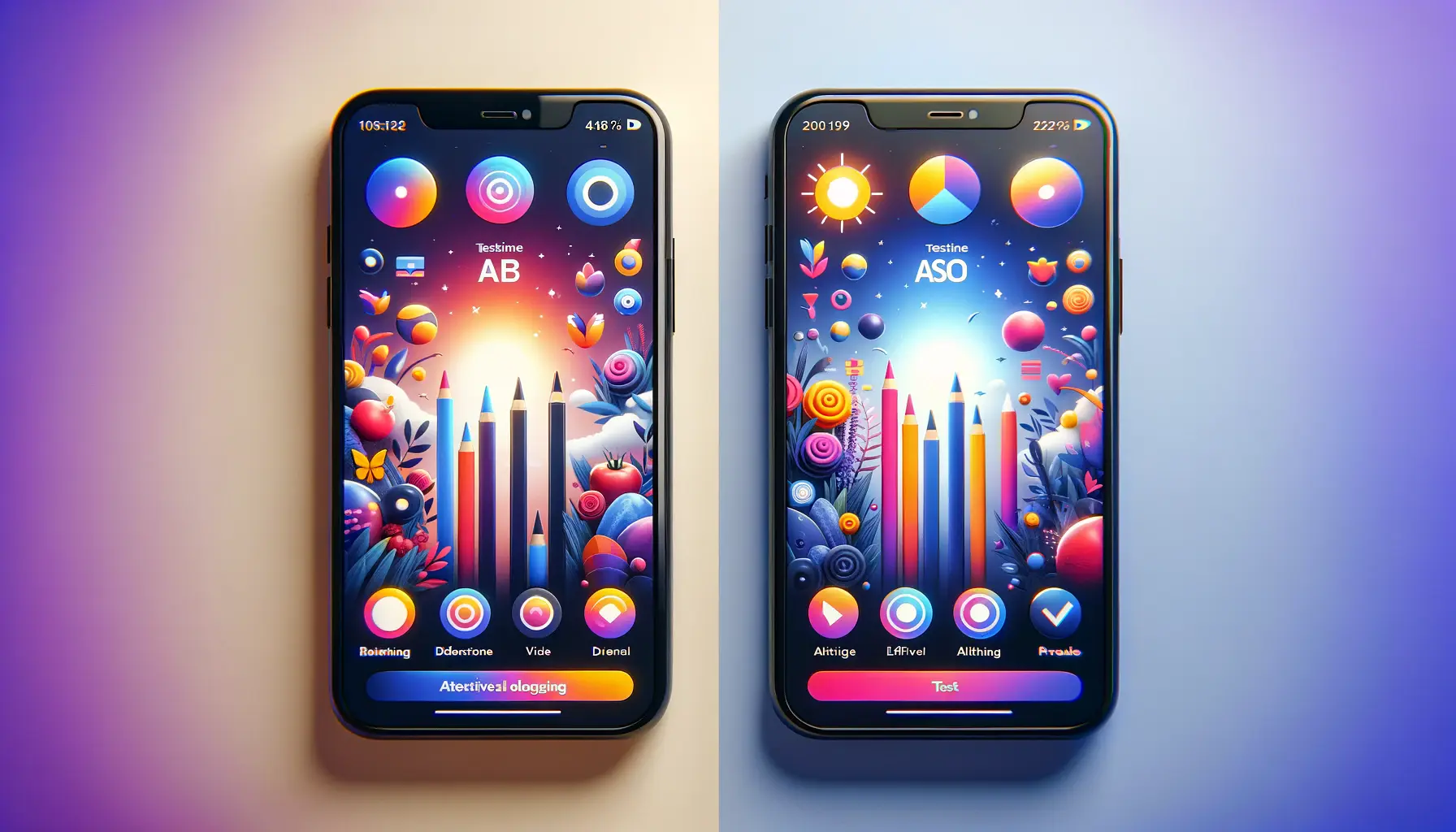
A/B testing, or split testing, is an invaluable tool in this process, allowing developers to present different versions of screenshots to a segment of their target audience to see which performs better in terms of clicks, engagement, and downloads.
This empirical approach can unveil preferences and behaviors that may not be immediately apparent, helping to refine the visual strategy to better meet user expectations and increase app store performance.
Iterating based on testing results ensures that your ASO strategy remains dynamic and responsive to user preferences.
It can also reveal trends and shifts in user behavior over time, allowing for timely updates to your app’s presentation in the app store.
This continuous optimization process is crucial in maintaining and improving your app’s visibility and attractiveness to potential users.
Leveraging Analytics for Color Optimization
Aside from direct A/B testing, analytics and user engagement data can provide insights into how color impacts your app’s performance.
Metrics such as conversion rates, time spent on the app page, and dropout rates can indicate how effectively your screenshots are resonating with potential users.
For instance, a higher engagement rate with a particular color scheme over another can signal a stronger connection with your target audience, guiding further optimization efforts.
Integrating user feedback into this process adds another layer of depth to your understanding of color impact.
User reviews and feedback can sometimes directly comment on the app’s visual appeal, or indirectly hint at it through expressions of the app experience.
Combining quantitative data with qualitative feedback provides a comprehensive view of how color influences user perception and interaction with your app in the store.
- Feedback Loops: Establishing feedback loops that incorporate user data and feedback into the color optimization process ensures that your ASO strategy is aligned with user preferences and trends.
- Market Adaptability: Staying adaptable and ready to iterate your color scheme based on testing and analytics allows you to keep pace with changing user behaviors and market dynamics.
Effective ASO is not static but evolves through continuous testing, iteration, and adaptation of color schemes based on empirical data and user feedback, ensuring that your app remains appealing and relevant.
Integrating Color with Other ASO Elements
While color plays a pivotal role in enhancing ASO screenshots, its integration with other ASO elements—such as text, layout, and imagery—is crucial for a cohesive and effective app store presentation.
The harmony between these elements can significantly amplify the impact of color, creating a compelling visual narrative that communicates the app’s value proposition at a glance.
For instance, the choice of font and its color can either make your text stand out or blend into the background, affecting readability and the user’s ability to quickly grasp what your app offers.
Similarly, the layout of your screenshots, including the use of space and alignment, can influence how colors are perceived and how effectively they guide the user’s eye through the key features of your app.
A well-thought-out combination of color, text, and layout ensures that each screenshot not only captures attention but also conveys essential information effectively, encouraging users to download the app.
Creating Visual Hierarchy with Color
Color can be a powerful tool in establishing a visual hierarchy within your ASO screenshots, highlighting critical information or calls to action.
By using contrasting colors for important elements or softer hues for background details, you can direct the user’s focus to where it matters most.
This visual prioritization helps potential users quickly understand your app’s key benefits and how it stands out from competitors.
Employing color strategically within this visual hierarchy enhances the user’s journey through your app’s store page, making the decision-making process smoother and more intuitive.
It’s not just about making the app look attractive but ensuring that the attractiveness is functional, guiding the user towards the desired action with clarity and precision.
- Consistency Across Branding: Ensure that the colors used in your ASO screenshots are consistent with your overall brand colors. This consistency strengthens brand recognition and creates a seamless experience for users from the app store to the app itself.
- Complementing Colors with Content: The content of your screenshots, including imagery and text, should complement the chosen color scheme, reinforcing the app’s messaging and appealing directly to your target audience’s preferences and expectations.
Neglecting the integration of color with other ASO elements can lead to a disjointed and less effective app presentation, undermining the potential benefits of a well-chosen color scheme.
Future Trends in Color and ASO
As technology evolves and user preferences shift, the role of color in ASO continues to adapt.
Emerging trends in design and user interface (UI) aesthetics influence how developers and marketers approach color selection for app store optimization.
For example, the rising popularity of dark mode across platforms and devices has led to an increased focus on how color schemes perform under different viewing conditions.
This has implications for ASO, as developers must now consider how their chosen colors will look not only in traditional light settings but also in dark mode environments, ensuring visibility and appeal across all user preferences.
Furthermore, advancements in screen technology, such as higher resolution displays and wider color gamuts, offer new opportunities and challenges for ASO.
These developments allow for more vibrant and varied color presentations but also require careful consideration to ensure that colors remain consistent and effective across different devices and display settings.
Adapting to User Preferences and Technological Changes
To stay ahead in the competitive app market, developers and marketers must keep abreast of these trends and be ready to adapt their ASO strategies accordingly.
This may involve regularly updating screenshot designs to align with current UI trends or experimenting with new color schemes that take advantage of advanced display capabilities.
Paying attention to user feedback and engagement metrics will also be crucial in identifying shifts in preferences that could signal the need for a change in approach.
Ultimately, the future of color in ASO will be characterized by a balance between innovation and user-centered design.
As developers and marketers experiment with new techniques and technologies, the core principle of using color to enhance user experience and convey the app’s value effectively will remain paramount.
Staying informed about trends and being flexible in implementation will be key to leveraging color successfully in ASO strategies moving forward.
- Embracing New Technologies: Explore how emerging technologies can enhance your ASO color strategy, such as using augmented reality (AR) to provide interactive and immersive screenshot experiences.
- Monitoring Trends: Keep an eye on design and color trends in the wider tech and entertainment industries, as these often influence user expectations and preferences in the app market.
Anticipating and adapting to future trends in color and technology can position your app at the forefront of user preferences, ensuring sustained engagement and success in an ever-evolving market.
Harnessing the Power of Color in ASO
As we have explored throughout this article, the role of color psychology in ASO screenshots is both profound and multifaceted.
By carefully selecting and integrating colors into ASO strategies, developers and marketers can significantly enhance app visibility, user engagement, and ultimately, download rates.
The strategic application of color goes beyond mere aesthetics, tapping into deep psychological triggers that can influence user behavior and decision-making processes.
Whether through evoking specific emotions, adhering to cultural preferences, or aligning with app category expectations, color is a crucial element in creating compelling and effective app store presentations.
Key Takeaways
- Understanding the psychological impact of colors can help tailor ASO strategies to evoke the desired emotional response from potential users.
- Cultural considerations are paramount in global app markets, where color perceptions can vary significantly across different regions.
- The integration of color with other ASO elements like text, layout, and imagery is essential for a cohesive and impactful presentation.
- Continuous testing and iteration based on user feedback and data analytics are critical for optimizing color schemes in ASO.
- Staying informed about future trends in design and technology will ensure that ASO strategies remain relevant and effective.
In conclusion, the role of color psychology in ASO screenshots is an indispensable tool in the digital marketing arsenal.
Its power lies not just in the ability to beautify and attract but in its capacity to communicate, persuade, and connect with users on a subconscious level.
As the digital landscape evolves, so too will the strategies for leveraging color in ASO.
However, the fundamental principle will remain unchanged: a well-considered and executed color strategy can make the difference between an app that fades into obscurity and one that rises to the top of the charts.
By embracing the insights and strategies discussed in this article, developers and marketers can harness the full potential of color to transform their ASO efforts and achieve unparalleled success in the app stores.
Boost your mobile app's success with our guaranteed App Store Optimization (ASO) service. Leave it to the experts!
FAQs on Color Psychology in ASO Screenshots
Discover key insights into leveraging color psychology for your app store optimization (ASO) screenshots.
Color influences user perceptions and emotions, making screenshots more appealing and guiding potential users’ decisions towards downloading the app.
There’s no one-size-fits-all answer; it depends on your app’s purpose, target audience, and emotional impact you aim to create. Blues for trust, reds for excitement, and greens for growth are common choices.
Yes, strategically chosen colors can enhance screenshot appeal, positively influencing user decisions and potentially increasing download rates.
Color consistency strengthens brand recognition and ensures a coherent visual experience across all app store elements, enhancing user trust.
Consider cultural connotations and preferences of your target market. Adapting color choices to local cultures can significantly improve engagement and downloads.
Yes, but the effectiveness of specific colors varies by app category. Tailor your color choices to align with the expected user emotions and app functionality.
Use A/B testing to compare different color schemes and analyze user engagement metrics to identify which colors perform better in attracting downloads.
Yes, trends like dark mode compatibility and advances in display technology influence color selection. Staying updated on these trends helps keep your ASO strategy effective.


