Imagine visiting a site that instantly calms you down, guiding your eyes gently to the data you require.
You don’t even realize it, but the hues of its design play an important role in crafting your experience.
This is referred to as color psychology, which explores how colors influence our moods and behavior.
In web design, understanding and applying color psychology can transform an uninteresting site into a stimulating online experience.
- Color Psychology in Web Design
- Applying Color Theory to Facilitate Visual Hierarchy
- The Aesthetic–Usability Effect: Balancing Beauty and Function
- Emotional Design: Captivating Users with Visceral, Behavioral, and Reflective Experiences
- Practical Uses of Color Psychology for Web Design
- Harnessing the Strength of Color Psychology in Web Design
- Frequently Asked Questions About Color Psychology in Web Design
Color Psychology in Web Design
Colors are more than mere visual stimuli; they evoke feelings, convey messages, and can even influence decisions.
In web design, understanding color psychology is paramount in an attempt to create interfaces that move people emotionally.
The Role of Color in User Experience
Did you ever wonder why certain websites are more trustworthy or calming than others?
The color scheme employed can actually have a lot of impact on how a user feels and reacts to a site.
Color psychology helps designers make intentional choices to guide those reactions.
Blue, for instance, is seen as trustworthy and professional and is often employed by banks.
On the other hand, bright colors like red or orange produce a feeling of excitement and urgency and can be employed for promotions or calls to action.
- Blue: Conveys trust, calmness, and professionalism.
- Red: Creates excitement, urgency, and passion.
- Green: Related to nature, growth, and tranquility.
- Yellow: Represents optimism, energy, and concentration.
By understanding these associations through color psychology, designers can design user experiences that match the desired emotional responses, leading to higher engagement and satisfaction.
Emotional Responses Elicited by Different Colors
Colors have the ability to provoke certain emotional responses.
Here’s how some of the most standard colors are seen in the lens of color psychology:
- Red: Stimulates energy and can quicken heart rates; often used to create a feeling of urgency.
- Blue: Creates feelings of calmness and security; widely used by businesses that want a trustworthy image.
- Green: Symbolizes health, tranquility, and nature; most commonly used in nature and wellness sites.
- Yellow: Attracts attention and emits warmth; overuse can lead to feelings of anxiety.
- Purple: Associated with luxury, creativity, and wisdom; most often used by high-end brands targeting emotional depth.
Finding these emotional triggers using color psychology allows designers to select colors consistent with the brand message and the user’s expectations, providing an easier and more pleasant experience.
Cultural Influences on Color Perception
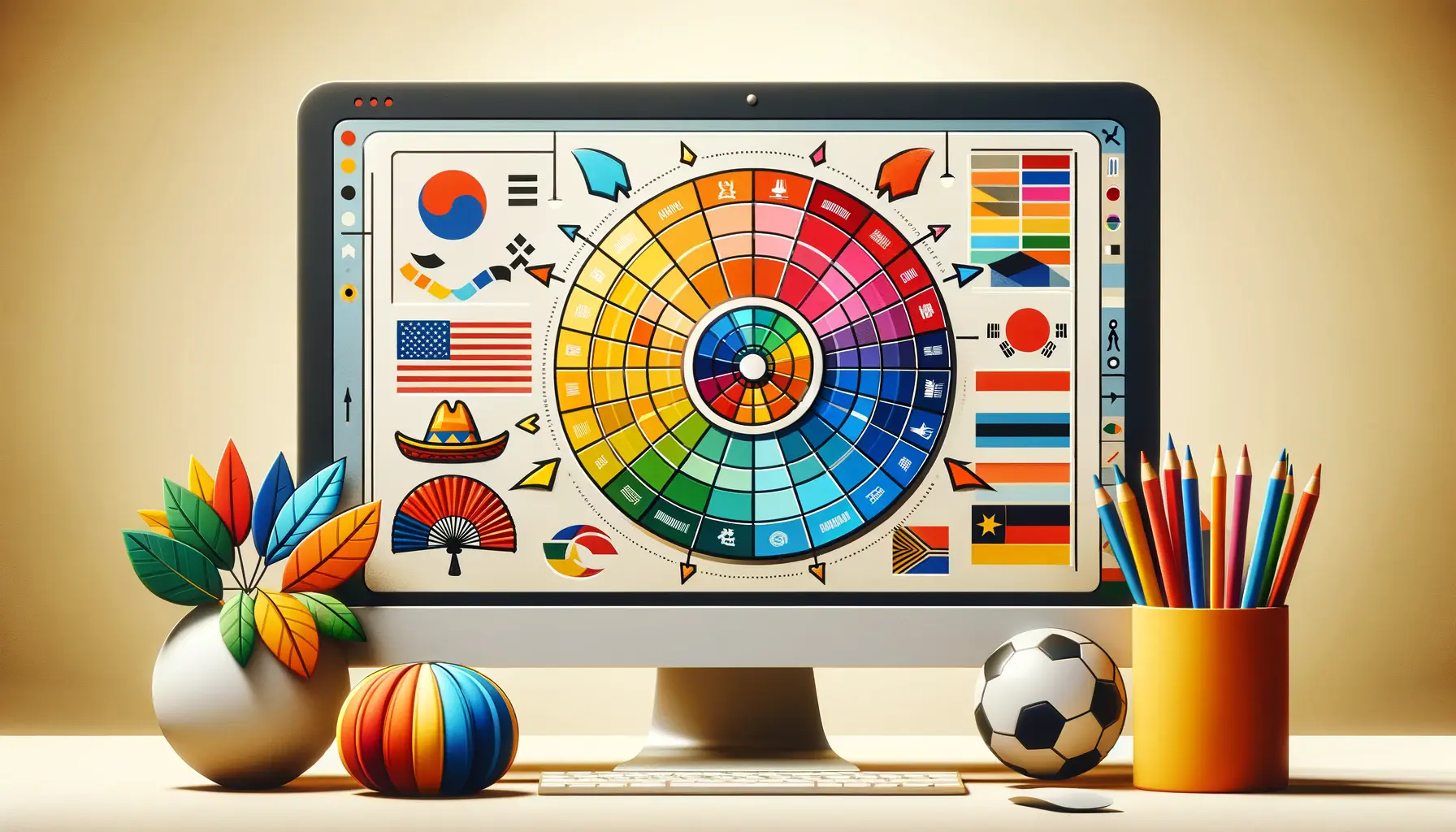
It’s amusing to note that color meanings also vary across cultures.
While white symbolizes purity in the West, it’s used for mourning in some Eastern cultures.
Similarly, red is seen as luck and prosperity in China but represents threat or warning elsewhere.
In designing for an international audience, it’s significant to remember such cultural variations in order to ensure the color palette resonates with different user bases in just the right manner.
Embedding a knowledge of color psychology in the design of a website is not just added decoration; it’s about making connections.
By selecting color with consideration to what would evoke desired emotional responses as well as cultural demands, web designers can create websites that, in addition to being beautiful, are evocative and emotionally intelligent.
Understanding color psychology allows designers to shape emotional responses and influence user actions, turning passive visits into meaningful interactions.
Applying Color Theory to Facilitate Visual Hierarchy
Have you ever noticed how some websites intuitively guide your gaze to key areas effortlessly, giving you an online experience that’s intuitive and enjoyable?
Such easy navigation is likely the result of an effective application of color psychology to establish a visual hierarchy.
By judicious application of colors, designers can manage the way users perceive information, giving primacy to the most critical bits.
Using Hue, Saturation, and Brightness
Being aware of the nuances of hue, saturation, and brightness is essential in creating an efficient visual hierarchy with color psychology:
- Hue: This is the color itself—red, blue, green, etc. Hues can be imbued with different emotions and meanings. Blue, for instance, will generally convey trust and professionalism, while red will show urgency or excitement.
- Saturation: Refers to the purity or intensity of color. Saturated colors are bright and eye-catching, and desaturated colors are dull and recede.
- Brightness (Value): Describes how light or dark the color is. Lighter colors can produce an open sensation and are used to fill backgrounds, while darker colors provide contrast and can be used to highlight foreground.
By modifying these characteristics through color psychology, designers can create depth and emphasis in a webpage and guide users seamlessly through the content.
Creating Contrast to Guide User Focus
Contrast is a powerful tool in directing user focus.
By creating contrast between elements using different colors, sizes, or shapes, designers can cause significant information to become prominent and create points of interest.
For example:
- Color Contrast: A very colorful call-to-action button against a background color will be noticed and encourage the user to perform the desired action.
- Size Contrast: Greater things get noticed more. Headlines or vital messages in big fonts or containers will catch the attention of the user before small text.
- Shape Contrast: Applying different shapes between similar elements can create visual interest and direct attention. A circular icon within a collection of squares, for instance, will automatically draw attention.
Intriguing use of contrast, besides creating more pleasing aesthetics, brings more prominence to significant elements and thus improves usability.
Color psychology plays a central role in making these contrasts effective and meaningful.
Use of Color Schemes for Better Design
Choosing a suitable color scheme is very important in developing a cohesive and effective design.
Some commonly used schemes include:
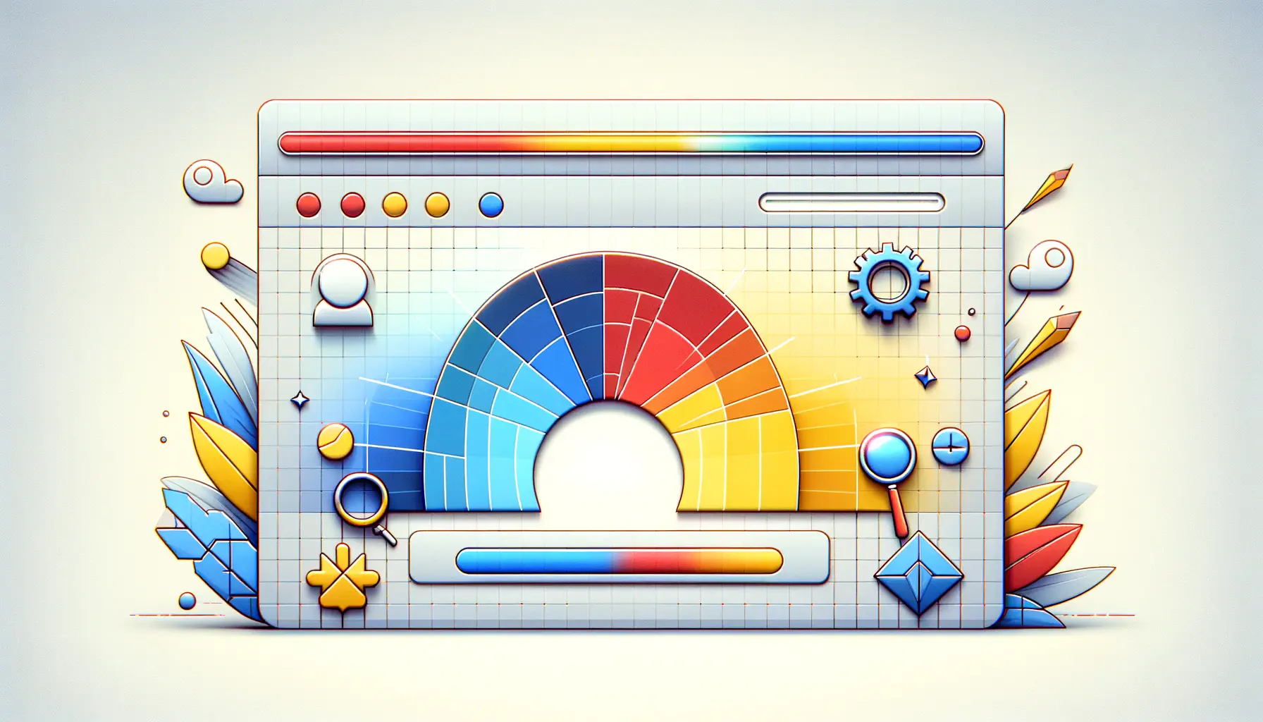
- Monochromatic: Contains various lightness and saturation degrees of a single color. This scheme gives a unified and smooth look, which can lead to a relaxing and refined design.
- Analogous: Utilizes colors next to each other on the color wheel. This method has more variety than monochromatic but is still harmonious, ideal for creating calm and snug designs.
- Complementary: Matches colors that are opposite each other on the color wheel, blue and orange being a good example. This color scheme has high contrast and can be used to make elements pop out, ideal for highlighting crucial items like call-to-action buttons.
Selecting the right color scheme considers the brand identity, target market, and the emotional connection you wish to achieve.
Strategic use of color psychology in these schemes improves the overall user experience and supports the communication conveyed by the design.
When you know how to use color theory in visual hierarchy, you can design for the web that is not only gorgeous but also functionally effective.
Color psychology helps guide users easily through your content and enhances their experience overall.
By leveraging hue, saturation, and brightness, designers can create intuitive navigation and highlight essential content without overwhelming the user.
The Aesthetic–Usability Effect: Balancing Beauty and Function
Have you ever been drawn to a website because it looks good, only to discover that it’s also very easy to use?
This phenomenon is referred to as the aesthetic–usability effect, which suggests that users will perceive more attractive designs as more usable than less attractive ones, even when there is no objective difference.
In web design, it’s crucial to strike the right balance between how something appears and how it works in order to build engaging and effective user experiences.
This is where color psychology can also play a subtle but impactful role.
Understanding the Aesthetic–Usability Effect
The aesthetic–usability effect explains the psychological impact of aesthetic design on user perceptions.
When users view a beautiful design, they overlook small usability defects and think that the product generally works better.
This bias proves the worth of including aesthetic considerations in usability practice to improve user satisfaction and engagement.
Smart use of color psychology can enhance this effect by emotionally connecting users to the interface.
Case Studies Demonstrating the Aesthetic–Usability Effect
Several studies have established the impact of aesthetics on perceived usability.
For instance, Masaaki Kurosu and Kaori Kashimura’s study demonstrated that users will find more aesthetically appealing interfaces to be more user-friendly even if they are not necessarily more functional.
This shows the significance of designers prioritizing visual appeal as well as usability in making more effective digital products.
Utilizing principles of color psychology in tandem with aesthetic design can further amplify this perception.
Strategies for Achieving Aesthetic and Functional Balance
To effectively incorporate aesthetics and usability in web design, the following approaches can be employed:
- Consistent Design Language: A consistent visual system that is coherent with the brand and used throughout all pages enhances user familiarity and trust.
- User-Centered Design: The requirements and user interests of the target audience are given priority through incorporating user research and usability testing. Understanding what people anticipate makes it easier to develop designs that both appear good and function well.
- Minimalist Approach: Simplicity is the act of eliminating what is not needed and focusing only on the main features. Cleaning up the interface provides a good-looking and functional layout.
- Responsive Design: Ensure that the website works well and is accessible on varying devices and screen sizes. Consistency and usability are enhanced through responsive design, contributing to a satisfactory user experience.
Through proper application of these principles, designers may craft web experiences that not only interest users on an aesthetic level but also present useful and successful operation, summarizing the laws of the aesthetic–usability effect.
Incorporating color psychology into these strategies can further support emotional engagement and functionality.
Attractive visuals can boost perceived usability, making aesthetics a vital component of a successful and user-friendly design.
Emotional Design: Captivating Users with Visceral, Behavioral, and Reflective Experiences
Sometimes you sit there thinking why some sites or products appeal to you on a more emotional, deeper level, making an ever-lasting impression.
Most often, this is due to emotional design, also first described by Donald Norman.
Emotional design involves designing products that aim to elicit particular emotional responses, thereby contributing to user satisfaction and engagement.
By understanding and integrating the three levels of emotional design—visceralRelating to deep inward feelings rather than intellect; instinctive or emotional., behavioral, and reflectiveIn design, refers to the stage where users evaluate and assign meaning to an experience after interaction.—designers are able to develop experiences that not only satisfy functional demands but also forge meaningful connections with users.
When combined with color psychology, emotional design becomes even more powerful in building strong bonds with users.
Visceral Design: The First Impression
Visceral design is the immediate, unconscious reaction people have when they are exposed to a product.
It’s the first impression—look, feel, and overall aesthetic appeal.
In this phase, design elements such as color scheme, typography, and imagery play a crucial part in evoking favorable emotional responses.
For instance, a well-crafted website with a harmonious color palette will instantly convey professionalism and trustworthiness, encouraging users to continue exploring.
Applying color psychology at this level helps trigger positive instincts from the first glance.
Behavioral Design: The Use Experience
Behavioral design cares about how functional and easy to use a product is.
It is concerned with how the user interacts with the design and if it works to support their goals effectively.
A good behavioral design ensures that the product is easy to use, effective, and rewarding.
For example, an easily accessible website with intuitive navigation ensures that users can access information quickly and easily, enhancing their overall experience.
Smart use of color psychology can also guide user actions and reduce friction by highlighting important elements.
Reflective Design: The Afterthought
Reflective design is the deliberate thinking and feeling of the user after using a product.
This is the quality of significance and worth the product adds to the user’s life and affects the future decision-making and brand loyalty of the user.
Reflective design considers how the product aligns with the user’s self-concept and personal values.
A website that not only provides valuable content but also resonates with the values and aspirations of the user can build a strong emotional bond, resulting in repeat visits and long-term loyalty.
Aligning this with color psychology ensures the entire experience—from first impression to final reflection—feels cohesive and emotionally fulfilling.
By skillfully combining visceral, behavioral, and reflective design, designers can create products and websites that not only get things done well but also form deep, emotional connections with customers.
This holistic approach to web design enhances user delight, fosters loyalty, and ultimately results in product or service success.
Leveraging color psychology throughout each level makes emotional design even more impactful and memorable.
Combining emotional design principles with color psychology leads to deeper user engagement and a more memorable digital experience.
Practical Uses of Color Psychology for Web Design
Including color psychology in your web design strategy can actually push user interaction, drive behavior, and shape brand perception.
By selecting and using colors deliberately, you can create a website that not only looks visually pleasing but also works well and accomplishes your objectives.
Enhancing Calls to Action (CTAs)
Calls to action are imperative elements that prompt users to take specific actions, such as subscribing to a newsletter or making a purchase.
CTA button color can have a profound effect on user behavior.
For instance, using contrasting colors for CTA buttons can increase their visibility, drawing users’ attention and prompting clicks.
A well-chosen color can improve the visibility and effectiveness of CTAs, leading to higher conversion rates through color psychology.
Emphasis on Brand Identity
Consistent recoloring reinforces brand recognition and relays the brand’s desired personality.
Selecting a color combination that mirrors your brand values and message is a critical consideration in establishing an enduring and uniform image.
For example:
- Innovative, energetic brands: Use bold, vibrant colors like red, orange, or electric blue.
- Trustworthy, calming brands: Use cool, subdued tones like blue, green, or soft grays.
By aligning the color scheme with brand identity using color psychology, you ensure a consistent and emotionally resonant experience across your digital presence.
Increasing Legibility and Accessibility
It is crucial that your site is readable and accessible to all visitors.
Increasing color contrast between text and background enhances readability by making information easier to digest.
Even taking into account users with color blindness and other visual impairments when determining your color scheme will enhance inclusivity.
- Use high-contrast combinations (e.g., dark text on a light background).
- Avoid relying solely on color to convey information—use icons or text labels.
- Utilize accessibility tools like contrast checkers to assess compliance with WCAG guidelines.
By using color psychology judiciously in these ways, you can create a web design experience that not only appears fantastic but is also functional, accessible, and aligned with your brand objectives.
Using color deliberately in CTAs, branding, and accessibilityThe practice of designing websites so they can be used by people with various disabilities. not only boosts performance but also reinforces a cohesive identity across platforms.
Harnessing the Strength of Color Psychology in Web Design
Why Color Psychology Matters Now More Than Ever
With the current competitive online environment, it is harder than ever to capture and retain user attention.
Color psychology can be a powerful tool for web designers that can be harnessed at this time.
From creating emotional resonance to driving user behavior, the thoroughly thought-out use of color impacts not just appearance but also functionality, brand, and user experience.
Key Takeaways from the Role of Color Psychology
Throughout this article, we can see how color psychology can improve all aspects of web design.
From first impression to usability of an interface or deeper emotional attachment users have toward a brand, color plays a critical role in influencing those experiences.
- Colors evoke emotional responses that can influence decision-making and perception.
- Visual hierarchy may be established via hue, saturation, and brightness to influence user flow.
- The aesthetic–usability effect shows that greater visual appeal enhances perceived usability.
- Emotional design integrates visceral, behavioral, and reflective layers—color playing a central role.
- Pragmatic uses of color—CTAs, branding, accessibility—directly impact performance and engagement.
Employing These Techniques in Your Personal Design Projects
If you’re designing a new site or revising an existing one, begin with an honest assessment of your purpose, audience, and personality.
Then apply color psychology to align your visual strategy with emotional connection.
- Establish your core message and emotional tone—do you want to instill trust, excitement, calmness, or imagination?
- Select a color palette that serves these purposes, taking inspiration from both psychological associations and cultural heritage.
- Use contrast intentionally to highlight key information, improve readability, and guide user attention.
- Test color combinations to ensure legibility and compliance with accessibility standards.
Designing with Intent and Emotion
Keeping color psychology in mind when you are designing your website is not just about selecting what looks good—it’s about designing with intention.
It’s about communicating the emotional color language and using it to connect, to communicate, and to convert.
And in doing so, you’re not only building sites that succeed, you’re building experiences that connect with people on a deeper level.
Ultimately, great web design is all about balance—between form and function, feeling and use, and user needs and brand identity.
And color, guided by psychological insight, is the common thread that links them.
Intentional color use is not about aesthetics alone—it’s a strategic tool for guiding behavior, building trust, and shaping emotional experiences.
Quality web design is key for a great website! Check out our service page to partner with an expert web design agency.
Frequently Asked Questions About Color Psychology in Web Design
Web design color psychology examines the influence of colors on the emotions and behaviors of users and how they impact perceptions and interactions with a website.
Colors elicit specific emotions; for example, blue can establish trust, and red can cause urgency, thereby influencing user behaviors and decision-making on a site.
Red or orange, vibrant and contrasting colors, are generally applied to call-to-action buttons to attract attention and stimulate click-throughs.
Yes, proper utilization of color psychology can enhance user engagement and conversion rates by focusing attention and eliciting intended emotional responses.
Cultural backgrounds can influence color connotations; what is a positive color in one culture can have different meanings in another.
A common web design theme usually includes a primary color, secondary color, and accent color, balancing aesthetics and usability.
Blue is widely viewed as a trustworthy and reliable color and is therefore a popular choice for financial and corporate websites.
High contrast colors facilitate better readability of text, which makes the content more accessible to visually impaired users and also improves overall user experience.
E-commerce sites often use colors like red to create urgency and green for success, which influence purchasing decisions and help boost sales.
