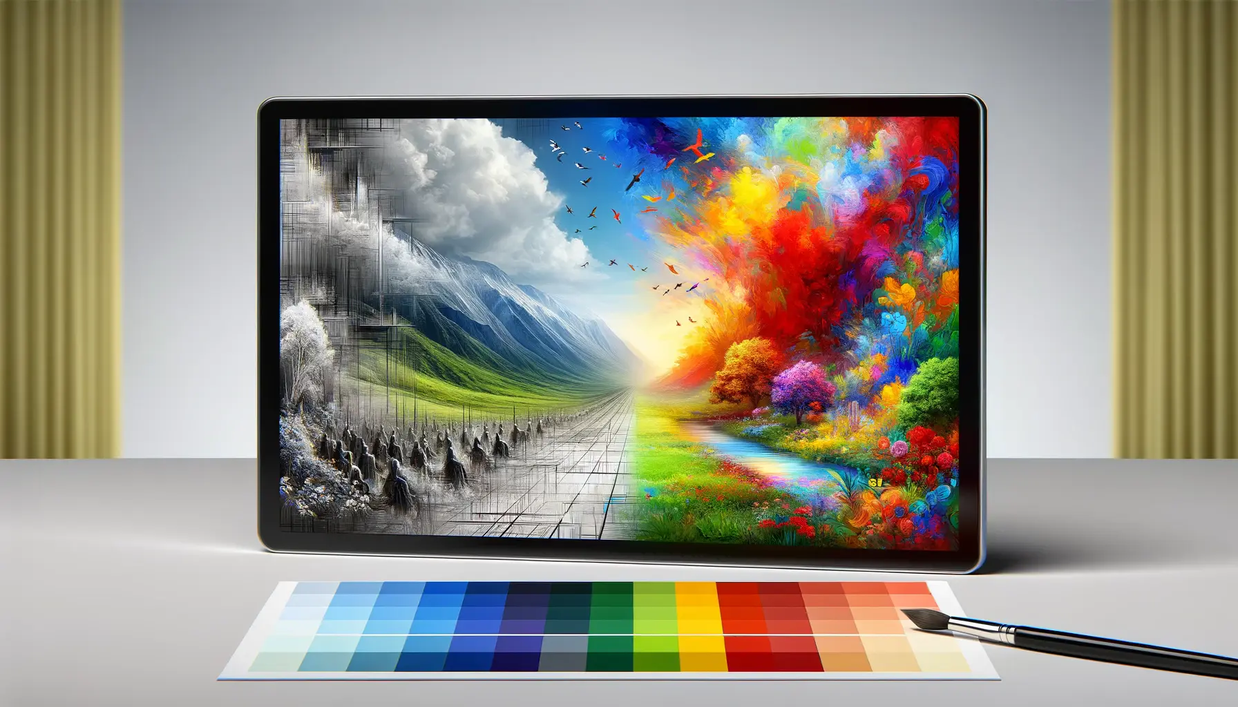
The digital design landscape is continually evolving, with new trends emerging that captivate both designers and users alike.
One such trend that has gained significant traction in recent years is Glassmorphism.
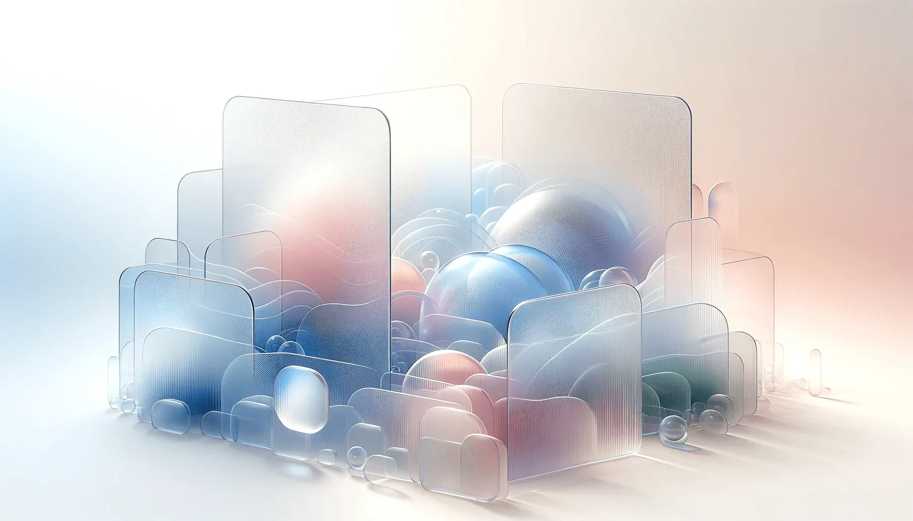
This design approach, characterized by its frosted glass-like aesthetics, brings a fresh and modern feel to web interfaces.
In this article, we delve into the intricacies of Glassmorphism, exploring its origins, key characteristics, and how it’s shaping the future of web design.
At its core, Glassmorphism represents a paradigm shift in web design, moving away from flat, monochromatic layouts to more dynamic, layered interfaces.
This style is not just about aesthetics; it’s about creating an immersive user experience that’s both functional and visually appealing.
By understanding Glassmorphism, web designers and developers can create websites that are not only trendy but also user-friendly and engaging.
- Understanding Glassmorphism
- Implementing Glassmorphism in Web Design
- Challenges and Best Practices in Glassmorphism
- Advanced Techniques in Glassmorphism
- Real-World Applications of Glassmorphism
- Future Trends and Evolution of Glassmorphism
- Embracing the Future with Glassmorphism
- Glassmorphism FAQs: Unveiling the Trend
Understanding Glassmorphism
Glassmorphism is a term coined to describe UI elements that mimic the appearance and texture of frosted glass.
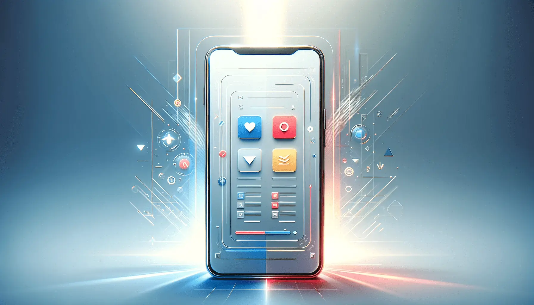
This design trend is marked by a soft, blurred background with translucent foreground elements, creating a sense of depth and dimension on the web page.
The style is reminiscent of the visual effects seen in modern operating systems and mobile apps, where background elements are blurred and overlaid with semi-transparent panels.
The appeal of Glassmorphism lies in its ability to create a layered, three-dimensional look on a traditionally flat medium.
This is achieved through the use of background blurs, transparency, and subtle lighting effects.
The result is a clean, minimalist design that focuses on content while providing a visually rich user experience.
Glassmorphism has been widely adopted in various digital platforms, including web and mobile applications, due to its modern and engaging appearance.
Key Characteristics of Glassmorphism
Several defining features set Glassmorphism apart from other design trends.
The most notable is the use of transparency and blur to create the effect of frosted glass.
This not only adds depth to the design but also helps in establishing a visual hierarchy on the page.
Another characteristic is the use of vibrant colors, which contrast sharply with the semi-transparent elements, creating a visually striking effect.
Additionally, Glassmorphism often incorporates light and shadow to enhance the three-dimensional feel of the interface.
This includes subtle reflections and highlights that mimic the way light interacts with glass surfaces.
The overall effect is a clean, modern look that brings a sense of sophistication and elegance to web design.
Glassmorphism is more than just a visual style; it’s a design philosophy that emphasizes depth, transparency, and a modern aesthetic in web interfaces.
Implementing Glassmorphism in Web Design
Adopting Glassmorphism in web design requires a thoughtful approach to ensure that the visual elements enhance the user experience rather than detract from it.
Here are some key considerations and steps for effectively implementing this style in your web projects:
Creating the Frosted Glass Effect
The cornerstone of Glassmorphism is the frosted glass effect, which can be achieved through specific CSS properties.
This involves using backdrop filters and layering to create the illusion of depth and translucency.
Here’s a simple guide to get started:
- Backdrop Filter: Use the CSS backdrop-filter property to apply a blur effect to the background elements behind your translucent panels.
- Transparency: Adjust the opacity of your foreground elements to allow the blurred background to show through, creating the signature frosted glass look.
- Layering: Strategically layer your elements to create a sense of depth. This can be done by stacking multiple divs with varying degrees of transparency and blur.
Color and Contrast
Color plays a crucial role in Glassmorphism.
The right choice of colors can make your design pop and keep it visually appealing.
Consider the following tips:
- Vibrant Backgrounds: Choose bright and vivid colors for your background to contrast effectively with the translucent elements.
- High Contrast Text: Ensure that your text stands out against the blurred background for readability. Opt for high-contrast color schemes.
Light and Shadow
Subtle lighting and shadow effects are essential in Glassmorphism to add realism and depth.
Here are some ways to incorporate these elements:
- Subtle Shadows: Apply soft drop shadows to your elements to lift them off the page and enhance the glass-like effect.
- Light Reflections: Use light gradients or subtle reflections to mimic how light interacts with glass, adding to the realism of your design.
Remember, the key to successful Glassmorphism design lies in subtlety and balance.
Overdoing any of these elements can overwhelm the user and detract from the overall experience.
Challenges and Best Practices in Glassmorphism
While Glassmorphism offers a visually appealing aesthetic, it comes with its own set of challenges.
Addressing these challenges effectively is crucial for creating a design that is not only beautiful but also functional and accessible.
Ensuring Readability and Accessibility
One of the primary concerns with Glassmorphism is maintaining text readability against the blurred and translucent backgrounds.
Here are some best practices to ensure your content remains accessible:
- Contrast: Use high-contrast colors for text and important UI elements to ensure they stand out against the background.
- Font Choices: Select fonts that are easy to read and avoid overly decorative styles that might clash with the background blur.
- Background Opacity: Adjust the opacity of your glass elements carefully to strike a balance between the aesthetic and readability.
Performance Considerations
Implementing Glassmorphism can impact website performance, especially on devices with lower processing power.
To mitigate this, consider the following:
- Optimize Blur Effects: Use backdrop filters judiciously and avoid excessive blurring that can lead to performance issues.
- Responsive Design: Ensure that your Glassmorphism design adapts well to different screen sizes and devices.
Design Consistency
Maintaining a consistent design language across your website is crucial.
Glassmorphism should complement your overall design theme and not feel out of place.
Keep these points in mind:
- Integrate with Existing Design: Glassmorphism should be integrated seamlessly with your existing design elements.
- Consistent Usage: Apply the Glassmorphism style consistently across different parts of your website to maintain a cohesive look.
Glassmorphism, when used thoughtfully, can elevate your web design, but it’s important to balance aesthetic appeal with usability and performance.
Advanced Techniques in Glassmorphism
Glassmorphism is not just limited to basic transparency and blur effects.
Advanced techniques can be employed to create more sophisticated and interactive designs.
Here’s how you can take Glassmorphism to the next level:
Interactive Elements
Interactive elements can significantly enhance the user experience in a Glassmorphism design.
Consider incorporating the following:
- Hover Effects: Use hover states to change the transparency or blur intensity, adding a dynamic aspect to your elements.
- Animations: Subtle animations can bring your Glassmorphism elements to life, making the user interaction more engaging.
Layering and Depth
Creating a sense of depth is crucial in Glassmorphism.
Here are some ways to achieve this:
- Multiple Layers: Use multiple layers of glass effects at different opacities to create a sense of depth and dimension.
- Parallax Scrolling: Implement parallax effects to give a more dynamic and immersive experience to your web pages.
Combining with Other Design Trends
Glassmorphism can be effectively combined with other design trends for a unique look.
Consider these combinations:
- Neumorphism: Combine Glassmorphism with Neumorphism for a mix of depth and soft extrusion effects.
- Minimalism: Use Glassmorphism in a minimalist design setting to emphasize cleanliness and simplicity.
By exploring advanced techniques and combining Glassmorphism with other design trends, you can create unique and captivating web experiences.
Real-World Applications of Glassmorphism
Glassmorphism has been embraced by designers and developers worldwide, finding its way into various real-world applications.
Let’s explore some of the areas where Glassmorphism is making a significant impact:
Web and Mobile Interfaces
Glassmorphism is particularly popular in web and mobile interface design, where it adds a modern and sleek look.
Here are some examples:
- Dashboard Designs: Glassmorphism is used in dashboards to create a clean and uncluttered interface, enhancing data visualization.
- Mobile Apps: Many mobile apps use Glassmorphism to create an attractive and intuitive user interface.
E-commerce and Marketing
In the realm of e-commerce and marketing, Glassmorphism can be a game-changer. Here’s how:
- Product Displays: Glassmorphism can make product displays more engaging, with interactive elements and a modern look.
- Landing Pages: Using Glassmorphism in landing pages can create a visually appealing first impression, potentially increasing conversion rates.
Branding and Identity
Glassmorphism can also play a significant role in branding and identity design:
- Brand Identity: Brands can use Glassmorphism to create a unique and modern visual identity.
- Marketing Materials: Incorporating Glassmorphism in marketing materials can make them stand out and capture the audience’s attention.
Glassmorphism’s versatility makes it suitable for a wide range of applications, from web and mobile interfaces to branding and marketing.
Future Trends and Evolution of Glassmorphism
The future of web design is dynamic and ever-evolving, with Glassmorphism playing a significant role in shaping design trends.
As we look ahead, it’s important to consider how Glassmorphism might evolve and influence future design paradigms.
Integration with Emerging Technologies
Glassmorphism is likely to intersect with various emerging technologies, offering new possibilities:
- Augmented Reality (AR): Glassmorphism could be used in AR interfaces to create immersive and interactive experiences.
- Virtual Reality (VR): In VR environments, Glassmorphism can add a layer of realism and depth to virtual interfaces.
Adaptation to User Preferences
As user preferences evolve, Glassmorphism will need to adapt to stay relevant.
This might include:
- Personalization: Customizable Glassmorphism elements that adapt to user preferences and behaviors.
- Accessibility: Enhanced focus on making Glassmorphism designs more accessible to all users, regardless of their abilities.
Sustainability in Design
Sustainability is becoming increasingly important in design.
Glassmorphism could contribute to this trend by:
- Eco-friendly Designs: Using Glassmorphism to promote sustainability through eco-themed designs and interfaces.
- Energy Efficiency: Optimizing Glassmorphism elements for energy efficiency, especially on mobile devices.
The potential of Glassmorphism in web design is vast, and its future evolution will likely be influenced by technological advancements, user preferences, and the growing importance of sustainability in design.
Embracing the Future with Glassmorphism
Glassmorphism has emerged as a significant trend in web design, offering a fresh perspective that blends aesthetics with functionality.
Its unique approach to creating depth and dimension through frosted glass effects has revolutionized the way designers and users perceive web interfaces.
As we look towards the future, it’s clear that Glassmorphism will continue to influence and inspire the world of digital design.
Key Takeaways from Glassmorphism
The journey through the world of Glassmorphism reveals several key takeaways:
- It emphasizes depth, transparency, and modern aesthetics, offering a visually appealing and intuitive user experience.
- Implementing Glassmorphism requires a balance between visual appeal and functionality, ensuring accessibility and readability.
- Advanced techniques and integration with other design trends can elevate Glassmorphism, making it more dynamic and engaging.
Looking Ahead: The Evolution of Glassmorphism
As technology advances, Glassmorphism is poised to adapt and evolve, potentially integrating with emerging technologies like AR and VR.
The focus on user preferences and sustainability will likely shape its future, ensuring that Glassmorphism remains relevant and impactful in the ever-changing landscape of web design.
In conclusion, Glassmorphism represents more than just a fleeting trend; it’s a testament to the evolving nature of web design, where creativity and innovation continue to push boundaries.
Its ability to blend functionality with a stunning visual narrative makes it a powerful tool in the hands of designers, capable of creating memorable and effective digital experiences.
As we embrace the future, Glassmorphism stands as a beacon of modern design, illuminating the path towards more immersive, engaging, and user-friendly web interfaces.
Quality web design is key for a great website! Check out our service page to partner with an expert web design agency.
Glassmorphism FAQs: Unveiling the Trend
As Glassmorphism continues to shape the web design landscape, numerous questions arise about its application and impact.
Here are some frequently asked questions to deepen your understanding of this trend.
Glassmorphism is a design trend in web design characterized by frosted glass-like aesthetics, using transparency, blur effects, and vivid colors to create depth and a layered interface.
Glassmorphism enhances user experience by creating a visually appealing, modern interface that emphasizes depth and dimension, making web pages more engaging and interactive.
Key characteristics include frosted glass-like transparency, background blur effects, vibrant color contrasts, and subtle lighting and shadow effects to create depth.
While Glassmorphism offers a unique aesthetic, it may not suit all websites.
It’s ideal for modern, visually-driven sites but may not align with more traditional or content-heavy sites.
Implement Glassmorphism responsibly by ensuring readability, maintaining performance, and balancing its use with other design elements for a cohesive look.
Yes, Glassmorphism can affect performance due to its heavy use of transparency and blur effects.
Optimizing these elements is crucial for maintaining site speed.
Future trends like augmented and virtual reality, user personalization, and sustainability in design might significantly influence the evolution of Glassmorphism.
Balancing aesthetics and functionality involves ensuring readability, user accessibility, and consistent design language while maintaining the unique visual appeal of Glassmorphism.
