With the digital age, it is harder than ever to capture and retain user attention.
One of the new methods that have been utilized to better address this issue is moving type, or kinetic typographyA technique that animates text to enhance communication and engagement..
Moving type adds motion to text, providing web design with an additional dynamic effect, making content more engaging and enabling more effective message delivery.
Understanding Moving Type in Modern Web Design
Moving type, or kinetic typography, is a motion graphicsAnimated visual elements used in digital design and media. technique employed to display text in motion as a means of communicating meaning and evoking emotion.
It is used to make otherwise fixed text interactive and dynamic.
But how did it begin, and how has it become such a crucial component of web design today?
Definition and Evolution of Moving Type
Kinetic typography is a technique of animating text to convey or evoke a particular idea or emotion.
It originated in the 1950s as a spin-off of film title design.
With technology evolving over the decades, moving type found uses in television, advertising, and web design.
The rise of digital media has also given it an added push, making it a fundamental part of creating interactive user experiences.
The Role of Moving Type in User Engagement
Moving type is applied in web design for several key purposes:
- Attention Grabbing: Animated text naturally draws the eye, making it effective for highlighting key messages or calls to action.
- Enhancing Understanding: Movement can be used to highlight specific points, making it easier to understand and remember.
- Improving User Experience: Dynamic text can guide users through a site, offering a more natural and engaging navigation experience.
Historical Highlights of Kinetic Typography
The history of moving type is marked by several significant milestones:
- 1959: Saul Bass’s title sequence for Alfred Hitchcock’s “North by Northwest” introduced dynamic text to mainstream cinema.
- 1995: Michael and Janet Jackson’s music video “Scream” showcased kinetic typography in popular media.
- 2000s: The introduction of digital software and tools made moving type more accessible to designers, leading to its widespread adoption in web design.
How to Distinguish Moving Type from Static Typography
Whereas traditional typography revolves around the structure of static text to convey meaning, moving type adds the dimension of time, utilizing movement to enhance the narrative.
This technique not only engages the audience but also enables storytelling approaches that static text cannot achieve.
For instance, text can appear through fades, zoom in or out, or follow a specific path, creating an immersive experience for the user.
As we delve further into the world of moving type, it is essential to be aware of the various techniques that can be applied for effective implementation of dynamic typography.
In the next section, we will cover these techniques and how they can be utilized to develop engaging web designs.
Moving type enhances user engagement by adding dynamic motion to text, making it more visually appealing and interactive.
Techniques for Dynamic Typography Implementation
The implementation of dynamic typography, or moving type, in web design involves a combination of creativity and technical skills.
Through the application of different techniques, designers can create interactive and responsive text elements that improve user experience.
Let’s discuss some useful methods:
Responsive Typography for Different Devices
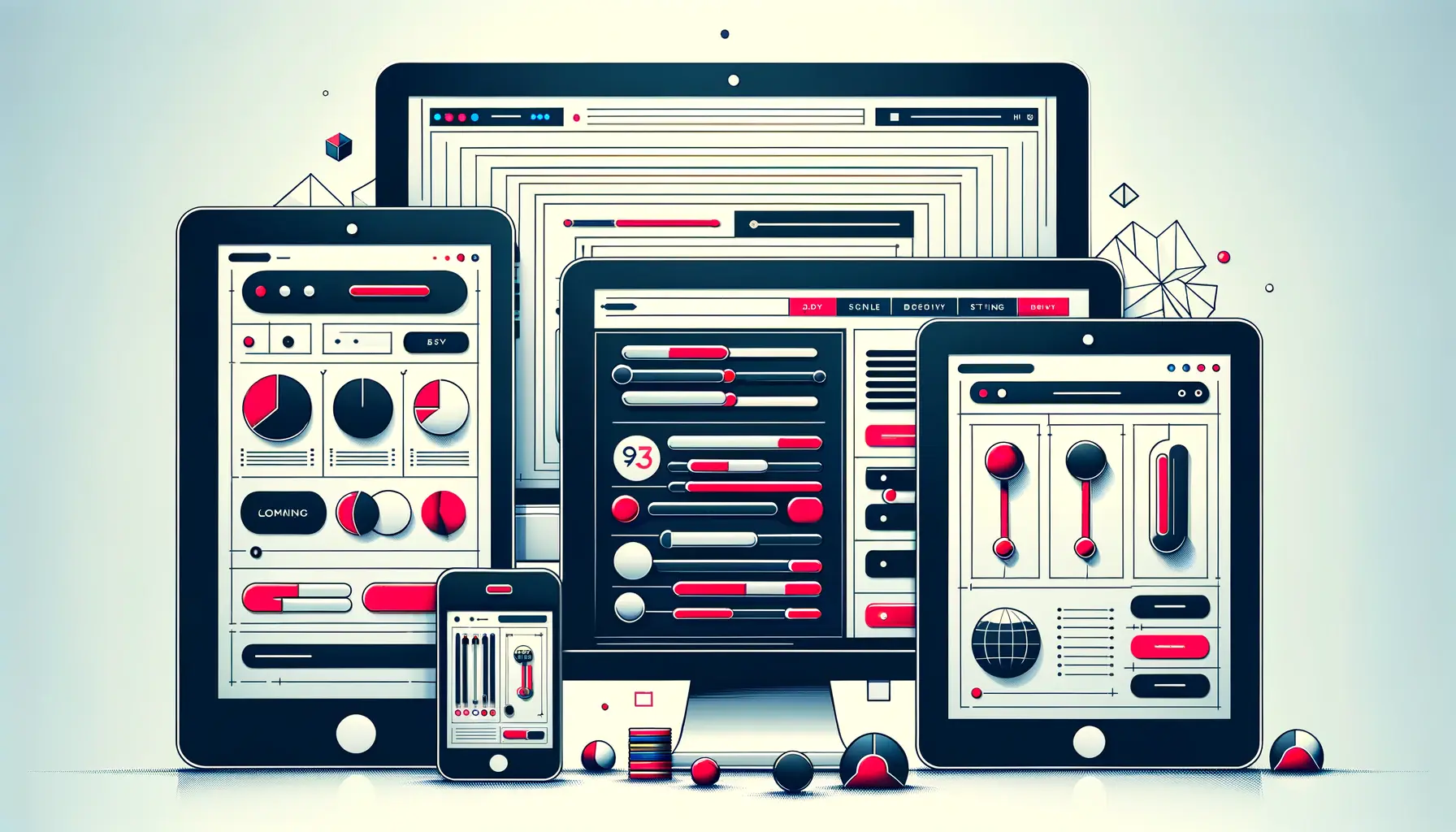
In today’s multi-device world, ensuring that moving type scales smoothly across various screen sizes is essential.
Responsive typography is about designing text that adapts proportionally across devices, from large desktop screens to small smartphones.
This approach enhances readability and maintains visual balance across platforms.
- Fluid Typography: Employ CSS techniques to make text elements scale proportionally based on the viewport size, ensuring consistent readability without manual intervention.
- Media Queries: Utilize CSS media queries to apply specific typographic styles based on the characteristics of the device, such as screen size or orientation, to enhance the user experience.
Employing Variable Fonts for Flexibility
Variable fonts provide a flexible solution for dynamic typography by encapsulating multiple font styles and weights within a single file.
They offer designers greater control and flexibility, leading to improved performance and consistency in design.
- Dynamic Adjustments: Make real-time adjustments to font properties such as weight, width, and slant, allowing precise typographic tuning to meet design requirements.
- Performance Optimization: Reduce the need for multiple font files by utilizing variable fonts, improving page load times and enhancing overall website performance.
Adding CSS Animations and Transitions
CSS transitions and animations are powerful tools for bringing moving type to life.
By using these techniques, designers can create interactive text effects that grab attention and communicate messages effectively.
- Text Hover Effects: Apply transitions that change font size, color, or style when users hover over text elements, enhancing interactivity and visual engagement.
- Scrolling Animations: Trigger animations on scroll, such as text sliding into place or fading in, to create an immersive storytelling experience.
Using JavaScript for Interactive Typography Effects
JavaScript enhances moving type by enabling more advanced interactions and animations beyond what CSS alone can achieve.
This allows for the development of highly interactive text elements that respond to user actions and increase engagement.
- Interactive Text Animations: Create animations that respond dynamically to user interactions, such as clicking or scrolling, to deliver a personalized and engaging experience.
- Data-Driven Typography: Use JavaScript to modify text content and formatting in real-time based on live data, creating dynamic and contextually relevant typography.
By combining these techniques, designers can successfully integrate moving type into web design, crafting visually appealing and accessible interfaces.
In the next section, we will explore best practices to ensure that dynamic typography is both effective and user-friendly.
Utilizing responsive typography, variable fontsFonts that contain multiple styles and weights within a single file., and CSS animations ensures moving type remains effective across different devices and screen sizes.
Best Practices for Successful Moving Type
Moving type can significantly enhance user experience and engagement in web design.
However, to achieve the intended effect, it’s crucial to follow best practices that ensure readability, accessibility, and performance.
Let’s explore these practices:
Maintaining Readability and Accessibility
As much as moving type adds life to a website, it’s essential to maintain text readability and ensure animations are accessible to all.
- Prioritize Legibility: Make the animated text readable and clear. Avoid using overly complex animations that might distract or confuse users.
- Provide Controls: Allow users to pause or disable animations, catering to individuals who find motion distracting or have motion sensitivities.
- Use Semantic HTML: Implement proper HTML tags to structure content, allowing screen readers to interpret and render information correctly.
- Consider Motion Preferences: Respect user preferences by detecting and adhering to the ‘prefers-reduced-motion’ media query, reducing motion for users who have opted for fewer animations.
Maintaining Brand Harmony with Dynamic Text
Dynamic typography should align with your brand identity so that animations enhance rather than distract from your message.
- Match Brand Guidelines: Ensure the style and behavior of animations are consistent with your brand’s tone and values to create a cohesive user experience.
- Cross-Device Consistency: Maintain uniformity in typography animations across different browsers and devices for a smooth user experience.
Balancing Animation with Performance Optimization
Animations should enhance the user experience without compromising website performance.
Optimizing animations ensures they run smoothly across all devices.
- Optimize Animation Performance: Use hardware-accelerated animations where possible and avoid animating properties that trigger layout recalculations, such as width and height. This minimizes performance bottlenecks and ensures smooth animations.
- Minimize File Sizes: Compress animation files and use efficient formats to reduce load times, improving overall site performance.
- Test Across Devices: Regularly test animations on various devices and browsers to ensure consistent performance and identify any potential issues.
Avoiding Common Pitfalls in Typography Animation
To effectively utilize moving type, it’s essential to recognize and avoid common mistakes that may hinder user experience.
- Use Animations Sparingly: Excessive animations can overwhelm users and distract from the main content. Use animations selectively to enhance key features without creating visual clutter.
- Avoid Scrolljacking: Do not interfere with users’ natural scrolling behavior, as it can lead to frustration. Allow users to navigate the page smoothly.
- Provide Fallbacks: Ensure content remains accessible even if animations fail to load or are unsupported by certain browsers. This practice maintains usability across different platforms.
By adhering to these best practices, designers can effectively incorporate moving type in web design, creating websites that are engaging, accessible, and high-performing for users.
Always prioritize readability, accessibility, and performance optimization when incorporating moving type into web design.
Real-Life Uses of Moving Type
Moving type, or kinetic typography, has been effectively utilized across various media to enhance narratives, convey emotions, and engage viewers.
Below are some fascinating real-life applications:
Film and Television Title Sequences
One of the earliest uses of moving type was in film title sequences.
A notable example is Alfred Hitchcock’s North by Northwest (1959), where Saul BassA graphic designer known for pioneering animated film title sequences.‘s innovative animated text set the film’s tone.
This technique has since become a standard practice in the industry, with kinetic typography being used to create memorable openings that captivate audiences from the start.
Music Videos
In the music industry, moving type has also been employed to create visually engaging lyric videos.
For instance, Snoop Dogg’s Talk Dat Shit lyric video uses animated words to synchronize with the rhythm and mood of the song, enhancing the viewer’s overall experience.
Advertising and Marketing Campaigns
Brands leverage the potential of moving type to convey powerful messages.
Apple’s Designed by Apple campaign effectively used kinetic typography to emphasize the company’s design philosophy and create a strong emotional connection with audiences.
Website Design
Moving type in web design is utilized to improve user engagement and present information dynamically.
For example, hover effects—where text changes its appearance when hovered over—are commonly implemented to enhance user interaction.
Educational Content
Educational platforms have integrated moving type to make learning materials more engaging.
Animated text is used to highlight key concepts, creating more interactive content that improves information retention.
These practical applications demonstrate the versatility of moving type across various fields, from entertainment to education, and its ability to enhance communication and user interaction.
From film title sequences to advertising campaigns, moving type has transformed the way visual storytelling is executed in media.
Future Trends in Moving Type
The moving type, or kinetic typography, landscape is constantly evolving, with technological advancements and changing design trends leading the way.
As we look to the future, several key trends are expected to revolutionize how designers approach dynamic typography:
Integration of Artificial Intelligence in Typography Design
Artificial Intelligence (AI) is transforming various aspects of design, including typography.
AI-powered software can simplify font creation, analyze user behavior, and generate customized typographic designs, increasing efficiency and personalization.
This technology enables rapid prototyping and allows designers to experiment with innovative typographic techniques.
Emphasis on Accessibility and Inclusivity
Typography designers are placing greater emphasis on accessibility to ensure digital content is available to all users, including individuals with visual impairments.
This includes using readable fonts, proper sizing, and sufficient color contrast.
Incorporating accessible moving type ensures that animations do not disrupt readability and remain compatible with assistive technologies.
Adoption of Variable Fonts for Responsive Design
Variable fonts, which allow multiple font styles within a single file, are becoming increasingly popular due to their flexibility and responsiveness.
They enable designers to dynamically adjust weight, width, and other attributes, creating responsive designs that seamlessly adapt to various devices and screen sizes.
This adaptability enhances the user experience by providing both visual consistency and optimized performance.
Experimental Use of Three-Dimensional Typography
The use of three-dimensional (3D) effects in typography is gaining traction as designers seek to create depth and realism.
By integrating 3D elements, designers can craft immersive experiences that grab attention and give digital text a more tangible presence.
This approach is particularly effective in web design and advertising, where striking visuals are essential.
Integration with Augmented and Virtual Reality
As augmented realityTechnology that overlays digital content onto the real world. (AR) and virtual realityA simulated digital environment that users can interact with. (VR) technologies continue to expand, moving type is being incorporated into these immersive environments.
In AR and VR settings, typography can interact with users’ surroundings, providing contextual information and enhancing the overall experience.
This integration unlocks new possibilities for storytelling and user engagement.
By embracing these trends, designers can push the boundaries of traditional typography, creating dynamic and interactive content that resonates with a broad audience in an ever-evolving digital landscape.
Emerging trends such as AI-driven typography, 3D typography, and AR/VR integration are set to redefine the future of moving type in web design.
The Impact and Future of Moving Type in Web Design
Moving type, or kinetic typography, is now a dynamic force in modern web design, transforming static text into interactive and engaging elements.
From its origins in film and television to its widespread application in digital media, moving type has continuously evolved to enhance communication, storytelling, and user engagement.
The Significance of Moving Type
Throughout this article, we’ve explored the various aspects of moving type and how it impacts digital design.
Below is a brief summary of its key contributions:
- Enhanced Engagement: Motion captures users’ attention, helping to convey important messages and direct focus effectively.
- Improved Readability: Smooth typography animations guide users through content in a structured and visually appealing manner.
- Bold Branding: Brands utilize moving type to reinforce brand identity and deliver messages with added personality.
- Interactive Web Design: Dynamic typography plays a crucial role in crafting immersive and user-friendly web experiences.
Key Techniques for Effective Moving Type
To efficiently utilize moving type, designers should focus on the following techniques:
- Responsive Typography: Ensuring scalability and readability across different devices and screen sizes.
- CSS and JavaScript Animations: Leveraging modern web technologies to create smooth transitions and dynamic text effects.
- Variable Fonts: Implementing flexible fonts that adjust weight, width, and style for optimal performance and design.
- Accessibility and Usability: Keeping animations subtle, ensuring readability, and making text inclusive for all users.
The Future of Moving Type
Looking ahead, moving type will continue to evolve as innovative technologies shape the future of digital typography.
Emerging trends such as AI-driven typography, 3D typography, and AR/VR integration are paving the way for more interactive and immersive web experiences.
Designers must balance creativity with usability to ensure that animations enhance rather than disrupt the user experience.
Final Thoughts
As web design continues to evolve, the role of moving type will become even more significant.
Whether in branding and advertising, education, or interactive media, kinetic typography holds limitless creative potential.
By understanding best practices, leveraging advanced tools, and prioritizing accessibility, designers can unlock the full potential of moving type to create engaging and meaningful digital experiences.
The possibilities of moving type are immense, and those who embrace its potential will continue to redefine the way text is experienced in the digital age.
Balancing creativity with usability is crucial in ensuring that moving type enhances, rather than disrupts, the user experience.
Quality web design is key for a great website! Check out our service page to partner with an expert web design agency.
Frequently Asked Questions About Moving Type
Moving type, also known as kinetic typography, is an interactive design technique that brings text to life.
Below are some common questions and concise responses to help you understand its application in web design.
Moving type, or kinetic typography, animates text to add visual interest, convey emotions, and improve user interaction on websites.
By adding motion to text, moving type captures user attention, emphasizes key messages, and guides users through content, making interactions more engaging.
Designers use CSS animations, JavaScript libraries, and SVGsScalable Vector Graphics, a format for rendering resolution-independent images. to create dynamic text effects such as fades, slides, and rotations.
With responsive design, moving type functions properly across various devices and screen sizes while maintaining readability and performance.
Providing controls to pause animations, limiting excessive motion, and ensuring text remains readable helps accommodate motion-sensitive users.
Complex animations can impact performance.
Optimizing code and using lightweight animations ensure that moving type does not hinder site speed.
Yes, excessive use can overwhelm users.
It is best to apply moving type strategically to highlight key information without causing distraction.
Yes, software such as Adobe After Effects, CSS3, and JavaScript libraries (e.g., GreenSockA JavaScript library for creating high-performance animations on the web.) assist in developing kinetic typography.
Film title sequences, lyric videos, and interactive infographics frequently utilize moving type to convey messages dynamically.
