Understanding the profound impact of color psychology in web design branding is essential for creating compelling and effective digital spaces.
The strategic use of color not only enhances the aesthetic appeal of a website but also influences user behavior, emotions, and brand perception.
This intricate relationship between color and human psychology is what makes color an indispensable tool in the arsenal of web designers and brand strategists alike.
At its core, color psychology seeks to unravel how different hues can evoke specific emotional responses and drive user engagement.
This knowledge is particularly valuable in the competitive digital landscape, where capturing and retaining user attention is paramount.
By leveraging the psychological effects of colors, brands can create more engaging, memorable, and persuasive online experiences.
- Understanding Color Psychology
- Color Schemes and User Experience
- Impact of Color on Conversion Rates
- Accessibility and Color Design
- Color Trends in Web Design
- Psychological Effects of Color in Marketing
- Global Influence of Color
- Embracing the Spectrum: The Integral Role of Color Psychology in Web Design Branding
- FAQs on Color Psychology in Web Design Branding
Understanding Color Psychology
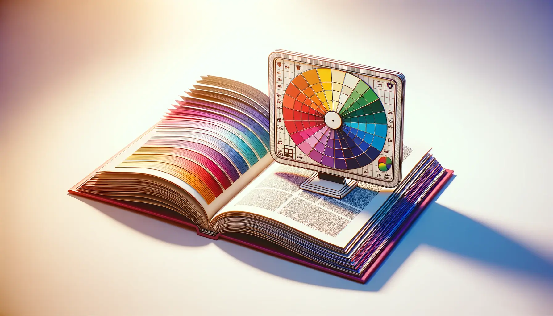
Color psychology is the science of how color affects human behavior and decision-making.
With each color capable of triggering different emotions and associations, selecting the right color palette becomes a critical decision in web design and branding.
This selection process goes beyond mere personal preference or aesthetic considerations; it involves a deep understanding of the target audience’s psychological makeup and the brand’s identity and values.
For instance, blue is often associated with trust, security, and calmness, making it a popular choice for financial institutions and healthcare websites.
Conversely, red can evoke feelings of excitement, passion, or urgency, frequently used in call-to-action buttons or sale announcements.
The key is to align color choices with the desired emotional response and the overall branding strategy to create a cohesive and effective design.
Color and Brand Identity
Color is a powerful branding tool that can significantly enhance brand recognition and differentiation.
A brand’s color palette is one of the first things that consumers notice and remember, making it a crucial element in building brand identity.
The right combination of colors can convey a brand’s personality and values without words, creating a visual language that speaks directly to the audience’s emotions.
Consider the iconic brands like Coca-Cola with its vibrant red or Tiffany & Co.’s distinctive robin egg blue.
These brands have effectively used color to carve out a unique identity in the minds of consumers.
By doing so, they have not only established a strong visual presence but have also fostered emotional connections with their audience, proving the undeniable power of color in branding.
The strategic application of color psychology in web design and branding can significantly influence user perception and interaction, making it a critical component of digital marketing success.
Color Schemes and User Experience
Creating an effective color scheme is more than just choosing appealing colors; it’s about crafting an experience that enhances user engagement and guides behavior on a website.
The right color scheme can significantly improve usability and user experience, making navigation more intuitive and content more accessible.
When designing a color scheme, it’s crucial to consider the contrast and balance between colors.
High contrast color combinations can make text stand out and improve readability, while a harmonious balance of colors can create a pleasing aesthetic that encourages longer site visits.
Here’s how to approach color schemes in web design:
Choosing a Primary Color
- Identify the emotion or action you want to evoke. This decision should align with your brand’s personality and the message you wish to convey.
- Consider the cultural connotations of your chosen color. Different cultures may associate colors with various meanings, which can impact user perception.
Adding Secondary Colors
- Select complementary or analogous colors to your primary hue to create visual interest and depth.
- Use secondary colors to highlight important features, such as call-to-action buttons or key information areas.
Implementing Accent Colors
- Choose a bold color that stands out but still fits within the overall color scheme to draw attention to specific elements.
- Limit the use of accent colors to avoid overwhelming users and diluting the focus on important actions or information.
Remember, the goal of your color scheme is to enhance the user experience by making your website not only visually appealing but also functional and accessible.
Effective color schemes are instrumental in guiding user interaction and improving the usability of a website.
By carefully selecting and applying colors, designers can create a path that leads users naturally through the website, from initial engagement to the desired action.
This strategic use of color enhances the overall user experience, making the website not only a visual treat but also a user-friendly environment that encourages interaction and conversion.
Impact of Color on Conversion Rates
The influence of color on conversion rates cannot be overstated.
Colors have the power to persuade, motivate, and influence the decisions of website visitors.
By understanding the psychological impact of specific colors, brands can significantly increase their chances of converting visitors into customers.
This section explores how different colors can affect conversion rates and how to apply this knowledge to web design.
Colors That Boost Conversions
- Red: Known for creating a sense of urgency, red is often used for clearance sales and call-to-action buttons to stimulate quick decisions.
- Green: Associated with ease and comfort, green is frequently used for checkout buttons or environmental causes, suggesting a smooth process.
- Blue: Evoking trust and security, blue is preferred by financial and tech companies to reassure users during transactions or sign-ups.
Testing and Optimization
To maximize conversion rates, continuous testing and optimization of color schemes are essential.
A/B testing, where two versions of a webpage are compared, is a popular method for evaluating the effectiveness of different colors in driving user action.
This data-driven approach allows designers to make informed decisions about color choices, ensuring they align with user preferences and behaviors.
Moreover, it’s crucial to consider the context in which colors are used.
The same color can have different effects depending on its application.
For example, a red ‘Buy Now’ button might perform well on an e-commerce site, while a green ‘Subscribe’ button could be more effective on a newsletter sign-up page.
Understanding the context and the audience’s psychological response to colors is key to optimizing conversion rates.
Consider the emotional and psychological impact of your chosen colors on your target audience to enhance conversion rates effectively.
Ultimately, the goal is to create a visually appealing and psychologically compelling website that encourages users to take the desired action.
Whether it’s making a purchase, signing up for a newsletter, or downloading a resource, the strategic use of color can lead to significant improvements in conversion rates.
By carefully selecting colors that resonate with their target audience and testing their impact, brands can create more engaging and effective websites.
Accessibility and Color Design
Accessibility in web design ensures that websites are usable by as many people as possible, including those with disabilities.
Color choice plays a crucial role in making web content accessible.
Poorly chosen color combinations can create barriers for users with visual impairments, such as color blindness, reducing the overall accessibility of a website.
Color Contrast for Readability
One of the key considerations for accessibility is color contrast.
High contrast between text and its background makes content more readable for everyone, including users with low vision or color vision deficiencies.
The Web Content Accessibility Guidelines (WCAG) recommend a minimum contrast ratio of 4.5:1 for normal text and 3:1 for large text.
Tools like the Color Contrast Checker can help designers evaluate and adjust their color choices to meet these standards.
Designing for Color Blindness
Designing with color blindness in mind involves choosing color schemes that are distinguishable to people with various types of color vision deficiencies.
This includes avoiding color combinations that are commonly problematic, such as red/green or blue/purple.
Instead, designers can use texture, patterns, and labels to differentiate elements, ensuring that information conveyed by color is also available through other means.
Ensuring your website is accessible to users with color vision deficiencies not only expands your audience but also enhances the user experience for all visitors.
Accessibility should be a priority from the outset of the design process, not an afterthought.
By incorporating accessible color design principles, designers can create more inclusive digital environments.
This approach not only benefits users with disabilities but also improves the overall usability and appeal of a website.
In an increasingly digital world, making your website accessible to as many people as possible is not just good practice—it’s essential.
Color Trends in Web Design
Staying abreast of color trends is crucial for web designers aiming to create modern and engaging websites.
While the foundational principles of color psychology remain constant, the popularity of specific hues can vary significantly over time.
These trends can influence user expectations and perceptions, making it essential for designers to integrate contemporary colors that resonate with today’s audience.
Current Color Trends
- Minimalist Pastels: Soft, muted pastel colors are increasingly popular for creating a calming and minimalist aesthetic. They are perfect for brands looking to convey sophistication and serenity.
- Vibrant Gradients: Gradients that combine bold and vibrant colors can add depth and dynamism to a design. They are often used to draw attention to key areas or to add a modern flair to logos and backgrounds.
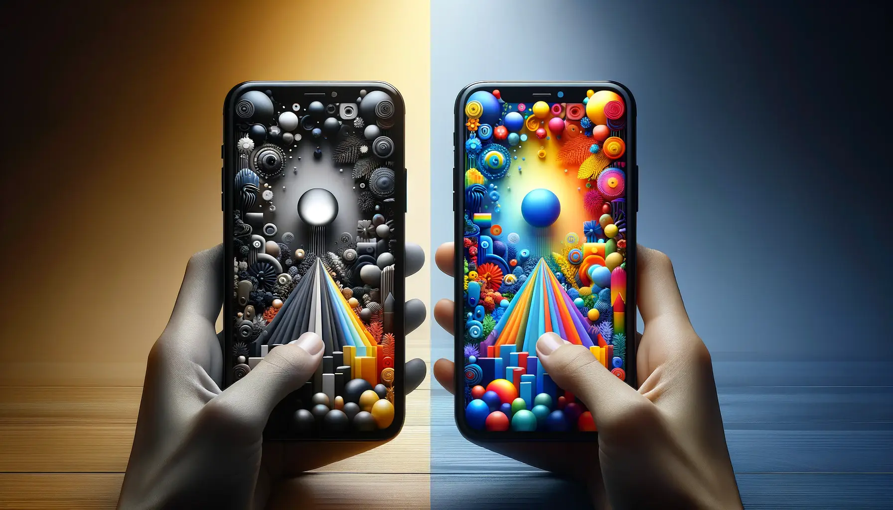
- Dark Mode: With many operating systems and apps offering dark mode options, using dark backgrounds with bright accent colors has become a trend. This scheme reduces eye strain in low-light conditions and offers a sleek, modern look.
Incorporating Trends Thoughtfully
While keeping up with color trends is important, it’s equally crucial to incorporate them thoughtfully into your designs.
Trends should complement the brand’s identity and not be used merely for the sake of being fashionable.
Here are some tips for integrating color trends:
- Align trends with your brand’s personality and messaging. Ensure that the trendy colors you choose do not clash with your brand’s core values and aesthetic.
- Use trendy colors as accents or in specific sections rather than overhauling your entire color scheme. This approach allows you to refresh your design without losing brand recognition.
- Consider your target audience’s preferences and expectations. Some demographics may be more receptive to bold and vibrant colors, while others may prefer a more subdued palette.
Adapting to color trends can keep your website looking fresh and engaging, but always ensure that these trends align with your brand’s identity and audience’s expectations.
Ultimately, the effective use of color trends in web design not only enhances the visual appeal of a website but also ensures that it remains relevant and resonant with its intended audience.
By thoughtfully integrating current trends with timeless principles of color psychology, designers can create compelling websites that stand out in the digital landscape.
Psychological Effects of Color in Marketing
The psychological effects of color extend far beyond aesthetics, playing a pivotal role in marketing strategies and consumer behavior.
The right choice of color can significantly influence how a brand is perceived, affecting everything from brand recognition to purchasing decisions.
Understanding the psychological impact of different colors can empower marketers to craft more effective and emotionally resonant campaigns.
Color and Brand Perception
- Colors can shape consumers’ perceptions of a brand’s personality. For example, green often represents eco-friendliness and sustainability, making it a popular choice for brands emphasizing environmental consciousness.
- Color consistency across all marketing materials enhances brand recognition. Consistent use of a specific color palette makes a brand more memorable and easily identifiable by consumers.
Color and Purchasing Decisions
- Colors can trigger specific behaviors and emotions, influencing consumers’ willingness to purchase. For instance, red can create a sense of urgency, often used in sales and clearance events to encourage quick buying decisions.
- The use of color in marketing materials can affect the perceived value of products and services. Luxurious brands may use black or gold to convey exclusivity and high quality.
Strategies for Leveraging Color Psychology in Marketing
- Identify the emotions and actions you want to evoke in your target audience and select colors accordingly. This alignment ensures that your marketing materials resonate with your audience’s psychological responses.
- Conduct market research to understand the color preferences of your target demographic. This insight allows for more targeted and effective marketing strategies.
- Test different colors in your marketing campaigns to see which ones perform best. A/B testing can reveal valuable insights into consumer preferences and behavior.
By strategically applying color psychology in marketing efforts, brands can enhance emotional engagement, improve brand perception, and drive consumer actions.
Incorporating the psychological effects of color into marketing strategies offers a powerful means to connect with consumers on an emotional level.
By carefully selecting colors that align with brand values and resonate with the target audience, marketers can significantly enhance the effectiveness of their campaigns, leading to increased engagement, loyalty, and sales.
Global Influence of Color
The impact of color extends beyond individual psychology and design principles, reaching into the realm of cultural significance and global influence.
Colors carry different meanings and associations across various cultures, affecting international branding, marketing, and web design strategies.
Understanding these cultural nuances is crucial for brands looking to establish a global presence and connect with diverse audiences worldwide.
Cultural Meanings of Colors
- Red: While red often signifies luck, prosperity, and happiness in many Asian cultures, it can represent danger or warning in Western cultures. This dual symbolism highlights the importance of cultural sensitivity in color selection.
- White: In Western cultures, white is associated with purity and peace, commonly used in weddings. Conversely, in some Eastern cultures, white is the color of mourning and funerals, illustrating vastly different emotional and cultural responses.
- Green: Green can symbolize nature, growth, and fertility across many cultures, but its specific meanings can vary. For example, green is considered a sacred color in Islam, representing paradise.
Adapting Color Strategies for Global Markets
- Research and understand the cultural contexts and meanings of colors in your target markets. This understanding can prevent potential misinterpretations or negative associations with your brand.
- Consider using a flexible color strategy that can be adapted for different cultural contexts. This approach may involve varying the color palette for specific regions to align with local preferences and meanings.
- Engage with local experts or conduct focus groups within target markets to gain insights into cultural perceptions of color. This feedback can inform more culturally aware and effective design and marketing strategies.
Assuming a one-size-fits-all approach to color in global marketing and design can lead to cultural misunderstandings and missed opportunities for engagement.
As brands navigate the complexities of the global marketplace, the thoughtful consideration of color’s cultural implications becomes increasingly important.
By recognizing and respecting the diverse meanings and associations of colors across cultures, brands can create more inclusive and resonant experiences for a worldwide audience.
This cultural sensitivity not only enhances brand perception but also fosters deeper connections with consumers from various backgrounds.
Embracing the Spectrum: The Integral Role of Color Psychology in Web Design Branding
The exploration of color psychology in web design branding reveals its undeniable power to influence user experience, emotional response, and ultimately, consumer behavior.
As we’ve navigated through the various dimensions of color’s impact—from enhancing user experience and accessibility to influencing conversion rates and global perceptions—it’s clear that color is not merely a design choice but a strategic branding tool.
Key Takeaways on Color Psychology
- Color choices can significantly affect a user’s first impression, engagement level, and decision-making process on a website.
- Accessibility considerations are paramount, ensuring that web designs are inclusive and navigable for all users, including those with visual impairments.
- Understanding cultural nuances in color perception is crucial for brands aiming for a global reach, necessitating a flexible and informed approach to color strategy.
Strategic Application in Branding
Incorporating color psychology into web design and branding is not just about adhering to the latest trends or personal preferences.
It requires a deep understanding of the brand’s identity, target audience, and the psychological underpinnings of color perception.
Brands that master this art can create compelling digital experiences that resonate on a global scale, driving engagement, loyalty, and conversion.
Future Directions
As digital landscapes evolve and consumer preferences shift, the role of color psychology in web design branding will continue to expand.
Innovations in technology and design tools will offer new ways to leverage color more effectively, making it imperative for designers and marketers to stay informed and adaptable.
The future of web design branding lies in a balanced integration of aesthetic appeal, psychological insight, and technological advancement, with color psychology at its core.
In conclusion, the strategic use of color in web design branding is a powerful tool that, when wielded with insight and precision, can transform the digital experience.
It bridges the gap between visual appeal and psychological influence, crafting brand identities that are not only visually stunning but also emotionally resonant.
As we move forward, the exploration and application of color psychology will undoubtedly continue to shape the future of branding in the digital realm.
Quality web design is key for a great website! Check out our service page to partner with an expert web design agency.
FAQs on Color Psychology in Web Design Branding
Delve into the fascinating world of color psychology in web design branding with these frequently asked questions, shedding light on how colors can transform user experience and brand perception.
Color psychology in web design explores how color choices affect user emotions, behaviors, and perceptions, influencing engagement and decision-making.
Color increases brand recognition by up to 80%, making it easier for users to remember and identify brands based on their color schemes.
Yes, color choices can significantly affect website conversions by eliciting specific emotions and actions, such as urgency or trust, from users.
Understanding color psychology enables web designers to strategically select colors that enhance user experience, engagement, and brand messaging.
Cultural differences play a crucial role in color psychology, as colors can have varied meanings and associations across different cultures.
Color shapes user experience by influencing readability, mood, and user navigation, making websites more intuitive and engaging.
Brands can leverage color psychology in marketing to evoke desired emotions, reinforce brand identity, and drive consumer behavior towards conversions.
Current trends include minimalist pastels, vibrant gradients, and dark mode aesthetics, reflecting modern tastes and enhancing user engagement.
