Understanding the nuances of color theory is essential for anyone involved in the creative process, whether you’re a web designer, artist, or simply someone looking to refine your aesthetic sensibilities.
At the heart of this complex field lie two fundamental concepts: shade and tint.
These elements play a pivotal role in defining the visual and emotional impact of color in design and art.
By exploring these aspects, we can unlock a deeper appreciation and application of color in our projects.
Shade and tint are often used interchangeably in casual conversation, but in the realm of color theory, they have distinct meanings that significantly affect the outcome of a design.
This distinction is not just academic; it influences how we perceive colors, craft palettes, and convey messages through design.
A solid grasp of these concepts can elevate your work from good to unforgettable, making it crucial for anyone looking to make a mark in any visually driven field.
- Understanding Color Theory
- Practical Applications of Shade and Tint
- Color Psychology in Shade and Tint
- Shade and Tint in Branding and Marketing
- Shade and Tint in Web and App Design
- Challenges and Solutions in Using Shade and Tint
- Innovative Techniques in Shade and Tint Manipulation
- Mastering the Art of Shade and Tint in Design
- FAQs on Shade and Tint in Color Theory
Understanding Color Theory
Color theory is a cornerstone of visual arts, underpinning the way we understand and use color in various disciplines.
It explains how humans perceive color, the visual effects of how colors mix, match, or contrast with each other, and the methods used to replicate or describe color.
At its core, color theory provides a logical structure for color mixing and the visual impacts of specific color combinations.
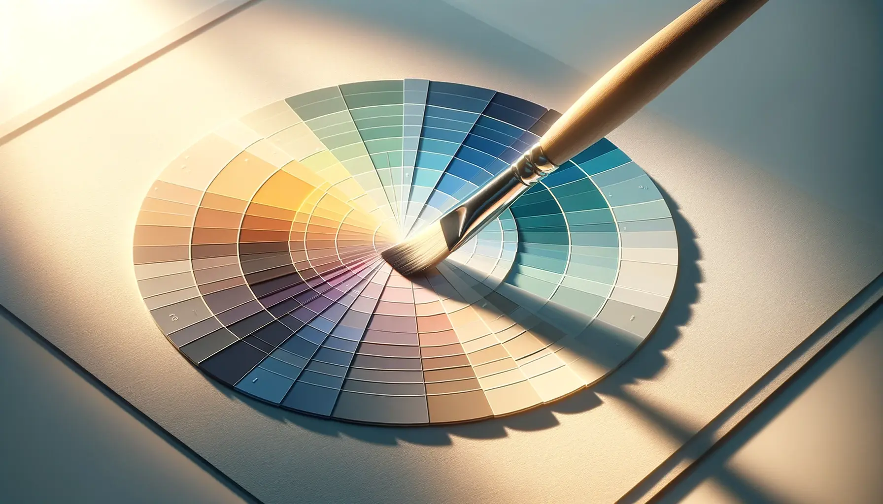
Within this framework, shade and tint are critical for adjusting the value and intensity of colors.
By manipulating these elements, designers and artists can create depth, contrast, and emphasis, guiding the viewer’s eye and evoking specific emotions.
This manipulation is not random but follows the principles laid out by color theory to achieve desired effects.
The Role of Shade in Color Theory
Shade refers to any color with black added to it.
This process darkens the original color, reducing its lightness without altering its hue.
Adding shade to a color increases its depth and can create a sense of weight or gravity in a design.
Shades are often used to convey a sense of sophistication, mystery, or formality.
They can also be employed to create contrast, highlight areas of importance, or develop a mood within a composition.
Understanding how to effectively use shades can transform a flat, two-dimensional piece into a dynamic work with visual depth and interest.
For instance, shading can be used to create the illusion of texture or to suggest light sources within an artwork.
In web design, shades can help create a visual hierarchy, directing the viewer’s attention to key elements.
Exploring the Impact of Tint
Tint is achieved by adding white to a base hue, lightening the original color.
This process increases the color’s lightness, making it softer and often more pastel.
Tints have the power to evoke a sense of airiness, freshness, or delicacy.
They are particularly useful in creating a relaxed or feminine look, making them popular choices in design projects aimed at evoking calmness and serenity.
Just as with shades, understanding how to use tints can significantly affect the mood and perception of a design.
Tints can be used to soften a color scheme, reduce visual weight, and create a more harmonious and inviting space.
Whether you’re designing a website, a brand identity, or a piece of art, tints offer a versatile tool for nuanced color manipulation.
Mastering the use of shade and tint within the context of color theory allows for more sophisticated and impactful design choices, enhancing the overall aesthetic appeal and effectiveness of your work.
Practical Applications of Shade and Tint
The practical applications of shade and tint in design and art are vast and varied.
By adjusting the lightness or darkness of a color, you can achieve remarkable effects that enhance the visual appeal and effectiveness of your work.
Here, we delve into specific ways these color theory principles can be applied across different mediums and projects.
Understanding when and how to apply shade and tint can dramatically alter the perception of your design, influencing mood, emphasis, and visual balance.
Let’s explore some key applications:
Creating Depth and Volume
One of the primary uses of shade in art and design is to create an illusion of depth and volume on a flat surface.
By strategically darkening areas of an object, you can suggest that parts of it are in shadow, thereby giving the viewer a sense of three-dimensional form.
Similarly, tints can be used to highlight areas that are exposed to light, enhancing the three-dimensional illusion.
- Shading techniques in drawing and painting can turn a simple shape into a lifelike form.
- In web design, using shades can help create a sense of depth in UI elements, making them appear more tactile and interactive.
Enhancing Visual Hierarchy
Shade and tint are powerful tools for establishing a visual hierarchy in design.
By varying the lightness or darkness of colors, you can guide the viewer’s eye to the most important elements of your composition.
Lighter tints often attract the eye first, followed by the darker shades, allowing you to control the order in which information is perceived.
- Using tints for background colors can make overlaid text in a darker shade stand out, improving readability.
- Darker shades can be used for less important elements to push them to the background.
Conveying Mood and Atmosphere
The choice between using a tint or a shade can significantly affect the mood and atmosphere of a design.
Lighter tints tend to convey a lighter, more airy mood, while darker shades can create a sense of seriousness or mystery.
- Tints are perfect for designs aiming to evoke a sense of freshness, purity, or femininity.
- Shades are ideal for conveying sophistication, power, or mystery.
Improving Aesthetics and Appeal
Shade and tint not only have practical applications in terms of functionality and usability but also play a crucial role in the aesthetic appeal of a design.
The right balance between light and dark can make a design more visually interesting and engaging.
- Adding a tint to a color scheme can soften harsh contrasts, creating a more harmonious and pleasing look.
- Incorporating shades can add richness and depth to a color palette, making it more dynamic and visually appealing.
Experimenting with different levels of shade and tint can unlock new possibilities in your design work, offering fresh ways to solve visual problems and enhance the user experience.
Color Psychology in Shade and Tint
Color psychology plays a pivotal role in how shade and tint influence the viewer’s perception and emotional response.
The psychological impact of colors is amplified when manipulated through shade and tint, affecting mood, behavior, and decision-making processes.
This section explores the psychological dimensions of shade and tint and how they can be harnessed in design and art to evoke specific responses.
Emotional Responses to Shades
Shades, being darker variations of colors, often evoke strong emotional responses.
They can add drama, sophistication, and intensity to a design, influencing how an audience feels about the visual message being conveyed.
For example, a darker shade of blue can evoke feelings of trust and stability, but with added depth and seriousness, making it ideal for corporate or financial institutions.
- Dark shades of green can evoke feelings of growth and prosperity, but with a more grounded or luxurious twist.
- A shade of red might be used to convey passion and excitement, but with an undercurrent of power and sophistication.
Perceptual Effects of Tints
Tints, on the other hand, lighten colors by adding white, creating softer, more pastel versions.
These lighter colors can evoke feelings of openness, airiness, and calm.
Tints are often used in designs intended to be soothing, feminine, or friendly.
A tint of blue, for instance, can feel more tranquil and refreshing, suitable for spaces meant to relax or invigorate.
- Light tints of purple can evoke feelings of creativity and spirituality, but with a gentler, more approachable edge.
- A tint of orange can be energizing and inviting, perfect for creating a sense of warmth and enthusiasm without overwhelming.
Using Color Psychology Strategically
The strategic use of shade and tint, informed by color psychology, can significantly enhance the effectiveness of a design.
By understanding the emotional and psychological effects of colors, designers can create more compelling and persuasive visual communications.
This understanding allows for the deliberate evocation of specific feelings or actions from the viewer, whether it’s to calm, excite, inspire trust, or provoke thought.
- Consider the target audience and the desired emotional response when choosing colors and their shades or tints for your design.
- Use shades to add sophistication and depth to your design, making it more compelling and emotionally resonant.
- Employ tints to soften the visual impact of colors, creating a more inviting and comfortable atmosphere.
The right application of shade and tint, guided by color psychology principles, can transform a design from merely visually appealing to emotionally engaging and psychologically impactful.
Shade and Tint in Branding and Marketing
The strategic use of shade and tint in branding and marketing can significantly influence consumer perception and brand identity.
These color manipulations are not merely aesthetic choices but are deeply intertwined with the psychological impact of colors on consumer behavior.
In this context, understanding how to effectively employ shade and tint can be a game-changer for creating memorable and effective brand identities and marketing campaigns.
Building Brand Identity with Color
Color is a critical element of brand identity, conveying the essence and values of a brand without words.
The use of shade and tint can refine this communication, adding layers of meaning and emotional depth.
A brand that uses dark shades in its color scheme might be perceived as more authoritative and sophisticated, while a brand that uses light tints could be seen as more approachable and gentle.
- Shades can be used to convey a sense of reliability and strength, ideal for brands aiming to project an image of trustworthiness and professionalism.
- Tints can help create a playful, innovative brand image, appealing to a younger or more dynamic audience.
Influencing Consumer Behavior
The psychological effects of color extend to its influence on consumer behavior, affecting everything from brand perception to purchasing decisions.
Shade and tint can subtly alter the emotional impact of a color, guiding consumer responses in a desired direction.
For example, a call-to-action button in a bright shade may be more compelling, while a tinted background can create a soothing environment that encourages longer engagement with content.
- Using darker shades in promotional materials can create a sense of urgency or importance, encouraging quicker decision-making.
- Employing tints in store designs or websites can make the shopping experience more enjoyable, potentially increasing sales and customer satisfaction.
Case Studies: Successful Use of Shade and Tint
Many successful brands have leveraged the power of shade and tint to create distinctive and impactful identities.
For instance, a luxury car brand might use deep shades of black and silver to evoke sophistication and power, while a health and wellness brand might use light tints of green and blue to promote feelings of peace and renewal.
- A technology company might use vibrant shades of blue to convey innovation and trust, standing out in a competitive market.
- A cosmetics brand could use soft tints of pink and nude to evoke natural beauty and femininity, appealing to its target audience.
Effective branding and marketing require a nuanced understanding of color’s psychological impact, including the strategic use of shade and tint to shape consumer perceptions and behaviors.
Shade and Tint in Web and App Design
In the digital realm, the application of shade and tint in web and app design plays a crucial role in user experience (UX) and interface (UI) aesthetics.
These color variations can significantly affect usability, accessibility, and the overall visual appeal of digital products.
By carefully selecting and applying shades and tints, designers can enhance navigation, emphasize important content, and create a memorable user experience.
Enhancing Usability and Accessibility
Shade and tint are not just about aesthetics; they are essential tools for improving the usability and accessibility of web and app interfaces.
By adjusting the lightness or darkness of colors, designers can ensure that text is readable, interactive elements are noticeable, and the overall layout is easy to navigate.
- Using tints for background colors can improve contrast with text, making it easier for users to read and understand content.
- Employing shades for buttons and call-to-action elements can make them stand out and guide users towards desired actions.
Creating Visual Hierarchy and Flow
The strategic use of shade and tint can help establish a visual hierarchy, directing users’ attention to key information and controls.
This visual guidance is crucial for creating an intuitive user experience, where users can easily find what they are looking for without feeling overwhelmed.
- Darker shades can be used to highlight important features or navigation elements, making them more prominent.
- Lighter tints can be used to differentiate secondary information or background elements, reducing visual clutter.
Case Study: Effective Color Schemes in UI Design
Consider a mobile app designed to promote relaxation and mindfulness.
The use of light tints of blue and green can create a calming atmosphere, encouraging users to engage with the content.
Contrastingly, a financial app might use strong shades of blue and green to convey stability and growth, reassuring users about the security and potential of their investments.
- An e-commerce app might use vibrant shades to highlight sale items or special offers, drawing users’ attention and encouraging purchases.
- A news app could use a combination of shades and tints to differentiate between types of content, such as breaking news, features, and opinion pieces, enhancing content discoverability.
The thoughtful application of shade and tint in web and app design not only improves the aesthetic appeal but also directly impacts user engagement, satisfaction, and conversion rates.
Challenges and Solutions in Using Shade and Tint
While the strategic use of shade and tint offers numerous benefits in design, it also presents specific challenges.
These challenges can range from maintaining color consistency across different mediums to ensuring accessibility for all users.
However, with a deep understanding of color theory and careful planning, these obstacles can be navigated successfully.
Maintaining Color Consistency
One of the primary challenges in using shade and tint effectively is maintaining color consistency across various platforms and devices.
Different screens and printing processes can display colors differently, leading to variations in how shades and tints are perceived.
- To address this, designers should use color management tools and standardized color profiles to ensure that colors remain consistent across digital and print mediums.
- Testing designs on multiple devices and in different lighting conditions can also help identify and correct inconsistencies.
Ensuring Accessibility
Another significant challenge is ensuring that designs remain accessible to users with visual impairments, including color blindness.
Over-reliance on color differences alone, especially subtle variations in shade and tint, can make content difficult to distinguish for some users.
- Designers can overcome this by combining color variations with other visual cues, such as patterns, textures, or labels, to ensure information is accessible to everyone.
- Accessibility tools and guidelines, such as the Web Content Accessibility Guidelines (WCAG), can provide valuable insights into making designs more inclusive.
Avoiding Visual Overload
Using too many shades and tints within a single design can lead to visual overload, making it difficult for users to focus on important elements.
Finding the right balance is key to creating a harmonious and effective design.
- Limiting the color palette to a few base colors and their shades and tints can help maintain visual coherence and focus.
- Employing negative space effectively can also reduce visual clutter, allowing the chosen colors to stand out more prominently.
Assuming that shade and tint can be applied uniformly across all elements of a design without consideration for context, medium, or audience needs is a common mistake that can undermine the effectiveness of a design.
Innovative Techniques in Shade and Tint Manipulation
The dynamic field of design continually evolves, with innovative techniques in shade and tint manipulation emerging regularly.
These advancements allow designers to push the boundaries of traditional color theory, creating visually stunning and emotionally resonant works.
Exploring these new methods can inspire fresh approaches to color in your projects.
Gradient Meshes in Digital Art
Gradient meshes are a powerful tool in digital art and design software, allowing for precise control over shade and tint within an object.
By manipulating these meshes, artists can create highly realistic gradients that mimic the subtleties of natural light and shadow, adding depth and dimension to their work.
- This technique is particularly effective for creating lifelike textures and forms in digital illustrations and vector art.
- Experimenting with different mesh points and color stops can yield unique effects, from smooth transitions to dramatic contrasts.
Color Blending Modes in Graphic Design
Graphic design software offers a range of color blending modes that dynamically alter how colors interact with each other.
These modes can be used to apply shades and tints in innovative ways, affecting the color, luminosity, and saturation of overlapping elements.
- Blending modes can be particularly useful in creating complex color overlays, enhancing the visual impact of photographs and textured backgrounds.
- They also offer a non-destructive way to experiment with color effects, as adjustments can be easily modified or reversed.
Interactive Color in Web Design
Advancements in web technologies have introduced new possibilities for interactive color manipulation.
Dynamic shade and tint adjustments based on user interaction can create engaging and immersive web experiences.
- Using CSS filters and animations, web designers can create effects that respond to cursor movements, clicks, or scroll actions, altering colors in real-time.
- This technique can be used to highlight interactive elements, guide user navigation, or add a layer of interactivity to storytelling elements on a webpage.
Embracing these innovative techniques in shade and tint manipulation can elevate your design work, offering new ways to engage your audience and express your creative vision.
Mastering the Art of Shade and Tint in Design
The exploration of shade and tint within the realm of color theory is not just an academic exercise but a practical toolset for designers, artists, and marketers alike.
These elements of color manipulation offer a nuanced control over visual communication, allowing for the creation of compelling, emotionally resonant designs.
As we’ve seen, the strategic application of shade and tint can transform the aesthetic and functional aspects of a project, from enhancing usability and accessibility in digital design to conveying brand identity and influencing consumer behavior.
The Power of Color Psychology
At the heart of effective use of shade and tint lies an understanding of color psychology.
By recognizing the emotional and psychological impacts of colors, designers can craft experiences that not only captivate visually but also connect on a deeper emotional level.
Whether it’s the calming effect of light tints or the sophistication of dark shades, the psychological dimension of color is a potent tool in the designer’s arsenal.
Challenges and Innovations
Despite the clear benefits, the use of shade and tint is not without its challenges.
Issues of color consistency across different media, ensuring accessibility for all users, and avoiding visual overload are all critical considerations.
However, the design community continues to innovate, developing new techniques and technologies to address these challenges.
From gradient meshes in digital art to interactive color in web design, the future of shade and tint manipulation is bright with possibilities.
- Gradient meshes offer unprecedented control over color transitions, enabling more lifelike representations in digital art.
- Color blending modes in graphic design software allow for dynamic interactions between colors, opening up new avenues for creative expression.
- Interactive color technologies in web design enhance user engagement through real-time color adjustments based on user actions.
In conclusion, the basics of shade and tint in color theory are foundational knowledge for anyone involved in the creative industries.
These concepts extend far beyond simple color choices, influencing everything from user experience to brand perception.
As designers and artists continue to push the boundaries of what’s possible with color, the exploration of shade and tint will undoubtedly remain at the forefront of innovative design.
Quality web design is key for a great website! Check out our service page to partner with an expert web design agency.
FAQs on Shade and Tint in Color Theory
Explore common questions about the nuanced world of shade and tint within color theory, providing insights for artists, designers, and color enthusiasts alike.
A tint is created by adding white to a color, making it lighter, while a shade is made by adding black, making the color darker.
Tints can evoke feelings of lightness and clarity, while shades often convey depth and seriousness, impacting the emotional response to color.
Yes, strategically using shade and tint can enhance usability, create visual hierarchy, and guide user interaction in web design.
Shade and tint are crucial in branding for conveying specific brand attributes and emotions, influencing consumer perception.
Use standardized color profiles and test designs on multiple devices to ensure shades and tints appear consistently.
Innovative techniques include gradient meshes in digital art and color blending modes in graphic design for dynamic effects.
By varying the darkness or lightness of colors, shade and tint can direct attention to key elements, establishing a visual order.
Challenges include maintaining accessibility and avoiding visual overload. Solutions involve using additional visual cues and limiting the color palette.
