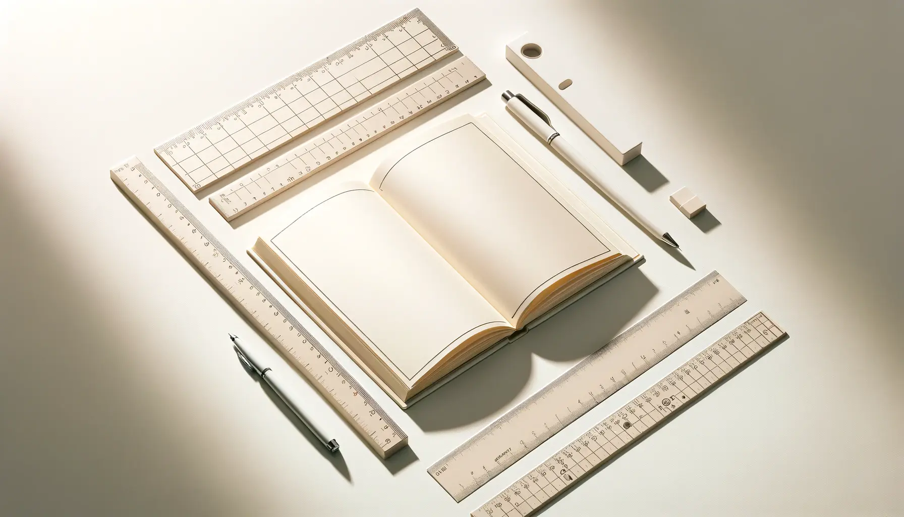
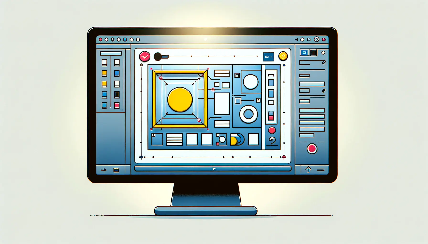
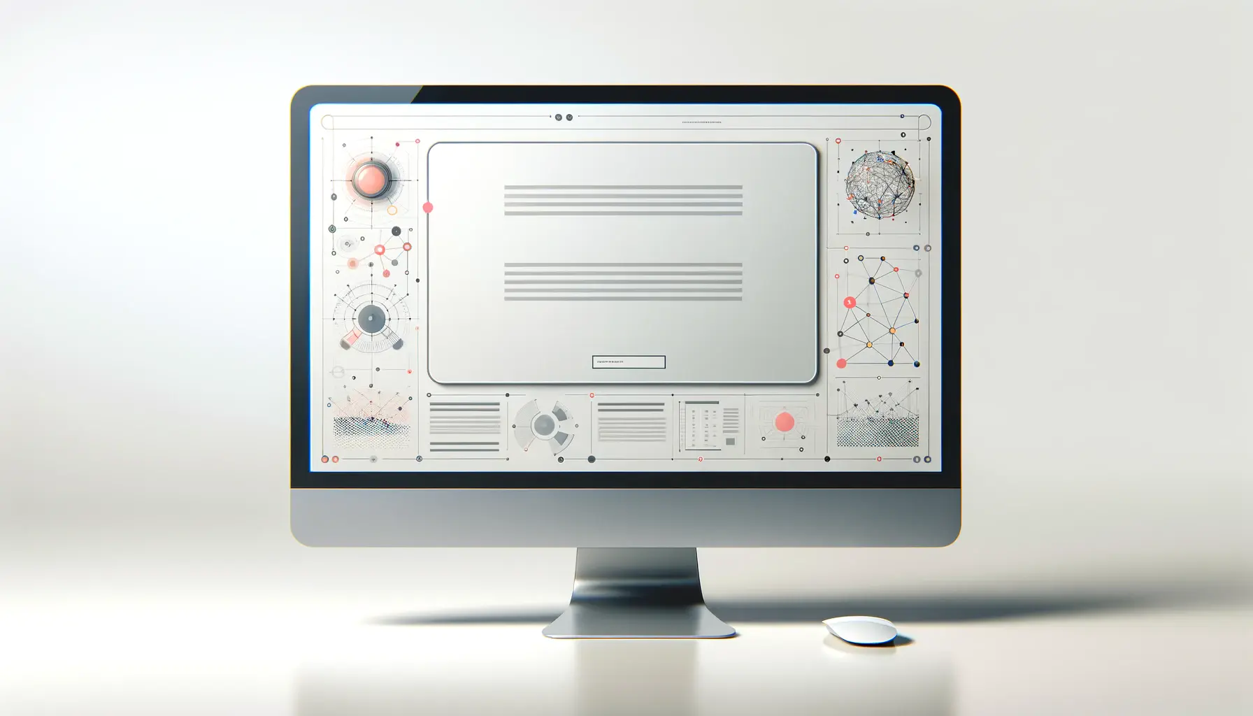
Whitespace, often overlooked and underappreciated, plays a pivotal role in the realm of typography and layout design.
Contrary to its name, whitespace is not merely empty space but a crucial element that contributes to the balance and readability of a design.
It’s the breathing room around and between elements that allows a design to communicate effectively.
In typography and layout, the strategic use of whitespace can transform a cluttered composition into an elegant and focused piece that guides the viewer’s eye with ease and clarity.
The importance of whitespace extends beyond aesthetic appeal; it’s fundamental to the user experience.
A well-designed layout with ample whitespace enhances comprehension, focuses attention on key elements, and creates a visual hierarchy that navigates the viewer through the content seamlessly.
This article delves into the nuanced role of whitespace in typography and layout, exploring how it shapes our interaction with text and images in profound ways.
- Understanding Whitespace in Design
- The Psychological Impact of Whitespace
- Whitespace as a Design Element
- Integrating Whitespace in Web Design
- Whitespace in Mobile Interface Design
- Case Studies: Whitespace in Action
- Optimizing Whitespace for Different Audiences
- Embracing Whitespace: The Keystone of Effective Design
- FAQs on Whitespace in Typography and Layout
Understanding Whitespace in Design
Defining Whitespace
Whitespace, often referred to as negative space, is the portion of a page left unmarked; the spaces between graphics, margins, gutters, lines of text, and between elements.
It’s a powerful tool in the designer’s arsenal, used to create a balanced, harmonious layout that enhances readability and directs focus.
Whitespace is not necessarily white; it encompasses any unoccupied area within a design, offering visual breathing room for the viewer’s eye.
The effective use of whitespace is a hallmark of good design.
It signifies sophistication and elegance, contributing to a layout that feels intentional and carefully crafted.
Beyond its aesthetic value, whitespace serves practical functions by improving legibility, emphasizing key information, and creating a logical flow that guides the viewer through the content.
Types of Whitespace
Whitespace is categorized into two main types: micro and macro.
Micro whitespace refers to the small gaps between lines of text, letters, and around smaller elements.
It’s crucial for readability, ensuring that text doesn’t appear cramped or overwhelming.
Macro whitespace, on the other hand, deals with larger spaces within a design, such as the areas between major layout elements or around the content itself.
This type of whitespace is instrumental in creating structure, separating distinct sections, and emphasizing key components of a design.
Both micro and macro whitespace are essential for creating a layout that communicates effectively.
By adjusting the balance between these two types of spaces, designers can control the viewer’s attention, highlight important information, and create a rhythm that makes the content more engaging and easier to digest.
The strategic use of micro and macro whitespace is key to achieving a balanced, readable, and aesthetically pleasing design.
Whitespace and User Experience
Whitespace is not just a tool for beautification; it’s a critical component of user experience design.
A layout with well-implemented whitespace can significantly enhance usability by reducing cognitive load, making information more accessible, and guiding users through the content intuitively.
In the digital realm, where users often skim content, the role of whitespace becomes even more crucial.
It helps in creating a clear visual hierarchy, drawing attention to key elements like calls to action and improving the overall navigability of a website or application.
Moreover, whitespace contributes to a design’s emotional tone.
It can evoke a sense of sophistication, calmness, and luxury, or, when used sparingly, can create a sense of urgency or density.
The amount and distribution of whitespace directly affect how content is perceived, making it an indispensable tool for designers aiming to create effective, user-friendly layouts.
The Psychological Impact of Whitespace
The influence of whitespace extends beyond the physical boundaries of design and delves into the psychological realm, affecting how content is perceived and processed by the viewer.
The strategic use of whitespace can evoke specific emotions and reactions, significantly impacting the user’s experience and interaction with the design.
This section explores the psychological nuances of whitespace and its effect on viewer perception and behavior.
Creating Focus and Attention
One of the primary psychological effects of whitespace is its ability to create focus and direct attention.
By isolating certain elements with whitespace, designers can highlight key information or calls to action, making them more noticeable and engaging.
This selective emphasis helps guide viewers through the content, ensuring they focus on the most important elements.
- Highlighting Key Messages: Ample whitespace around headlines or important messages increases their visibility and impact.
- Enhancing Call to Action: Buttons and links surrounded by whitespace draw the eye and encourage clicks, improving conversion rates.
Improving Comprehension and Readability
Whitespace significantly affects readability and comprehension by breaking down content into digestible chunks.
A text-heavy page without adequate spacing can overwhelm viewers, leading to disengagement.
Proper use of whitespace, especially micro whitespace around text, makes content more approachable and easier to read.
- Paragraph Spacing: Adequate space between paragraphs allows the eye to rest and improves the flow of reading.
- Line Height: Adjusting the space between lines of text can drastically improve legibility and reduce strain.
Eliciting Emotional Responses
The amount and arrangement of whitespace can also play a significant role in eliciting emotional responses from the viewer.
A minimalist design with abundant whitespace can evoke feelings of elegance, luxury, and calmness.
Conversely, a design with minimal whitespace can create a sense of urgency or importance, compelling the viewer to pay attention.
- Luxury and Sophistication: High-end brands often use generous whitespace in their designs to convey a sense of exclusivity and quality.
- Urgency and Importance: News websites and promotional materials may use less whitespace to create a sense of immediacy and significance.
Understanding the psychological impact of whitespace allows designers to craft experiences that not only look visually appealing but also resonate with the viewer on an emotional level.
Whitespace as a Design Element
Whitespace is often misconceived as mere emptiness, a void awaiting content.
However, in the hands of a skilled designer, whitespace becomes an active element of design, shaping the user’s experience, guiding their journey through the layout, and emphasizing the most crucial parts of the message.
This section explores how whitespace functions as a fundamental design element, integral to creating effective and impactful layouts.
Effective use of whitespace is not about adding space but about the strategic placement and control of space to enhance the design’s functionality and aesthetic appeal.
It’s about creating balance, focusing on content, and improving readability and comprehension.
Here’s how whitespace serves as a crucial design element:
- Balance and Harmony: Whitespace contributes to the visual equilibrium of a layout. It helps in distributing the elements evenly, ensuring that the design doesn’t feel too crowded on one side or too sparse on the other. This balance is essential for creating a harmonious and aesthetically pleasing design.
- Content Hierarchy: By adjusting the whitespace around different elements, designers can establish a clear hierarchy of information. Larger spaces can signify more important content, guiding the viewer’s attention to where it’s most needed.
- Clarity and Focus: Whitespace eliminates unnecessary distractions by isolating and framing the core message. This clarity ensures that the viewer’s focus is directed solely to the intended content, enhancing the communication effectiveness of the design.
- Enhanced User Experience: A design that incorporates ample whitespace is easier to navigate and interact with. It allows users to easily identify clickable elements and understand the flow of information, leading to a more intuitive and satisfying user experience.
Whitespace in Digital Design
In the realm of digital design, whitespace is particularly crucial due to the diverse range of devices and screen sizes.
A layout that adapts well across devices, maintaining its readability and functionality, often relies heavily on the effective use of whitespace.
Responsive design principles emphasize the importance of adaptable whitespace to ensure content is easily accessible and engaging, regardless of the viewing context.
- Adaptive Spacing: Responsive designs utilize whitespace to ensure content remains legible and accessible across devices, from desktop monitors to mobile phones.
- Touch Targets: In mobile interfaces, whitespace is used to create larger touch targets, making interactive elements easier to tap and reducing user errors.
Challenges and Considerations
While whitespace is a powerful tool in design, its implementation comes with its own set of challenges.
Designers must carefully consider the amount of whitespace used, ensuring it supports the content without overwhelming it.
Too much whitespace can lead to a design that feels empty or unfinished, while too little can make a design feel cluttered and chaotic.
Finding the right balance is key to leveraging whitespace effectively as a design element.
- Content Density: Designers must strike a balance between content density and whitespace to avoid overwhelming or underwhelming the viewer.
- Brand Perception: The amount of whitespace can influence how a brand is perceived, with more whitespace often associated with luxury and sophistication.
The thoughtful use of whitespace is essential in creating designs that are not only visually appealing but also functionally superior and user-friendly.
Integrating Whitespace in Web Design
In the digital landscape, the integration of whitespace is a critical factor in web design that significantly influences usability, aesthetics, and user engagement.
A well-designed website uses whitespace not as an afterthought but as an integral part of the planning and development process.
This deliberate integration helps in creating a site that is both visually appealing and functionally robust, enhancing the user’s journey through the content and interactions on the page.
Effective integration of whitespace in web design requires a strategic approach, focusing on both the macro and micro levels of a layout.
Here’s how designers can thoughtfully incorporate whitespace into their web projects:
- Navigation Clarity: Utilizing whitespace around navigation elements simplifies site exploration, making menus and links stand out and easily clickable. This clarity is crucial for a positive user experience, guiding users effortlessly to their desired content.
- Content Legibility: Ample space around text blocks and between lines improves readability, making content more approachable. This spacing is especially important in long-form content, where maintaining the reader’s attention is key.
- Emphasizing Calls to Action: Isolating call-to-action buttons with whitespace draws attention to them, increasing their visibility and the likelihood of user interaction. This technique is vital for conversion optimization, directing users towards desired actions.
- Segmenting Information: Using whitespace to segment different sections of a website helps in organizing content, making it easier for users to digest information in chunks. This segmentation aids in creating a logical flow that users can follow, enhancing the overall structure of the site.
Whitespace and Responsive Design
With the increasing variety of device sizes and screen resolutions, responsive design has become a cornerstone of web development.
Whitespace plays a pivotal role in responsive layouts, ensuring that designs adapt gracefully across devices.
Flexible margins and padding that adjust based on screen size maintain content’s legibility and accessibility, providing a consistent user experience regardless of how the site is accessed.
- Flexible Margins and Padding: Implementing flexible spacing ensures that elements have enough room to breathe across different devices, maintaining a clean and uncluttered look.
- Touchscreen Friendliness: Adequate whitespace around interactive elements like buttons and links makes them easier to tap on touchscreens, enhancing usability on mobile devices.
Visual Hierarchy Through Whitespace
Whitespace is instrumental in establishing a visual hierarchy on a webpage, guiding the user’s eye to the most important information first.
By varying the amount of whitespace around elements, designers can create a focal point that attracts attention.
This hierarchy is crucial for effective communication, ensuring that users see the most important information in the order intended by the designer.
- Highlighting Key Content: Strategic placement of whitespace can make key content stand out, ensuring it catches the user’s eye.
- Organizing Content: Different amounts of whitespace can be used to group related items or separate distinct sections, making the page easier to scan.
Integrating whitespace effectively in web design not only enhances the aesthetic appeal of a site but also its usability and functionality, making it a critical element in the design process.
Whitespace in Mobile Interface Design
The rise of mobile computing has brought new challenges and opportunities in design, particularly in how whitespace is utilized in mobile interfaces.
On smaller screens, the balance between content and whitespace becomes even more critical, as designers strive to deliver a seamless and engaging user experience without sacrificing usability.
The thoughtful application of whitespace in mobile design can significantly enhance readability, navigation, and overall user satisfaction.
Integrating whitespace effectively in mobile interfaces requires a nuanced approach, taking into account the limited screen real estate and the unique interaction patterns of mobile users.
Here are key strategies for leveraging whitespace in mobile design:
- Minimizing Cognitive Load: On mobile devices, screen space is at a premium. Using whitespace to break up information into manageable chunks helps reduce cognitive load, making content easier to understand and interact with.
- Enhancing Usability: Adequate spacing around touch targets, such as buttons and links, ensures that they are easy to tap without accidental activations. This spacing is crucial for creating a frustration-free navigation experience on touchscreens.
- Improving Content Focus: By strategically using whitespace to isolate key pieces of information or actions, designers can direct users’ attention to the most important elements, improving the effectiveness of communication on small screens.
Adapting Whitespace for Different Screen Sizes
Responsive and adaptive design techniques allow for the dynamic adjustment of layouts based on the device’s screen size.
Whitespace is a critical component of these techniques, ensuring that layouts remain legible and aesthetically pleasing across a wide range of devices.
Designers must consider how whitespace will scale and adjust to maintain balance and usability in their mobile interfaces.
- Scalable Padding and Margins: Using relative units for spacing (such as percentages or viewport widths) allows whitespace to adjust automatically, maintaining proper proportions and spacing as screen sizes change.
- Conditional Whitespace: Employing media queries to conditionally apply different amounts of whitespace can optimize layouts for various screen sizes, enhancing readability and user experience on each device.
Whitespace and Mobile Typography
Typography plays a significant role in mobile interface design, where reading on small screens can be challenging.
Whitespace is a key ally in making mobile typography readable and appealing.
Proper line spacing (leading), letter spacing (tracking), and margin around text blocks can dramatically improve the legibility of text on mobile devices, contributing to a more enjoyable reading experience.
- Line Spacing: Increasing line spacing on mobile devices helps prevent text from appearing too cramped, making it easier to read.
- Letter Spacing: Adjusting letter spacing can improve the readability of text at small sizes, especially for users with visual impairments.
In mobile interface design, whitespace is not merely an aesthetic choice but a functional element that enhances usability, readability, and user engagement, making it indispensable in the creation of effective mobile experiences.
Case Studies: Whitespace in Action
Examining real-world applications of whitespace in design offers valuable insights into its impact on usability, aesthetics, and user engagement.
Through specific case studies, we can observe how strategic use of whitespace contributes to successful designs, enhancing both the visual appeal and functionality of websites and mobile applications.
These examples underscore the versatility and effectiveness of whitespace as a design element.
Minimalist Website Design
A prominent online retailer redesigned its homepage to embrace a minimalist aesthetic, significantly increasing the use of whitespace.
The redesign aimed to simplify the user interface, focusing on a clean, uncluttered presentation that highlighted key products and calls to action.
The result was a notable improvement in user engagement metrics, including increased time on site and higher conversion rates.
The ample whitespace around product images and descriptions made them more prominent and appealing, encouraging users to explore further.
- User Engagement: The clean, minimalist design led to a 20% increase in user engagement.
- Conversion Rates: Simplifying the layout and using whitespace to highlight calls to action resulted in a 15% increase in conversion rates.
Mobile App Navigation
A popular social media app introduced a redesign that utilized increased whitespace to improve navigation and readability on mobile devices.
The redesign spaced out navigation icons and increased the padding around content areas, making the app more accessible and easier to use with one hand.
Feedback from users was overwhelmingly positive, citing the app’s improved usability and cleaner look as key improvements.
This case study demonstrates how whitespace can be effectively used to enhance mobile app interfaces, contributing to a better user experience.
- Usability Improvements: User feedback highlighted a 30% improvement in navigation ease.
- Positive User Feedback: 85% of users responded positively to the cleaner, more spaced-out design.
Enhancing Brand Perception
A luxury brand’s website overhaul included a strategic increase in whitespace, aiming to elevate the brand’s online presence and align it more closely with its high-end positioning.
The new design featured large, empty spaces around high-quality images of products and sparse, elegant typography.
This use of whitespace conveyed a sense of exclusivity and sophistication, resonating with the brand’s target audience and enhancing its online brand perception.
- Brand Perception: Surveys conducted post-launch indicated a 40% improvement in consumer perception of the brand as luxurious and high-quality.
- Increased Sales: The website’s refined look contributed to a 25% increase in online sales, demonstrating the direct impact of design on consumer behavior.
These case studies illustrate that whitespace is much more than empty space; it’s a powerful tool that, when used strategically, can significantly enhance design outcomes, from improving usability and readability to elevating brand perception and increasing engagement and conversions.
Optimizing Whitespace for Different Audiences
The effectiveness of whitespace in design is not universal; it varies significantly across different audiences and contexts.
What works for a luxury brand’s audience seeking simplicity and elegance might not resonate with a tech-savvy audience looking for information density and quick access.
Understanding and optimizing whitespace for your specific audience is crucial in creating designs that not only look good but also perform well in achieving your objectives.
To optimize whitespace effectively, designers must consider the audience’s expectations, preferences, and browsing behaviors.
This tailored approach ensures that the design communicates effectively, enhances user experience, and aligns with the audience’s needs and values.
Here are strategies for optimizing whitespace for different audiences:
- Research Your Audience: Conduct user research to understand your audience’s preferences and how they interact with your content. This insight can guide how much whitespace is appropriate for your design.
- Test and Iterate: Use A/B testing to experiment with different levels of whitespace and measure how changes affect user engagement and conversion rates. This data-driven approach allows you to fine-tune your design for optimal performance.
- Consider Content Type: The amount and type of content you’re presenting will influence your whitespace strategy. Information-heavy sites may require more micro whitespace to improve readability, while visually-driven sites might benefit from more macro whitespace to highlight imagery.
Adapting Whitespace for Cultural Differences
Cultural factors also play a significant role in how whitespace is perceived and can affect the design’s effectiveness in different regions.
For instance, high-context cultures (e.g., East Asian countries) may interpret abundant whitespace as a lack of information, whereas low-context cultures (e.g., Western countries) often view it as sophisticated and clear.
Being culturally sensitive when designing for international audiences ensures that your use of whitespace aligns with cultural expectations and communication styles.
- High-Context Cultures: Consider reducing whitespace and increasing information density to align with expectations for more direct communication.
- Low-Context Cultures: Leverage whitespace to create clean, focused designs that emphasize key messages and visual elements.
Whitespace and Accessibility
Optimizing whitespace also involves ensuring that your design is accessible to all users, including those with disabilities.
Adequate whitespace can improve readability for users with dyslexia or visual impairments by reducing text crowding.
Similarly, sufficient space around interactive elements aids users with motor impairments in navigating your site or app more easily.
- Readable Text: Use whitespace to increase legibility for users with reading difficulties, enhancing their ability to process information.
- Interactive Element Spacing: Ensure interactive elements are easily clickable for users with motor impairments by providing ample space around them.
By understanding and adapting whitespace to meet the needs and preferences of your specific audience, you can create more effective, engaging, and inclusive designs that resonate with users and drive desired actions.
Embracing Whitespace: The Keystone of Effective Design
The exploration of whitespace in typography and layout reveals its undeniable significance as a core element of design.
Far from being mere empty space, whitespace is a powerful tool that, when used strategically, can transform a design from cluttered and confusing to clear and compelling.
This article has delved into various aspects of whitespace, demonstrating its versatility and impact across different design contexts, from web and mobile interfaces to cultural considerations and accessibility.
The Strategic Use of Whitespace
Whitespace is not just an aesthetic choice; it’s a strategic one.
Its thoughtful application can enhance readability, direct attention, and create a visual hierarchy, guiding users through content with ease and clarity.
The case studies highlighted in this article underscore the practical benefits of whitespace, showing how it can increase engagement, improve usability, and even elevate brand perception.
These real-world examples serve as a testament to the transformative power of whitespace in design.
Optimizing Whitespace for Diverse Audiences
Understanding that the effectiveness of whitespace varies among different audiences is crucial for designers.
By tailoring the use of whitespace to the specific needs and preferences of the target audience, designers can create more engaging and effective designs.
This customization extends to acknowledging cultural differences and ensuring accessibility, making designs inclusive and resonant with a broad spectrum of users.
The strategies outlined for optimizing whitespace underscore the importance of a nuanced approach, one that considers the unique context and objectives of each design project.
Conclusion
In conclusion, the role of whitespace in typography and layout is both foundational and transformative.
It is the silent force that gives design its clarity, balance, and impact.
As we have seen, the strategic use of whitespace can significantly enhance the user experience, making content more accessible and interactions more intuitive.
For designers, mastering the art of whitespace is not optional; it is essential to creating effective, aesthetically pleasing, and user-friendly designs.
As the digital landscape continues to evolve, the importance of whitespace remains constant, a timeless principle that underpins good design.
Let us embrace whitespace, not as empty space, but as the canvas on which we paint our most compelling designs.
Quality web design is key for a great website! Check out our service page to partner with an expert web design agency.
FAQs on Whitespace in Typography and Layout
Explore common questions about the strategic use of whitespace in design, offering insights into its role in enhancing typography and layout.
Whitespace, or negative space, is the unmarked area between and within design elements, crucial for balance and readability.
It enhances legibility, focuses attention, and creates a clean, uncluttered aesthetic that improves user experience.
Whitespace improves readability by spacing out letters, words, and lines, making text more approachable and legible.
Yes, whitespace doesn’t have to be white; it can be any color or texture that provides contrast and space.
Micro whitespace refers to small gaps between elements, while macro whitespace involves larger spaces within a layout.
It creates a visually appealing layout that guides users, making information easily digestible and interactions intuitive.
No, it’s a strategic element that enhances design effectiveness, not wasted but intentionally unoccupied space.
By ensuring adequate spacing for readability and interaction, adapting to screen sizes for a seamless mobile experience.
