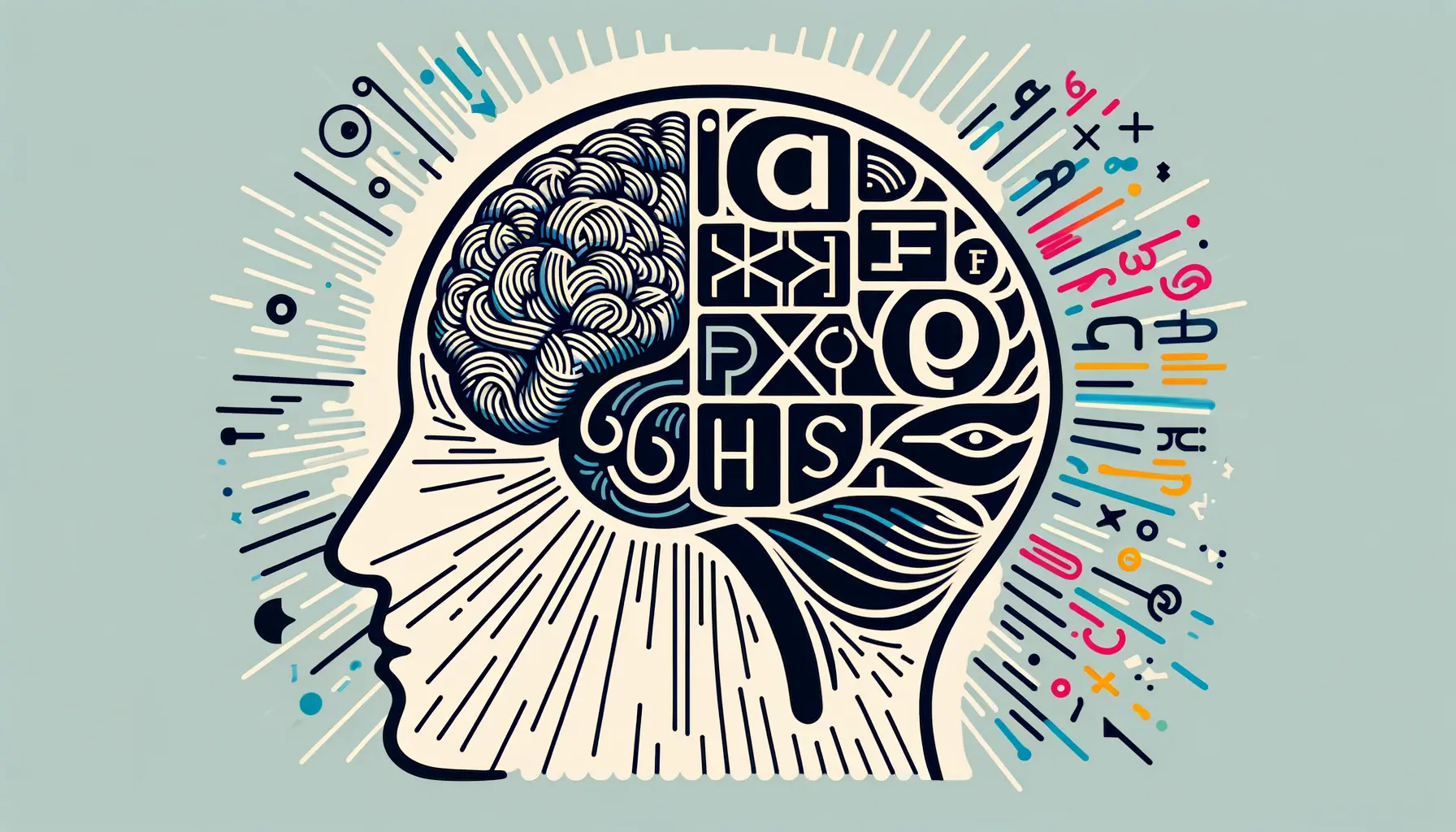
The art of typography extends far beyond the mere selection of fonts for visual appeal; it is a powerful tool capable of evoking emotions, setting the tone, and enhancing the overall message of any piece of communication.
Sophisticated typography choices are instrumental in creating a mood that resonates with the audience, transforming the mundane into the extraordinary.
This intricate dance between typeface, size, color, and layout invites readers into a world meticulously crafted by the designer, where every letter plays a pivotal role in the narrative.
Understanding the psychological impact of typography is essential for designers aiming to convey a specific atmosphere or emotion.
The choice of a serif versus a sans-serif, the weight of the font, and the spacing between letters can dramatically alter the reader’s perception and emotional response.
This article delves into the nuanced world of typography, exploring how sophisticated choices can elevate a design from simply informative to emotionally engaging and memorable.
- The Foundation of Typography in Mood Creation
- Exploring the Psychological Impact of Typography
- Typography in Branding and Identity
- Typography and User Experience (UX)
- Typography Trends and Innovations
- Integrating Typography with Other Design Elements
- Challenges and Solutions in Typography Design
- Mastering the Art of Sophisticated Typography
- Sophisticated Typography Choices: FAQs
The Foundation of Typography in Mood Creation
Understanding Typography’s Emotional Spectrum
Typography is not just about making words legible; it’s about making them feel.
The emotional spectrum of typography is vast, with each typeface carrying its own personality and emotional baggage.
Serif fonts, for example, are often associated with tradition, reliability, and respectability, making them a popular choice for formal documents and publications.
On the other hand, sans-serif fonts, with their clean and modern appearance, convey a sense of simplicity and approachability, ideal for digital platforms and contemporary brands.
The choice between a serif and a sans-serif font is just the beginning.
The weight of the font, its width, and the spacing between letters and lines all contribute to the mood of the text.
A heavy, bold font may convey strength and importance, while a light, airy font might feel delicate and ephemeral.
Understanding these subtle nuances allows designers to craft messages that resonate on a deeper emotional level with their audience.
The Role of Color and Contrast in Typography
Color plays a crucial role in typography, significantly affecting the mood and readability of the text.
Warm colors like red and orange are vibrant and energetic, capturing attention and evoking emotions of passion and excitement.
Cooler colors, such as blue and green, create a sense of calm and trust, making them ideal for corporate communication and health-related content.
The contrast between the text color and its background not only affects readability but also contributes to the emotional impact of the design.
High contrast combinations are bold and dynamic, while low contrast pairings offer a subtle and sophisticated feel.
Employing sophisticated typography choices involves more than selecting a beautiful font; it requires a deep understanding of the interplay between typeface, color, contrast, and spacing.
By mastering these elements, designers can create compelling designs that evoke the desired mood and connect with the audience on an emotional level.
Sophisticated typography choices are not just about aesthetics but about crafting an emotional experience that enhances the message and connects with the audience.
Exploring the Psychological Impact of Typography
The psychological impact of typography on readers is profound, influencing not only how information is perceived but also how it is felt.
Typography can affect mood, cognitive response, and even the memorability of the content.
This section delves into the psychological nuances of typography, exploring how different elements can shape the reader’s experience and emotional response.
Typography’s power lies in its ability to trigger specific emotions and associations in the reader’s mind.
For instance, a study might reveal that readers perceive information set in a serif font as more credible and authoritative than the same information presented in a sans-serif font.
This psychological effect can be attributed to the historical use of serif fonts in printed literature and academic publications, creating an association with formality, reliability, and tradition.
Impact of Font Choices on Reader Perception
- Serif Fonts: Often associated with professionalism and trustworthiness, making them ideal for legal documents, newspapers, and academic journals.
- Sans-Serif Fonts: Convey a sense of modernity and approachability, preferred for websites, digital advertisements, and corporate communications.
- Script Fonts: Evoke elegance and creativity, suitable for invitations, branding, and advertising luxury products.
- Display Fonts: Attract attention with their unique designs, used sparingly for headlines, logos, and emphasis.
The psychological impact of typography extends beyond the choice of font.
The arrangement of text, including alignment, line spacing, and letter spacing, plays a crucial role in readability and mood.
For example, tightly spaced text can create a sense of urgency or tension, while generously spaced text promotes a feeling of openness and clarity.
Typography and Emotional Engagement
Engaging readers on an emotional level is a key objective in design and typography is a critical tool in achieving this engagement.
The emotional impact of typography can be leveraged to align the reader’s feelings with the message or brand identity.
For instance, a brand aiming to appear accessible and friendly might opt for a rounded, sans-serif font, which research suggests can make the text seem more approachable.
Furthermore, the context in which typography is used can amplify its emotional impact.
In marketing, for example, choosing the right typography can enhance brand recognition and loyalty by consistently evoking the desired emotional response from the target audience.
This emotional consistency helps to build a strong, relatable brand identity.
Understanding the psychological impact of typography is essential for designers aiming to create compelling, emotionally resonant work that truly connects with the audience.
Typography in Branding and Identity
Typography is a cornerstone of brand identity, serving as a silent ambassador for the brand.
It conveys the brand’s values, tone, and personality even before a word is read.
In the realm of branding, the strategic selection of typography can differentiate a brand from its competitors, fostering a unique identity that resonates with the target audience.
The process of selecting typography for branding involves more than just aesthetic appeal; it requires a deep understanding of the brand’s core values and the message it seeks to communicate.
A luxury brand, for example, might choose a sleek, serif font to convey elegance and exclusivity, while a tech startup might opt for a clean, sans-serif font to emphasize innovation and efficiency.
Case Studies of Effective Typography in Branding
- Coca-Cola: The iconic cursive script of Coca-Cola’s logo is instantly recognizable, evoking feelings of nostalgia and happiness. This choice of typography has played a crucial role in the brand’s identity, making it one of the most beloved and well-known brands globally.
- Apple: Apple’s use of the sans-serif typeface in its branding emphasizes simplicity and modernity, mirroring the design philosophy of its products. This consistency in typography across all platforms reinforces Apple’s brand identity as innovative and user-friendly.
Typography in branding extends beyond logos and includes website design, packaging, and marketing materials.
Consistency in typography across all touchpoints is key to building a cohesive brand identity.
This consistency helps to reinforce the brand’s message and values, making it more memorable to the audience.
Choosing Typography for Brand Identity
When selecting typography for brand identity, it’s important to consider the brand’s target audience and the emotional response the typography is intended to elicit.
The typography should align with the brand’s personality, whether it’s authoritative, playful, sophisticated, or rustic.
Additionally, the chosen typeface should be versatile enough to work across various mediums, from digital to print, ensuring a consistent brand experience.
Another consideration is the longevity of the typeface.
Trends in typography come and go, but a brand’s typography should stand the test of time.
Opting for a timeless font can ensure that the brand identity remains strong and relevant for years to come.
The strategic use of typography in branding is not just about creating a visually appealing design; it’s about crafting a brand identity that communicates the brand’s values and resonates with its audience on a deep, emotional level.
Typography and User Experience (UX)
Typography plays a pivotal role in shaping the user experience (UX) of digital products and websites.
It’s not merely a design element; it’s a crucial tool for enhancing readability, usability, and accessibility.
The right typographic choices can guide users through a digital space effortlessly, making the journey not only enjoyable but also intuitive.
Good typography enhances the clarity of the content, making it easy for users to find what they’re looking for.
It contributes to the overall aesthetic of the site, aligning with its design principles and enhancing the user’s engagement.
Conversely, poor typography can lead to confusion, frustration, and a higher bounce rate as users struggle to navigate through the content.
Key Considerations for Typography in UX
- Readability: Ensuring text is easy to read across devices and platforms is fundamental. This includes choosing the right font size, line height, and letter spacing.
- Hierarchy: Effective use of typographic hierarchy helps users navigate content by clearly distinguishing between headings, subheadings, body text, and calls to action.
- Consistency: Consistent use of typography across a website or app strengthens the brand identity and improves the user’s ability to understand and interact with the content.
- Accessibility: Typography must be accessible to all users, including those with disabilities. This means considering color contrast, font choice, and the ability to resize text without losing legibility.
Typography also plays a crucial role in creating a mood or tone for the digital experience.
For instance, a website for a children’s book might use playful, rounded fonts to evoke a sense of whimsy and fun, while a legal firm’s site would likely lean towards more traditional, serif fonts to convey seriousness and professionalism.
Improving UX with Responsive Typography
Responsive typography adapts to the screen size and orientation of the device being used, ensuring that text is always legible and effectively presented.
This adaptability is crucial for providing a seamless user experience across all devices, from desktop computers to smartphones.
Implementing responsive typography involves more than just adjusting font sizes; it requires a comprehensive approach that includes scaling line heights, adjusting letter spacing, and sometimes changing font weights to maintain readability and aesthetic appeal across different screen resolutions.
This level of detail ensures that the typography contributes positively to the UX, regardless of how or where the content is accessed.
Effective typography in UX design is about creating a seamless bridge between the user and the content, enhancing the overall experience and ensuring that the message is not just seen, but also felt and understood.
Typography Trends and Innovations
The dynamic world of typography is continually evolving, with trends and innovations shaping the way we perceive and interact with text.
Staying abreast of these changes is crucial for designers and brands alike, as typography can significantly influence design aesthetics and user engagement.
This exploration into the latest typography trends and innovations reveals how they are set to impact the design world.
From the resurgence of vintage typefaces to the adoption of variable fonts for enhanced digital experiences, the landscape of typography is rich with creative potential.
These trends not only reflect current design preferences but also anticipate future shifts in how we approach typography in various mediums.
Embracing Variable Fonts
Variable fonts stand at the forefront of typographic innovation, offering unprecedented flexibility and control over typography.
These fonts allow for the adjustment of weight, width, and other attributes with a single file, enabling designers to fine-tune typography for any context.
The adoption of variable fonts is particularly beneficial for digital platforms, where responsiveness and user experience are paramount.
The benefits of variable fonts extend beyond aesthetics and performance.
They also offer practical advantages, such as reducing load times and improving the efficiency of web pages, making them a smart choice for designers focused on both form and function.
Revival of Retro and Vintage Typefaces
A nostalgic wave has swept through the design world, bringing retro and vintage typefaces back into the spotlight.
These fonts evoke a sense of nostalgia, warmth, and authenticity, appealing to audiences seeking a connection with the past.
Brands and designers are leveraging these typefaces to create memorable, emotionally resonant designs that stand out in a digital age dominated by sleek, modern aesthetics.
The revival of retro and vintage fonts is not merely a nod to the past; it’s a fusion of historical influences with contemporary design principles.
This trend underscores the timeless appeal of well-crafted typography and its power to convey complex emotions and narratives.
Focus on Inclusivity and Accessibility
Inclusivity and accessibility have become central themes in typography, reflecting a broader shift towards more empathetic and user-centric design.
Designers are increasingly prioritizing fonts that are not only visually appealing but also legible and accessible to all users, including those with visual impairments or dyslexia.
This focus on inclusivity extends to the development of new typefaces designed with accessibility in mind, as well as the adoption of best practices for typography in digital content.
By embracing inclusivity, designers can ensure that their work resonates with a wider audience, fostering a more inclusive digital environment.
Staying informed about the latest trends and innovations in typography allows designers to push creative boundaries, enhance user experiences, and create work that is not only beautiful but also meaningful and accessible.
Integrating Typography with Other Design Elements
Typography does not exist in isolation within the design landscape; it interacts dynamically with other design elements such as color, imagery, and layout.
The integration of typography with these elements is crucial for creating cohesive, impactful designs.
This harmonious blend can amplify the message, enhance aesthetic appeal, and improve the overall effectiveness of the design.
Understanding how to effectively combine typography with other design elements requires a keen eye for detail and a deep understanding of design principles.
It’s about finding the right balance, where each element complements the others, creating a unified and compelling design narrative.
Typography and Color
- Contrast: Utilizing contrasting colors for typography and backgrounds can significantly enhance readability and draw attention to key messages.
- Mood: The color of typography can influence the mood of the design, with warmer colors evoking excitement and cooler colors conveying calmness.
- Brand Identity: Color choices for typography should align with the brand’s identity, ensuring consistency across all design elements.
Typography and Imagery
- Layering: Carefully layering text over images can create depth and interest, but it’s essential to ensure that the text remains legible.
- Alignment: Aligning text with key elements in images can create a sense of harmony and cohesion within the design.
- Interaction: Typography can interact with imagery to guide the viewer’s eye through the design, highlighting important information or creating visual pathways.
Typography and Layout
- Hierarchy: Establishing a clear typographic hierarchy within the layout helps organize information, making it easier for viewers to navigate the content.
- Balance: The distribution of typographic elements within a layout should be balanced, ensuring that no single element overwhelms the others.
- Whitespace: Effective use of whitespace around typography can enhance readability and create a more refined and elegant design.
The integration of typography with other design elements is a delicate art that requires thoughtful consideration and creative experimentation.
By understanding the interplay between typography, color, imagery, and layout, designers can craft visually stunning and cohesive designs that effectively communicate the intended message and engage the audience.
The successful integration of typography with other design elements is key to creating designs that are not only visually appealing but also strategically effective, resonating with viewers and leaving a lasting impression.
Challenges and Solutions in Typography Design
While typography is a powerful tool in the hands of a designer, it comes with its own set of challenges.
From maintaining legibility across various devices to ensuring accessibility for all users, the path to perfect typography is fraught with obstacles.
However, for every challenge, there are creative solutions and best practices that can help designers navigate these issues effectively.
Addressing these challenges is crucial for creating typography that not only looks good but also performs well across all platforms and is accessible to every member of the audience.
Let’s explore some common typographic challenges and the strategies to overcome them.
Maintaining Legibility Across Devices
- Responsive Typography: Implementing responsive design principles ensures that typography adjusts according to screen size and resolution, maintaining legibility and user experience.
- Flexible Layouts: Designing layouts that adapt to various devices can prevent text from becoming too small or too large, keeping the content readable and engaging.
Ensuring Typography Accessibility
- Color Contrast: Ensuring high contrast between text and its background improves readability for users with visual impairments.
- Font Choice: Selecting fonts that are easy to read and avoiding overly decorative typefaces can help users with dyslexia or other reading difficulties.
Creating a Cohesive Brand Identity
- Consistent Typography: Using a consistent set of typefaces across all brand materials reinforces brand identity and improves recognition.
- Brand Guidelines: Developing comprehensive brand guidelines that include typographic standards ensures consistency and coherence in all communications.
Adapting to Cultural and Language Differences
- Localization: Adapting typography to suit cultural and language differences is crucial for global brands, ensuring that messages resonate with diverse audiences.
- Multi-Language Support: Choosing typefaces that support a wide range of languages and scripts can facilitate seamless localization efforts.
Overcoming these challenges requires a blend of technical knowledge, creative thinking, and a deep understanding of the audience’s needs and preferences.
By applying these solutions, designers can create typography that is not only visually appealing but also functional, accessible, and aligned with the brand’s identity.
Ignoring the challenges in typography design can lead to poor user experiences, diminished brand perception, and barriers to communication. Addressing these issues proactively is essential for successful design outcomes.
Mastering the Art of Sophisticated Typography
In the realm of design, sophisticated typography choices serve as the cornerstone of effective communication and emotional engagement.
Through the strategic use of typefaces, designers can evoke specific moods, convey brand identities, and enhance the user experience.
This article has traversed the intricate landscape of typography, from its psychological impact to its integration with other design elements, offering insights into overcoming common challenges and embracing current trends.
The Power of Typography in Emotional Connection
Typography’s ability to connect on an emotional level cannot be overstated.
By carefully selecting typefaces that resonate with the intended audience, designers can create a mood that aligns with the message or brand identity.
This emotional connection is crucial for capturing attention and fostering a memorable experience, whether through the nostalgia of retro fonts or the modernity of sans-serif typefaces.
Typography as a Pillar of Brand Identity
Brand identity thrives on consistency and coherence, with typography playing a pivotal role in this visual harmony.
A well-chosen typeface can become synonymous with the brand itself, reinforcing its values and personality across various mediums.
The challenge lies in selecting typography that not only reflects the brand’s essence but also remains versatile and timeless amidst changing trends.
Enhancing User Experience with Typography
The user experience is significantly influenced by typographic choices, particularly in digital environments.
Responsive typography, which adapts to different devices and screen sizes, ensures legibility and accessibility, key factors in user satisfaction.
Moreover, the strategic use of typography in UX design can guide users through content seamlessly, making the interaction both enjoyable and efficient.
Navigating Challenges with Creative Solutions
Despite its potential, typography presents challenges, from maintaining legibility across devices to ensuring accessibility for all users.
Addressing these challenges requires a combination of responsive design, careful font selection, and adherence to accessibility guidelines.
Furthermore, the globalization of brands necessitates typography that transcends cultural and language barriers, emphasizing the need for localization and multi-language support.
In conclusion, sophisticated typography choices are instrumental in crafting compelling narratives, establishing brand identity, and enhancing user engagement.
As designers navigate the evolving landscape of typography, the focus should remain on creating typography that is not only visually appealing but also meaningful, accessible, and reflective of the brand’s core values.
The art of typography, when mastered, has the power to transform words into a profound visual and emotional experience.
Quality web design is key for a great website! Check out our service page to partner with an expert web design agency.
Sophisticated Typography Choices: FAQs
Delve into the intricacies of sophisticated typography with these frequently asked questions, designed to enhance your understanding and application of this crucial design element.
Sophisticated typography involves the strategic use of typefaces to enhance readability, convey a specific mood, and support the overall design aesthetic.
Typography is pivotal in establishing brand identity, conveying the brand’s values, and ensuring consistency across all mediums of communication.
Yes, by enhancing readability, creating a visual hierarchy, and aligning with the design’s overall mood, typography significantly improves user experience.
Considerations include readability, mood conveyance, brand alignment, versatility across mediums, and the emotional impact on the audience.
Color can enhance or diminish the impact of typography by affecting contrast, readability, and the emotional tone of the design.
Typography shapes UX by guiding users through content, enhancing accessibility, and contributing to the site’s overall aesthetic and functionality.
Challenges can be overcome through responsive design, accessibility considerations, consistent brand identity, and adapting to cultural differences.
Current trends include the use of variable fonts, a revival of retro and vintage styles, and a focus on inclusivity and accessibility in design.


