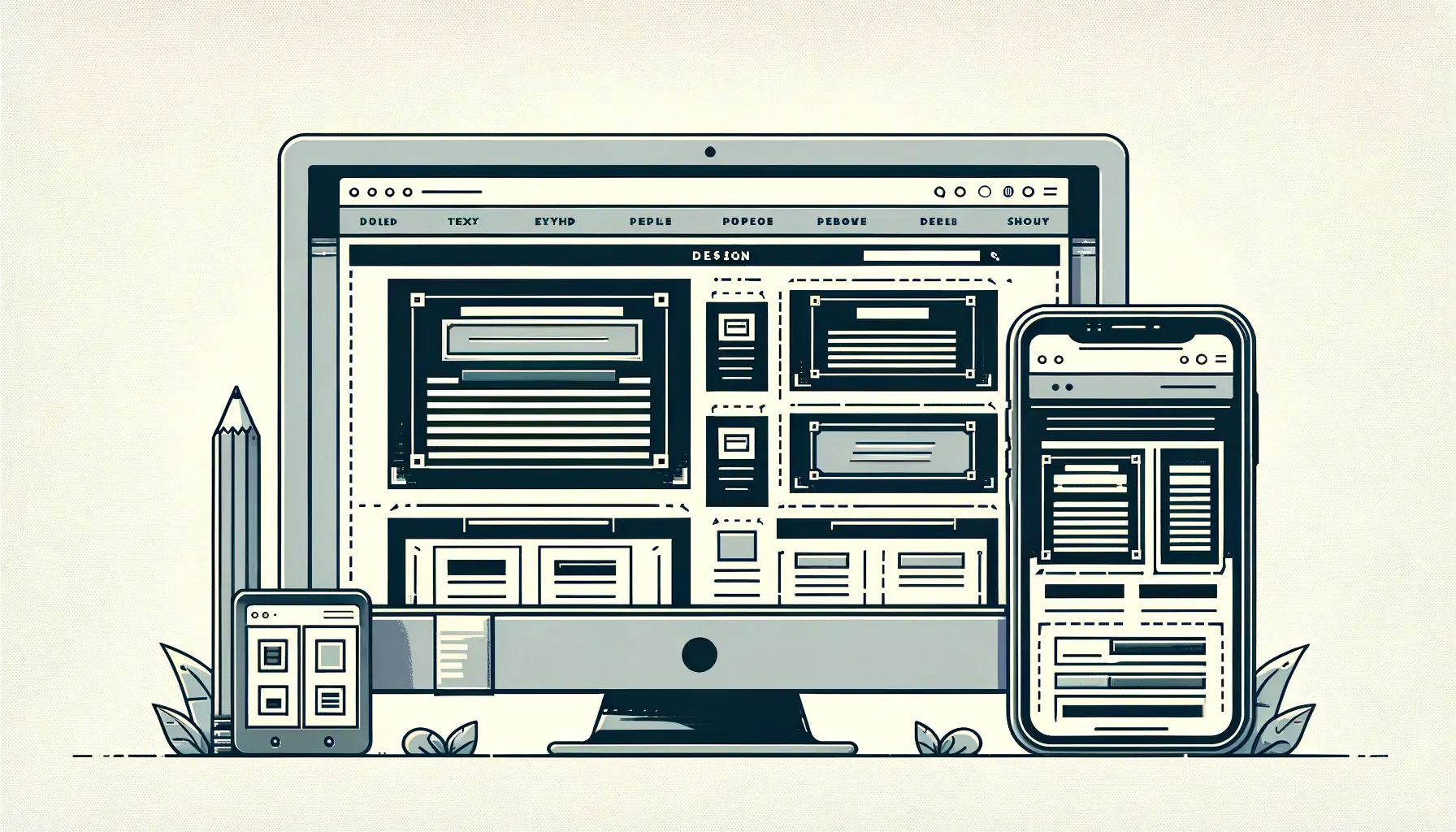
Adaptive typography is a cornerstone of modern web design, playing a pivotal role in creating responsive, user-friendly digital environments.
As screens vary from desktops to smartphones, the demand for web content that adjusts seamlessly has never been more critical.
Adaptive typography, by its very nature, ensures that text is legible, accessible, and aesthetically pleasing across all devices, enhancing the overall user experience.
This approach to typography is not just about scaling text sizes up or down but about understanding and implementing a design that responds to the user’s environment.
It involves a nuanced blend of font sizes, line heights, and letter spacing, all dynamically adjusted based on the screen size and resolution.
This adaptability is crucial for maintaining readability and ensuring that the message is effectively communicated, regardless of how or where it’s viewed.
- Understanding Adaptive Typography
- The Role of Typography in User Experience
- Best Practices in Adaptive Typography
- Challenges in Implementing Adaptive Typography
- Innovative Examples of Adaptive Typography
- Adaptive Typography and Brand Identity
- Future Trends in Adaptive Typography
- Embracing the Future of Adaptive Typography
- Adaptive Typography in Responsive Design FAQs
Understanding Adaptive Typography
At its core, adaptive typography is about making web content accessible and legible across a wide range of devices.
This design philosophy takes into account the varying screen sizes, resolutions, and user settings, adjusting text properties accordingly.
The goal is to provide a consistent and comfortable reading experience by dynamically changing text attributes to fit the device’s display characteristics.
Implementing adaptive typography involves using CSS and JavaScript to adjust text based on predefined breakpoints or viewport sizes.
This method allows designers to create a more personalized reading experience, as text can be optimized for specific devices, enhancing both the usability and aesthetics of a website.
Key Components of Adaptive Typography
The implementation of adaptive typography revolves around several key components, each contributing to the flexibility and responsiveness of web content.
These include:
- Fluid Scaling: Text size is scaled based on the viewport dimensions, ensuring that content is readable at any screen size.
- Dynamic Line Heights: Line heights are adjusted in relation to the font size to maintain optimal readability and text flow.
- Responsive Letter Spacing: Letter spacing (tracking) is modified dynamically to improve legibility and readability across devices.
- Media Queries: CSS media queries detect the device’s characteristics, such as its width and height, to apply appropriate typographic adjustments.
By focusing on these components, designers can craft text that not only looks good but also improves the user’s reading experience, regardless of the device used to access the content.
Adaptive typography is essential for creating responsive designs that cater to the diverse range of devices and screen sizes used to access web content today.
The Role of Typography in User Experience
Typography plays a crucial role in shaping the user experience (UX) on the web.
It goes beyond mere aesthetics, influencing how users interact with and perceive online content.
Good typography enhances readability, guides users through the content hierarchy, and contributes to the overall accessibility of a website.
In the context of adaptive typography, these aspects become even more significant, as they ensure a consistent and engaging experience across all devices.
Effective typography leads to increased comprehension and retention of information.
When text is easy to read and visually appealing, users are more likely to stay engaged with the content.
Adaptive typography, by adjusting to the user’s viewing environment, minimizes the cognitive load on readers, making it easier for them to process and understand the information presented.
Enhancing Readability and Accessibility
Adaptive typography directly impacts the readability and accessibility of web content.
By dynamically adjusting text size, spacing, and layout based on the user’s device, it ensures that content is legible for everyone, including individuals with visual impairments or those using mobile devices with small screens.
This adaptability not only improves the user experience but also aligns with web accessibility standards, making the web more inclusive.
Furthermore, by optimizing line lengths and paragraph spacing, adaptive typography helps in reducing eye strain and enhancing the overall comfort of reading online content.
This is particularly important in today’s digital age, where people spend significant amounts of time looking at screens.
Improving Content Hierarchy and Navigation
Typography is a powerful tool for establishing content hierarchy and guiding users through a website’s navigation.
Adaptive typography enhances this by ensuring that headings, subheadings, and body text are clearly distinguishable across all devices.
This clarity in text hierarchy aids users in quickly identifying the most important information and understanding how to navigate the content effectively.
Moreover, the use of varying font weights, styles, and sizes helps in creating a visual distinction between different types of content, making it easier for users to scan through pages and find what they’re looking for.
This not only improves the usability of a website but also contributes to a more satisfying user experience.
Incorporating adaptive typography in web design is not just about enhancing aesthetics; it’s about creating a more readable, accessible, and navigable online environment that meets the needs of all users.
Best Practices in Adaptive Typography
Implementing adaptive typography effectively requires adherence to several best practices.
These guidelines ensure that typography not only responds to different screen sizes and resolutions but also contributes positively to the user experience.
By following these practices, designers can create web content that is both visually appealing and functionally robust.
Adaptive typography is not a one-size-fits-all solution; it demands a thoughtful approach to design, considering the nuances of text presentation across various devices.
Here are some of the key practices to consider:
Setting the Foundation with Fluid Typography
Fluid typography uses CSS to ensure that text scales smoothly across different screen sizes.
This approach involves using viewport width (vw), viewport height (vh), or a combination of both to define font sizes, which allows for a more dynamic and responsive scaling of text.
The goal is to maintain legibility and readability without the need for constant adjustments or breakpoints.
- Utilize CSS functions like
calc(),min(), andmax()to create flexible type settings that adapt to the screen. - Consider the default font size of devices to ensure that your scaling does not make the text too small or too large for comfortable reading.
Employing Responsive Units for Adaptability
Responsive units such as ems, rems, and percentages play a crucial role in adaptive typography.
They offer a way to size text relative to parent elements (ems) or the root element (rems), providing consistency and flexibility in text appearance across different devices.
- Use
emsfor local scaling within components to maintain relative sizing based on parent elements. - Adopt
remsfor global scaling to ensure consistent font sizes across the entire website based on the root font size. - Implement percentages for line heights to achieve optimal readability and text flow.
Optimizing Text for Readability
Readability is paramount in adaptive typography.
It’s essential to optimize text properties such as line length, line height, and letter spacing to enhance the reading experience.
Shorter line lengths on smaller screens can help maintain readability, while increased line height and spacing can improve text clarity.
- Aim for a line length of 50-75 characters for optimal readability.
- Adjust line height between 1.4 to 1.6 times the font size for better text flow and readability.
- Modify letter spacing, especially in headings and small text, to prevent crowding and improve legibility.
Remember, the key to successful adaptive typography lies in testing and iteration. Regularly test your designs on various devices to ensure that your typographic choices provide the best reading experience across all platforms.
Challenges in Implementing Adaptive Typography
While adaptive typography is essential for creating responsive and user-friendly web designs, its implementation comes with its own set of challenges.
These obstacles often stem from the dynamic nature of web content, the diversity of devices, and the varying preferences of users.
Understanding these challenges is crucial for designers and developers aiming to create effective typographic solutions that cater to a wide audience.
Device Diversity and Screen Sizes
One of the primary challenges in implementing adaptive typography is the sheer diversity of devices and screen sizes.
From large desktop monitors to compact smartphones, each device presents unique requirements for text presentation.
Ensuring that typography adapts effectively across this spectrum requires careful planning and testing.
- Designing for the unknown: With new devices constantly entering the market, designers must anticipate future trends and ensure their typography remains adaptable.
- Breakpoints and scalability: Determining the right breakpoints for font size adjustments can be complex, requiring a balance between too many and too few.
Performance Considerations
Adaptive typography, while enhancing readability and user experience, can also impact website performance.
The use of additional CSS and JavaScript for typographic adjustments can increase page load times, especially on mobile devices with slower internet connections.
- Optimizing resources: Minimizing the use of heavy scripts and employing efficient CSS techniques can help mitigate performance issues.
- Testing and optimization: Regular performance testing is essential to identify bottlenecks and optimize typographic responsiveness without compromising speed.
User Preferences and Accessibility
Accommodating user preferences and ensuring accessibility pose additional challenges in adaptive typography.
Users with visual impairments or specific reading needs may require more significant adjustments to typography than what is typically provided by responsive designs.
- Customization options: Providing users with the ability to adjust font sizes and contrast settings can enhance accessibility but requires additional design and development efforts.
- Compliance with standards: Meeting web accessibility standards, such as WCAG, necessitates a thorough understanding of how typography affects users with disabilities.
Despite these challenges, the benefits of implementing adaptive typography—improved readability, enhanced user experience, and increased accessibility—far outweigh the difficulties. With careful planning, testing, and optimization, designers can overcome these obstacles and create web content that is both beautiful and functional across all devices.
Innovative Examples of Adaptive Typography
Exploring innovative examples of adaptive typography in action can provide valuable insights into how designers are pushing the boundaries of responsive design.
These examples not only showcase the versatility of adaptive typography but also illustrate how it can be used to enhance user engagement and convey a brand’s message effectively across different platforms.
Dynamic Scaling for Editorial Content
One notable example of adaptive typography is seen in online editorial platforms that utilize dynamic scaling to improve readability.
These platforms adjust the font size, line height, and letter spacing based on the user’s screen size, ensuring that long-form articles are as comfortable to read on a mobile device as they are on a desktop.
This approach not only enhances the reading experience but also encourages users to engage with content for longer periods.
- Fluid text resizing: Editorial platforms often employ fluid text resizing techniques, allowing text to scale smoothly across different viewport sizes.
- Content-focused design: By prioritizing readability, these platforms ensure that the design serves the content, making information easily accessible to all users.
Interactive Typography in Web Applications
Another example of adaptive typography can be found in web applications that incorporate interactive typography.
These applications dynamically adjust not only the size but also the style of the text based on user interaction or specific actions within the app.
This level of interactivity can significantly enhance the user experience, making the application more engaging and personalized.
- Responsive feedback: Interactive typography provides immediate visual feedback to users, reinforcing their actions and decisions within the application.
- Enhanced personalization: By adjusting typography based on user preferences or behavior, web applications can offer a more customized experience.
Branding and Identity Across Devices
Adaptive typography also plays a crucial role in maintaining brand consistency across devices.
By carefully selecting and adjusting typefaces that reflect the brand’s identity, companies can ensure that their message remains cohesive, regardless of how or where it’s viewed.
This consistency is key to building brand recognition and trust among users.
- Consistent brand experience: Adaptive typography allows brands to maintain a consistent visual identity across all digital touchpoints.
- Strategic typeface selection: Choosing typefaces that are versatile and adaptable ensures that the brand’s personality shines through in every context.
These examples underscore the importance of adaptive typography in modern web design. By embracing the principles of adaptability and responsiveness, designers can create experiences that are not only visually appealing but also deeply engaging and accessible to a broad audience.
Adaptive Typography and Brand Identity
Adaptive typography is a powerful tool in establishing and maintaining a brand’s identity across various digital platforms.
In the realm of responsive design, the ability to present a consistent typographic style plays a crucial role in conveying a brand’s personality and values, regardless of the device used to access the content.
This consistency ensures that the brand is recognizable and memorable, reinforcing its message and enhancing its connection with the audience.
Consistency Across Platforms
A key aspect of leveraging adaptive typography for brand identity is ensuring consistency across all platforms.
This means that the brand’s chosen typefaces, along with their associated styles and weights, should appear uniform on desktops, tablets, and smartphones.
Achieving this level of consistency requires a strategic approach to typography, selecting fonts that are not only visually appealing but also highly functional and adaptable to various screen sizes.
- Strategic font selection: Choose typefaces that reflect the brand’s character and are versatile enough to maintain their integrity across different resolutions and devices.
- Responsive design principles: Apply responsive design principles to typography, ensuring that text elements scale appropriately and remain legible and aesthetically pleasing on any screen.
Enhancing Brand Personality
Adaptive typography also plays a significant role in enhancing a brand’s personality.
The choice of typeface, along with how it adapts and responds to different devices, can convey a wide range of emotions and attributes, from professionalism and reliability to creativity and innovation.
By carefully crafting typographic experiences that resonate with the brand’s identity, companies can create a deeper emotional connection with their audience.
- Emotional impact: Select typefaces and typographic treatments that evoke the desired emotional response, aligning with the brand’s messaging and values.
- User engagement: Use adaptive typography to create engaging and interactive experiences that draw users in and encourage them to explore the brand further.
Building Trust and Recognition
Finally, adaptive typography contributes to building trust and recognition among the brand’s audience.
Consistent and well-executed typography reassures users of the brand’s professionalism and attention to detail, fostering a sense of reliability.
Moreover, by maintaining a coherent visual identity across all digital touchpoints, brands can enhance their recognizability, making it easier for users to identify and remember them in a crowded marketplace.
- Trust through consistency: Deliver a consistent typographic experience across all platforms to build trust with the audience.
- Recognition through uniqueness: Employ unique typographic elements that set the brand apart, making it easily identifiable to users.
Incorporating adaptive typography into a brand’s digital strategy is not just about ensuring readability and responsiveness; it’s about crafting a cohesive and compelling brand identity that resonates with users across every interaction.
Future Trends in Adaptive Typography
The landscape of web design is continually evolving, with adaptive typography at the forefront of this transformation.
As technology advances and user expectations grow, the role of typography in digital experiences is set to become even more significant.
Looking ahead, several trends are likely to shape the future of adaptive typography, influencing how content is presented and consumed across various devices and platforms.
Artificial Intelligence and Machine Learning
One of the most exciting prospects for the future of adaptive typography is the integration of artificial intelligence (AI) and machine learning.
These technologies have the potential to revolutionize responsive design by enabling more dynamic and personalized typographic experiences.
AI could analyze user behavior and preferences to automatically adjust typography in real-time, creating a truly customized reading experience for each individual.
- Personalized typography: AI algorithms could tailor font sizes, styles, and layouts to match the user’s reading habits and preferences.
- Context-aware adaptation: Machine learning could enable typography to adapt not just to screen size but also to environmental factors such as lighting conditions and reading distance.
Variable Fonts and Advanced Typography
Variable fonts are set to play a pivotal role in the future of adaptive typography.
These fonts allow for a single font file to behave like multiple fonts, offering a wide range of weights, widths, and other typographic features within a compact file size.
This versatility makes variable fonts an ideal choice for responsive design, enabling more nuanced and flexible typographic adjustments across devices.
- Efficiency and performance: Variable fonts reduce the need for multiple font files, improving website load times and performance.
- Creative possibilities: The extensive range of styles available within a single variable font opens up new creative possibilities for dynamic and adaptive typography.
Enhanced Accessibility and Inclusivity
As the web becomes increasingly accessible, adaptive typography will play a crucial role in ensuring that digital content is inclusive for all users, including those with disabilities.
Future trends in adaptive typography are likely to focus on enhancing readability and navigability for users with visual impairments, learning disabilities, and other challenges, making the web a more inclusive space.
- Accessibility-first design: Typography will be designed with accessibility as a primary consideration, ensuring that text is legible and navigable for users with diverse needs.
- Adaptive technologies: New technologies and design approaches will emerge to address specific accessibility challenges, making adaptive typography an integral part of inclusive web design.
The future of adaptive typography is bright, with advancements in technology and design thinking paving the way for more personalized, efficient, and inclusive typographic experiences. As we look ahead, it’s clear that adaptive typography will continue to be a key driver of innovation in responsive web design.
Embracing the Future of Adaptive Typography
The journey through the realms of adaptive typography underscores its pivotal role in the evolution of responsive web design.
As we’ve explored, adaptive typography is not merely a tool for enhancing aesthetic appeal; it’s a fundamental component that ensures usability, accessibility, and engagement across the ever-expanding universe of digital devices.
The future of web design is intrinsically linked to the advancement of adaptive typography, promising a landscape where content is not only accessible but also resonates on a personal level with each user.
The Pillars of Adaptive Typography
Adaptive typography stands on the pillars of flexibility, responsiveness, and user-centric design.
Its implementation challenges designers to think beyond static layouts, pushing towards a dynamic interface that responds to the user’s environment.
The innovative examples and best practices highlighted throughout this exploration serve as a testament to the creative and technical prowess that adaptive typography brings to the table.
As we move forward, these pillars will only strengthen, supported by advancements in technology and a deeper understanding of user behavior.
Driving User Engagement and Brand Consistency
One cannot overstate the importance of adaptive typography in driving user engagement and maintaining brand consistency.
By ensuring that text is legible and appealing across all platforms, brands can forge a stronger connection with their audience, fostering trust and recognition.
The role of adaptive typography in brand identity is a powerful reminder that how we present our message is just as crucial as the message itself.
As brands navigate the digital landscape, adaptive typography will remain a key player in crafting cohesive and compelling narratives.
Navigating the Challenges Ahead
Despite its many benefits, the path to implementing adaptive typography is fraught with challenges.
From the diversity of devices and screen sizes to the nuances of user preferences, designers must navigate a complex web of considerations.
However, these challenges also present opportunities for innovation and growth.
By embracing the principles of adaptive typography, designers can create more inclusive, engaging, and effective web experiences that stand the test of time and technology.
Looking to the Horizon
As we look to the horizon, the future of adaptive typography is bright with potential.
The integration of AI and machine learning, the rise of variable fonts, and a renewed focus on accessibility and inclusivity are just a few of the trends that will shape the next chapter of web design.
These advancements promise a future where adaptive typography not only enhances the visual landscape of the web but also deepens our connection to the digital world.
In conclusion, the benefits of adaptive typography in responsive design are manifold and profound.
As we continue to explore and expand the boundaries of what’s possible in web design, adaptive typography will undoubtedly play a crucial role in shaping a more accessible, engaging, and beautiful digital future.
The journey ahead is filled with promise, and adaptive typography will be at the heart of this transformative journey, ensuring that every word, every letter, resonates across the spectrum of human experience.
Quality web design is key for a great website! Check out our service page to partner with an expert web design agency.
Adaptive Typography in Responsive Design FAQs
Explore common questions about integrating adaptive typography into responsive web designs to enhance user experience and ensure content readability across all devices.
Adaptive typography refers to the practice of adjusting text properties like size, spacing, and layout dynamically across different screen sizes to improve readability and user experience.
It ensures that web content is legible and accessible on any device, enhancing user engagement and supporting a seamless digital experience across various platforms.
Using CSS and JavaScript, designers can create rules that adjust typography based on the device’s screen size, orientation, and resolution.
Yes, by enhancing the user experience and website usability, adaptive typography can indirectly contribute to better SEO rankings through increased engagement and lower bounce rates.
Designers must consider the diversity of devices, manage performance implications, and ensure content remains accessible and user-friendly across all platforms.
AI and machine learning can analyze user behavior to offer personalized typographic experiences, dynamically adjusting text for individual reading preferences.
Variable fonts allow for a single font file to provide multiple variations of a typeface, making it easier to implement responsive and adaptive typography with less impact on performance.
The future points towards more personalized, AI-driven typographic experiences, with a focus on accessibility and inclusivity, leveraging advancements in variable fonts and responsive design technologies.


