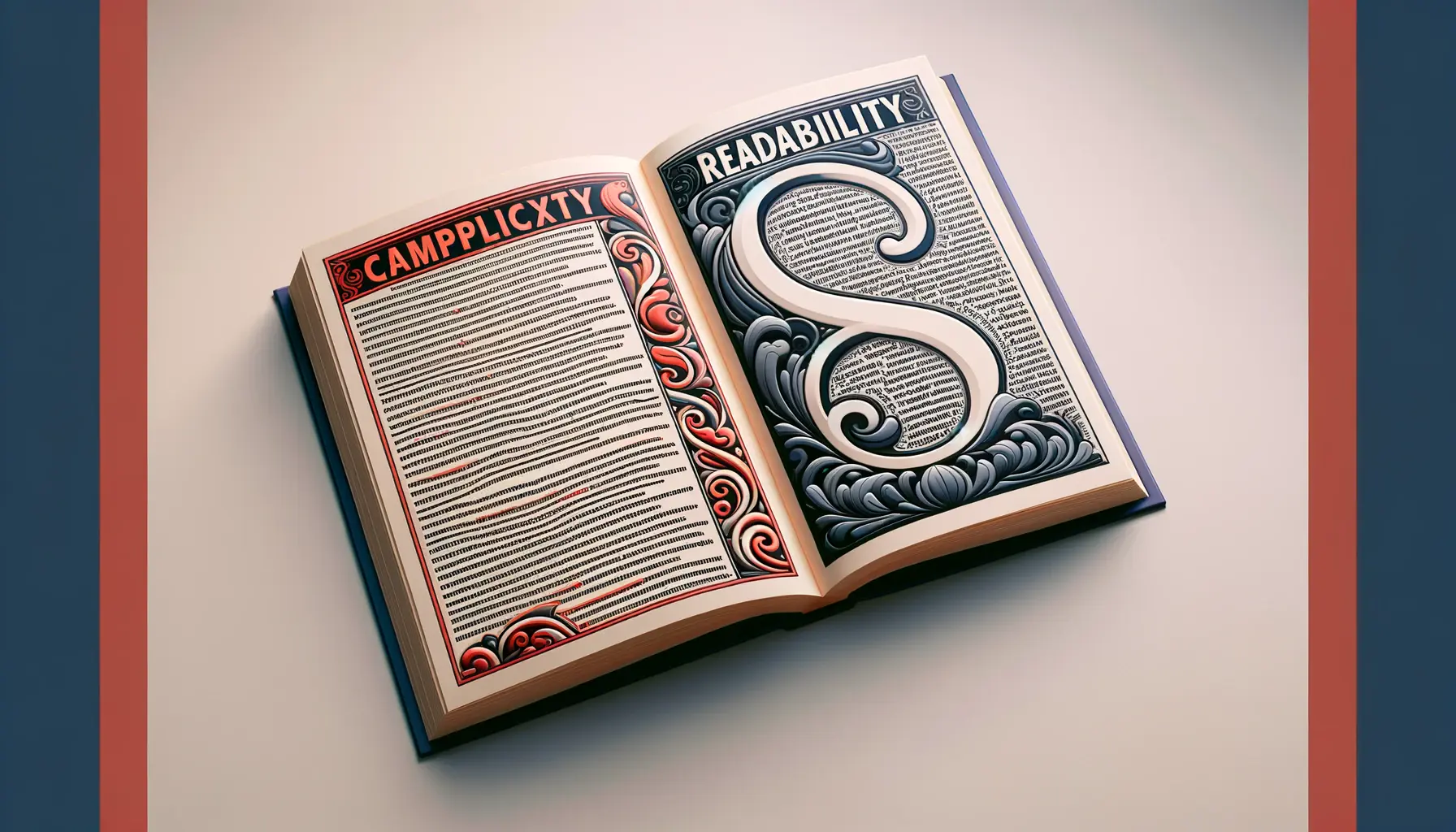
Typography, the art of arranging type, plays a pivotal role in the design of readable and engaging content.
It’s a craft that balances the aesthetic appeal of text with its legibility, ensuring that readers are not only drawn to the words but can also absorb the information effortlessly.
The complexity in typography comes from the vast array of typefaces, each carrying its own personality and set of rules, and the challenge lies in selecting and combining these elements in a way that communicates the intended message effectively.
This intricate dance between form and function is what makes typography a critical component in the realm of design.
Understanding the nuances of typography is essential for designers and content creators alike.
It’s not just about choosing beautiful fonts; it’s about creating a hierarchy that guides the reader’s eye, employing spacing that enhances readability, and selecting colors that complement the overall design.
The goal is to craft content that is not only visually appealing but also easy to read and understand.
In this article, we delve into the principles of balancing complexity and readability in typography, offering valuable insights and practical tips to elevate your typographic designs.
- Understanding Typography Fundamentals
- Typography in Digital Design
- Creating Visual Hierarchy with Typography
- Typography and Brand Identity
- Accessibility in Typography
- Typography in User Interface Design
- Typography Trends and Innovation
- Concluding Thoughts on Balancing Complexity and Readability in Typography
- FAQs on Balancing Complexity and Readability in Typography
Understanding Typography Fundamentals
Before diving into the complexities of typography, it’s crucial to grasp its basic principles.
Typography encompasses everything from font selection to line spacing and alignment.
Each decision impacts how text is perceived and understood.
A well-designed typographic piece considers the context of its use, ensuring that the text is accessible and enjoyable to read across different mediums and devices.
At the heart of typography lies the choice of typeface, which sets the tone for the entire piece.
Serif fonts, known for their traditional appeal, often convey a sense of formality and elegance.
Sans-serif fonts, on the other hand, offer a cleaner, more modern aesthetic.
The key is to select a typeface that aligns with the message you wish to convey, keeping in mind the target audience and the medium through which the content will be consumed.
Font Size and Line Spacing
Font size and line spacing are critical factors in ensuring readability.
A font size too small can strain the eyes, while one too large can disrupt the reading flow.
Line spacing, or leading, helps define the vertical distance between lines of text, affecting how easily the reader can move from one line to the next.
Optimal line spacing makes text more approachable, allowing for a smoother reading experience.
Adjusting font size and line spacing according to the content’s context enhances its accessibility.
For digital platforms, where readers might view content on various devices, responsive typography adjusts these elements dynamically, ensuring that text remains legible and appealing across all screen sizes.
Choosing the right font size and line spacing is essential for creating readable and visually appealing content.
Color and Contrast
The use of color in typography goes beyond aesthetic appeal; it plays a significant role in readability.
High contrast between text and its background is crucial for legibility.
For instance, dark text on a light background or vice versa can significantly enhance readability.
However, the choice of colors should also consider those with visual impairments, such as color blindness, ensuring that the text is accessible to a wider audience.
Moreover, the emotional impact of color cannot be overlooked.
Colors evoke feelings and set the mood for the content.
The strategic use of color in typography can reinforce the message, engage the reader’s emotions, and contribute to a cohesive brand identity.
Typography in Digital Design
The digital landscape presents unique challenges and opportunities for typography.
With the proliferation of devices and screen sizes, designers must employ responsive typography to ensure that text is not only legible but also aesthetically pleasing across all platforms.
This section explores key considerations for typography in digital design, focusing on how to maintain balance and readability.
Responsive Typography
Responsive typography adapts to the varying screen sizes and resolutions of devices, ensuring that text is both readable and visually engaging.
This adaptability is crucial for providing a seamless user experience, regardless of how the content is accessed.
Key aspects of responsive typography include:
- Scalable font sizes: Employing relative units like ems or percentages allows font sizes to adjust based on the device’s screen size or the browser’s default settings.
- Flexible line lengths: Adjusting container widths to maintain optimal line lengths ensures that text remains comfortable to read without causing strain or disrupting the reading flow.
- Media queries: Utilizing CSS media queries enables designers to apply different typographic settings based on specific conditions, such as device orientation or viewport width.
Legibility on Screens
Ensuring legibility on screens involves more than just choosing the right font size.
It encompasses a range of factors that contribute to how easily digital content can be read.
Considerations for enhancing legibility on screens include:
- Screen resolution: High-definition screens allow for finer text rendering, enabling the use of lighter font weights without sacrificing legibility.
- Backlit displays: The luminance of screens can cause glare and eye fatigue. Employing high-contrast color schemes can mitigate these effects and improve readability.
- Typography for mobile devices: Given the smaller screen sizes, simplifying typographic elements and increasing line spacing can significantly enhance readability on mobile devices.
Embracing the constraints and capabilities of digital mediums can lead to innovative typographic solutions that enhance user engagement and content readability.
Web Fonts and Performance
The choice of web fonts plays a pivotal role in both the aesthetic appeal and performance of a website.
While custom fonts can significantly enhance a brand’s identity and the overall design, they can also impact page load times.
Strategies for balancing design and performance include:
- Font hosting options: Choosing between hosting fonts locally or using a web font service can affect loading times. Each option has its trade-offs in terms of control, flexibility, and speed.
- Font loading strategies: Implementing font loading techniques, such as font swapping or using the
font-displayCSS property, can improve the user experience by reducing perceived loading times. - Minimal font weights and styles: Limiting the number of font weights and styles used not only contributes to a cohesive design but also reduces the amount of data that needs to be downloaded.
Creating Visual Hierarchy with Typography
Visual hierarchy is a fundamental aspect of design that guides the reader’s eye through the content, emphasizing important elements and creating a clear structure.
Typography is a powerful tool in establishing this hierarchy, enabling designers to draw attention to key information and improve the overall readability of the content.
Employing Typographic Contrast
Contrast is a critical element in creating a visual hierarchy.
It can be achieved through variations in font size, weight, color, and style.
Effective use of typographic contrast helps in distinguishing between different levels of information, such as headings, subheadings, and body text.
Considerations for employing typographic contrast include:
- Using bold or italic styles to highlight important words or phrases within the body text.
- Varying font sizes significantly between headings and subheadings to establish a clear order of importance.
- Introducing color to draw attention to specific elements, such as call-to-action buttons or links.
Strategic Use of Typefaces
The selection of typefaces plays a crucial role in defining the character and tone of the content.
When creating a visual hierarchy, the relationship between different typefaces should be carefully considered.
Strategies for the strategic use of typefaces include:
- Pairing complementary typefaces that reflect the content’s nature and purpose, such as a serif for headings and a sans-serif for body text.
- Avoiding the use of too many typefaces, which can lead to a cluttered and confusing layout.
- Choosing typefaces with a variety of weights and styles to provide flexibility in creating contrast and emphasis.
A well-defined visual hierarchy not only enhances the aesthetic appeal of the content but also significantly improves its navigability and readability.
Spacing and Alignment
Effective spacing and alignment are essential for creating a clean and organized typographic layout.
These elements contribute to the visual hierarchy by grouping related content and separating distinct sections.
Key practices in spacing and alignment include:
- Adjusting line spacing (leading) to improve the readability of body text and reduce visual clutter.
- Using consistent margins and padding to create a balanced layout and to separate text blocks effectively.
- Employing grid systems for alignment, ensuring that all typographic elements align cohesively across the layout.
Highlighting Calls to Action
Typography can be effectively used to highlight calls to action (CTAs), guiding users towards desired actions.
Through the strategic use of size, color, and weight, CTAs can stand out in the layout, drawing the reader’s attention and encouraging interaction.
Techniques for typographically highlighting CTAs include:
- Using contrasting colors for CTA buttons or links to make them visually distinct from the rest of the content.
- Employing larger font sizes or bold weights to make CTAs more prominent and clickable.
- Placing CTAs in strategic locations within the layout, such as at the end of sections or articles, where they are more likely to be noticed.
Typography and Brand Identity
Typography is not just a tool for communication but a powerful element in building and expressing brand identity.
The choice of typefaces, the styling of text, and the overall typographic approach can significantly influence how a brand is perceived by its audience.
A well-crafted typographic identity can convey a brand’s values, tone, and personality, creating a memorable impression on consumers.
Consistency Across Touchpoints
Consistency in typography across all brand touchpoints is crucial for building a strong and recognizable brand identity.
Whether it’s on a website, in marketing materials, or on social media, maintaining a consistent typographic style helps to reinforce the brand’s presence and ensures that the audience can easily identify the brand across different platforms.
Key strategies for achieving typographic consistency include:
- Developing a brand style guide that specifies the typefaces, font sizes, and typographic treatments to be used across all brand materials.
- Choosing versatile typefaces that work well in various contexts, from digital displays to print materials.
- Regularly reviewing and updating typographic standards to ensure they remain effective and aligned with the brand’s evolving identity.
Typography as a Differentiator
In a crowded market, typography can serve as a differentiator, setting a brand apart from its competitors.
A unique typographic style or a custom typeface can be a distinctive feature of a brand’s visual identity, making it stand out in the minds of consumers.
Considerations for using typography as a differentiator include:
- Investing in a custom typeface designed specifically for the brand, reflecting its unique attributes and personality.
- Experimenting with unconventional typographic layouts and treatments to capture attention and convey innovation.
- Using typography to tell a brand’s story, leveraging the emotional impact of type to connect with the audience on a deeper level.
A distinctive typographic identity not only enhances brand recognition but also adds value to the brand, enriching the overall brand experience for the audience.
Emotional Impact of Typography
The emotional impact of typography on brand perception cannot be underestimated.
The choice of typefaces and the way text is presented can evoke specific feelings and associations, influencing how the audience feels about the brand.
To harness the emotional power of typography, brands should:
- Understand the psychological effects of different typefaces and choose those that align with the brand’s emotional tone.
- Use typography to evoke the desired emotional response in marketing campaigns, product packaging, and other brand communications.
- Consider the cultural connotations of typefaces and ensure they are appropriate for the brand’s target audience and market.
Typography in Logo Design
The role of typography in logo design is pivotal in establishing brand identity.
A well-designed typographic logo can be both visually striking and highly effective in conveying the brand’s essence.
Key aspects of typographic logo design include:
- Choosing or designing a typeface that captures the brand’s character and is legible across sizes and mediums.
- Integrating typographic elements with visual symbols or motifs to create a cohesive and memorable logo.
- Ensuring that the logo’s typographic style is adaptable and scalable, maintaining its integrity across various applications.
Accessibility in Typography
Accessibility in typography is about ensuring that text content is easily readable and understandable by all users, including those with disabilities.
This aspect of typography is not just a matter of compliance with legal standards but a fundamental component of inclusive design.
By prioritizing accessibility, designers can create content that is not only universally usable but also reflects a commitment to diversity and inclusion.
Font Choice and Readability
The choice of font plays a crucial role in making text accessible.
Some fonts are inherently more readable than others, especially for users with visual impairments or dyslexia.
To enhance accessibility through typography, consider the following:
- Selecting fonts with distinguishable letterforms to reduce confusion between similar characters (e.g., ‘I’ and ‘l’, ‘O’ and ‘0’).
- Opting for fonts with a medium weight that neither too thin nor too bold, as extreme weights can hinder readability.
- Avoiding decorative fonts for body text, as their intricate details can make them difficult to read at smaller sizes or on low-resolution screens.
Contrast and Color
Ensuring sufficient contrast between text and its background is essential for readability, particularly for users with low vision or color blindness.
Effective use of contrast and color in typography involves:
- Applying high-contrast color schemes that meet or exceed the minimum contrast ratios recommended by accessibility guidelines.
- Using color thoughtfully to convey information, ensuring that text is still legible without color cues for users who cannot perceive them.
- Testing designs under various lighting conditions and on different devices to ensure consistent readability.
Accessibility in typography extends beyond visual design to include semantic structuring of content for screen readers and assistive technologies.
Text Spacing and Layout
Proper text spacing and a well-organized layout can significantly improve the accessibility of typographic content.
To create accessible text spacing and layouts, designers should:
- Use adequate line spacing (leading) and paragraph spacing to prevent text from appearing cramped, which can make it difficult for users with dyslexia.
- Ensure that margins and padding are used consistently to create a clear and predictable structure that aids comprehension.
- Align text in a way that supports easy scanning and reading, typically left-aligned or justified text with caution to avoid creating large gaps between words.
Scalability and Responsiveness
Typography must be scalable and responsive to accommodate users’ needs and preferences, including those who need to enlarge text to read it comfortably.
Scalable and responsive typography includes:
- Designing with relative units (e.g., percentages, ems) rather than fixed units (e.g., pixels) to allow text to resize smoothly across devices and screen sizes.
- Ensuring that layouts are flexible and content does not become obscured or unreadable when text size is increased.
- Providing users with controls to adjust text size and spacing according to their needs, enhancing the usability of the content.
Typography in User Interface Design
Typography in user interface (UI) design holds the key to effective communication and user engagement.
It’s not just about making things look attractive; it’s about enhancing usability and ensuring a seamless user experience.
The right typographic choices can guide users effortlessly through a digital product, making interactions intuitive and information easily digestible.
Clarity and Simplicity
The primary goal of typography in UI design is to achieve clarity and simplicity.
This ensures that users can navigate and understand the interface without unnecessary confusion.
Achieving this involves:
- Using clear, legible fonts that are easy to read on various devices and resolutions.
- Keeping typographic styles simple and consistent throughout the interface to avoid overwhelming users with too many variations.
- Employing a limited color palette to highlight important elements without distracting from the overall user experience.
Information Hierarchy
Effective typography helps establish an information hierarchy, making it easier for users to identify key areas of importance at a glance.
Techniques for creating a strong typographic hierarchy in UI design include:
- Differentiating text elements such as headings, subheadings, and body text through size, weight, and color.
- Utilizing white space strategically to group related items and separate distinct sections, enhancing the overall structure of the content.
- Highlighting actionable items like buttons or links with distinctive typographic treatments to make them stand out.
Good typography in UI design not only conveys the message clearly but also contributes to an aesthetically pleasing and cohesive visual language that enhances the brand’s identity.
User Engagement and Readability
Typography plays a crucial role in user engagement by making content readable and appealing.
To maximize engagement through typography, UI designers should:
- Choose fonts that reflect the tone and purpose of the content, whether it’s professional, casual, or playful.
- Ensure that text is easily scannable by breaking large blocks of text into shorter paragraphs and using bullet points or numbered lists where appropriate.
- Adjust line lengths to prevent eye fatigue, keeping lines neither too short nor too long for comfortable reading.
Adaptive and Responsive Typography
As digital products are accessed on a wide range of devices, typography must be adaptive and responsive to meet the needs of diverse users.
Implementing adaptive and responsive typography involves:
- Designing with mobile-first approach, ensuring that typography is legible and effective on smaller screens before scaling up to larger displays.
- Using responsive design techniques to adjust typographic scale, spacing, and layout based on the device’s screen size and orientation.
- Testing typographic choices in real-world scenarios to ensure they perform well across different platforms, browsers, and devices.
Typography Trends and Innovation
The dynamic nature of design means that typography is always evolving, with new trends and innovations continually shaping how we interact with text.
Staying abreast of these changes not only inspires creativity but also ensures that designs remain fresh, relevant, and engaging.
This section explores current typography trends and how they influence design practices.
Emerging Typography Trends
Recent years have seen a surge in typographic creativity, with designers experimenting with bold, expressive fonts, mixed typefaces, and unconventional layouts.
Some notable trends include:
- Variable fonts: Offering unparalleled flexibility, variable fonts allow designers to adjust a font’s weight, width, and other attributes on the fly, enabling more responsive and dynamic typography.
- Hand-drawn and custom fonts: Personalization is key in standing out, and hand-drawn or custom fonts offer a unique, authentic touch that can significantly enhance brand identity.
- Overlapping elements: Layering text over images or using text as a mask creates depth and interest, pushing the boundaries of traditional typographic layouts.
Innovative Uses of Typography
Beyond trends, innovation in typography also involves finding new ways to use text to enhance user experience and convey messages more effectively.
Innovations include:
- Animated typography: Motion design applied to text can grab attention and add a dynamic, interactive element to digital experiences.
- Augmented reality (AR) and virtual reality (VR): Typography in AR and VR environments opens up new possibilities for immersive storytelling and information presentation.
- Accessible typography: Innovations in accessibility ensure that typography can be enjoyed by a broader audience, including those with disabilities, enhancing inclusivity in design.
Assuming that typography is static and unchanging can lead to designs that feel outdated or fail to connect with contemporary audiences.
Adapting to Change
As typography continues to evolve, the ability to adapt and experiment with new styles, technologies, and approaches is crucial for designers.
This adaptability not only keeps work current but also allows designers to explore the full potential of typography as a tool for communication and expression.
Embracing change involves:
- Staying informed about the latest typographic trends and technologies through design publications, forums, and communities.
- Experimenting with new typographic techniques and tools in personal and professional projects to understand their potential and limitations.
- Seeking feedback from peers and users to gauge the effectiveness of innovative typographic approaches in real-world applications.
Future of Typography
The future of typography lies in the intersection of design, technology, and user needs.
As digital environments become more sophisticated, typography will play an even more critical role in creating engaging, accessible, and meaningful user experiences.
Forward-thinking designers will continue to push the boundaries of what’s possible with text, exploring new ways to captivate and communicate with audiences worldwide.
Concluding Thoughts on Balancing Complexity and Readability in Typography
The journey through the intricacies of typography reveals a world where art meets functionality, where the choice of a font or the spacing between lines can significantly impact how information is perceived and understood.
Balancing complexity and readability in typography is not merely a design challenge; it’s a fundamental aspect of effective communication in our increasingly digital world.
This balance is crucial for creating content that is not only visually appealing but also accessible and enjoyable for a wide audience.
The Essence of Typography in Design
Typography, at its core, is about making connections.
It connects words to ideas, emotions to expressions, and individuals to the broader world.
The complexity in typography—its vast array of typefaces, styles, and applications—offers designers a rich palette to work from.
Yet, the true art lies in using these elements judiciously to enhance readability, ensuring that the message is not lost amidst the beauty of the letters.
Strategies for Effective Typography
Effective typography is achieved through a combination of thoughtful design decisions:
- Choosing the right typefaces that reflect the content’s tone and purpose.
- Employing contrast and hierarchy to guide the reader’s eye through the text.
- Adjusting spacing and alignment to improve legibility and overall aesthetics.
- Incorporating innovative trends and technologies to keep content engaging and relevant.
Looking Ahead: The Future of Typography
As we look to the future, the role of typography in design will only grow in importance.
With advancements in technology and a greater emphasis on user experience, typography will continue to evolve, offering new ways to enhance readability and engage audiences.
The challenge for designers will be to stay abreast of these changes, experimenting with new approaches while maintaining the delicate balance between complexity and readability that defines effective typography.
Final Thoughts
In conclusion, mastering the balance between complexity and readability in typography is essential for any designer or content creator.
It requires a deep understanding of the principles of typography, an awareness of current trends and innovations, and, most importantly, a commitment to creating content that resonates with readers.
By embracing the complexities of typography and focusing on readability, designers can craft compelling, accessible, and memorable content that stands the test of time.
Quality web design is key for a great website! Check out our service page to partner with an expert web design agency.
FAQs on Balancing Complexity and Readability in Typography
Delving into the nuances of typography, we encounter common inquiries that bridge the gap between aesthetic appeal and functional readability. Here are answers to frequently asked questions that might illuminate the path for both budding and seasoned designers.
An ideal font size for readability ranges between 16 to 18 pixels for digital content, ensuring that text is comfortable to read across various devices.
Contrast and hierarchy guide the reader’s eye, emphasizing key information and structuring content in a clear, digestible manner for enhanced comprehension.
Yes, typography significantly influences a brand’s identity, conveying its tone, values, and personality through strategic font selection and styling.
Spacing improves readability and aesthetic appeal by balancing white space, aligning elements, and preventing text from appearing cluttered or overwhelming.
Responsive typography adapts to screen sizes and resolutions, ensuring legibility and a consistent user experience across all devices.
Variable fonts allow customization of style attributes with a single file, offering flexibility in design and improved performance on web pages.
Choose typefaces that align with the content’s tone, ensure readability, and complement the design’s overall aesthetic for coherent communication.
Typography in UI design enhances usability, guides user interaction, and contributes to the aesthetic and functional coherence of the digital interface.
