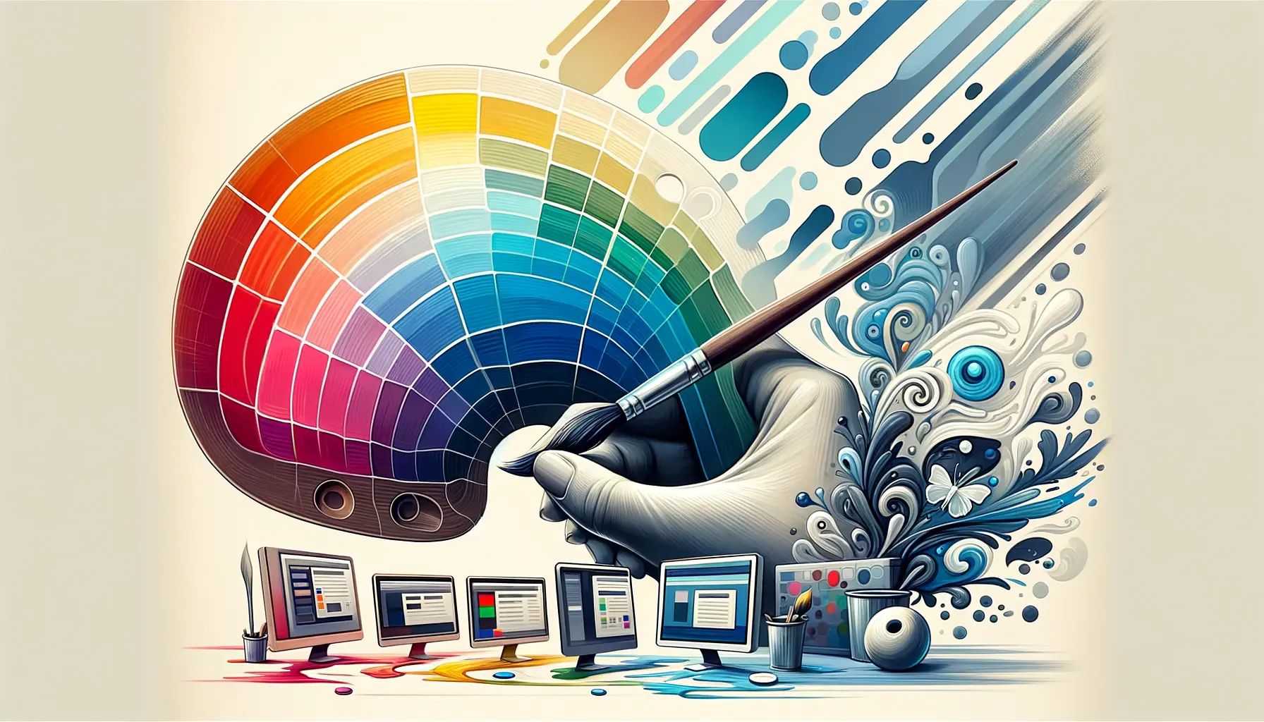
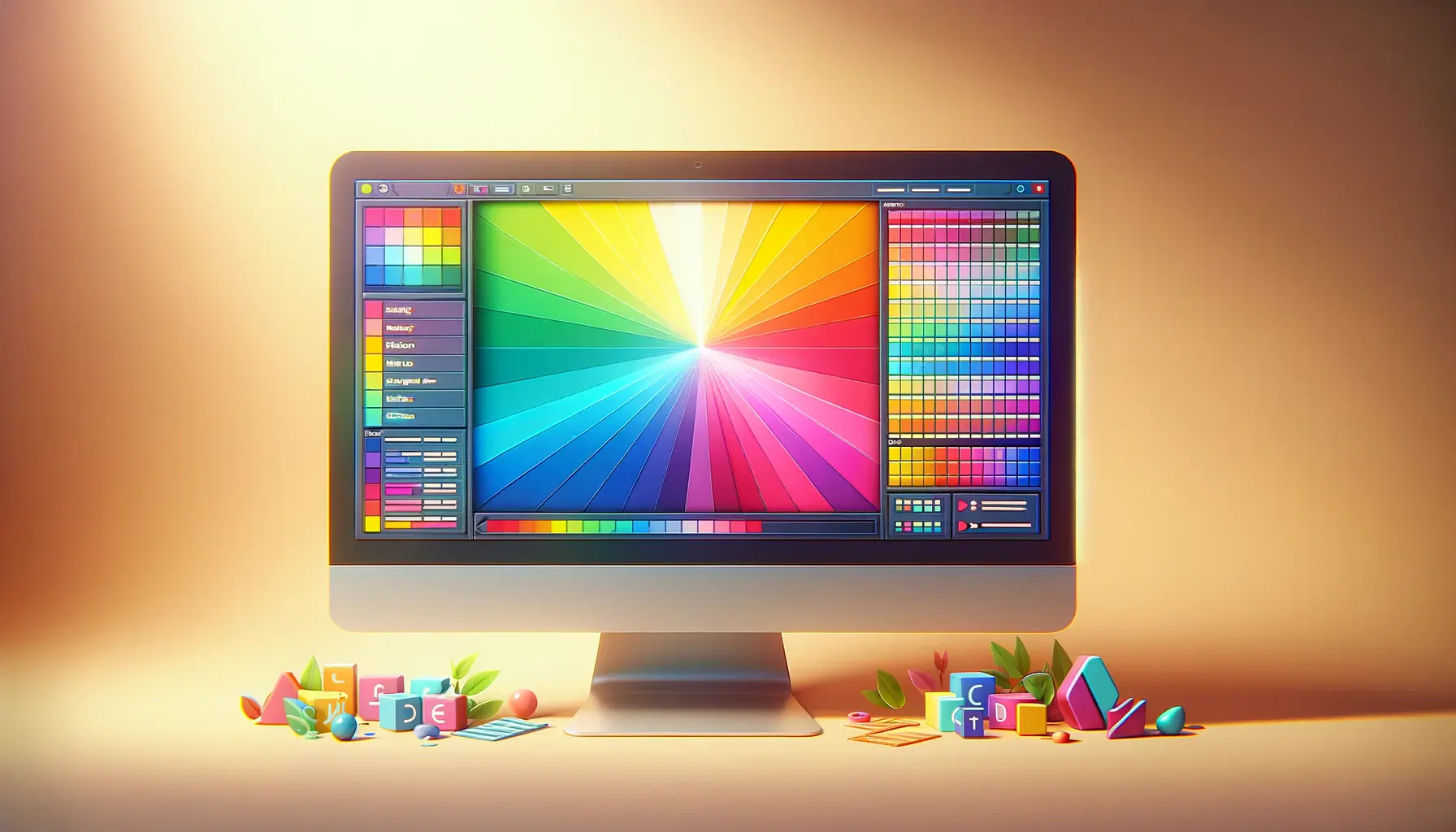
The journey of color theory in web design is a fascinating exploration of how colors influence user experience, emotion, and interaction on the digital canvas.
From the early days of the internet, where web design was limited to a handful of colors and basic graphics, to the present era of high-definition displays and complex color schemes, the evolution of color theory in web design reflects a deep understanding of human psychology and aesthetic preferences.
This article delves into the historical milestones, key concepts, and transformative trends that have shaped the use of color in web design, offering insights into how color theory continues to impact the digital world.
Understanding the history of color theory in web design requires a look back at the origins of color theory itself, which dates back to the 18th century.
Initially developed for traditional art and design, color theory principles were adapted for digital mediums as technology advanced.
The application of color theory in web design is not just about making websites look attractive; it’s about using color strategically to communicate messages, evoke emotions, and enhance usability.
As we explore the evolution of color theory in web design, we uncover the intricate relationship between color, technology, and user experience.
- Foundations of Color Theory in Web Design
- Color Psychology and User Experience
- Evolution of Web Design Technologies
- Impact of Color on Website Accessibility
- Color Trends and Cultural Influences in Web Design
- Strategies for Choosing Effective Color Schemes
- Future Directions in Color Theory and Web Design
- Reflecting on the Colorful Journey of Web Design
- FAQs on Color Theory in Web Design
Foundations of Color Theory in Web Design
The Basics of Color Theory
At the heart of color theory lies a simple yet profound concept: colors can influence perception and behavior.
This principle has guided artists and designers for centuries, forming the basis of color theory in web design.
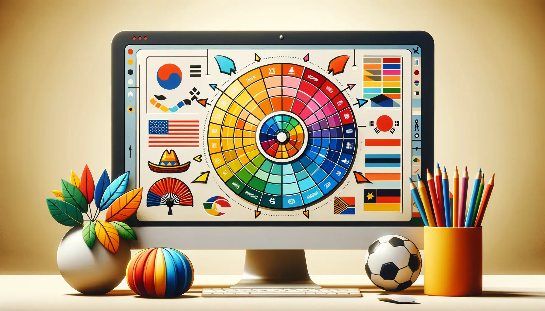
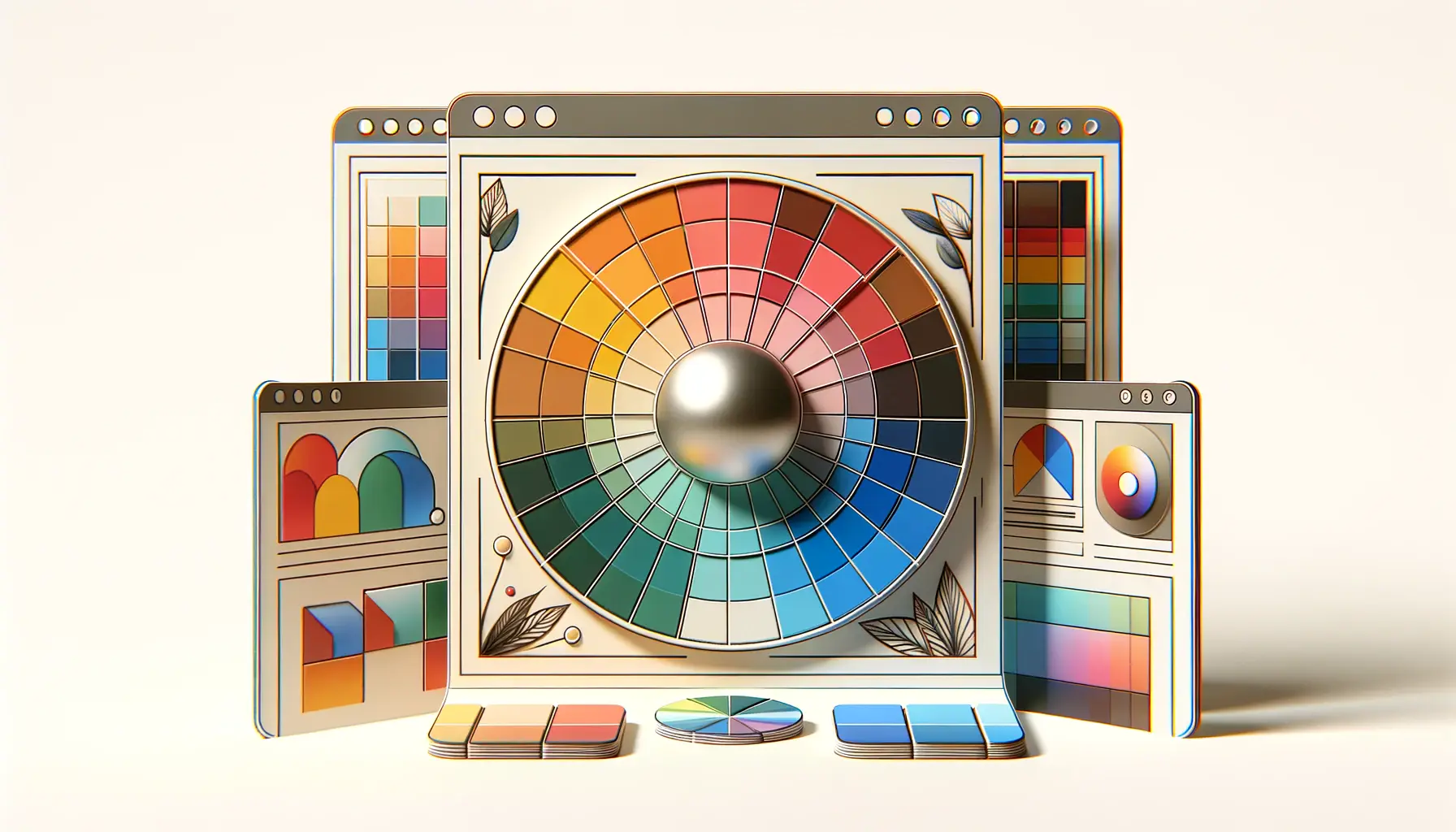
The primary, secondary, and tertiary color wheels, along with concepts such as hue, saturation, and brightness, provide a framework for understanding color relationships.
These fundamental tools help web designers create harmonious and appealing color schemes that enhance the visual appeal and functionality of websites.
Color theory also encompasses the psychological effects of colors, which are pivotal in web design.
Different colors can evoke different emotions and reactions from users.
For example, blue is often associated with trust and reliability, making it a popular choice for corporate websites.
Understanding these psychological associations allows web designers to use color strategically to influence user behavior and decision-making processes.
History: Early Web Design and Color Limitations
In the early days of the web, designers faced significant constraints regarding color.
The 216-color web-safe palette was a standard, ensuring that colors appeared consistently across different browsers and operating systems.
This limitation challenged designers to be creative within a restricted color range.
Despite these constraints, early web designers laid the groundwork for the sophisticated use of color in today’s web design by experimenting with color combinations and contrasts to improve readability and user experience.
The transition from the web-safe palette to the vast array of colors available on modern displays marked a significant evolution in web design.
This shift allowed for more complex and nuanced color schemes, enabling designers to more accurately convey brand identities and emotional tones.
The development of CSS (Cascading Style Sheets) further revolutionized web design, providing designers with greater control over color and style, and paving the way for the dynamic and interactive web experiences we enjoy today.
The evolution of color theory in web design is a testament to the field’s adaptability and the creative ingenuity of designers in overcoming technological limitations to create compelling and user-friendly websites.
Color Psychology and User Experience
The interplay between color psychology and user experience in web design cannot be overstated.
Colors do more than fill spaces; they communicate values, evoke emotions, and influence actions.
Understanding the psychological impact of colors is crucial for creating effective and engaging web designs.
This section explores how different colors affect user perception and behavior, and how this knowledge is applied in web design to enhance user experience.
Colors have the power to evoke specific emotions and reactions.
For instance, red can trigger feelings of excitement or urgency, making it effective for call-to-action buttons or sale announcements.
On the other hand, green is often associated with peace and health, making it a popular choice for wellness and environmental websites.
The strategic use of color can guide users’ emotions and behaviors, enhancing the overall effectiveness of a website.
Color and Brand Identity
Color is a key component of brand identity, serving as a visual representation of a company’s values and personality.
The choice of color scheme can significantly affect how a brand is perceived by its audience.
For example, a tech company might use sleek, cool tones to convey innovation and efficiency, while a bakery might opt for warm, inviting hues to evoke coziness and comfort.
By aligning color choices with brand identity, web designers can create a cohesive and memorable online presence that resonates with the target audience.
- Case Study: A study on consumer reaction to different website color schemes showed that users made up their minds within 90 seconds of viewing a website, and up to 90% of that judgment was based on color alone. This underscores the importance of choosing the right color palette for conveying a brand’s identity and values.
- Impact on Conversion Rates: Colors not only affect brand perception but also conversion rates. For instance, changing the color of a call-to-action button can significantly impact click-through rates. A/B testing different colors can help identify which hues are most effective at encouraging user action.
Accessibility and Color Contrast
Accessibility is a critical aspect of web design, ensuring that content is usable by everyone, including individuals with visual impairments.
Color contrast plays a vital role in accessibility, as it affects the readability of text and the visibility of interactive elements.
Web Content Accessibility Guidelines (WCAG) recommend specific contrast ratios for text and background colors to ensure that information is accessible to all users.
Implementing high contrast color schemes not only improves accessibility but also enhances the overall user experience by making content more readable and navigation more intuitive.
Designers must balance aesthetic appeal with functionality, ensuring that color choices contribute to an inclusive and user-friendly web environment.
The strategic application of color psychology can significantly enhance user experience, brand perception, and website accessibility, making it a fundamental aspect of web design.
Evolution of Web Design Technologies
The evolution of web design technologies has dramatically expanded the possibilities for using color in web design.
From the early, simplistic HTML pages with limited color options to the dynamic, visually rich websites of today, advancements in technology have continuously pushed the boundaries of what’s possible in web design.
This part explores key technological milestones that have influenced the use of color in web design.
The introduction of Cascading Style Sheets (CSS) was a pivotal moment in web design.
CSS allowed designers to separate content from design, providing unprecedented control over the layout and appearance of web pages, including color.
This separation meant that designers could experiment with color schemes more freely, without affecting the website’s structure or content.
High-Definition Displays and Color Fidelity
As display technology advanced, so did the capabilities for color representation.
High-definition displays with millions of colors allowed for more nuanced and vibrant color schemes.
This leap in technology meant that designers could use subtle gradients, shadows, and transitions to create depth and texture, enhancing the visual appeal of websites.
- Responsive Design: The rise of mobile devices introduced the need for responsive design, ensuring that websites look good and function well on any screen size. This development had implications for color use, as designers had to ensure that color schemes remained effective and appealing across different devices.
- Web Fonts and Color: The integration of web fonts brought typography into the realm of web design considerations, allowing for more cohesive and expressive color and font pairings. This added another layer to how color could be used to enhance readability and user experience.
Interactive and Dynamic Elements
Modern web design technologies such as JavaScript and CSS animations have introduced interactive and dynamic elements to web pages, further influencing the use of color.
Interactive elements like hover effects, buttons, and animations can change color to provide feedback or guide the user’s attention, making the web experience more engaging and intuitive.
The use of dynamic elements requires a thoughtful approach to color selection, ensuring that interactive cues are noticeable without being distracting.
This balance is crucial for maintaining a positive user experience while leveraging the full potential of color in web design.
The continuous evolution of web design technologies has not only enhanced the visual capabilities of websites but also deepened the strategic use of color in creating engaging and effective online experiences.
Impact of Color on Website Accessibility
Website accessibility remains a crucial consideration in web design, ensuring that all users, including those with disabilities, can access and navigate websites effectively.
Color plays a significant role in this regard, influencing the readability of text, the clarity of navigational cues, and the overall user experience for people with visual impairments or color blindness.
This section delves into the strategies and considerations for using color to enhance website accessibility.
One of the primary concerns in accessible web design is ensuring sufficient contrast between text and its background.
This contrast is vital for users with low vision or color blindness, as it affects their ability to distinguish text and interact with web content.
The Web Content Accessibility Guidelines (WCAG) provide specific contrast ratio standards for text and images of text, guiding designers in creating accessible color schemes.
Designing for Color Blindness
Designing with color blindness in mind requires an understanding of how different color combinations are perceived by people with various types of color vision deficiencies.
Tools and software are available to simulate how designs appear to users with color blindness, helping designers make informed choices about color schemes that are accessible to a wider audience.
- Use of Color and Patterns: Beyond color contrast, incorporating patterns or textures along with color cues can improve accessibility. For example, using stripes or dots in addition to color differences can help users with color blindness distinguish between elements that might otherwise appear similar.
- Color and Navigation: Color should not be the sole means of conveying information or indicating action on a website. Ensuring that navigational elements are distinguishable by shape or text labels, in addition to color, can significantly improve the site’s usability for users with color vision deficiencies.
Accessibility Tools and Testing
Advancements in accessibility tools and testing methodologies have made it easier for designers to evaluate and improve the color accessibility of their websites.
Automated tools can identify issues with color contrast and suggest modifications to meet accessibility standards.
However, these tools should be complemented with user testing, ideally involving individuals with various types of visual impairments, to ensure that web designs are truly accessible.
By prioritizing accessibility in color choices, web designers can create more inclusive digital environments.
This not only benefits users with disabilities but also enhances the overall user experience, reflecting a commitment to diversity and inclusion in the digital realm.
Ensuring color accessibility is not just about compliance with standards but about fostering an inclusive web where everyone has equal access to information and digital experiences.
Color Trends and Cultural Influences in Web Design
The use of color in web design is not only influenced by technological advancements and accessibility considerations but also by evolving cultural trends and societal shifts.
Color trends in web design often reflect broader trends in fashion, interior design, and popular culture, showcasing how societal influences shape digital aesthetics.
This section explores how color trends and cultural influences have left their mark on web design, and how designers can navigate these trends to create timely yet timeless designs.
Color trends in web design can signal shifts in user preferences and societal moods.
For example, the popularity of minimalist, neutral color schemes in recent years can be attributed to a broader cultural shift towards simplicity and mindfulness.
Conversely, the use of bold and vibrant colors might reflect a collective desire for optimism and energy in challenging times.
Understanding these cultural undercurrents can help designers create resonant and relevant web experiences.
Global Cultural Influences
Web design is a global medium, and color preferences can vary significantly across different cultures.
What is considered appealing or appropriate in one culture might not be in another.
For instance, white is often associated with purity and weddings in Western cultures, while in some Eastern cultures, it is the color of mourning.
Designers working on international projects must be mindful of these cultural nuances in color perception to ensure their designs are culturally sensitive and appropriate.
- Incorporating Cultural Insights: Researching and incorporating cultural insights into web design can enhance the global appeal of a website. This might involve using color schemes that resonate with a particular cultural group or avoiding colors that have negative connotations in the target culture.
- Adapting to Local Preferences: For websites targeting specific geographic regions, adapting color schemes to reflect local tastes and preferences can improve user engagement and brand perception. This localized approach to color can make web experiences more personal and relevant to the audience.
Staying Ahead of Color Trends
While it’s important to be aware of current color trends, web designers must also strive to create designs that will remain appealing and effective over time.
This involves balancing trend-driven choices with a timeless approach to color selection.
Designers can stay ahead of trends by participating in design communities, attending industry events, and keeping an eye on emerging cultural movements.
However, the ultimate goal should always be to serve the website’s purpose and audience, rather than simply following the latest trends.
By understanding and thoughtfully applying color trends and cultural influences, web designers can create more engaging, meaningful, and effective web experiences.
This approach not only enhances the aesthetic appeal of websites but also deepens the connection between brands and their audiences, reflecting a nuanced understanding of the cultural context in which they operate.
Navigating color trends and cultural influences requires a delicate balance between being current and creating a lasting impact, a challenge that web designers are uniquely positioned to meet.
Strategies for Choosing Effective Color Schemes
Choosing an effective color scheme is a critical step in web design that can influence the overall impact and success of a website.
The right color scheme can enhance brand identity, improve user experience, and even affect conversion rates.
This section outlines strategies for selecting color schemes that resonate with users and support the goals of the website.
Understanding the target audience is the first step in selecting an effective color scheme.
Different demographics may respond differently to color choices, influenced by factors such as age, gender, and cultural background.
For instance, younger audiences might be drawn to vibrant, high-contrast color schemes, while older users may prefer more subdued tones.
Researching and understanding the preferences of the target audience can guide the selection of a color scheme that will appeal to them.
Color Psychology in Scheme Selection
Color psychology plays a pivotal role in scheme selection, as different colors can evoke different emotions and associations.
For example, blue is often associated with trust and reliability, making it a popular choice for financial institutions.
Green, associated with nature and growth, is frequently used by environmental organizations.
Selecting colors that align with the emotional tone and values of the brand can create a stronger connection with the audience.
- Complementary and Analogous Schemes: Complementary color schemes, using colors opposite each other on the color wheel, can create a vibrant look with high contrast, ideal for grabbing attention. Analogous color schemes, using colors next to each other on the color wheel, offer a more harmonious and cohesive look, suitable for creating a calm and unified aesthetic.
- Monochromatic Schemes: Monochromatic color schemes, based on a single color with varying shades and tints, can create a sophisticated and cohesive look. This approach is effective for minimalist designs, emphasizing cleanliness and focus.
Testing and Iteration
Choosing a color scheme is not always a straightforward process, and what works in theory may not always resonate in practice.
Testing different color schemes with real users can provide valuable feedback on their effectiveness.
A/B testing, in particular, can reveal preferences and behaviors that inform the final selection of a color scheme.
Iterating based on user feedback ensures that the color scheme not only looks good but also performs well in terms of user engagement and conversion rates.
Ultimately, the goal of selecting a color scheme is to support the overall design and objectives of the website.
By considering the target audience, leveraging color psychology, and testing with real users, designers can choose color schemes that enhance the user experience and contribute to the success of the website.
Effective color schemes are the result of thoughtful consideration of the brand, audience, and the psychological impact of colors, underscored by testing and iteration to refine the user experience.
Future Directions in Color Theory and Web Design
The landscape of web design is perpetually evolving, influenced by technological advancements, cultural shifts, and new understandings of human psychology.
As we look towards the future, color theory in web design is poised to continue its evolution, embracing new technologies, exploring innovative applications, and addressing emerging challenges.
This final section speculates on the future directions of color theory in web design, highlighting potential trends and areas of growth.
One area of future growth is the integration of more advanced technologies, such as augmented reality (AR) and virtual reality (VR), into web design.
These technologies offer new canvases and challenges for color theory, requiring designers to consider color in three-dimensional spaces and immersive environments.
The use of color in AR and VR must account for depth perception, environmental interaction, and the psychological impact of being surrounded by digital color, pushing the boundaries of traditional color theory.
Personalization and Adaptive Color Schemes
As personalization becomes increasingly important in digital experiences, we may see the rise of adaptive color schemes that change based on user preferences, time of day, or even emotional state.
This level of personalization would require sophisticated algorithms and user data analysis but could lead to highly individualized and engaging web experiences.
Imagine a wellness website that adjusts its color scheme to promote relaxation in the evening or a productivity app that uses vibrant colors to energize users during their morning routine.
- Sustainability and Color: Sustainability is becoming a critical concern in all areas of design, including web design. Future color theory may incorporate principles of sustainable design, such as minimizing energy consumption on digital displays. Designers might favor color schemes that require less energy to display, particularly on mobile devices, contributing to longer battery life and reduced environmental impact.
- Inclusive Design Practices: The importance of inclusive design will continue to grow, with color theory playing a key role in creating accessible web experiences for all users. This includes not only designing for color blindness and visual impairments but also considering the cultural and emotional implications of color choices to ensure that web designs are welcoming and inclusive for a global audience.
Emerging Color Technologies
Technological advancements will also introduce new ways to experience color.
Innovations in display technology, such as quantum dots and OLED screens, offer richer and more vibrant colors, challenging designers to utilize these capabilities in creative and impactful ways.
Additionally, the development of color management software and tools will continue to improve, allowing for more precise and consistent color across various devices and platforms.
The future of color theory in web design is bright, with endless possibilities for innovation and creativity.
By embracing new technologies, prioritizing personalization and sustainability, and committing to inclusive design, the next generation of web designers will continue to push the boundaries of what’s possible with color, creating digital experiences that are more engaging, accessible, and impactful than ever before.
The exploration of color in web design is an ever-evolving journey, with future advancements promising to deepen our understanding and application of color in creating meaningful and memorable digital experiences.
Reflecting on the Colorful Journey of Web Design
The exploration of color theory in web design is a testament to the dynamic interplay between technology, psychology, and artistic expression.
As we’ve journeyed through the history, application, and future directions of color in web design, it’s clear that color is not just an aesthetic choice but a powerful tool for communication and engagement.
The evolution from limited, web-safe palettes to today’s vibrant, adaptive color schemes highlights the technological advancements and cultural shifts that have shaped web design practices over the years.
The Enduring Impact of Color Theory
Color theory remains at the heart of effective web design, guiding designers in creating visually appealing and emotionally resonant digital experiences.
The principles of color harmony, contrast, and psychology are as relevant today as they were in the early days of the web, albeit applied in increasingly sophisticated and personalized ways.
The future of color in web design promises even greater possibilities for innovation, with emerging technologies offering new canvases and challenges for the application of color theory.
Key Takeaways for Web Designers
- Understanding the psychological impact of colors is crucial for designing websites that engage and influence users.
- Accessibility and inclusivity should be central considerations in color scheme selection, ensuring that digital experiences are usable and welcoming for all.
- Staying informed about technological advancements and cultural trends can help designers leverage color in new and meaningful ways.
In conclusion, the history of color theory in web design is a rich narrative of innovation, creativity, and adaptation.
As web designers, we have the opportunity to continue this narrative, using color to create digital experiences that are not only visually stunning but also deeply engaging and inclusive.
By embracing the lessons of the past and the possibilities of the future, we can use color to connect with users in powerful and memorable ways, ensuring that the web remains a vibrant and dynamic space for expression and interaction.
Quality web design is key for a great website! Check out our service page to partner with an expert web design agency.
FAQs on Color Theory in Web Design
Explore common questions about the application and significance of color theory in web design.
Color significantly impacts user experience by evoking emotions, conveying messages, and enhancing aesthetic appeal and usability.
Consider your brand identity, target audience’s preferences, and color psychology to select a scheme that aligns with your website’s goals.
Yes, using contrasting colors improves readability for users with visual impairments, making your site more accessible to a wider audience.
This rule suggests using a primary color for 60% of the space, a secondary color for 30%, and an accent color for 10% to create balance.
Color psychology helps designers choose hues that evoke the desired emotional response, enhancing user engagement and conveying brand values.
Web-safe colors were a set of 216 colors guaranteed to display consistently across monitors; they are less relevant today due to advanced displays.
Use A/B testing and user feedback to evaluate the effectiveness of your color scheme in terms of user engagement and conversion rates.
Yes, numerous online tools and software can help you create harmonious color schemes based on color theory principles.
