In today’s digital age where screens dominate much of our existence, visual comfort is a necessity.
Dark mode design is an interesting innovation that meets the need for a visually comfortable screen.
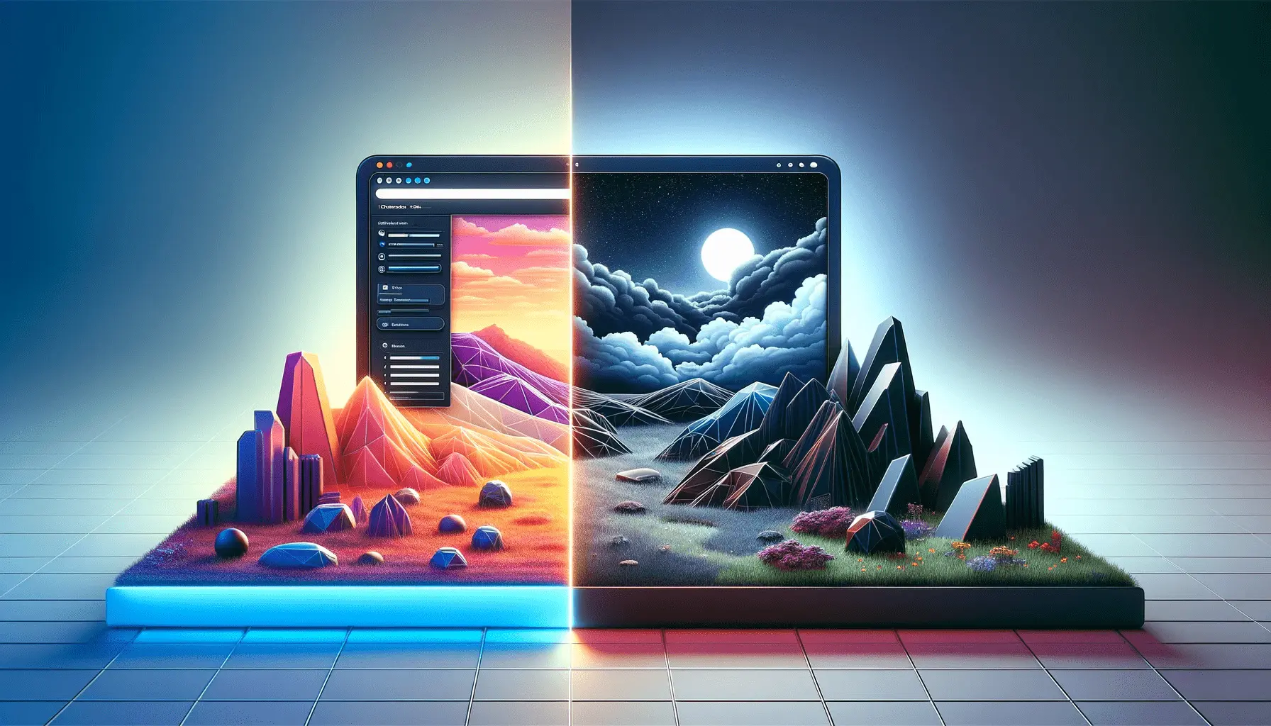
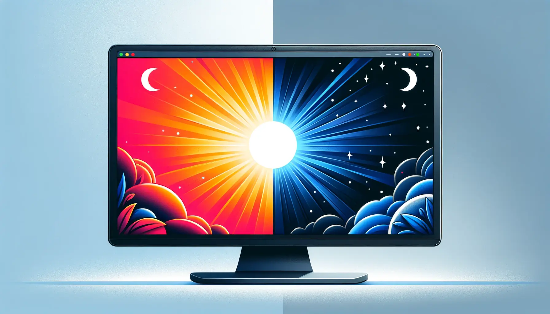
Dark mode design features a darker color scheme compared to the traditional white interface, with a strong focus on eye comfort and an improved user experience.
Understanding Dark Mode Design
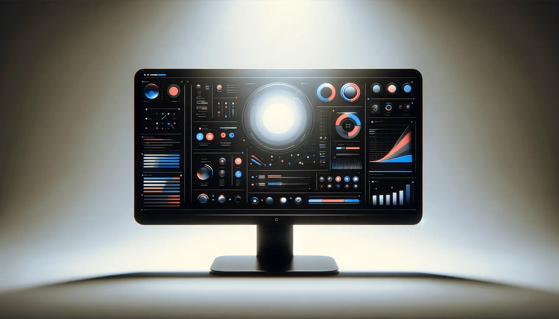
Dark mode design refers to a user interface (UIShort for User Interface, it refers to the visual layout and interactive elements of an application.) scheme that uses light-colored text, icons, and graphical elements on a dark background.
This inversion of the usual dark-on-light presentation gives a distinctive visual impression, typically defined as contemporary and streamlined.
Definition and Origin of Dark Mode
Dark mode design is not a new concept.
During early computing times, monochromeA display mode that uses only one color in varying shades, typically seen in early computer screens. screens displayed light-colored text on dark backgrounds due to technology limitations.
With the improvement of display technology, the situation was reversed with dark text and light-colored backgrounds, which mirrored ink on paper.
However, the current fashion for dark mode design is founded upon aesthetic appeal in addition to functional benefits such as reduced eye strain and power conservation.
Evolution and Adoption in Modern Interfaces
The evolution of dark mode design from an enthusiast-level feature to a standard design element is noteworthy.
Operating systems and mainstream applications have joined the cause, recognizing the popularity and advantage of dark mode design.
For instance:
- Operating Systems: macOS and Windows have each provided system-wide dark mode themes wherein users can switch between light and dark interfaces without any hassle.
- Mobile Platforms: Both iOS and Android launched dark mode options, which led to its popularity among apps and services.
- Web Design: Web applications and web pages started incorporating dark mode design functionality, in support of user preference and accessibility.
Such prevalent usage signifies a shift towards more personalized and enjoyable user experiences, where dark mode design has become a key part of mainstream interface design.
Dark mode design leverages contrast reversal to improve usability and create a sleek, modern visual style that resonates with users in today’s digital era.
Benefits of Dark Mode for Visual Comfort
Embracing dark mode design has several advantages that enhance visual comfort and usability in general.
Let us outline these advantages:
Reducing Eye Strain in Low-Light Environments
Have you ever had your eyes hurt after gazing at a bright screen within a dark environment?
Dark mode design addresses the issue by limiting screen brightness, which can minimize eye strain, especially in low-light environments.
This adjustment ensures a more enjoyable viewing experience while operating the device during nighttime or in dimly lit rooms.
Improving Readability and Focus
Dark mode design can also be utilized for enhancing readability through the creation of a clear contrast between text and background, breaking it down into an easier-to-read form.
Dark mode design can serve as a handy feature for users who engage in reading or working on digital media for hours on end because it can help maintain focus while reducing visual strain.
Saving Device Battery Life
Did you also know that the enabling of dark mode design can extend the life of your device battery?
With OLEDOrganic Light Emitting Diode, a display technology where each pixel emits its own light. or AMOLEDActive Matrix Organic Light Emitting Diode, an advanced OLED display technology with better power efficiency and image quality. technologies, presenting darker hues takes less energy than lighter hues.
By embracing dark mode design layouts, individuals get to have greater battery longevity.
For many who heavily utilize their devices through the day, it’s the reasonable thing to do.
The incorporation of dark mode design aesthetics not only enhances visual ease but also has pragmatic benefits like improved readability and increased battery life, which render it a valuable contribution to modern interface design.
Dark mode can enhance comfort in low-light environments, reduce eye strain, and even contribute to longer battery life on OLED devices—making it both user- and eco-friendly.
Best Practices for Implementing Dark Mode Design
Dark mode design implementation requires thoughtful consideration to offer a visually appealing and user-friendly experience.
Below are some best practices to guide you:
Avoid Pure Black and Pure White Colors
Using pure black (#000000) backgrounds and pure white (#FFFFFF) text creates too much contrast and leads to eye fatigue.
Instead, use dark gray backgrounds and off-white text to provide a less fatiguing view.
This approach reduces visual fatigue and enhances readability in dark mode design.
Manage Color Saturation and Contrast
Saturated colors may be visually jarring on black backgrounds.
Desaturate colors as needed to ensure legibility and aesthetics.
Text and interactive items should meet suggested contrast ratios to be accessible in a well-designed dark mode design interface.
Maintain Brand Identity in Dark Modes
Transitioning to dark mode design doesn’t mean giving up your brand’s visual identity.
Adjust your color palette to support dark backgrounds without compromising critical brand elements.
For example, use desaturated forms of your brand colors to maintain recognition without compromising visual comfort.
Communicate Depth and Elevation
In dark mode design, the normal shadows may fail to represent elevation.
Employ lighter greys to differentiate between layers and create a visual suggestion of depth.
This approach facilitates easier learning for users about the hierarchy and interactivity of UI elements.
Provide User Control Over Theme Selection
Users have various tastes and visual needs.
Offering the option to switch between light mode and dark mode design provides users with control over the most appropriate theme for their environment and reduces eye strain.
Employing an easy-to-use toggle facilitates personalization.
Following these best practices, you can implement a visually pleasing and effective dark mode design, boosting user satisfaction and accessibility.
When implementing dark mode, it’s essential to consider contrast, color balance, and branding elements to deliver a harmonious user experience.
Challenges and Considerations in Dark Mode Design
While dark mode design has many benefits, it’s important to recognize and overcome the challenges of its implementation.
Having knowledge of these considerations offers an inclusive and effective user experience.
Ensuring Accessibility Compliance
Dark mode design implementation is not necessarily more accessible to all.
In fact, it can present some challenges:
- Astigmatism and Halation: Astigmatism users may experience a halo effect, rendering light-colored text on dark backgrounds blurry, which reduces readability.
- Contrast Sensitivity: Insufficient contrast between text and background may lead to eye strain, especially in low-light conditions. Maintaining good contrast ratios is necessary for readability.
To overcome such issues, providing users with an option to toggle between light and dark mode design according to their needs and preferences is important.
Consistency Across Platforms
A uniform dark mode design appearance on various devices and platforms is usually challenging due to differences in display technologies and system setups.
Inconsistent styling creates user confusion and a diluted overall experience.
In order to maintain consistency:
- Develop a Thorough Style Guide: Establish guidelines that prescribe color schemes, typography, and design patterns specific to dark mode design. This will ensure consistency across devices and platforms.
- Conduct Rigorous Testing: Test your dark mode design on various devices and under varying lighting conditions to deliver a consistent and usable user experience.
Managing User Preferences and Toggle Options
Users vary in terms of preferences and viewing needs.
Some might like dark mode design for its appearance or reduced glare, while others might prefer light mode for better readability.
To accommodate these varying preferences:
- Offer Theme Choice Options: Allow users to quickly switch between light mode and dark mode design so they can choose the most appropriate interface for their comfort and accessibility needs.
- Respect System Preferences: Employ settings that identify and respond to the user’s system-wide theme preferences, offering a unified experience across applications.
By actively confronting these challenges in dark mode design, designers can create more accessible and user-friendly interfaces that are inclusive of a broader audience.
Poorly designed dark mode can hinder accessibility and create inconsistency across platforms—pay close attention to contrast and user control.
Future Trends in Dark Mode Design
As technology and user behavior evolve, dark mode design also stays in the game, offering new opportunities and challenges.
Let us talk about some future trends that will shape the direction of dark mode design:
Dynamic Dark Mode Adaptation
Imagine your device switching its theme automatically based on your surroundings.
Future releases may explore dynamic dark mode design, adapting in real time based on ambient light levels.
This intelligent system would provide users with the optimal viewing experience, automatically modifying the interface brightness and color scheme.
AI-Driven Personalization
Artificial intelligence (AI) could potentially have a significant role to play in tailoring dark mode design experiences to the requirements of individual users.
AI algorithms can dynamically modify dark mode settings in accordance with usage patterns and user feedback.
More Advanced Visual Design Elements
Designers are pushing the boundaries of dark mode design visuals by incorporating:
- Gradients and Textures: To confer depth and visual appeal to dark interfaces, fine gradients and textures move beyond flat design.
- Minimalist Dark Interfaces: An emerging minimalist dark mode design trend is anticipated, focusing on clean lines, unobtrusive layout, and reduced visuals. The trend caters to the need for distraction-free experiences without compromising the elegance of dark-mode appearance.
Cross-Platform Consistency
Ensuring an integrated dark mode design experience on a variety of devices and platforms becomes more crucial.
Designers and developers could make efforts to create unified dark mode experiences that readily transition between mobile devices, desktops, and web applications in order to render more uniformity across platforms and devices.
Accessibility Enhancements
Dark mode design can be enhanced by more robust accessibility features such as adjustable contrast, improved readability features, and enhanced support for assistive technologiesTools and software designed to support individuals with disabilities in interacting with digital content..
By staying sensitive to these trends, designers can create dark mode designs that not only look appealing but also are adaptive, tailored, and inclusive, responding to the diverse requirements of users in an evolving digital world.
Emerging innovations like AI-driven personalization and adaptive interfaces are set to revolutionize how dark mode integrates into digital experiences.
Embracing the Dark Mode Design of the Future
Why Dark Mode Design Matters More Than Ever
As we spend more and more time on the internet, the importance of visual comfort and convenience cannot be overstated.
Dark mode design has proven to be a solid response to these requirements, both aesthetically and functionally.
From reducing eye strain in low light to saving battery life on OLED screens, it addresses a wide range of user requirements and preferences.
Key Takeaways from This Exploration
Throughout this article, we’ve explored the multi-faceted nature of dark mode design.
Understanding its history, advantages, and implementation challenges enables designers to make informed decisions that enhance user experience.
Here’s a quick recap:
- Dark mode design offers a sleek, modern look while improving readability and reducing eye fatigue.
- Best practices involve careful color management, contrast adjustments, and user-centric customization.
- Accessibility is always a top priority—designs need to accommodate users with varying visual needs.
- Cross-platform consistency and user control over theme selection are required for a seamless experience.
- New trends such as AI-driven personalization, dynamic adaptation, and clean interfaces will continue to shape dark mode design.
Conclusion for Designers and Developers
Achieving a good dark mode design is more than a color flip.
It’s about understanding human behavior, respecting user preferences, and designing for real use cases.
Done well, dark mode is more than a visual preference—it’s an important part of the user’s digital life.
Fostering Innovation with Purpose
As digital environments evolve, so must our approach to interface design.
Embracing dark mode design not only future-proofs your products but also demonstrates a commitment to accessibility, performance, and user comfort.
Whether you’re designing for web, mobile, or desktop platforms, integrating dark mode thoughtfully will set your experience apart in an increasingly crowded digital space.
Designing with dark mode in mind shows a commitment to accessibility, performance, and user preference—key pillars of modern digital design.
Quality web design is key for a great website! Check out our service page to partner with an expert web design agency.
Frequently Asked Questions About Dark Mode Design
Dark mode design features light-colored text and objects on a dark background, giving a modern appearance and potential benefits like reduced eye strain and improved battery life on OLED screens.
For certain users, dark mode design can reduce eye strain, especially in low-light environments.
It might not be ideal for everyone, particularly those with specific visual disabilities.
On OLED or AMOLED screens, dark mode design can save battery life because it takes less power to display dark pixels.
Battery life savings depend on screen brightness and usage patterns.
Adding dark mode design involves using dark backgrounds and light text, adjusting color saturation, ensuring sufficient contrast, and maintaining brand identity.
Testing across multiple devices ensures consistency.
Dark mode design is effective for most, but not ideal for everyone.
Individuals with astigmatism or certain visual disorders might find light text on dark backgrounds harder to read.
Offering dark mode design can enhance user experience, but it’s not essential for every website.
Consider your audience and content type before deciding to implement it.
Dark mode design can improve readability in low-light settings.
However, poor contrast and color choices can harm legibility, making careful design decisions necessary.
Dark mode design can challenge accessibility if poorly implemented.
Adequate contrast, avoiding pure black backgrounds, and offering user control are key to accessibility.
Dark mode design does not directly affect SEO.
However, ensuring your site is accessible and usable in both light and dark modes supports a better user experience, which benefits SEO indirectly.
