Understanding color theory is crucial in web design, as colors not only enhance the aesthetic appeal of a website but also influence user behavior and brand perception.
However, even the most experienced web designers can fall prey to common color theory mistakes, leading to less engaging and effective websites.
This article delves into the pitfalls of color theory in web design, offering insights and strategies to avoid them, ensuring your website communicates effectively with its intended audience.
Colors speak a language of their own, evoking emotions and conveying messages without words.
In the realm of web design, the application of color theory transcends mere decoration, playing a pivotal role in user experience (UX) and interface (UI) design.
Yet, missteps in color selection and combination can detract from a website’s goals, hindering usability, accessibility, and conversion rates.
By exploring these common mistakes, designers can harness the power of color more effectively, creating visually appealing and user-friendly websites.
- Understanding Color Theory Fundamentals
- Color Psychology in Web Design
- Navigating Color Trends and Consistency
- Color and Web Accessibility
- Effective Use of Color in User Interface (UI) Design
- Color in Branding and Web Identity
- Optimizing Color for Conversion
- Conclusion: Navigating the Colorful Landscape of Web Design
- FAQs: Color Theory Mistakes in Web Design
Understanding Color Theory Fundamentals
The Importance of Color Harmony
At the heart of effective web design lies the concept of color harmony, where colors are chosen and combined in a way that is pleasing to the eye.
This harmony is essential for creating a balanced and cohesive look for a website.
However, a common mistake is the misuse of color schemes, leading to jarring combinations that can overwhelm or disengage users.
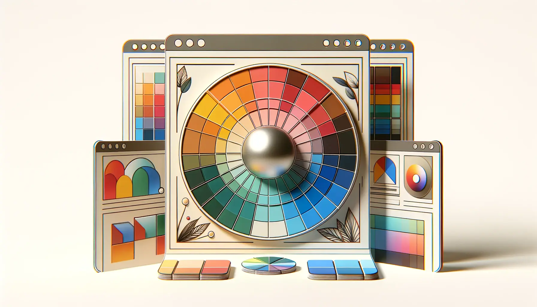
To avoid this, designers should employ color wheel principles, such as analogous, complementary, or triadic schemes, to achieve visual balance and unity.
Another aspect of color harmony involves the psychological impact of colors.
Different colors can evoke different emotions and associations.
For example, blue is often associated with trust and reliability, making it a popular choice for corporate websites.
Misunderstanding these associations can lead to color choices that misalign with the website’s message or target audience, undermining its effectiveness.
Contrast and Accessibility
Contrast is another critical component of color theory that impacts web design.
Adequate contrast between the text and background colors is essential for readability and accessibility.
A frequent mistake is using colors with low contrast, making content difficult to read for many users, including those with visual impairments.
Tools like the Web Content Accessibility Guidelines (WCAG) contrast ratio checker can help designers ensure their color choices meet accessibility standards.
However, overly high contrast can also be problematic, leading to visual fatigue and discomfort.
Striking the right balance is key, ensuring that text is easily readable without straining the eyes.
This balance is particularly important in long-form content and navigation elements, where clarity and legibility are paramount.
Remember, understanding and applying color theory fundamentals is the first step towards avoiding common mistakes in web design. By focusing on color harmony, contrast, and accessibility, designers can create more effective and engaging websites.
Color Psychology in Web Design
Color psychology plays a pivotal role in web design, influencing how users perceive and interact with a website.
The choice of colors can significantly affect user emotions and behaviors, making it essential for designers to understand the psychological effects of their color choices.
This section explores the impact of color psychology on user engagement and how to leverage it to enhance the user experience.
Colors have the power to evoke specific emotions and actions from users.
For example, red can stimulate feelings of excitement or urgency, often used in call-to-action buttons to encourage clicks.
On the other hand, green is associated with peace and growth, making it ideal for environmental or wellness-related websites.
Selecting colors that align with the website’s purpose and audience’s expectations can greatly improve engagement and conversion rates.
Strategic Use of Color for Calls to Action
One of the most critical applications of color psychology is in the design of calls to action (CTAs).
The right color can draw attention to the CTA, making it stand out from the rest of the website and prompting users to take the desired action.
However, a common mistake is using colors that blend too much with the site’s overall color scheme, causing CTAs to go unnoticed.
To avoid this, designers should choose contrasting colors for CTAs while ensuring they harmonize with the overall design.
- Highlighting Key Information: Beyond CTAs, color can be used to highlight important information or guide users through a website. Strategic use of color can direct users’ attention to critical sections, improving navigation and the overall user experience.
- Emotional Alignment: Ensuring the website’s color palette aligns with the emotional tone of the content is crucial. A mismatch between the color scheme and the website’s tone can confuse users or detract from the message.
Avoiding Overstimulation and Color Fatigue
While color can be a powerful tool in engaging users, overuse or poor combinations can lead to overstimulation and color fatigue.
An overly vibrant palette can be visually exhausting, leading to a negative user experience.
Designers should aim for a balanced color scheme that uses vibrant colors sparingly and focuses on creating a visually comfortable environment for users.
- Balance with Neutrals: Incorporating neutral colors can help balance more vibrant tones, providing visual rest points for the user.
- Consistent Color Themes: Maintaining a consistent color theme throughout the website helps create a cohesive user experience, reducing cognitive load and enhancing usability.
Leveraging color psychology in web design not only enhances the aesthetic appeal of a website but also its functionality and effectiveness in communicating with the audience. By carefully selecting colors that evoke the desired emotional response and action, designers can significantly improve user engagement and satisfaction.
Navigating Color Trends and Consistency
The allure of color trends is undeniable in the world of web design, offering fresh inspiration and modern aesthetics.
However, blindly following these trends without considering the brand’s identity and audience preferences can lead to a disconnect between the website and its users.
This section discusses the balance between embracing color trends and maintaining consistency in web design.
Color trends can serve as a powerful tool for refreshing a brand’s online presence, signaling that a company is up-to-date with current design practices.
Yet, the challenge lies in integrating these trends in a way that complements the brand’s existing identity and resonates with its target audience.
A sudden shift in color scheme, especially one that clashes with the brand’s core values or message, can confuse users and dilute brand recognition.
Adapting Color Trends Wisely
To effectively incorporate color trends into web design, it’s crucial to evaluate how these trends align with the brand’s personality and the website’s goals.
Designers should consider the emotional connotations of trending colors and how they can enhance the user experience without overshadowing the brand’s identity.
- Selective Incorporation: Instead of a complete overhaul, introduce trending colors through accents or secondary elements. This approach allows for a nod to current trends while maintaining the core color scheme.
- Test and Iterate: Implementing A/B testing for color changes can provide insights into how users respond to new color schemes, enabling data-driven decisions that align with user preferences and conversion goals.
Maintaining Color Consistency
While exploring color trends, maintaining consistency across all brand touchpoints is paramount.
Consistent use of color strengthens brand recognition and fosters trust among users.
Inconsistencies, on the other hand, can lead to a fragmented user experience, undermining the brand’s credibility.
- Brand Guidelines: Developing comprehensive brand guidelines that include color specifications ensures consistency across the website, social media, and other marketing materials.
- Cohesive User Experience: Consistency in color usage contributes to a cohesive user experience, making navigation intuitive and reinforcing the brand’s identity throughout the user’s journey.
Balancing the adoption of color trends with the need for consistency is crucial in web design. By thoughtfully integrating trending colors and maintaining a consistent color scheme, designers can create visually appealing and brand-aligned websites that resonate with users and stand the test of time.
Color and Web Accessibility
Ensuring web accessibility is a fundamental aspect of web design, allowing people with disabilities to perceive, understand, navigate, and interact with the web effectively.
Color plays a significant role in this context, as poor color choices can severely hinder accessibility for users with visual impairments, including color blindness.
This section highlights the importance of color in enhancing web accessibility and outlines strategies to ensure an inclusive digital environment.
Web accessibility is not just a matter of ethical responsibility but also a legal requirement in many jurisdictions.
Designers must consider how color choices affect the readability and navigability of a website for everyone, including those with color vision deficiencies.
The goal is to create a web experience that is universally accessible, ensuring that all users have equal access to information and functionality.
Implementing Accessible Color Schemes
To create an accessible color scheme, designers must prioritize contrast and clarity.
Text and background colors need to have sufficient contrast to be easily distinguishable by all users, including those with visual impairments.
The Web Content Accessibility Guidelines (WCAG) provide clear standards for contrast ratios, ensuring that text is readable against its background.
- Contrast Ratio Tools: Utilizing tools to check the contrast ratio of text and background colors can help designers adhere to accessibility standards.
- Color Blindness Simulators: Simulators can provide insights into how color schemes appear to users with different types of color vision deficiencies, guiding more inclusive design decisions.
Designing for Color Blindness
Designing with color blindness in mind is crucial for creating an accessible web.
This involves choosing color combinations that are distinguishable to users with various forms of color blindness and ensuring that information is not conveyed through color alone.
For instance, adding text labels or icons alongside color-coded information can make it accessible to everyone.
- Use of Patterns and Textures: Incorporating patterns or textures along with color coding can help differentiate elements without relying solely on color.
- Alternative Information Channels: Providing alternative ways to convey information, such as through text or audio descriptions, ensures that all users can access the content, regardless of their ability to perceive color.
Incorporating accessibility principles into color choices not only complies with legal standards but also expands the reach of a website, making it usable and enjoyable for a broader audience. By focusing on accessible color schemes and designing with color blindness in mind, web designers can create more inclusive digital experiences.
Effective Use of Color in User Interface (UI) Design
The user interface (UI) is where users interact with a website, making its design crucial for ensuring a positive user experience.
Color is a key element in UI design, serving not just to beautify the interface but also to guide users, convey information, and evoke the right emotions.
This section explores how to effectively use color in UI design to enhance usability and user satisfaction.
Effective UI design requires a strategic approach to color selection and application.
Colors can direct attention, define hierarchy, and signal interactivity, aiding users in navigating the interface intuitively.
However, missteps in color usage can lead to confusion, frustration, and a poor overall user experience.
By understanding the principles of color in UI design, designers can create more engaging and user-friendly interfaces.
Guiding Users with Color
Color can act as a visual cue to guide users through a website’s interface, highlighting important elements and pathways.
For instance, using a distinct color for call-to-action buttons makes them stand out and encourages clicks.
Similarly, color differentiation can help users distinguish between interactive elements and static information, improving navigability.
- Visual Hierarchy: Establishing a visual hierarchy with color helps users understand the importance of different elements, guiding their attention to key information first.
- Feedback and Interactivity: Color changes can provide immediate feedback to users, such as a button changing color when hovered over, indicating that it is clickable.
Creating Mood and Atmosphere
The choice of colors can significantly affect the mood and atmosphere of a website, influencing how users feel while interacting with the UI.
Warm colors can create a sense of energy and dynamism, suitable for brands looking to evoke excitement.
In contrast, cool colors can convey calmness and professionalism, ideal for corporate or healthcare websites.
- Emotional Alignment: Ensuring the website’s color palette aligns with the desired emotional tone is crucial for creating an effective user interface.
- Consistency Across Pages: Maintaining color consistency across different pages and sections of the website reinforces the mood and supports a cohesive user experience.
Enhancing Usability with Color
Color not only affects the aesthetic appeal of a UI but also its usability.
Clear color distinctions between different UI elements can enhance readability and make the interface more intuitive.
However, it’s important to avoid overusing color, which can lead to a cluttered and overwhelming interface.
Balancing color usage is key to creating a UI that is both visually appealing and functional.
- Accessibility Considerations: As discussed earlier, ensuring high contrast and designing for color blindness are essential for making the UI accessible to all users.
- Simplicity and Clarity: A simple color scheme with a clear distinction between elements can greatly improve the usability of the UI, making it easier for users to navigate and find what they need.
The strategic use of color in UI design is crucial for creating an engaging and effective user interface. By guiding users, creating the right mood, and enhancing usability, color can significantly improve the user experience on a website.
Color in Branding and Web Identity
Color is a powerful tool in establishing and communicating a brand’s identity on the web.
The right color palette can convey a brand’s values, attract the target audience, and differentiate the brand from its competitors.
This section explores the role of color in branding and how it shapes the web identity of a business.
Choosing a color scheme for a brand’s online presence is a critical decision that influences user perception and brand recognition.
Colors carry inherent meanings and associations that can significantly impact how a brand is viewed by its audience.
A well-chosen color palette can enhance brand identity, making it memorable and recognizable across various digital platforms.
Conveying Brand Values through Color
Every color has specific psychological associations that can help convey a brand’s values and personality.
For example, blue often represents trust, stability, and professionalism, making it a popular choice for financial institutions and technology companies.
Understanding these associations allows brands to select colors that accurately reflect their identity and values.
- Emotional Connection: Colors that resonate with a brand’s target audience can create an emotional connection, making the brand more relatable and appealing.
- Consistency Across Platforms: Consistent use of color across all online and offline branding materials strengthens brand recognition and reinforces the brand’s identity.
Differentiating with Color
In a crowded market, color can be a key differentiator for a brand.
A unique color scheme can set a brand apart from its competitors, making it stand out in the minds of consumers.
However, it’s important to balance uniqueness with appropriateness, ensuring that the color palette not only distinguishes the brand but also aligns with industry expectations and audience preferences.
- Market Research: Conducting market research to understand the color schemes used by competitors can inform a strategic choice of colors that differentiates the brand while still appealing to the target market.
- Brand Personality: The color palette should reflect the brand’s personality, whether it’s bold and energetic or calm and soothing, helping to attract the brand’s ideal customers.
Building a Cohesive Web Identity
A cohesive web identity is crucial for brand consistency and recognition.
The color scheme plays a significant role in achieving this cohesion, tying together various elements of the website and other digital assets.
A consistent color palette helps users quickly identify the brand across different contexts, enhancing the overall brand experience.
- Visual Elements: Beyond the website, the color scheme should extend to all visual elements of the brand, including logos, imagery, and social media profiles, to create a unified brand presence.
- User Experience: Consistent color usage enhances the user experience by providing a familiar and comfortable environment that reinforces the brand’s identity at every touchpoint.
Neglecting the impact of color on branding and web identity can lead to missed opportunities for establishing a strong and recognizable brand presence online. By carefully selecting and consistently applying a color scheme, brands can effectively communicate their values, connect with their audience, and stand out in the digital landscape.
Optimizing Color for Conversion
At the intersection of design and marketing, optimizing color usage for conversion rates is a critical strategy for any website.
The right color choices can significantly influence user actions, from clicking a call-to-action button to completing a purchase.
This section delves into how colors can be optimized to boost conversions, providing practical tips for web designers and marketers alike.
Understanding the psychology behind color preferences and how they affect user behavior is key to optimizing a website for conversions.
Different colors can evoke different responses, making it essential to choose a palette that encourages users to take the desired action.
However, it’s not just about picking the “right” color; it’s about using color strategically to guide and persuade users at every step of their online journey.
Color and Call-to-Action Buttons
Call-to-action (CTA) buttons are one of the most critical elements on a website, serving as the primary driver for user action.
The color of a CTA button can make it stand out or blend in, significantly affecting its visibility and click-through rate.
Testing different colors for CTA buttons can reveal which hues are most effective at capturing attention and encouraging clicks, leading to higher conversion rates.
- A/B Testing: Conducting A/B tests with different color variations for CTA buttons can provide valuable insights into user preferences and conversion optimization.
- Contrast and Visibility: Ensuring that CTA buttons contrast with the surrounding elements makes them more visible and prompts users to take action.
Creating a Conversion-Friendly Color Scheme
While individual elements like CTA buttons are crucial, the overall color scheme of a website also plays a significant role in conversions.
A cohesive and strategically chosen color palette can create a comfortable and engaging environment that encourages users to stay longer and explore more, ultimately leading to increased conversions.
- User Psychology: Selecting colors that align with the psychological profile of the target audience can enhance the effectiveness of the color scheme in driving conversions.
- Consistency with Brand Identity: The color scheme should reinforce the brand’s identity, creating a seamless experience that builds trust and encourages conversion.
Leveraging Color for User Segmentation
Color can also be used to segment users and tailor experiences based on their preferences or behaviors.
For example, different color schemes can be employed for different sections of a website, targeting specific user groups or interests.
This segmentation can enhance the relevance of the content for various user segments, improving engagement and conversion rates.
- Personalization: Using color to personalize the user experience can make visitors feel more valued and understood, increasing the likelihood of conversion.
- Highlighting Offers: Employing distinct colors to highlight special offers or important information can draw user attention and boost conversions.
Optimizing color for conversion is a nuanced process that requires understanding user behavior, testing different approaches, and making data-driven decisions. By strategically employing color throughout the website, from CTA buttons to the overall color scheme, businesses can create a more engaging and conversion-friendly online presence.
Conclusion: Navigating the Colorful Landscape of Web Design
In the vast and vibrant world of web design, color theory emerges as a cornerstone, influencing not only aesthetic appeal but also usability, accessibility, and user psychology.
The strategic application of color theory can elevate a website from merely functional to truly phenomenal, engaging users and guiding them through a seamless digital journey.
However, as we’ve explored, common mistakes in color usage can hinder a website’s effectiveness, impacting user experience and brand perception.
Avoiding Pitfalls and Embracing Best Practices
From understanding the fundamentals of color harmony and psychology to navigating the latest trends with a keen eye on brand consistency, web designers have the challenging task of balancing various elements to create cohesive and compelling online experiences.
The key to success lies in avoiding common pitfalls such as poor contrast, overstimulation, and trend overreliance, while embracing best practices that prioritize user needs and brand identity.
Strategic Color Application for Enhanced Web Experiences
Effective use of color in web design goes beyond aesthetic considerations, playing a crucial role in enhancing usability, accessibility, and conversion rates.
By carefully selecting color schemes that align with brand values and user expectations, designers can create intuitive and engaging interfaces that resonate with their audience.
Moreover, optimizing color for conversion and leveraging it for user segmentation can significantly improve the effectiveness of a website, turning casual visitors into loyal customers.
- Understanding and applying color theory to avoid common mistakes
- Embracing color psychology to engage and influence user behavior
- Maintaining brand consistency while exploring color trends
- Enhancing web accessibility through thoughtful color choices
- Utilizing color strategically in UI design for a better user experience
- Leveraging color to strengthen branding and web identity
- Optimizing color usage for improved conversion rates
In conclusion, the journey through the colorful landscape of web design is one of exploration, experimentation, and continuous learning.
By steering clear of common color theory mistakes and employing strategic color choices, web designers can craft experiences that not only captivate and delight users but also drive brand success in the digital age.
The power of color in web design is immense, and when wielded wisely, it can transform the ordinary into the extraordinary, making every online interaction memorable.
Quality web design is key for a great website! Check out our service page to partner with an expert web design agency.
FAQs: Color Theory Mistakes in Web Design
Explore common questions about color theory mistakes in web design to enhance your understanding and improve your design skills.
Insufficient contrast refers to low visual distinction between text and background, making content hard to read and negatively impacting user experience.
These colors can cause strain on the eyes, making text difficult to read and potentially deterring users from engaging with the content.
Following trends without considering brand identity can lead to a disjointed user experience and dilute brand consistency across digital platforms.
Color theory informs the selection of a palette that aligns with brand values, enhances recognition, and evokes the intended emotional response from the audience.
Choosing clashing colors, overusing vibrant hues, and neglecting color psychology can lead to a visually overwhelming or unappealing website.
Inappropriate or inconsistent color use can confuse the audience, weaken brand identity, and reduce the effectiveness of marketing efforts.
Ignoring color theory can lead to aesthetic and communicative failures, diminishing user engagement and the overall success of the design.
Certain colors can evoke negative emotions, reduce readability, or clash with cultural associations, adversely affecting user experience and brand image.
