Integrating color theory into design projects is not just about choosing appealing colors; it’s a complex process that significantly impacts user experience, brand perception, and ultimately, the success of a design project.
Color theory, a cornerstone of design, guides the use of colors in a way that is both aesthetically pleasing and strategically effective.
However, the implementation of color theory in design projects comes with its own set of costs and considerations that designers and businesses must navigate.
The application of color theory extends beyond mere selection; it involves research, testing, and refinement to align with a project’s goals.
This process, while crucial, incurs costs that can vary widely depending on the project’s scope, the complexity of the color scheme, and the desired outcomes.
Understanding these costs is essential for designers and businesses alike to make informed decisions and allocate resources effectively.
- Understanding the Basics of Color Theory in Design
- Cost Factors in Implementing Color Theory
- Strategies for Cost-Effective Color Implementation
- Maximizing the Impact of Color in Design
- Challenges in Implementing Color Theory
- Technological Advances in Color Design
- Future Directions in Color Theory Application
- Conclusion: Embracing the Spectrum of Color Theory in Design
- FAQs: Navigating the Costs of Implementing Color Theory in Design
Understanding the Basics of Color Theory in Design
The Impact of Color on User Experience
Color theory plays a pivotal role in shaping user experience.
Colors not only convey aesthetics but also evoke emotions and influence perceptions.
For instance, blue can instill a sense of trust and security, while yellow might evoke happiness and energy.
The strategic use of color can enhance user engagement and facilitate the desired user actions, such as clicking a call-to-action button or navigating a website.
However, achieving the right emotional and psychological impact requires a deep understanding of color psychology, cultural connotations, and the target audience’s preferences.
This necessitates research and experimentation, which contribute to the overall costs of implementing color theory in design projects.
Color Selection and Brand Identity
Choosing the right colors is crucial for reinforcing a brand’s identity and ensuring consistency across all design elements.
The colors must align with the brand’s values, message, and target audience.
This alignment is critical for brand recognition and can influence consumer trust and loyalty.
The process of selecting and standardizing colors for a brand involves creating color palettes, guidelines, and sometimes, custom colors.
This can involve collaboration with color experts, testing on various media, and adjustments based on feedback, all of which add to the cost of implementing color theory in design.
Implementing color theory effectively requires a balance between aesthetic appeal and strategic functionality, impacting both user experience and brand identity.
Cost Factors in Implementing Color Theory
The implementation of color theory in design projects involves various cost factors that can significantly impact the overall budget.
Understanding these factors is crucial for effective project management and resource allocation.
Here are some key cost considerations:
Research and Development
Before a color scheme can be applied, extensive research and development are necessary.
This phase includes:
- Studying the target audience’s response to different colors.
- Exploring color psychology and its impact on brand perception.
- Assessing the competition and industry trends to ensure the chosen colors stand out and convey the intended message.
This foundational work is essential but time-consuming and can require significant investment, especially if specialized expertise is needed.
Testing and Iteration
Once preliminary colors are selected, they must be tested across various applications and platforms.
This process may involve:
- Creating mockups or prototypes to evaluate the colors in real-world scenarios.
- Gathering feedback from focus groups or user testing sessions.
- Making adjustments based on feedback and testing outcomes, which may require several iterations.
Each iteration adds to the project timeline and budget, making testing a critical yet costly phase of implementing color theory.
Production and Implementation Costs
Applying the finalized color scheme across all design elements entails additional costs, including:
- Updating digital assets to reflect the new color palette.
- Revising printed materials, such as business cards, brochures, and packaging, to ensure color consistency.
- Adjusting color settings for various printing processes and materials, which may require specialized knowledge to avoid costly mistakes.
Ensuring color consistency across different media can be challenging and often requires adjustments to the original color choices, further increasing costs.
Effective project management and clear communication with all stakeholders are essential to minimize revisions and control costs associated with implementing color theory.
Strategies for Cost-Effective Color Implementation
While implementing color theory in design projects involves various costs, there are strategies that can help manage and reduce these expenses without compromising the effectiveness of the color scheme.
Here are some cost-effective approaches to consider:
Opt for Universal Color Palettes
- Choose colors that are widely recognized and easy to reproduce across different platforms and materials. This can reduce the need for custom color development and specialized printing processes.
- Utilize color palettes that are known for their versatility and appeal to a broad audience, which can enhance the project’s reach and impact.
Leverage Digital Tools and Resources
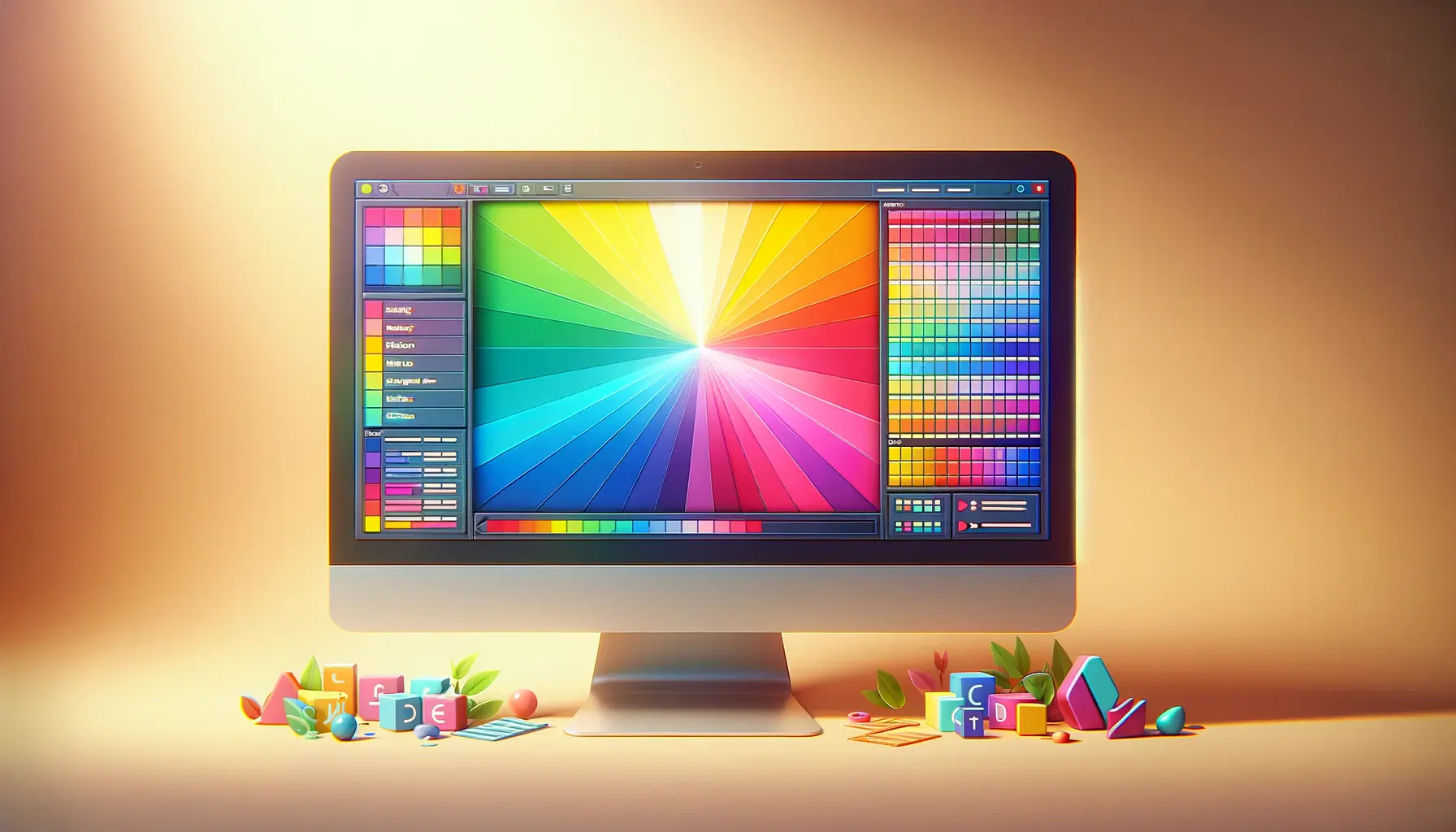
- Use digital color tools and software to experiment with color schemes before finalizing. Many of these tools offer insights into color psychology, compatibility, and web-safe colors, streamlining the selection process.
- Explore online resources and communities for feedback and suggestions on color schemes, which can provide valuable insights without the need for formal testing.
Implement Modular Design Systems
- Adopt a modular design approach where color schemes can be easily adjusted or updated without overhauling the entire design. This flexibility can save costs in the long run by facilitating easy updates.
- Create a design system that includes a range of color variations and applications, allowing for consistency across different projects and materials.
Focus on Key Brand Elements
- Concentrate the use of color on critical brand elements and touchpoints, ensuring that the investment in color theory has the maximum impact on user experience and brand perception.
- Limit the use of extensive color schemes in areas of the design that have less interaction or visibility, focusing resources on high-impact areas.
Plan for Long-Term Use and Flexibility
- Design with the future in mind, choosing color schemes that can evolve with the brand and remain relevant over time. This reduces the need for frequent updates and redesigns.
- Ensure that the color scheme is flexible enough to accommodate seasonal variations, special campaigns, or shifts in brand strategy without significant cost implications.
By adopting these strategies, designers and businesses can implement color theory in a cost-effective manner, ensuring that the benefits of a well-considered color scheme are realized without undue financial burden.
Maximizing the Impact of Color in Design
Effectively incorporating color theory into design projects not only involves managing costs but also maximizing the impact of color to achieve strategic objectives.
Here are ways to ensure that color serves as a powerful tool in design:
Align Color with Brand Identity
Ensuring that color choices align with the brand’s identity and values is crucial for creating a cohesive and recognizable brand image.
Colors should reflect the brand’s personality, whether it’s energetic, trustworthy, innovative, or calm.
This alignment enhances brand recognition and fosters a deeper connection with the target audience.
Use Color to Enhance Usability and Accessibility
Color can play a significant role in improving the usability and accessibility of design projects.
Contrasting colors can be used to highlight important elements, such as call-to-action buttons or navigation menus, making them more noticeable and easier to use.
Additionally, considering color blindness and ensuring sufficient contrast can make designs accessible to a wider audience, enhancing user experience for all.
Leverage Psychological Effects of Color
The psychological impact of color on consumers can be leveraged to influence perceptions and behaviors.
Understanding the emotions and associations tied to different colors can help in designing projects that evoke the desired response, whether it’s excitement, trust, creativity, or calmness.
This strategic use of color psychology can significantly enhance the effectiveness of design projects.
Consider Cultural Connotations of Color
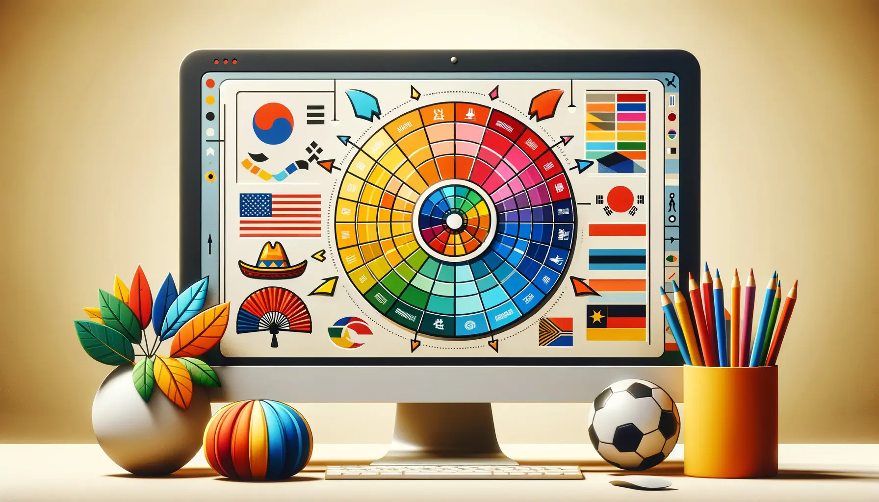
Colors carry different meanings and associations across cultures, which can influence the global appeal and acceptance of design projects.
Researching and considering these cultural connotations can prevent unintended messages and ensure that designs resonate positively with a diverse audience.
This global perspective on color choice can open up new markets and opportunities for brands.
Test and Iterate Color Choices
Testing color schemes with the target audience can provide valuable insights into their preferences and perceptions.
This feedback can be used to refine and iterate color choices, ensuring they effectively communicate the intended message and evoke the desired emotional response.
Continuous testing and iteration can lead to more impactful and successful design outcomes.
The strategic application of color theory, aligned with brand identity, usability, psychological impact, cultural considerations, and iterative testing, can significantly enhance the effectiveness and impact of design projects.
Challenges in Implementing Color Theory
While color theory offers a robust framework for enhancing design projects, its implementation is not without challenges.
Addressing these obstacles requires strategic planning and creative solutions.
Here are some common challenges and strategies to overcome them:
Staying Updated with Color Trends
Keeping pace with evolving color trends can be daunting but is essential for maintaining relevance in a competitive market.
Challenges include:
- Identifying reliable sources for trend forecasting.
- Adapting existing brand colors to align with new trends without losing brand identity.
Strategies for staying updated include subscribing to design publications, attending industry events, and leveraging online trend platforms.
Incorporating trending colors through accents or seasonal campaigns can refresh a brand’s look while maintaining core identity elements.
Ensuring Color Consistency Across Media
Achieving color consistency across various media and platforms is critical for brand coherence but poses significant challenges:
- Variations in material substrates and printing techniques can alter color appearance.
- Digital displays vary in color calibration, affecting how colors are viewed online.
To ensure consistency, use standardized color systems like Pantone for print and sRGB for digital.
Conducting cross-media testing and working closely with printing partners can help identify and adjust for discrepancies.
Color Accessibility and Inclusivity
Designing for accessibility and inclusivity is imperative but can be challenging due to:
- The need to accommodate various forms of color vision deficiency.
- Ensuring sufficient contrast for readability and usability.
Employing tools to simulate how designs appear to those with color vision deficiencies and adhering to Web Content Accessibility Guidelines (WCAG) for color contrast can enhance accessibility.
Inclusive design workshops and user testing with diverse groups can provide insights into effective color usage.
Managing Client Expectations
Clients may have specific color preferences that don’t align with design best practices or project goals.
Challenges include:
- Communicating the rationale behind color choices.
- Navigating client preferences while maintaining design integrity.
Strategies involve educating clients on color theory principles, presenting research-backed recommendations, and showing visual mockups to demonstrate the impact of proposed color schemes.
Collaborative workshops can help align expectations and foster a shared vision.
Overcoming the challenges in implementing color theory requires a blend of ongoing education, strategic planning, and effective communication, ensuring that color remains a powerful tool in the designer’s toolkit.
Technological Advances in Color Design
The field of color design is continually evolving, with technological advances offering new tools and methodologies to enhance the implementation of color theory in design projects.
These innovations not only streamline the design process but also open up new possibilities for creativity and precision in color application.
Digital Color Tools and Software
Advancements in digital color tools and software have revolutionized the way designers work with color.
Key benefits include:
- Enhanced color selection and palette creation tools that offer real-time previews and compatibility checks.
- Color matching systems that ensure consistency across digital and print mediums.
- Accessibility features that simulate various forms of color blindness, aiding in the creation of inclusive designs.
These tools facilitate a more efficient and accurate approach to color design, allowing designers to experiment with and finalize color schemes with greater confidence and speed.
Augmented Reality (AR) and Virtual Reality (VR)
AR and VR technologies are transforming the way designers and clients visualize and experience color in spatial contexts.
Applications include:
- Virtual walkthroughs of interior spaces with customizable color schemes, enabling immediate visual feedback on color choices.
- AR applications that overlay digital color palettes onto physical objects, helping in decision-making processes for product design.
These immersive technologies offer a dynamic platform for exploring color interactions in real-time, enhancing collaborative decision-making and client engagement.
Artificial Intelligence (AI) in Color Prediction and Trends
AI and machine learning are playing an increasingly significant role in predicting color trends and consumer preferences.
By analyzing vast datasets from fashion, interiors, and media, AI algorithms can identify emerging color trends, offering designers a data-driven approach to color selection.
This predictive capability can be a valuable asset in strategic planning for brand identity and product development, ensuring relevance and market alignment.
3D Printing and Color
The integration of color in 3D printing opens up new avenues for product design and prototyping.
Designers can now:
- Create detailed and color-accurate prototypes, reducing the need for multiple iterations and speeding up the development process.
- Experiment with color gradients and textures in physical models, offering a more nuanced approach to product aesthetics.
This technology enhances the tangible exploration of color in design, bridging the gap between digital concepts and physical reality.
Embracing technological advances in color design not only enhances the designer’s toolkit but also fosters innovation and precision in the application of color theory, ultimately enriching the visual and emotional impact of design projects.
Future Directions in Color Theory Application
The application of color theory in design is on the cusp of exciting developments, driven by technological innovation, environmental considerations, and a deeper understanding of human psychology.
As we look to the future, several key trends are poised to shape how color theory is applied in design projects, offering new opportunities for creativity and impact.
Sustainable Color Choices
As environmental concerns become increasingly paramount, the demand for sustainable design practices extends to color selection.
Future directions include:
- Preference for colors derived from natural, non-toxic pigments and sustainable sources.
- Increased use of digital color applications to reduce waste associated with physical prototypes and samples.
This shift towards eco-friendly color choices reflects a broader commitment to sustainability in the design industry, influencing consumer perceptions and brand identities.
Color for Well-being
The psychological impact of color on well-being is gaining attention, with designers exploring how color schemes can contribute to health and emotional balance.
Upcoming trends involve:
- Designing spaces and products that utilize color psychology to promote relaxation, focus, and overall well-being.
- Incorporating biophilic design principles, using colors that reflect natural environments to enhance human-nature connections.
This holistic approach to color design underscores the importance of creating environments that support mental and physical health.
Advanced Personalization Through Color
Technological advancements are enabling unprecedented levels of personalization in design, with color playing a key role.
Future applications may include:
- Customizable color schemes for products and interfaces, allowing users to tailor their experiences to their personal preferences.
- Dynamic color systems that adapt to user behavior, context, or mood, offering a more interactive and responsive design approach.
This trend towards personalized color experiences reflects a broader shift towards user-centered design, enhancing engagement and satisfaction.
Interactive and Responsive Colors
The development of materials and technologies that change color in response to environmental stimuli or user interaction is set to expand.
Potential applications include:
- Wearable technology that changes color based on physical activity or health metrics.
- Building materials that adapt their color to temperature changes, contributing to energy efficiency.
These innovations in responsive color design open up new possibilities for functionality and aesthetics, blurring the lines between design, technology, and the environment.
The future of color theory application in design is rich with potential, guided by advancements in sustainability, well-being, personalization, and interactive technologies. Embracing these directions can lead to more meaningful, impactful, and innovative design outcomes.
Conclusion: Embracing the Spectrum of Color Theory in Design
The journey through the nuances of implementing color theory in design reveals a landscape rich with challenges and opportunities.
From the foundational principles that guide color selection to the cutting-edge technologies enhancing its application, color theory remains a pivotal element in the design process.
Its strategic use not only elevates the aesthetic appeal of design projects but also significantly impacts user experience, brand identity, and market relevance.
The Strategic Value of Color
Understanding and applying color theory goes beyond mere decoration; it is a strategic endeavor that requires careful consideration and expertise.
The costs associated with implementing color theory in design are an investment in creating compelling, effective, and memorable design projects.
By acknowledging the complexities of color selection, testing, and application, designers can navigate these challenges to harness the full potential of color in their work.
Future Horizons in Color Application
Looking ahead, the future of color theory in design is set to unfold in exciting directions.
Sustainable color choices, the emphasis on color for well-being, advanced personalization, and interactive colors represent the next frontier in design innovation.
These developments promise to deepen the connection between design and the human experience, offering new ways to engage, inspire, and influence through the power of color.
- Sustainable color choices will encourage eco-friendly design practices, aligning with global efforts towards environmental conservation.
- The focus on color for well-being highlights the profound impact of design on mental and physical health, offering avenues to enhance quality of life through thoughtful color application.
- Personalization and interactivity in color design will cater to individual preferences and contexts, making design more responsive and user-centric.
In conclusion, the costs associated with implementing color theory in design are a testament to its significance and complexity.
As we navigate the evolving landscape of design, the strategic, thoughtful application of color theory will continue to be a cornerstone of innovation and impact.
By embracing the full spectrum of possibilities that color offers, designers can create work that is not only visually stunning but also deeply resonant and meaningful.
Quality web design is key for a great website! Check out our service page to partner with an expert web design agency.
FAQs: Navigating the Costs of Implementing Color Theory in Design
Discover insights into effectively incorporating color theory into your design projects while managing costs.
Basic costs range from $2,500 for visual guides to over $5,000 for comprehensive brand books, excluding website design and development.
Color psychology requires research to evoke the right emotions, potentially increasing costs with extensive testing and iteration for effectiveness.
Key components include understanding color harmonies, the psychological impact of colors, and their application across various media.
Choosing the right colors involves analyzing your brand’s identity, target audience preferences, and the emotional impact of colors.
Effective strategies include using universal color palettes, leveraging digital tools, and focusing on key brand elements for impact.
Yes, digital color tools, AR/VR, and AI in color prediction can streamline the design process, enhancing efficiency and reducing costs.
Future trends include sustainable color choices, color for well-being, and advanced personalization, potentially influencing costs.
Color accessibility ensures designs are usable by everyone, requiring additional consideration and testing, which may impact costs.
